Form Builder plugin
Demo URL: https://october-demo.renatio.com/backend/backend/auth/signin
Login: formbuilder
Password: formbuilder
Plugin allows you to build custom front-end forms with ease. Without any technical knowledge create functional forms for all your needs.
Features
- Build and manage your forms in OctoberCMS backend
- Use custom HTML markup for fields
- Create custom fields
- Reorder fields
- Example form with all default form controls
- Simple contact form included
- Native ajax files upload
- Basic responsive mail templates
- Google reCaptcha support
- RainLab Translate Plugin support with Multisite
- RainLab Location Plugin support
- RainLab Pages Plugin support to use form as snippet
- Duplicate form and field types
- Reply to functionality and autoresponder with custom mail template
- Form logs with export functionality
- Event for extending default functionality
- Custom Form Template
- Spam Protection Plugin support
Why is this a paid plugin?
Something that is free has little or no perceived value. Users do not commit to free products and only use them until something else looks nice and is free comes along. When I invest my time in the development of a new plugin I commit to supporting and maintaining it. I ask my customers to do the same. I do not make money from this plugin by advertisements, upgrades or additional services like hosting or setup.
Did you know that 30% of your purchase or donation goes to help fund the October Project?
My plugins take many hours to develop (40-120+) and even more hours to document and maintain. My paid plugins have to pay for both this time, and the time I am spending on free plugins and less successful paid plugins. This means that it will take even a successful plugin years to become profitable. Please consider buying an extended license if you want me to continue to maintain these plugins for the very small fee I ask in return or hire me for adding functionality that you feel is missing but valuable.
Like this plugin?
If you like this plugin, give this plugin a Like or Make donation with PayPal.
My other plugins
Please check my other plugins.
Support
Please use GitHub Issues Page to report any issues with plugin.
Reviews should not be used for getting support, if you need support please use the Plugin support link.
Icon made by Darius Dan from www.flaticon.com.
Documentation
Usage
After installation plugin will register backend Form Builder menu position. From there you will be able to manage your forms.
There will be three sub-menus, Forms, Field types and Form logs.
Forms list all created forms.
Field types list all available field types.
Form logs list all forms submissions.
There will two examples forms included after installation. Simple contact form and default form, that will demonstrate all available fields.
Plugin will register renderForm component to use it on CMS page. After adding component to CMS page, you must inspect
it (by clicking on it) and choose the form.
Plugin uses Ajax Framework to process form. Remember to add following code in layout:
{% framework extras %}
{% scripts %}
Please check if you have a following code in your layout <head> section.
{% styles %}Example of placing form component on CMS page
/themes/demo/pages/contact.htm
url = "/contact"
layout = "default"

[renderForm contactForm]
formCode = "contact-form"
==
{% component 'contactForm' %}
Example of placing form component on CMS partial
/themes/demo/pages/contact.htm
url = "/contact"
layout = "default"

[renderForm contactForm]
formCode = "contact-form"
==
{% ajaxPartial "contact" %}
/themes/demo/partials/contact.htm
{% component 'contactForm' %}Important note: For form handler to work you must use
{% ajaxPartial %}instead of normal partial tag{% partial %}.
Forms
Spam Protection
If you need Spam protection for your forms I recommend to install following plugin: Spam Protection Plugin
After you install this plugin it will automatically protect all your forms. It will work out of the box.
Custom template
By default, plugin will auto generate template when Custom Template field is empty. When you need to replace default
markup generated by plugin than you can write it here. You have access to special form_field() function that takes one
parameter, the name of the field.
Example that will display two fields in one row:
<div class="row">
    <div class="col-6">{{ form_field('first_name') }}</div>
    <div class="col-6">{{ form_field('last_name') }}</div>
</div>
Floating labels
Simple form labels that float over your input fields. This requires to use Bootstrap 5.
Fields
Custom HTML markup for fields
You can change HTML markup for each field by going to Form Builder -> Field types and updating the field type. Recommended approach is to duplicate field type and then modify it as you wish.
Custom field types
You can create custom field types by going to Form Builder -> Field types and clicking New field type button.
For example if you want to create Email field type just duplicate the markup from Text field type and change the type of the input from text to email.
Now after saving this field it will be possible to use it in your form.
In markup section you can use Twig and following variables:
| Property | Type | Description |
|---|---|---|
| label | String | Label for the field. |
| label_class | String | Label CSS classes. |
| name | String | HTML name attribute. Also used in mail template. |
| default | String | Default value for the field. |
| comment | String | Help block for the field. |
| class | String | HTML class. |
| wrapper_class | String | HTML wrapper class. |
| placeholder | String | Placeholder for the field. |
| options | Array | Options for dropdown, radio list, checkbox list. |
| custom_attributes | String | Custom HTML attributes. For example id="my-field". |
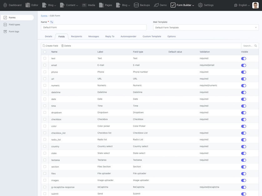
Available field types
Text
Renders a single line text box.
Renders e-mail address field.
Phone number
Renders phone number field.
URL
Renders URL field.
Numeric
Renders numeric field.
Datetime
Renders datetime field.
Date
Renders date field.
Time
Renders time field.
Color Picker
Renders a color picker.
Textarea
Renders a multiline text box.
Dropdown
Renders a dropdown with specified options.
Checkbox
Renders a single checkbox.
Checkbox List
Renders a list of checkboxes.
Radio List
Renders a list of radio options, where only one item can be selected at a time.
reCaptcha
Renders google reCaptcha box for SPAM protection.
Please visit reCaptcha site to obtain credentials.
Next go to Settings -> Form Builder -> Google reCaptcha and fill your site key and secret.
Important note: This field must have g-recaptcha-response as field name and required|recaptcha in validation section to work properly.
Files upload
Renders a file input.
Filter fields selected by a user
To filter allowed file extensions or file types you can add custom attribute.
For example to only allow selecting files with extension .pdf or .doc.
accept=".pdf,.doc"For example to only allow selecting images:
accept="image/*"Validation
To make file input required just add required in validation section.
To restrict max file size to 512 kb just add max:512 in validation section.
To restrict file mime type to pdfs just add mimes:pdf in validation section.
To restrict file to images just add image in validation section.
For more available validation rules see October documentation.
Multiple files
By default file upload field only allow to upload a single file. To enable multiple file uploads in Upload options tab
check Allow multiple files checkbox.
When validating multiple files to work correctly you must check Nested array based form input checkbox in validation
section. This will apply validation for each uploaded file. Do not check this checkbox when using required rule.
Send uploaded files as mail attachments
By default uploaded files are sent with mail as attachments. You can disable this behaviour by unchecking this checkbox.
Display mode
Display mode is just to inform backend area how to display uploaded files in form log entry. If you only allow to upload
images then select image mode.
Country select
Renders a dropdown with country options.
Important note: You must install Location Plugin to use this field.
State select
Renders a dropdown with state options. This field depends on country select.
Important note: You must install Location Plugin to use this field.
Section
Renders a section heading and subheading. Useful for grouping fields.
Submit
Renders form submit button.
Form Logs
Form Builder plugin have built in simple logging information about sent form. Form log record will contain filled form data by user and corresponding file attachments.
Events
Plugin will fire formBuilder.overrideForm event which allow to change form properties before rendering the form markup.
Event::listen('formBuilder.overrideForm', function ($form) {
    // example code
    $form->css_class = 'form-horizontal';
});
Plugin will fire formBuilder.overrideField event which allow to change field properties before rendering the form markup.
Event::listen('formBuilder.overrideField', function ($field, $form) {
    // example code
    if ($field->name === 'currency') {
        $field->default = 'USD';
    }
});
Plugin will fire formBuilder.extendFormData event which allow to change submitted form data.
Event::listen('formBuilder.extendFormData', function ($data) {
    // example code
    $data['foo'] = 'bar';

    return $data; // this line is required
});
Plugin will fire formBuilder.beforeSendMessage event before sending email. You can use this to extend Form Builder default functionality.
In your extension plugin boot method listen for this event:
Event::listen('formBuilder.beforeSendMessage', function ($form, $data) {
    // example code
    $form->from_email = 'john.doe@exampl.com';
    $form->from_name = 'John Doe';
});
You will have access to form object and array with posted data.
If you return false from this event then this will stop default behavior of sending email message.