Closed osrf-migration closed 9 years ago
Original comment by Jackie K (Bitbucket: jacquelinekay).
Louise, I'm assigning this to you, but feel free to pass it off if you don't think you have time. Nate and I worked the most on the existing Haptix GUI, let us know if you want to go over how it works with you.
Original comment by Steffi Paepcke (Bitbucket: spaepcke).
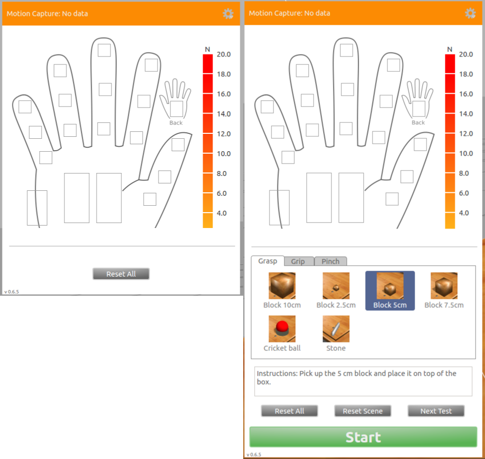
Since we're removing the ARAT tasks, shall Louise also remove the Start Test button? Its presence would only make sense now if the user has created their own tests...We're removing the Next Test button, as well.
Original comment by Louise Poubel (Bitbucket: chapulina, GitHub: chapulina).
Actually I've removed what I understood were task-related elements whenever the world doesn't describe any tasks. So if there are no tasks defined in the world (like in the handsim_empty.world
I'lll be adding), you get the GUI on the left, if the world has tasks defined, you get the GUI on the right. The timer only shows if there are tasks.
Original comment by Steffi Paepcke (Bitbucket: spaepcke).
That seems like a fine approach to me.
On the left, Reset All would reset the view, arm, and any models they've added to the scene, correct? The models would reset to their original pose, I'd guess. Is there a tooltip on that button explaining what it'll reset?
On the right GUI, how often will users have multiple tests? We may need to grey out the Next Test button if there's only one test. I'm not clear on how we expect teams to use this feature.
Louise, would you be able to remove the little arrow on the Settings icon? I think the icon alone should suffice affordance-wise.
Original comment by Jackie K (Bitbucket: jacquelinekay).
Original report (archived issue) by Steffi Paepcke (Bitbucket: spaepcke).
Do we want to have the "Hide GUI" option in-GUI, or in a menu?