react-diff-view
A git diff component to consume the git unified diff output.
Overview
Split view
Unified view
Optimized selection
Full features
- A clean and small core to display diff.
- Support split (side by side) and unified (one column) views.
- Tolerable performance.
- Flexible decoration component to render custom content around blocks of changes.
- Extensible widget architecture to support code commenting and various requirements.
- Customizable events and styles.
- Powerful token system to enable code highlight, mark special words, inline diff and more, supports web worker.
- A bunch of utility function to manipulate diff structure if source text is provided.
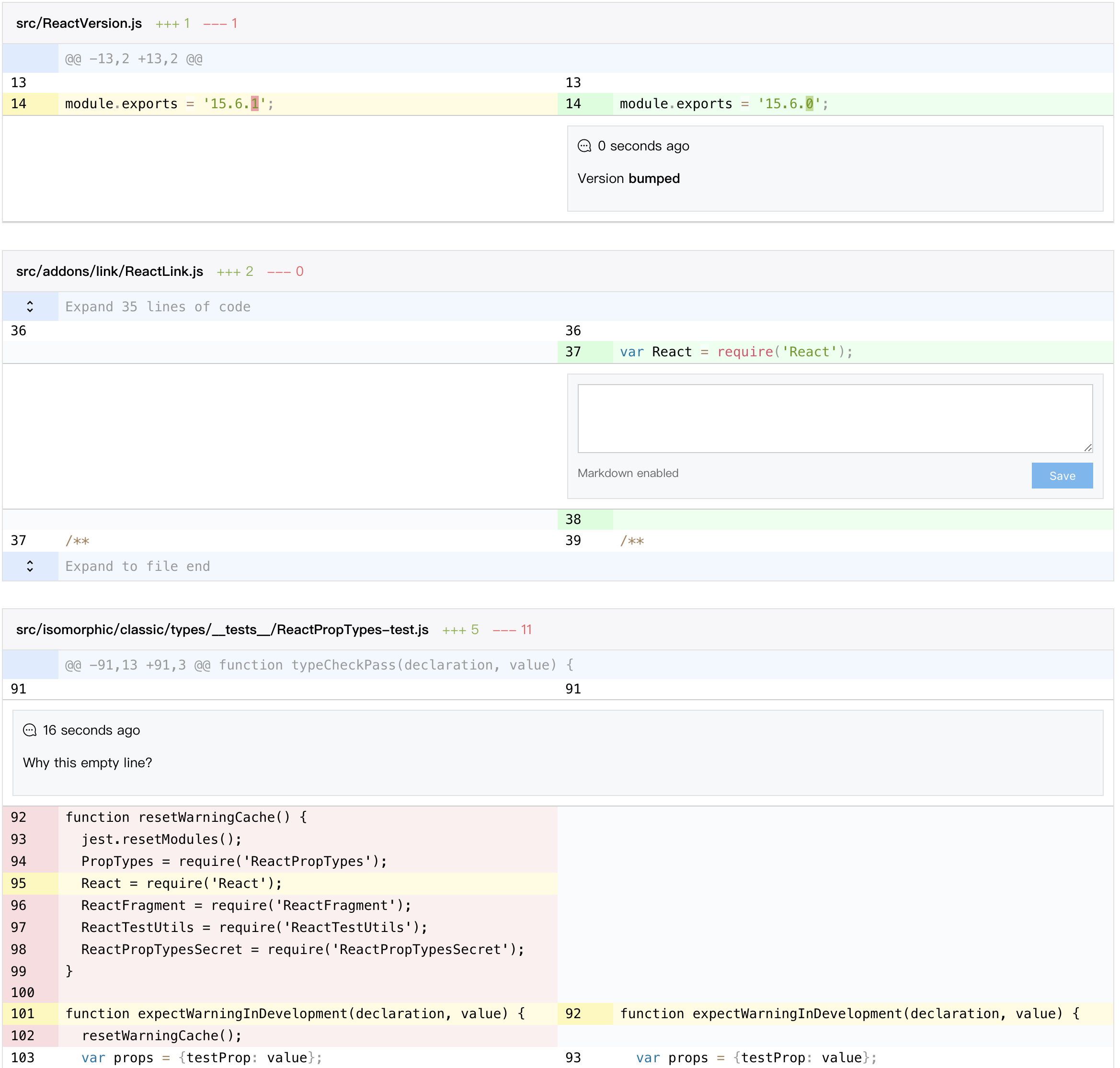
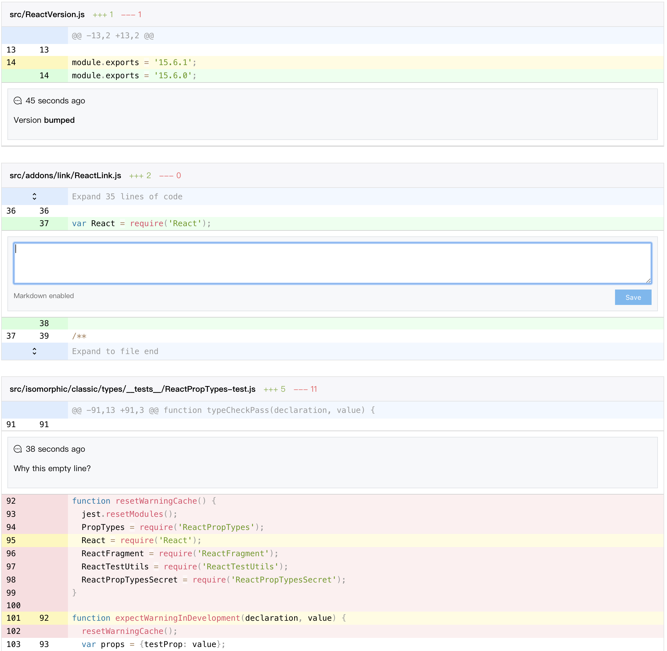
Run npm start to enjoy a full featured demo with diff display, collapsed code expansion, code comment and large diff lazy load.
I test the performance with a 2.2MB diff file with 375 files changed, 18721 insertions(+), 35671 deletions(-).
In my laptop (MacBook Pro 15-inch 2016, 2.6 GHz Intel Core i7, 16 GB 2133 MHz LPDDR3) it performs quite slow but tolerable without lazy rendering:
parse: 88.73291015625ms
render: 26072.791015625ms
paint: 6199.848876953125ms
Install
npm install --save react-diff-viewStarting from 3.1.0, you can import {Diff} from 'react-diff-view/esm to reference an unminified ESM module.
Basic usage
Parse diff text
For best display effect, you should generate your diff text with git diff -U1 command.
The {File[] parseDiff({string} text, {Object} [options]) named export is a wrap of gitdiff-parser package with some extra options:
{string} nearbySequences: The action to take when meet nearby sequences, only the"zip"value has its own behavior.
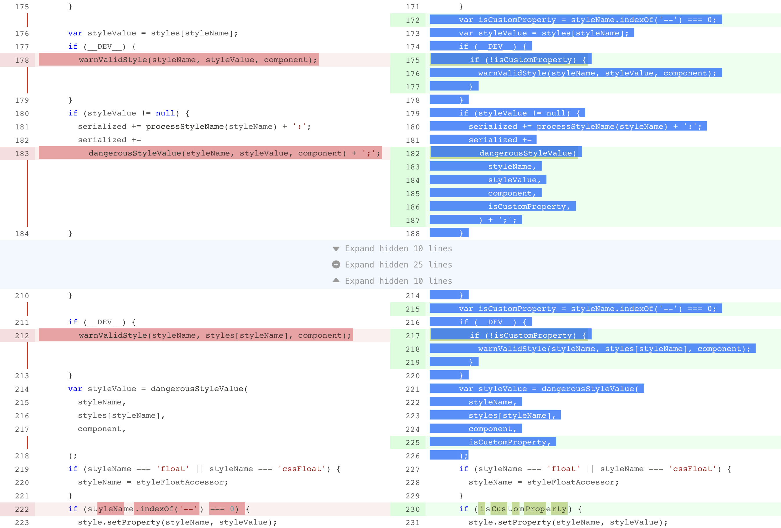
The nearbySequences can have a value of "zip" to "zip" a sequences of deletion and additions, as an example, here is a diff generated from react:
-    // if someone has already defined a value bail and don't track value
-    // will cause over reporting of changes, but it's better then a hard failure
-    // (needed for certain tests that spyOn input values)
-    if (node.hasOwnProperty(valueField)) {
+    // if someone has already defined a value or Safari, then bail
+    // and don't track value will cause over reporting of changes,
+    // but it's better then a hard failure
+    // (needed for certain tests that spyOn input values and Safari)
This is the normal behavior, which will displayed as 3 lines of deletion, 1 line of modification and 3 lines of addition:
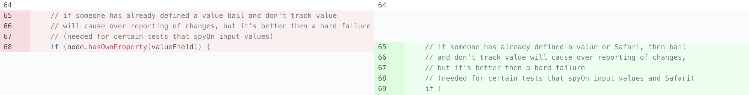
When the value "zip" is passed, the diff will be modified to:
-    // if someone has already defined a value bail and don't track value
+    // if someone has already defined a value or Safari, then bail
-    // will cause over reporting of changes, but it's better then a hard failure
+    // and don't track value will cause over reporting of changes,
-    // (needed for certain tests that spyOn input values)
+    // but it's better then a hard failure
-    if (node.hasOwnProperty(valueField)) {
+    // (needed for certain tests that spyOn input values and Safari)
and as a result rendered as:

In most cases it can provide a better look in split view.
Render diff hunks
The Diff named export is a component to render a diff, a simplest case to render a diff could be:
import {parseDiff, Diff, Hunk} from 'react-diff-view';

function renderFile({oldRevision, newRevision, type, hunks}) {
    return (
        <Diff key={oldRevision + '-' + newRevision} viewType="split" diffType={type} hunks={hunks}>
            {hunks => hunks.map(hunk => <Hunk key={hunk.content} hunk={hunk} />)}
        </Diff>
    );
}

function App({diffText}) {
    const files = parseDiff(diffText);

    return (
        <div>
            {files.map(renderFile)}
        </div>
    );
}
The children is optional if you only need all hunks to be displayed, however you can use this function children to add custom events or classes to hunks.
As you can see, Diff component requires a hunks prop as well as a function children prop which receive the hunks prop as its argument, this may looks redundant but actually very useful when work with HOCs modifying hunks. For example, we have a HOC to remove all normal changes:
const filterOutNormalChanges = hunk => {
    return {
        ...hunk,
        changes: hunk.changes.filter(change => !change.isNormal);
    };
};

const removeNormalChanges = ComponentIn => {
    const ComponentOut = ({hunks, ...props}) => {
        const purgedHunks = hunks.map(filterOutNormalChanges);

        return <ComponentIn {...props} hunks={hunks} />;
    };

    ComponentOut.displayName = `removeNormalChanges(${ComponentIn.displayName})`;

    return ComponentOut;
};

const MyDiff = removeNormalChanges(Diff);
We can still pass original hunks to MyDiff, however all normal changes are removed from the hunks argument in children prop.
Here is the full list of its props:
{Object[] hunks}: Hunks of diff.{Function} children: A function which receives an array of hunks and returns react elements.{string} viewType: Can be either"unified"or"split"to determine how the diff should look like.{string} className: An extra css class.{Object} customEvents: An object containing events for different part, see Customize events section for detail.{Object} customClassNames: An object containing css classes for different part, see Customize styles section for detail.{string[]} selectedChanges: An array of selected changes's key, these changes will be highlighted.{Object} widgets: An object of{changeKey: element}to render widget for changes, see Add widgets section for detail.{string} gutterType: How the gutter cell should be rendered, can be either"default"to render only the line number,"none"to hide the gutter column, or"anchor"to render line number as an<a>element so user can click gutter to scroll to corresponding line.{Function} generateAnchorID: A function to generate a DOMidattribute for each change, this is required whengutterTypeis set to"anchor". Provided function receives achangeobject as the only argument and should return either a string orundefined, ifundefinedis returned noidattribute will be placed on DOM. Theidattribute will be placed on the gutter<td>element, for normal changes in split mode, only the left side gutter will have theidattribute.{boolean} optimizeSelection: Whether to optimize selection to a single column, when this prop is set totruein split mode, user can only select code from either old or new side, this can help copy and paste lines of code. This feature can cause some performance dropdown when the diff is extremely large, so it is turned off by default.{Function} renderToken: A function to render customized syntax tokens, see Pick ranges section for detail.{Function} renderGutter: A function to render content in gutter cells, see Customize gutter section for detail.
Key of change
In selectedChanges and widgets props the key of change is used to match a specific change, a change's key is simply a string computed by the following rules:
if (change.type === 'insert') {
    return 'I' + change.lineNumber;
}
else if (change.type === 'delete') {
    return 'D' + change.lineNumber;
}
else {
    return 'N' + change.oldLineNumber;
}
You are not required to compute this key yourself, the getChangeKey(change) exported function will do it.
Add decoration around hunks
A decoration is customized content rendered around Hunk component, pass a Decoration element in Diff's children is the only required action.
Decoration component basically receives a children prop which can either have one or two elements:
- A single element: this will be rendered in the entire row.
- An array containing two elements: The first element will be rendered in gutter position, the second will be rendered in code position.
A very simple use case of Decoration is to provide a summary information of hunk:
import {flatMap} from 'lodash';
import {Diff, Hunk, Decoration} from 'react-diff-view';

const renderHunk = hunk => [
    <Decoration key={'decoration-' + hunk.content}>
        {hunk.content}
    </Decoration>,
    <Hunk key={'hunk-' + hunk.content}> hunk={hunk} />
];

const DiffFile = ({diffType, hunks}) => (
    <Diff viewType="split" diffType={diffType}>
        {flatMap(hunks, renderHunk)}
    </Diff>
);
We can also render more content by providing two elements to Decoration:
const renderHunk = hunk => [
    <Decoration key={'decoration-' + hunk.content}>
        <SmileFace />,
        <span>{hunk.content}</span>
    </Decoration>,
    <Hunk key={'hunk-' + hunk.content}> hunk={hunk} />
]
Add widgets
In some cases we need functions like commenting on change, react-diff-view provides an extensible solution called widget to archive such scenarios.
A widget is any react element bound to a change object, a widget is configured in an object with change and element property, when rendering diff changes, if there is a widget object with the same change object, the element will be rendered below the line of code.
In split view a widget will be rendered to its corresponding side if change object is of type addition or deletion, otherwise the widget will be rendered across the entire row.
Note although the widgets prop is of type array, each change can only render one widget, so if there are entries with the same change property, only the first one will be rendered.
Here is a very basic example which adds a warning text on long lines:
import {parseDiff, getChangeKey, Diff} from 'react-diff-view';

const getWidgets = hunks => {
    const changes = hunks.reduce((result, {changes}) => [...result, ...changes], []);
    const longLines = changes.filter(({content}) => content.length > 120);
    return longLines.reduce(
        (widgets, change) => {
            const changeKey = getChangeKey(change);

            return {
                ...widgets,
                [changeKey]: <span className="error">Line too long</span>,
            };
        },
        {}
    );
};

const App = ({diffText}) => {
    const files = parseDiff(diffText);

    return (
        <div>
            {files.map(({hunks}, i) => <Diff key={i} hunks={hunks} widgets={getWidgets(hunks)} viewType="split" />)}
        </div>
    );
};
For a more complex case, you can reference the example in demo/File.js about implementing code comments with the widgets prop.
Customize styles
The basic theme of react-diff-view is simply "picked" from github, with some additional colors for column diffs, the style is located at react-diff-view/style/index.css, you can simply import this file in your project.
CSS variables
react-diff-view includes a bunch of css variables (custom properties) to customize the presentation of diff in supported browsers, these includes:
:root {
    --diff-background-color: initial;
    --diff-text-color: initial;
    --diff-font-family: Consolas, Courier, monospace;
    --diff-selection-background-color: #b3d7ff;
    --diff-selection-text-color: var(--diff-text-color);;
    --diff-gutter-insert-background-color: #d6fedb;
    --diff-gutter-insert-text-color: var(--diff-text-color);
    --diff-gutter-delete-background-color: #fadde0;
    --diff-gutter-delete-text-color: var(--diff-text-color);
    --diff-gutter-selected-background-color: #fffce0;
    --diff-gutter-selected-text-color: var(--diff-text-color);
    --diff-code-insert-background-color: #eaffee;
    --diff-code-insert-text-color: var(--diff-text-color);
    --diff-code-delete-background-color: #fdeff0;
    --diff-code-delete-text-color: var(--diff-text-color);
    --diff-code-insert-edit-background-color: #c0dc91;
    --diff-code-insert-edit-text-color: var(--diff-text-color);
    --diff-code-delete-edit-background-color: #f39ea2;
    --diff-code-delete-edit-text-color: var(--diff-text-color);
    --diff-code-selected-background-color: #fffce0;
    --diff-code-selected-text-color: var(--diff-text-color);
    --diff-omit-gutter-line-color: #cb2a1d;
}
For code highlight colors, we recommend prism-color-variables package which includes CSS variables of every refractor generated token type.
Class names
You can override styles on certain css classes to customize the appearance of react-diff-view, here is a list of css classes generated by component:
diff: The diff container, a<table>element.diff-gutter-col: The<col>element to control the gutter column.diff-hunk: The<tbody>element representing a diff hunk.diff-decoration: The<tr>element representing the decoration row.diff-decoration-gutter: The<td>element corresponding to gutter within decoration.diff-decoration-content: The<td>element corresponding to code content within decoration.diff-gutter: The<td>element containing the line number.diff-gutter-normal: Gutter of a normal change.diff-gutter-insert: Gutter of an addition.diff-gutter-delete: Gutter of a deletion.diff-gutter-omit: Gutter with no content.diff-gutter-selected: Gutter of a selected change.diff-line: The<tr>element for a diff line.diff-line-old-only: The<tr>element which only contains the left side columns, appears in split viewdiff-line-new-only: The<tr>element which only contains the right side columns, appears in split viewdiff-code: The<td>element containing code.diff-code-normal: Code of a normal change.diff-code-insert: Code of an addition.diff-code-delete: Code of a deletion.diff-code-omit: Code with no content.diff-code-selected: Code of a selected change.diff-code-edit: Edits on a line of code.diff-code-mark: Marked word on a line of code.diff-widget: The<tr>element to render widget.diff-widget-content: The<td>element to render widget content.diff-line-hover-old: The<td>element of the old side gutter and code which is currently hovered.diff-line-hover-new: The<td>element of the new side gutter and code which is currently hovered.
The diff-line-hover-(old|new) class is especially designed to tell the precise hover element in split mode, so it only applies when viewType is set to "split", if you want a style on a hovering change, the selector could be:
// Less selector to disable the line number and add an icon in the gutter element when a change is hovered
.diff-line-hover-old.diff-gutter,
.diff-line-hover-new.diff-gutter,
.diff-unified .diff-line:hover .diff-gutter {
    &::before {
        font-family: "FontAwesome";
        content: "\f4b2"; // comment-plus
    }
}
You can pass the className prop to a Diff component to add a custom class to the <table> element.
The Hunk component receives class name props as:
className: The class name of hunk's root<tbody>element.lineClassName: The class name of each change's<tr>element.gutterClassName: The class name of the gutter<td>element in each row.codeClassName: The class name of the code<td>element in each row.
Similarly Decoration component also receives some props to customize class names:
className: The class name of decoration's root<tr>element.gutterClassName: The class name of the gutter<td>element.contentClassName: The class name of the content<td>element.
Customize events
The Hunk component receives gutterEvents and codeEvents props to customize events on either gutter or code <td> element.
Both of the above prop is an object containing DOM events key/value pair.
Each event callback receive an object with key change and side, the side property is undefined in unified mode, in split mode it could be either "old" and "new" responding to the triggering element.
One of the common cases is to add code selecting functionality. This can be archived simply by passing an onClick event to gutter and coe and manipulating the selectedChanges prop:
import {useState, useCallback, useMemo} from 'react';

function File({hunks, diffType}) {
    const [selectedChanges, setSelectedChanges] = useState([]);
    const selectChange = useCallback(
        ({change}) => {
            const toggle = selectedChanges => {
                const index = selectedChanges.indexOf(change);
                if (index >= 0) {
                    return [
                        ...selectedChanges.slice(0, index),
                        ...selectedChanges.slice(index + 1),
                    ];
                }
                return [...selectedChanges, change];
            };
            setSelectedChanges(toggle);
        },
        []
    );
    const diffProps = useMemo(
        () => {
            return {
                gutterEvents: {onClick: selectChange},
                codeEvents: {onClick: selectChange},
            };
        },
        [selectChange]
    );

    return (
        <Diff viewType="split" diffType={diffType} hunks={hunks} {...diffProps}>
            {hunks => hunks.map(hunk => <Hunk key={hunk.content} hunk={hunk} />)}
        </Diff>
    );
}
Token system
Since the version 2.0.0 we introduce a powerful token system to provide enhancements such as code highlighting, special word marking, inline diff edits and more.
To find a very simple tokenization example including inline edits highlight please check out this sandbox. This example works in an synchronous way, however we'd like to recommend you utilize web workers to put tokenization process in background.
The token system is quite complicated internally, so we recommend to use only the exported tokenize function to parse and tokenize diffs.
The tokenize function accepts 2 arguments, the first is the hunks array, the second one is an options object containing many optional configurations:
{boolean} highlight: Whether to highlight code syntax.{Object} refractor: Ifhighlightis set totrue, we require the refractor library to highlight code, you can simply pass the default export ofrefractorlib, or create a custom build of it.- Please note that it isn't compatible with refractor@4.x currently, use refractor@3.x instead
{string} oldSource: When highlight is enabled, it can generate more accurate syntax result when the entire source code is provided. Only the old source code is required, new code will be automatically generated from the diff patch. This is not required, however lack of it can result incorrect highlight in cases like multiline comments or template strings.{string} language: When highlight is enabled, you must provide the language of your source code, yourrefractorobject should also support the providing language, a list of language can be found here.{Function[]} enhancers: A list of enhancers to enhance the result syntax tokens.
The react-diff-view also ships with several common enhancers:
Edits
The markEdits(hunks, options) exported function will further diff the old and new text within a hunk, the differences between two sides will be marked a class name diff-code-edit.
The options object accepts properties:
{string} type: How inline diff should work, the value could be"line"to diff texts line by line, or"block"(by default) which diffs text with a hunk.
It uses diff-match-patch as its internal implement.
Special words
The markWord(word, name, replacement) exported function enables you to mark some special word with 2 arguments:
{string} word: The word you want to mark, such as"\r"or"Hello".{string} name: The name of word, such as"carriage-return"or"hello".{string} replacement: The text to replaceword, for example we can use"␍"to replace"\r"to make it visible on screen.
Marked word will have a class name of diff-code-${name}.
It is better markEdits before markWord since it will not break inline highlight.
Pick ranges
The pickRanges(oldRanges, newRanges) exported function is a more low level function which helps you to pick some ranges of text from each line.
Each range is an object with properties:
{string} type: The custom type of range, this will be passed to your custom render function.{number} lineNumber: The line number of this ranges, starting from 1.{number} start: The starting index within line, starting from 0.{number} length: The length of range.{object} properties: Extra properties of range, these properties will be passed to your custom render function.
By giving an array of ranges on both old and new side, the token system will pick them out of each line, you should pass a renderToken function prop to Diff component to customize your render implement of customized token. The renderToken is a simple function receiving (token, defaultRender) as arguments:
// Suppose we pick ranges of type `searchResult`
const renderToken = (token, defaultRender, i) => {
    if (token.type === 'searchResult') {
        return (
            <span key={i} className="search-result">
                {token.children && token.children.map((token, i) => renderToken(token, defaultRender, i))}
            </span>
        );
    }

    // For other types, use the default render function
    return defaultRender(token, i);
};
We can utilize enhancers to create effects above diffs, for example we want to enable inline diff edits, and highlight tab and carriage return characters, this can be done by:
import refractor from 'refractor';

const options = {
    highlight: true,
    refractor: refractor,
    oldSource: oldSource,
    language: 'jsx',
    enhancers: [
        markWord('\r', 'carriage-return'),
        markWord('\t', 'tab'),
        markEdits(hunks),
    ],
};

const tokens = tokenize(hunks, options);
The tokenize function can work inside a web worker so it does not block the user interface.
Customize gutter
By default, the gutter cell contains the line number of current change, however in many cases developers want a more complicated content in a gutter cell, we provided a renderGutter prop on Diff component to provide flexibility.
The renderGutter function prop will receive a single object argument with following properties:
{Change} change: current change.{string} side:"new"or"old".{Function} renderDefault: A default render function which returns line number if possible.{Function} wrapInAnchor: A function that receives an element and wrap it in an<a>element ifgutterAnchoris enabled.{boolean} inHoverState: Whether this change is hovered.
const renderGutter = ({change, side, renderDefault, wrapInAnchor, inHoverState}) => {
    if (inHoverState) {
        return (
            <>
                {side === 'new' && <UnitTestCoverageBar change={change} />}
                <CommentButton change={change} />
            </>
        );
    }

    return (
        <>
            <UnitTestCoverageBar change={change} />
            {wrapInAnchor(renderDefault())}
        </>
    );
};
Utilities
react-diff-view comes with some utility functions to help simplify common issues:
{number} computeOldLineNumber({Change} change): Compute the line number in old revision for a change, returns-1on insert changes.{number} computeNewLineNumber({Change} change): Compute the line number in new revision for a change, returns-1on delete changes.{Hunk} textLinesToHunk({string[]} lines, {number} oldStartLineNumber, {number} newStartLineNumber): Create a hunk with all normal changes, this is useful when expanding code between two hunks.{Hunk[]} insertHunk({Hunk[]} hunks, {Hunk} insertion): Insert a new hunk into the original list, it will merge sibling hunks if possible, useful for expanding code.{number} computeCorrespondingOldLineNumber({Hunk[]} hunks, {number} newLineNumber): Get the corresponding old line number by a line number on the new side. This function returns-1when no corresponding line exists (pure insert and delete changes).{number} computeCorrespondingNewLineNumber({Hunk[]} hunks, {number} oldLineNumber): Opposite tocomputeCorrespondingOldLineNumberfunction.{Change} findChangeByOldLineNumber({Hunk[]} hunks, {number} oldLineNumber): Find the change by a line number on the old side, if none is found, returnsundefined.{Change} findChangeByNewLineNumber({Hunk[]} hunks, {number} newLineNumber): Opposite tofindChangeByNewLineNumberfunction.{number} getCollapsedLinesCountBetween({Hunk} previousHunk, {Hunk} nextHunk): Get the count of collapsed line between given sibling hunks.
Enjoy more with raw text provided
Once you can provide a rawCodeOrLines object (which can be a string, or an array of lines of code), there are many more utility function you can use to help organize hunks:
{Hunk[]} expandFromRawCode({Hunk[]} hunks, {string|string[]} rawCodeOrLines, {number} start, {number} end): Create a hunk from source code slicing fromstarttoend, then insert this hunk intohunks, merging with existing hunks are automatically done.{Hunk[]} addStubHunk({Hunk[]} hunks, {string|string[]} referenceRawCodeOrLines): This is an overload ofaddStubHunkfunction, once you provide the secondreferenceRawCodeOrLines, the stub hunk will only be appended when there is more code after the last hunk.{Hunk[]} expandCollapsedBlockBy({Hunk[]} hunks, {string|string[]} rawCodeOrLines, {Function} predicate): Iterate over all collapsed block (lines between 2 hunks) and expand those withpredicatereturnstrue. Thepredicatefunction receives({number} lines, {number} oldStart, {number} newStart)as arguments.
Unsupported
Wordwrap
No, there isn't a wordwrap configuration. Lines are automatically wrapped by default, and it is almost impossible to implement other wrap styles, unless we choose table-layout: auto which critically hinders the performance.
Any solutions for this issue are welcome.
Test
I don't really know how to test such a complicated and UI centric component, any help is welcome.
Related Libraries
Breaking Changes
2.x
-
Diff
childrenprop onDiffcomponent is now of type function which receiveshunksas its argument.diffTypeprop onDiffcomponent is now required.customClassNamesandcustomEventsprops are removed fromDiffcomponent, instead of itHunkandDecorationcomponent receivesxxxClassNameandxxxEvents, see Customize events and Customize styles sections.hideGutterandgutterAnchorprops are merged intogutterTypeprop with 3 values:"default","anchor"and"none".markEditsandonRenderCodeprops are removed, now the tokenizer system takes all enhancement on code view.
-
Hunk
headerprops is removed sinceDecorationcomponent is provided.- All callbacks defined in
codeEventsandgutterEventsnow receives an object with keychangeandside.
-
Others
- The main module is now
cjs/index.js, with an ES version ates/index.js, style is placed atstyle/index.css. parsemodule is removed, use named exports from main module instead, tree shaking can be enabled on ES version.stubHunkoptions ofparseDifffunction is removed, with the power ofDecorationcomponent, we no longer need the stub hunk.addStubHunkfunction is also removed sinceDecorationcomponent is provided.- The line number is no longer rendered via a
::beforeelement and adata-line-numberattribute, it is an actual child node of the gutter element,user-select: noneis applied to disable selection.
- The main module is now
Change Log
1.0.0
- Move to a self-implement diff parser which is faster and provides more information (binary, chmod, etc...).
- Add a
react-diff-view/parsemodule providing 2 named exports:parseDiffandaddStubHunk, this can be used on web workers. - Styles are now in a standalone
index.cssfile with source map support. - Upgrade
reactandprop-typesdependency versions to MIT licensed ones, alsoreact ^16.0.0is supported.
1.1.0
- Remove unofficial styles such as paddings and borders around widgets.
- Introduce class names for widgets.
- Upgrade
gitdiff-parserto^0.0.5to fix a line number issue.
1.1.1
- Fix a bug where custom event callbacks on hunk header content are not invoked.
- Fix the broken
insertHunkfunction. - Fix a bug in
nearbySequences: 'zip'implement.
1.2.0
- Add key prop to hunks to improve widget insertion performance.
- Fix a bug where
compute(Old|New)LineNumberwill return a valid line number when given unacceptable change object.
1.3.0
- Add
generateAnchorIDandgutterAnchorprops to allow anchor to specific changes.
1.3.1
- Fix an issue where
textLinesToHunkmistakenly adds an heading whitespace to each line of code.
1.3.2
- Update
gitdiff-parserto fix an issue with whitespace in filename.
1.4.0
- Add
expandFromRawCodefunction to create hunks from source code. - Make
insertHunkwork when hunks have overlaps. - Add
referenceRawCodeOrLinesparameter toaddStubHunkfunction to automatically determines whether a stub hunk is required. - Add
computeCorresponding(Old|New)LineNumberfunctions to get corresponding line number from one side to another side. - Add
findChangeBy(Old|New)LineNumberfunctions to find specific change in hunks. - Add
getCollapsedLinesCountBetweenfunction to count collapsed lines between two hunks. - Add
expandCollapsedBlockByfunction to expand collapsed blocks from a predicate function. stubHunkoption onparsefunction is deprecated.
1.4.1
- Fix an edge case in
sliceHunk.
1.4.2
- Update
gitdiff-parserto fix an issue when there is only one line in diff.
1.4.3
- Fix an issue where
sliceHunkfunction will remove all insert changes in slice range.
1.4.4
- Improve
expandFromRawCodefunction to support start from a delete change. - Simplified
sliceHunkinternal function to have a more stable behavior.
1.4.5
- Fix an issue where hunks with insert changes at tail will fail to merge.
1.4.6
- Fix a bug computing end line of a hunk
1.4.7
- Fix a bug where isTextHunk property get the wrong value when merged.
- Fix a bug where code expanding range includes insert or delete change results incorrect hunks.
1.4.8
- Fix a bug missing argument to compute valid expand ranges.
1.4.9
- Fix incorrect content property on custom hunks.
- Fix a bug where edge insert changes can be omitted when merge.
1.4.10
- Fix a logic bug when split range of lines into valid ones.
1.4.11
- Fix a bug where a stub hunk will crash the hunk insertion.
1.5.0
- Add
hideGutterprop to hide gutter columns
1.6.0
- Enable optimized selection to select only one side in split view, a
optimizeSelectionprop is added.
1.6.1
- Optimize performance of column selection.
1.6.2
- Fix an issue where click on hunk header can cause error because optimized selection doesn't handle clicks in non code cells.
2.0.0
- All big reimplement.
- Require
react^16.8.0
2.0.1
- Fix a build issue by disabling
manglein terser.
2.1.0
- Add hooks to provide HOC funcionalities.
- Fix a bug in diff apply function.
2.1.1
- Fix unexpected dependency to
reskript. - Upgrade all dependencies.
2.1.2
- Fix a bug in
applyDifffunction.
2.1.4
- Fix a bug where incorrect
sideEffectsconfig inpackage.jsoncan make webpack tree shaking css ofreact-diff-view.
2.2.0
- Add
renderGutterprop to customize content in gutter cells.
2.3.0
- Exposes internal enhancement hooks.
2.4.0
- Add CSS variables to customize diff components.
2.6.0
- Add more CSS variable to customize text color inside insert, delete changes.