Toastification 
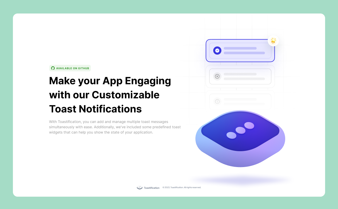
Toastification is a Flutter package that allows developers to easily display toast notifications in their apps. Toast notifications are a type of pop-up message that typically appear on the screen and disappear after a short amount of time. They are commonly used to display information, alerts, or confirmations to the user.
One of the advantages of the Toastification package is its ability to handle multiple toast messages. With Toastification, developers can display multiple toast notifications at once and display them in a queue. This means that if multiple notifications are triggered at the same time, they will be displayed one after the other, rather than overlapping on the screen.
Overall, Toastification is a useful package for Flutter developers who want to add toast notifications to their apps without having to write the code from scratch.
Toast Builder
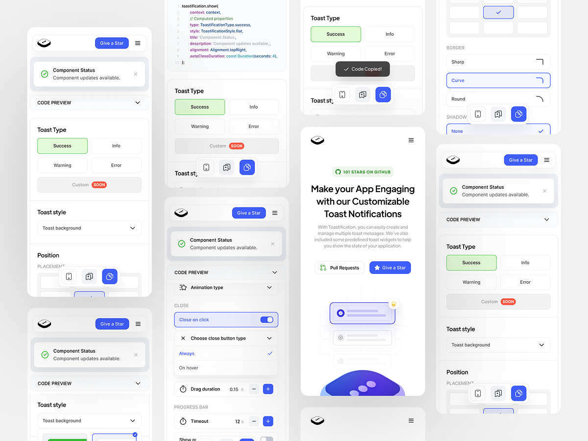
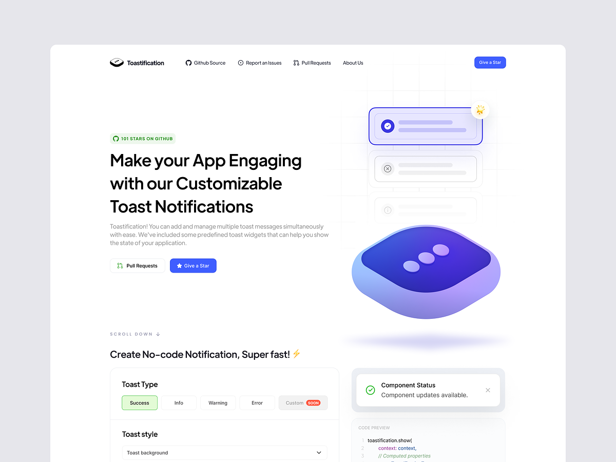
Don't want to dive into the whole documentation? No problem! Just head over to our Toast Builder Website, where you can effortlessly customize your toast notifications, copy the generated code, and seamlessly integrate them into your project. It's the quickest way to get started with Toastification!
https://github.com/payam-zahedi/toastification/assets/47558577/0e40aefd-b768-4d13-b982-eeeefb2256e9
Installation
To use Toastification, you need to add it to your pubspec.yaml file:
dependencies:
  toastification: latest_version
Then, run flutter pub get to install the package.
Usage
To use Toastification in your Flutter app, first import the package:
import 'package:toastification/toastification.dart';before we dive into the details, you should know that you can use Toastification in two different way:
toastification.show Method: to show predefined toast messages with predefined styles.
toastification.showCustom Method: to show custom toast messages with custom styles.
you can either use the 'toastification' instance or 'Toastification()' constructor to access the methods.
Usage without context
If you want to display toast messages without using context, wrap your AppWidget with ToastificationWrapper like this:
return ToastificationWrapper(
  child: MaterialApp(),
);
And now you can use both toastification.show and toastification.showCustom without providing context.
Show Method
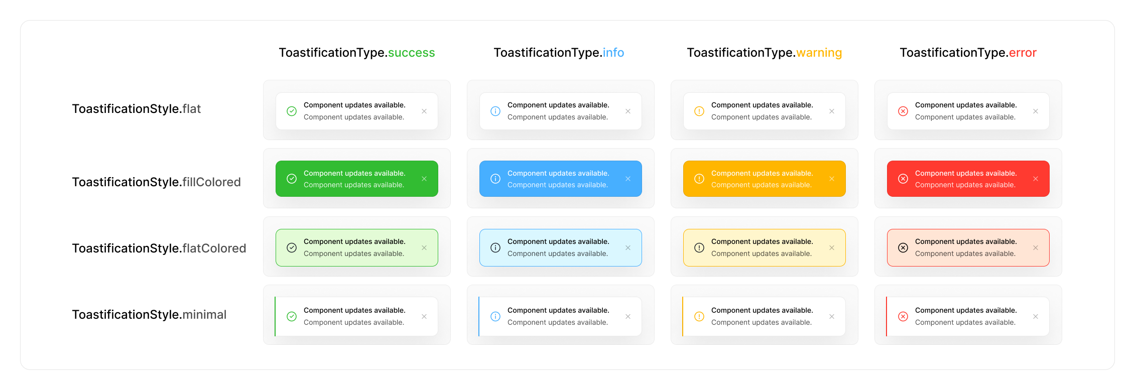
by using the show method, you can show predefined toast messages. you can use the ToastificationType enum to choose the type and ToastificationStyle enum to choose the style of the toast message.
toastification.show(
  context: context, // optional if you use ToastificationWrapper
  title: Text('Hello, world!'),
  autoCloseDuration: const Duration(seconds: 5),
);
This will display a toast message with the text "Hello, world!".
You can customize the appearance of the toast message by passing in additional parameters to the show() method:
toastification.show(
  context: context, // optional if you use ToastificationWrapper
  type: ToastificationType.success,
  style: ToastificationStyle.flat,
  autoCloseDuration: const Duration(seconds: 5),
  title: Text('Hello, World!'),
  // you can also use RichText widget for title and description parameters
  description: RichText(text: const TextSpan(text: 'This is a sample toast message. ')),
  alignment: Alignment.topRight,
  direction: TextDirection.ltr,
  animationDuration: const Duration(milliseconds: 300),
  animationBuilder: (context, animation, alignment, child) {
    return FadeTransition(
      turns: animation,
      child: child,
    );
  },
  icon: const Icon(Icons.check),
  showIcon: true, // show or hide the icon
  primaryColor: Colors.green,
  backgroundColor: Colors.white,
  foregroundColor: Colors.black,
  padding: const EdgeInsets.symmetric(horizontal: 12, vertical: 16),
  margin: const EdgeInsets.symmetric(horizontal: 12, vertical: 8),
  borderRadius: BorderRadius.circular(12),
  boxShadow: const [
    BoxShadow(
      color: Color(0x07000000),
      blurRadius: 16,
      offset: Offset(0, 16),
      spreadRadius: 0,
    )
  ],
  showProgressBar: true,
  closeButtonShowType: CloseButtonShowType.onHover,
  closeOnClick: false,
  pauseOnHover: true,
  dragToClose: true,
  applyBlurEffect: true,
  callbacks: ToastificationCallbacks(
    onTap: (toastItem) => print('Toast ${toastItem.id} tapped'),
    onCloseButtonTap: (toastItem) => print('Toast ${toastItem.id} close button tapped'),
    onAutoCompleteCompleted: (toastItem) => print('Toast ${toastItem.id} auto complete completed'),
    onDismissed: (toastItem) => print('Toast ${toastItem.id} dismissed'),
  ),
);
ToastificationStyle
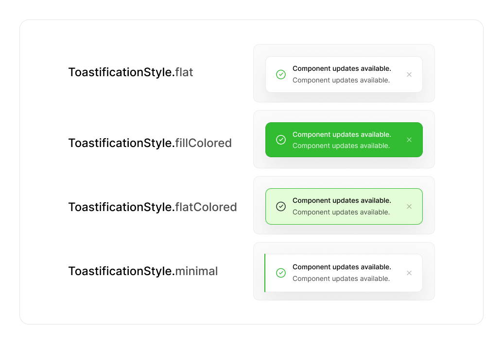
We have 5 predefined styles for toast messages, each offering a unique look and feel to match your application's design. Here's a breakdown of each style:
-
ToastificationStyle.flat
- A simple and clean style with a subtle border and no background fill. Ideal for minimalist notifications that don't overwhelm the interface.
-
ToastificationStyle.fillColored
- A bold style with a solid colored background. Perfect for high-visibility alerts or important notifications that need immediate attention.
-
ToastificationStyle.flatColored
- A balanced style with a flat design, colored borders, and text, but without a solid fill. Great for notifications that need to stand out without being too bold.
-
ToastificationStyle.minimal
- A sleek and modern design with minimal elements and an accent line denoting the notification type. Perfect for clean, distraction-free interfaces.
-
ToastificationStyle.simple
- A straightforward style showing a single line of text. Best for short, simple messages or confirmations where minimal design is preferred.
ShowCustom Method
If you are looking for even more control over the appearance and behavior of your toast messages, you can use the showCustom() method to create a completely custom toast message. This method lets you pass in a builder function that returns the widget you want to display, giving you complete control over the toast's layout, styling, and interactivity.
With showCustom(), the possibilities are endless. You can create a custom toast message that matches your app's unique visual style, or you can add interactive elements like buttons and sliders to make your toast messages more engaging and dynamic.
Here's an example of how to use showCustom() to create a custom toast message with a button that lets users perform an action:
toastification.showCustom(
  context: context, // optional if you use ToastificationWrapper
  autoCloseDuration: const Duration(seconds: 5),
  alignment: Alignment.topRight,
  builder: (BuildContext context, ToastificationItem holder) {
    return Container(
      decoration: BoxDecoration(
        borderRadius: BorderRadius.circular(8),
        color: Colors.blue,
      ),
      padding: const EdgeInsets.all(16),
      margin: const EdgeInsets.all(8),
      child: Column(
        crossAxisAlignment: CrossAxisAlignment.start,
        children: [
          const Text('Custom Toast',
              style: TextStyle(
                  color: Colors.white, fontWeight: FontWeight.bold)),
          const SizedBox(height: 8),
          const Text('This is a custom toast message!',
              style: TextStyle(color: Colors.white)),
          const SizedBox(height: 16),
          Row(
            children: [
              ElevatedButton(
                onPressed: () {
                  // Perform an action when the button is pressed
                },
                child: const Text('Do Something'),
              ),
            ],
          ),
        ],
      ),
    );
  },
);
With showCustom(), you're only limited by your imagination. Create a toast message that stands out from the crowd and adds a touch of personality to your app!
Custom Animations
You can customize the animation of the toast notification by providing a Duration for the animation duration and implementing your own animation builder function using the animationBuilder parameter. Here's an example of how to use custom animations:
toastification.show(
  context: context,
  title: Text('Hello, world!'),
  // .... Other parameters
  animationDuration: const Duration(milliseconds: 300),
  animationBuilder: (context, animation, alignment, child) {
    return RotationTransition(
      turns: animation,
      child: child,
    );
  },
);
Global/Default Configuration
Global configuration allows you to change the default behavior of Toastification across your entire application or in a specific page. To achieve this, you can provide your own ToastificationConfig using the ToastificationConfigProvider widget.
The ToastificationConfigProvider is an inherited widget, which means the provided configuration will be available to all child widgets in the widget tree. This allows you to maintain consistent toast notification behavior throughout your app.
Applying Global Configuration for the Whole App
To apply global configuration for the entire application, use builder parameter of the MaterialApp widget to wrap your pages with ToastificationConfigProvider and provide an instance of ToastificationConfig. Here's an example:
class MyApp extends StatelessWidget {
  const MyApp({super.key});

  @override
  Widget build(BuildContext context) {
    return MaterialApp(
      title: 'Toastification',
      builder: (context, child) {
        return ToastificationConfigProvider(
          config: const ToastificationConfig(
            margin: EdgeInsets.fromLTRB(0, 16, 0, 110),
            alignment: Alignment.center,
            itemWidth: 440,
            animationDuration: Duration(milliseconds: 500),
          ),
          child: child!,
        );
      },
    );
  }
}
Applying Global Configuration for a Specific Page
To apply global configuration for a specific page, you can wrap the widget tree of that page with ToastificationConfigProvider and provide an instance of ToastificationConfig. Here's an example:
class HomePage extends StatelessWidget {
  const HomePage({super.key});

  @override
  Widget build(BuildContext context) {
    return const ToastificationConfigProvider(
      config: ToastificationConfig(
        margin: EdgeInsets.fromLTRB(0, 16, 0, 110),
        alignment: Alignment.center,
        itemWidth: 440,
        animationDuration: Duration(milliseconds: 500),
      ),
      child: Scaffold(
        body: HomeBody(),
      ),
    );
  }
}
Manage Your Notifications
In addition to displaying toast messages, the Toastification package also provides methods for managing and dismissing existing notifications. Here are the available methods:
Find a Notification item
Find a notification with the given ID.
final notification = toastification.findToastificationItem('my_notification_id');Dismiss a Notification
Remove a specific notification from the screen.
final notification = toastification.show(
  context: context,
  title: Text('Hello'),
  autoCloseDuration: const Duration(seconds: 5),
);

toastification.dismiss(notification);
Dismiss a Notification by ID
Remove a notification with the given ID from the screen.
toastification.dismissById('my_notification_id');Dismiss All Notifications
Remove all notifications that are currently displayed on the screen.
toastification.dismissAll(delayForAnimation: true);You can customize the dismissal behavior by setting the delayForAnimation parameter. If set to true, Toastification will wait for the animation to finish before dismissing all notifications. If set to false, the notifications will be dismissed immediately without waiting for the animation.
Dismiss First Notification
Remove the first notification from the screen.
toastification.dismissFirst();Dismiss Last Notification
Remove the last notification from the screen.
toastification.dismissLast();Design
Toastification was redesigned by Sepide Moqadasi. We want to extend our heartfelt appreciation to Sepide for her exceptional design work, which has made Toastification visually appealing and user-friendly. Special thanks to Sepide for her valuable contributions to this project.
Contributors
Contributions are always welcome! If you have any suggestions, bug reports, or feature requests, please open an issue on the GitHub repository.
If you would like to contribute to the project, please read the CONTRIBUTING.md file for more information on how to contribute.
License
Toastification is released under the BSD-3-Clause License. You can find the full text of the license in the LICENSE file in the root of the repository.