![]()


![]()
![]()
![]()
![]()
plotly_resampler: visualize large sequential data by adding resampling functionality to Plotly figures
plotly-resampler improves the scalability of Plotly for visualizing large time series datasets. Specifically, our library dynamically aggregates time-series data respective to the current graph view, ensuring efficient and responsive updates during user interactions like panning or zooming via callbacks.
This core aggregation functionality is achieved by utilizing by time-series data point selection algorithms, for which plotly-resampler leverages the highly optimized implementations available in tsdownsample. Our default data aggregation method is MinMaxLTTB (and selects 1000 data points for plotting). For a deeper understanding of this method, you can consult to the algorithm's dedicated MinMaxLTTB repository and the associated research paper.
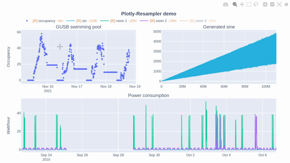
In this Plotly-Resampler demo over 110,000,000 data points are visualized!
🛠️ Installation
| pip | pip install plotly-resampler |
||
|---|---|---|---|
| <!-- | conda | conda install -c conda-forge plotly_resampler |
--> |
👀 What is the difference between plotly-resampler figures and plain plotly figures?
`plotly-resampler` can be thought of as wrapper around plain plotly figures which adds visualization scalability to line-charts by dynamically aggregating the data w.r.t. the front-end view. `plotly-resampler` thus adds dynamic aggregation functionality to plain plotly figures. **❗ Important to know**: * ``show`` *always* generates a static HTML view of the figure, prohibiting dynamic aggregation. * To have dynamic aggregation: * Use `show_dash` with `FigureResampler` to initiate a **Dash** app to realize the dynamic aggregation with **callbacks**.(or output the object in a cell via ``IPython.display``), which will also spawn a dash-web app * with ``FigureWidgetResampler``, you need to use ``IPython.display`` on the object, which uses widget-events to realize dynamic aggregation (via the running **IPython kernel**). **Other changes of plotly-resampler figures w.r.t. vanilla plotly**: * **double-clicking** within a line-chart area **does not Reset Axes**, as it results in an “Autoscale” event. We decided to implement an Autoscale event as updating your y-range such that it shows all the data that is in your x-range. * **Note**: vanilla Plotly figures their Autoscale result in Reset Axes behavior, in our opinion this did not make a lot of sense. It is therefore that we have overriden this behavior in plotly-resampler.
### 📋 Features * **Convenient** to use: * just add either * `register_plotly_resampler` function to your notebook with the best suited `mode` argument. * `FigureResampler` decorator around a plotly Figure and call `.show_dash()` * `FigureWidgetResampler` decorator around a plotly Figure and output the instance in a cell * allows all other plotly figure construction flexibility to be used! * **Environment-independent** * can be used in Jupyter, vscode-notebooks, Pycharm-notebooks, Google Colab, DataSpell, and even as application (on a server) * Interface for **various aggregation algorithms**: * ability to develop or select your preferred sequence aggregation method ## 🚀 Usage **Add dynamic aggregation** to your plotly Figure _(unfold your fitting use case)_ * 🤖 Automatically _(minimal code overhead)_:
Use the register_plotly_resampler function
1. Import and call the `register_plotly_resampler` method 2. Just use your regular graph construction code * **code example**: ```python import plotly.graph_objects as go; import numpy as np from plotly_resampler import register_plotly_resampler # Call the register function once and all Figures/FigureWidgets will be wrapped # according to the register_plotly_resampler its `mode` argument register_plotly_resampler(mode='auto') x = np.arange(1_000_000) noisy_sin = (3 + np.sin(x / 200) + np.random.randn(len(x)) / 10) * x / 1_000 # auto mode: when working in an IPython environment, this will automatically be a # FigureWidgetResampler else, this will be an FigureResampler f = go.Figure() f.add_trace({"y": noisy_sin + 2, "name": "yp2"}) f ``` > **Note**: This wraps **all** plotly graph object figures with a > `FigureResampler` | `FigureWidgetResampler`. This can thus also be > used for the `plotly.express` interface. 🎉
> **Note**: > Any plotly Figure can be wrapped with `FigureResampler` and `FigureWidgetResampler`! 🎉 > But **only** the `go.Scatter`/`go.Scattergl` **traces are resampled**. ## 💭 Important considerations & tips * When running the code on a server, you should forward the port of the `FigureResampler.show_dash()` method to your local machine.
**Note** that you can add dynamic aggregation to plotly figures with the `FigureWidgetResampler` wrapper without needing to forward a port! * The `FigureWidgetResampler` *uses the IPython main thread* for its data aggregation functionality, so when this main thread is occupied, no resampling logic can be executed. For example; if you perform long computations within your notebook, the kernel will be occupied during these computations, and will only execute the resampling operations that take place during these computations after finishing that computation. * In general, when using downsampling one should be aware of (possible) [aliasing](https://en.wikipedia.org/wiki/Aliasing) effects. The [R] in the legend indicates when the corresponding trace is being resampled (and thus possibly distorted) or not. Additionally, the `~
code: https://github.com/predict-idlab/ts-datapoint-selection-vis - **MinMaxLTTB** - an efficient data point selection algorithm (preprint): https://arxiv.org/abs/2305.00332
code: https://github.com/predict-idlab/MinMaxLTTB
---
👤 Jonas Van Der Donckt, Jeroen Van Der Donckt, Emiel Deprost