accessibility_tools
Checkers and tools to ensure your app is accessible to all.
Creating an accessible app is incredibly important. But too often it's forgotten about, or left to later. This package ensures your app is accessible from day one, by checking your interface as you build it.
To show the issue tooltip, hover over the widget or long-press it.
Tap wrench icon to open testing tools panel:
From Rebel App Studio

Getting Started
Add AccessibilityTools to your app's builder property:
class MyApp extends StatelessWidget {
  @override
  Widget build(BuildContext context) {
    return MaterialApp(
      // *** Add the line below ***
      builder: (context, child) => AccessibilityTools(child: child),
      home: HomePage(),
    );
  }
}
The tools only run in debug mode, and are compiled out of release builds.
Current accessibility checkers
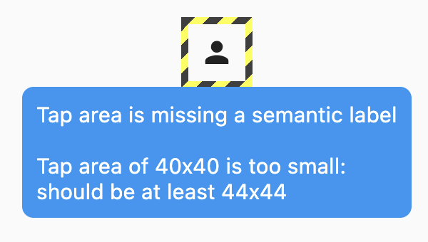
Semantic label checker
Ensures buttons (and other tappable widgets) have an associated semantic label.
For example, this icon button is missing a label:
IconButton(
  onPressed: () => login(),
  icon: Icon(Icons.person),
)
Adding a semantic label would fix this: Icon(Icons.person, semanticLabel: 'Login').
Tap area checker
Makes sure all tappable widgets are large enough to easily tap. Defaults to the Material Design minimum of 48x48 on mobile devices, and 44x44 on desktop devices.
Large font overflow checker
Experimental: ensures that no flex widgets, such as Column and Row, overflow when a user is using larger font sizes. This checker is experimental, and disabled by default, and can be enabled via AccessibilityTools(checkFontOverflows: true).
Input label checker
Makes sure text fields (TextField, TextFormField, Autocomplete etc) and inputs (Checkbox, Radio, Switch etc) have semantic labels.
Image label checker
Makes sure images have semantic labels.
Current testing tools toggles
- Text scale. Changes text scale factor, range is 0.1 to 10.0. Does nothing if app ignores text scaling
- Localization. Overrides current selected locale of a
WidgetApp - Text direction. Forces text to be displayed according to the selected values (right-to-left or left-to-right)
- Platform. Changes current
TargetPlatform. This may change scrolling behavior, back button icon, gesture navigation etc - Density. Changes app's visual density. This may change padding of some widgets (e.g.
ListTile) - Bold text. Simulates operating system's request to make text bolder
- Color mode simulation. Simulates a color mode. Supported modes: protanopia, deuteranopia, tritanopia, inverted colors, grayscale
- Screen reader mode. Enables semantics debugger to simulate how app is seen by screen readers
Configuration
Checkers are enabled or disabled with properties on the AccessibilityTools widget:
AccessibilityTools(
  // Set to null to disable tap area checking
  minimumTapAreas: MinimumTapAreas.material,
  // Check for semantic labels
  checkSemanticLabels: false,
  // Check for flex overflows
  checkFontOverflows: true,
  // Check for image labels
  checkImageLabels: true,
  // Set how much info about issues is printed
  logLevel: LogLevel.verbose,
  // Set where the buttons are placed
  buttonsAlignment: ButtonsAlignment.bottomRight,
  // Enable or disable draging the buttons around
  enableButtonsDrag: false,
  child: child,
)