This package helps to create forms in Flutter by removing the boilerplate needed to build a form, validate fields, react to changes and collect final user input.
Also included are common ready-made form input fields for GSForm. This gives you a convenient way of adding common ready-made input fields instead of creating your own FormBuilderField from scratch.

See real examples:
Table of contents
Installation
Run this command:
With Flutter:
flutter pub add gsformThis will add a line like this to your package's pubspec.yaml (and run an implicit flutter pub get):
dependencies:
  gsform: ^0.3.6
Alternatively, your editor might support flutter pub get. Check the docs for your editor to learn more about it.
Style
| ```dart GSFormStyle( backgroundFieldColor: COLOR, backgroundSectionColor: COLOR, sectionCardElevation: 0 titleStyle: TextStyle, fieldHintStyle: TextStyle, fieldTextStyle: TextStyle, sectionRadius: 10.0, errorTextStyle: TextStyle, fieldRadius: double, helpTextStyle:TextStyle , requireType: GSFieldRequireTypeEnum, //text, star sectionCardPadding: 8.0, requiredText: '(required)' ) ``` | 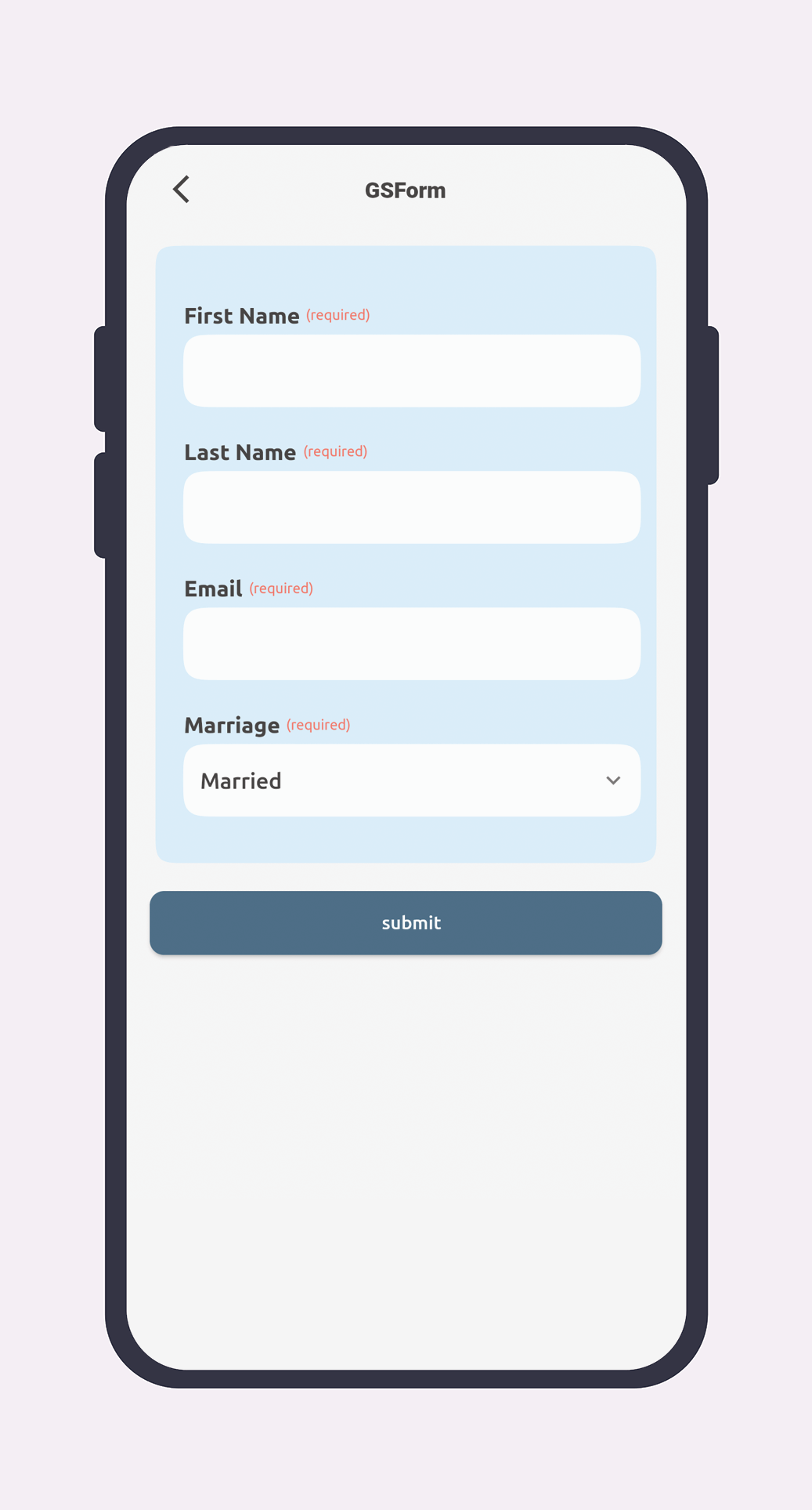
|
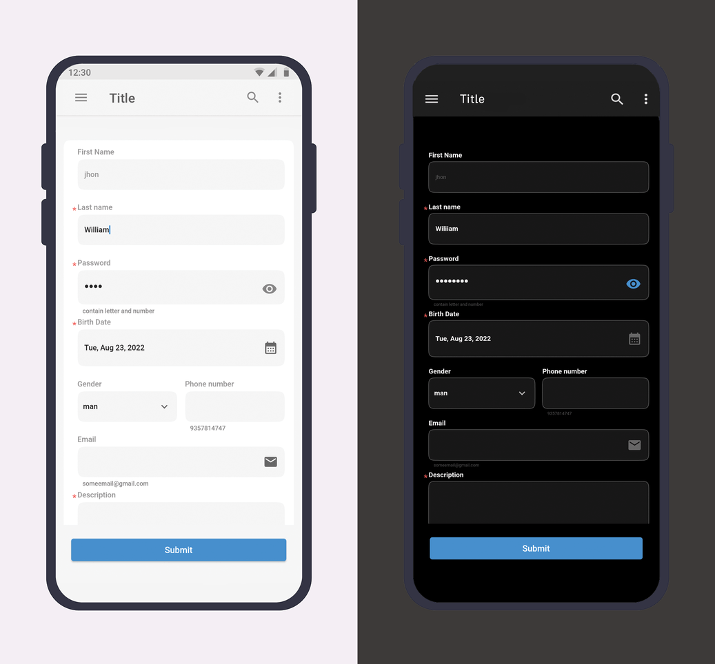
Dark Support
As we all now Dark theme is trending and most of the popular app has the feature to turn into the dark mode, we support Dark theme in GSForm if you did'nt user custom Style in components, otherwise you should handle this yourself.
Direction
Some languages of the world (Arabic, Hebrew etc.) are RTL, meaning they are read right-to-left, instead of left-to-right. GSForm Support RTL Direction !
Required Show Types
You can set type of required show in form with GSFieldRequireTypeEnum (text Or star)
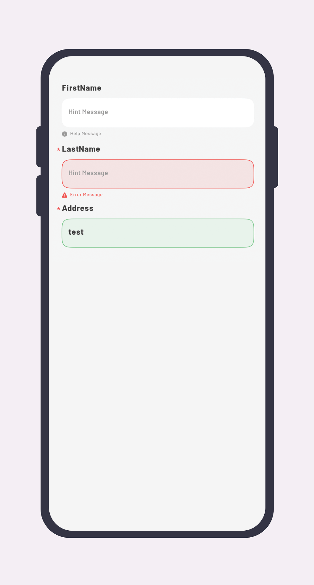
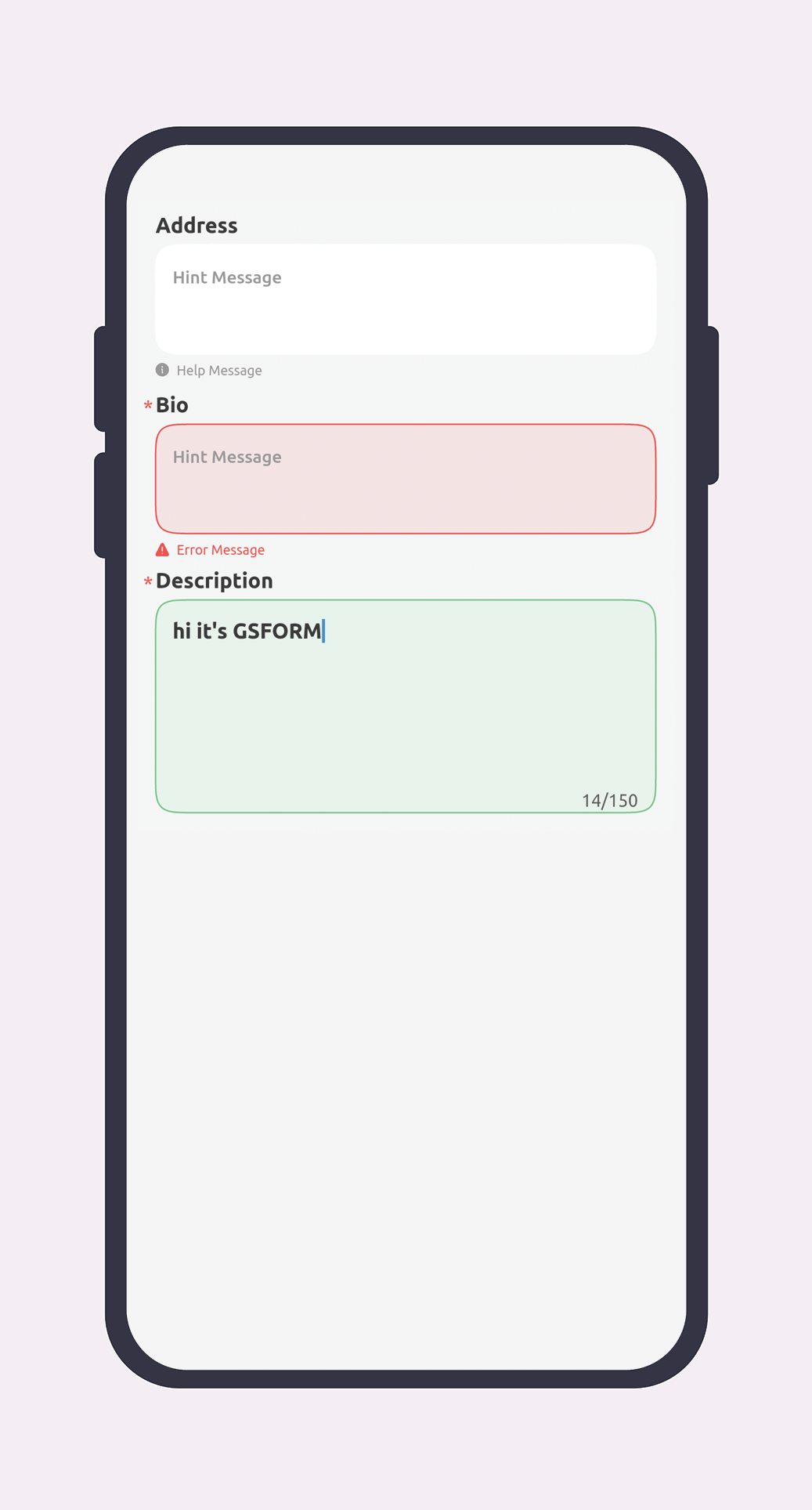
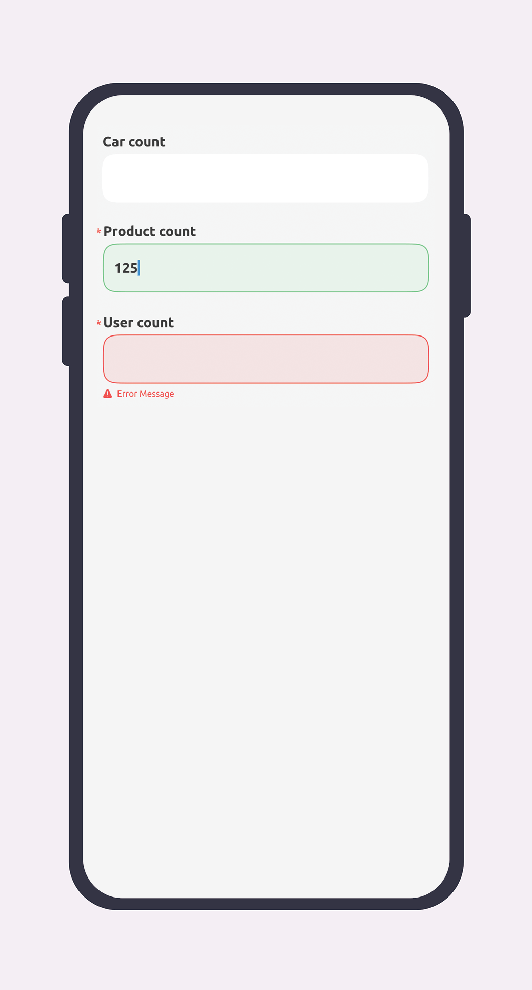
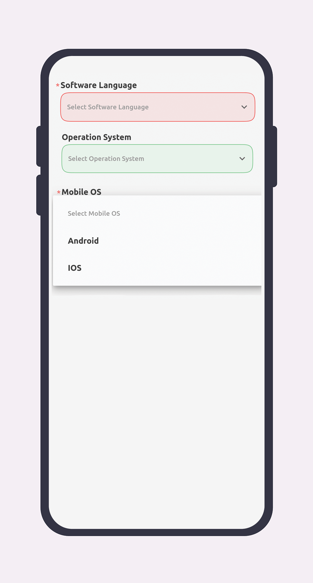
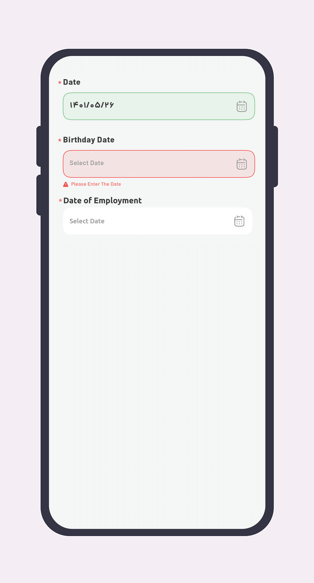
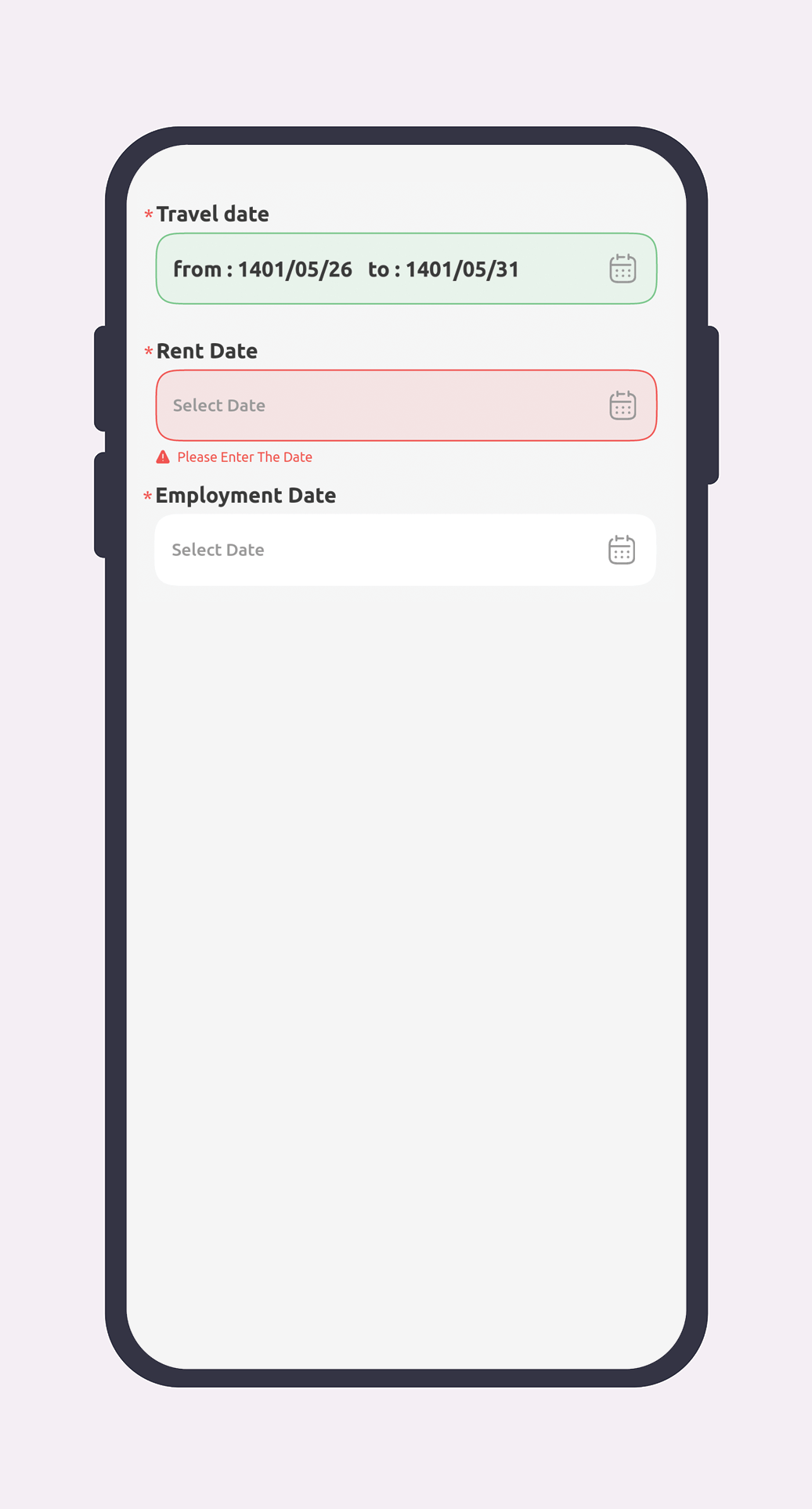
Fields
| Row | Field | Sample Code | Preview |
| 1 | Text | ```dart GSField.text( tag: 'postalCode', title: 'title', minLine: 1, maxLine: 1, weight: 12, required: true, maxLength: 100, errorMessage: 'error message', hint: 'hint message', helpMessage: 'help message', validateRegEx: regX, postfixWidget: widget, prefixWidget: widget, ) ``` |
|
| 2 | Text Plain | ```dart GSField.textPlain( tag: 'textualAddress', title: 'title', weight: 12, required: true, errorMessage: 'error message', hint: 'hint message', helpMessage: 'help message', maxLength: 100, maxLine: 2, minLine: 1, postfixWidget: widget, prefixWidget: widget, ) ``` |
|
| 3 | Number | ```dart GSField.number( tag: '', title: 'title', weight: 12, maxLength: 11, required: true, errorMessage: 'Error Message', helpMessage: 'less than 100', ), ``` |
|
| 4 | Spinner | ```dart GSField.spinner( errorMessage: 'error message', hint: 'hint message', helpMessage: 'help message', tag: 'tag', required: true, weight: 12, title: 'title', items: [ SpinnerDataModel( name: '', id: 1,), ], ) ``` |
|
| 5 | Date Picker | ```dart GSField.datePicker( tag: 'tag', title: 'title', weight: 12, isPastAvailable: false, required: true, postfixWidget: widget, displayDateType: DisplayDateType.numeric, initialDate: Jalali.now(), errorMessage: 'error message', hint: 'hint message', helpMessage: 'help message', prefixWidget: widget, ) ``` |
|
| 6 | Date Ranged Picker | ```dart GSField.dateRangePicker( tag: 'tag', title: 'title', weight: 12, required: true, postfixWidget: widget, displayDateType: DisplayDateType.numeric, isPastAvailable: false, availableFrom: Jalali, availableTo: Jalali, initialDate: Jalali.now(), from: 'From : ', to: 'To : ', errorMessage: 'error message', hint: 'hint message', helpMessage: 'help message', prefixWidget: widget, ) ``` |
|
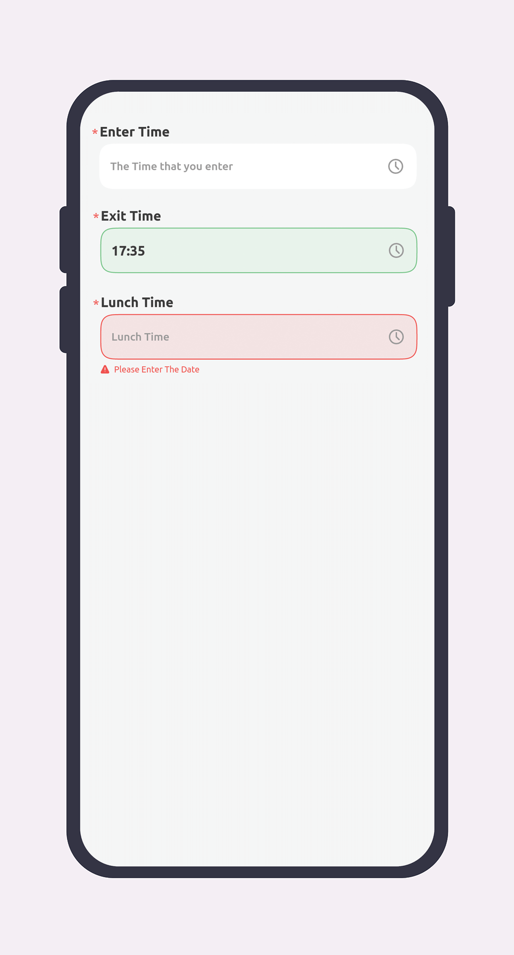
| 7 | Time Picker | ```dart GSField.time( tag: 'tag', prefixWidget: widget, postfixWidget: widget, errorMessage: 'error message', hint: 'hint message', helpMessage: 'help message', required: true, initialTime: TimeOfDay, weight: 12 ) ``` |
|
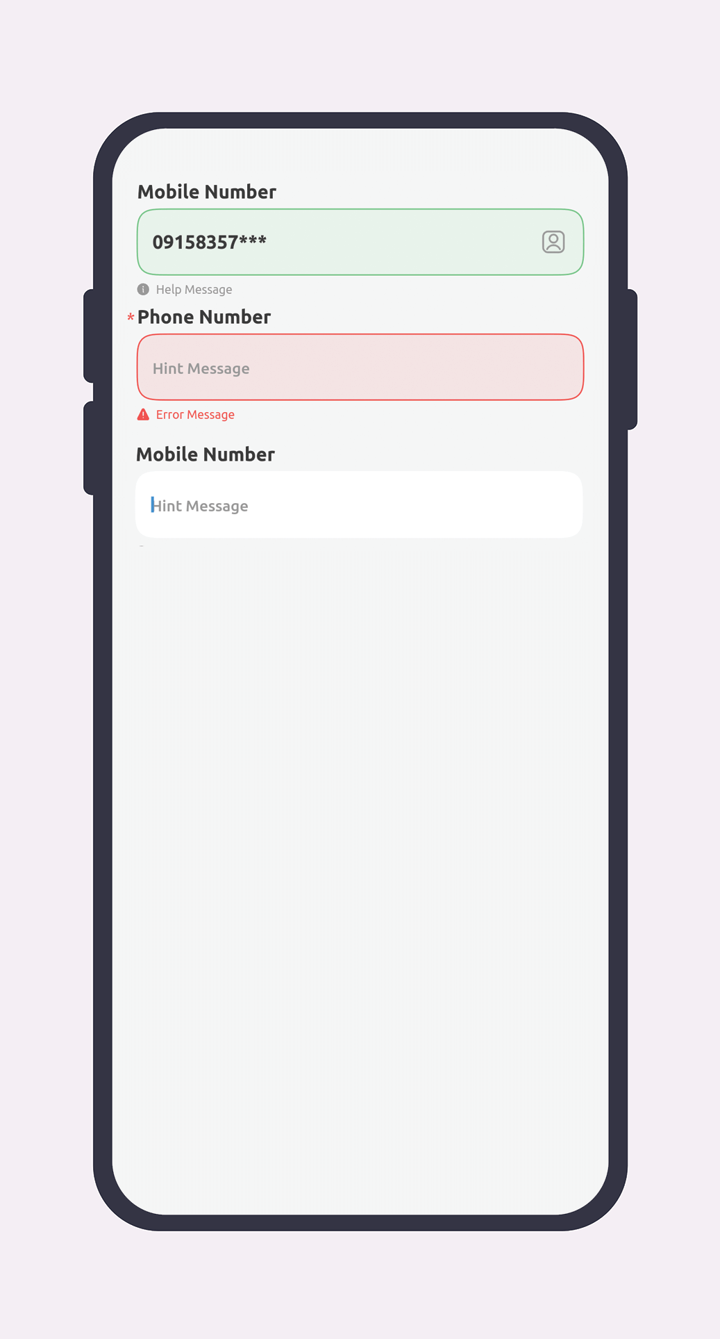
| 8 | Mobile | ```dart GSField.mobile( tag: 'tag', errorMessage: 'error message', hint: 'hint message', helpMessage: 'help message', title: 'title', maxLength: 11, postfixWidget: widget, prefixWidget: widget, validateRegEx: regex, weight: 12, required: true, ) ``` |
|
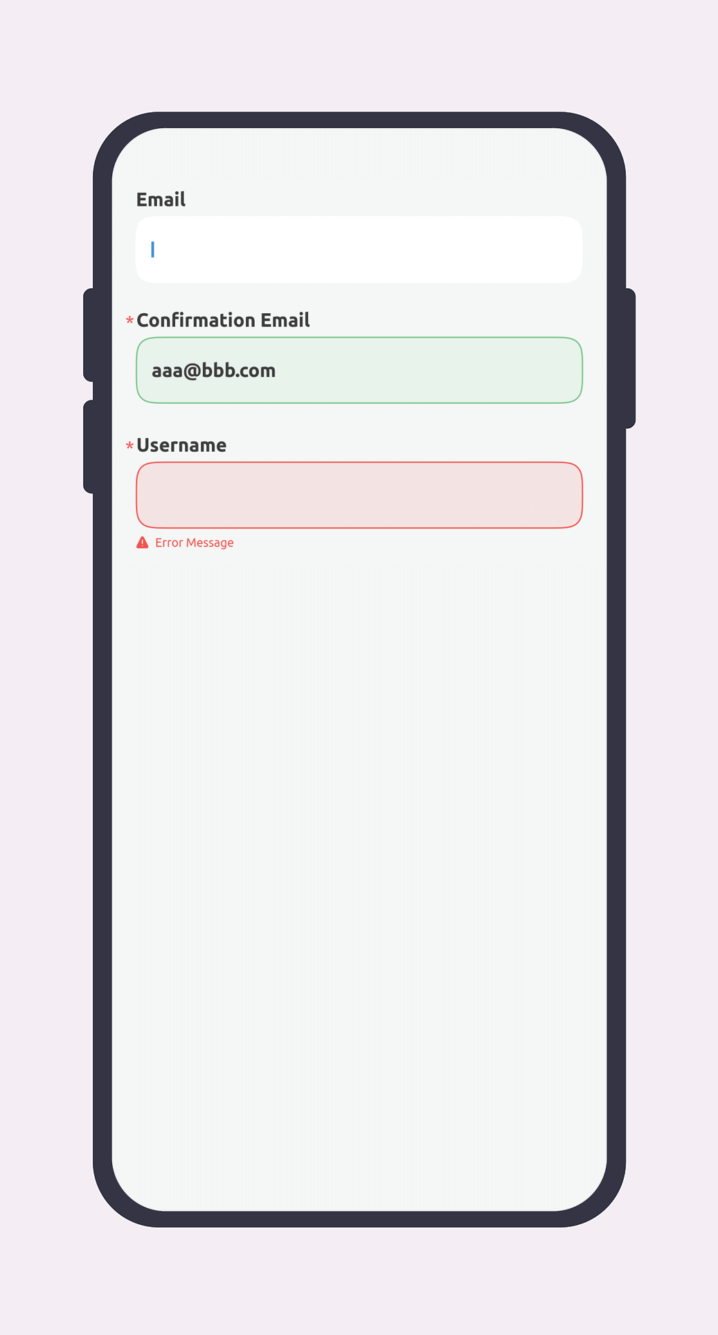
| 9 | ```dart GSField.email( tag: 'tag', errorMessage: 'error message', hint: 'hint message', helpMessage: 'help message', title: 'title', maxLength: 11, postfixWidget: widget, prefixWidget: widget, validateRegEx: regex, weight: 12, required: true, ) ``` |
|
|
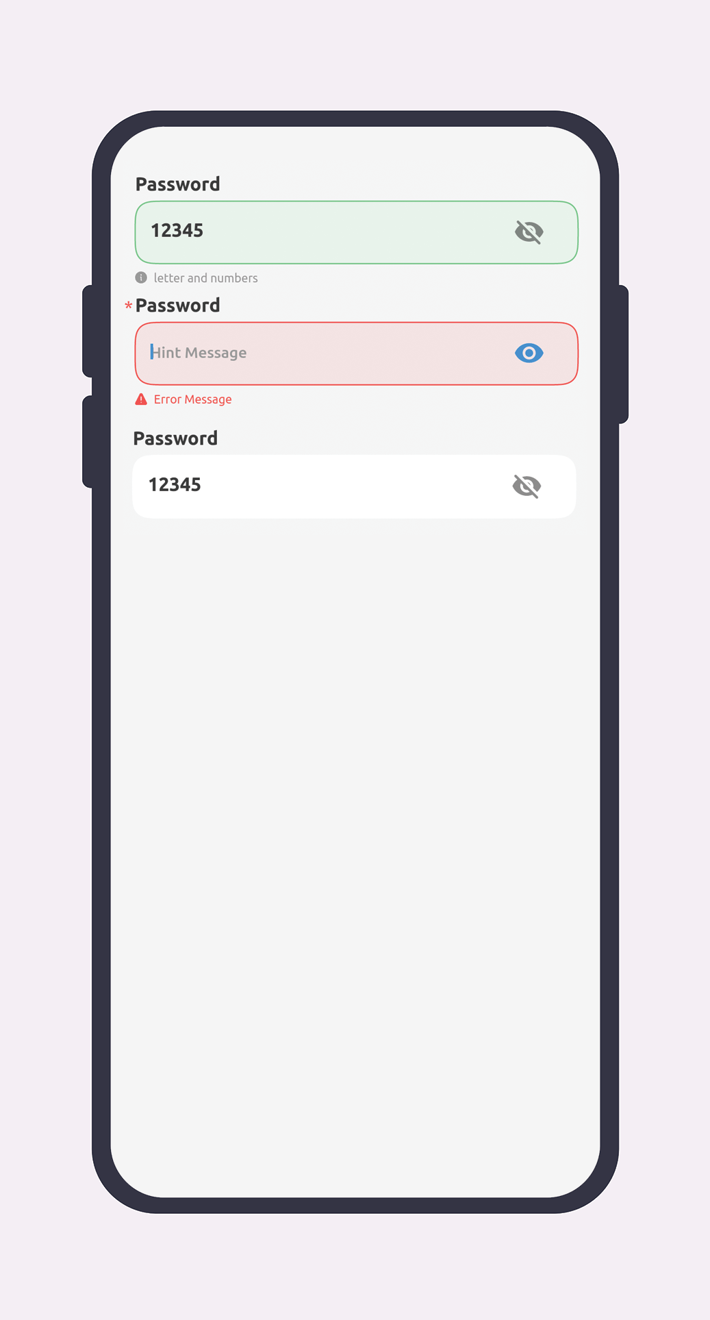
| 10 | Password | ```dart GSField.password( tag: 'tag', errorMessage: 'error message', hint: 'hint message', helpMessage: 'help message', title: 'title', maxLength: 11, prefixWidget: widget, weight: 12, required: true, ) ``` |
|
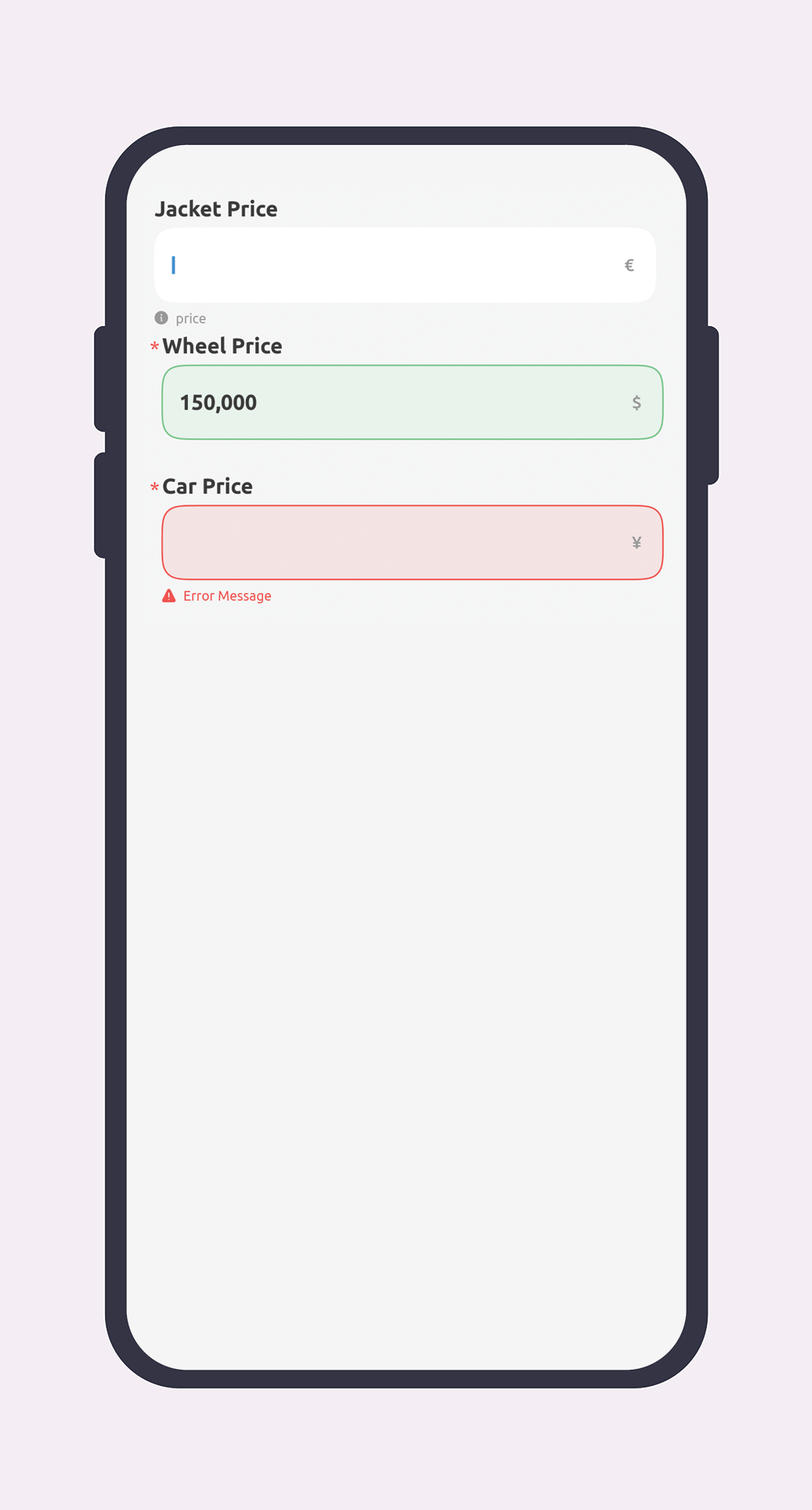
| 11 | Price | ```dart GSField.price( tag: 'tag', errorMessage: 'error message', hint: 'hint message', helpMessage: 'help message', title: 'title', maxLength: 11, prefixWidget: widget, currencyName: "\$" , weight: 12, required: true, ) ``` |
|
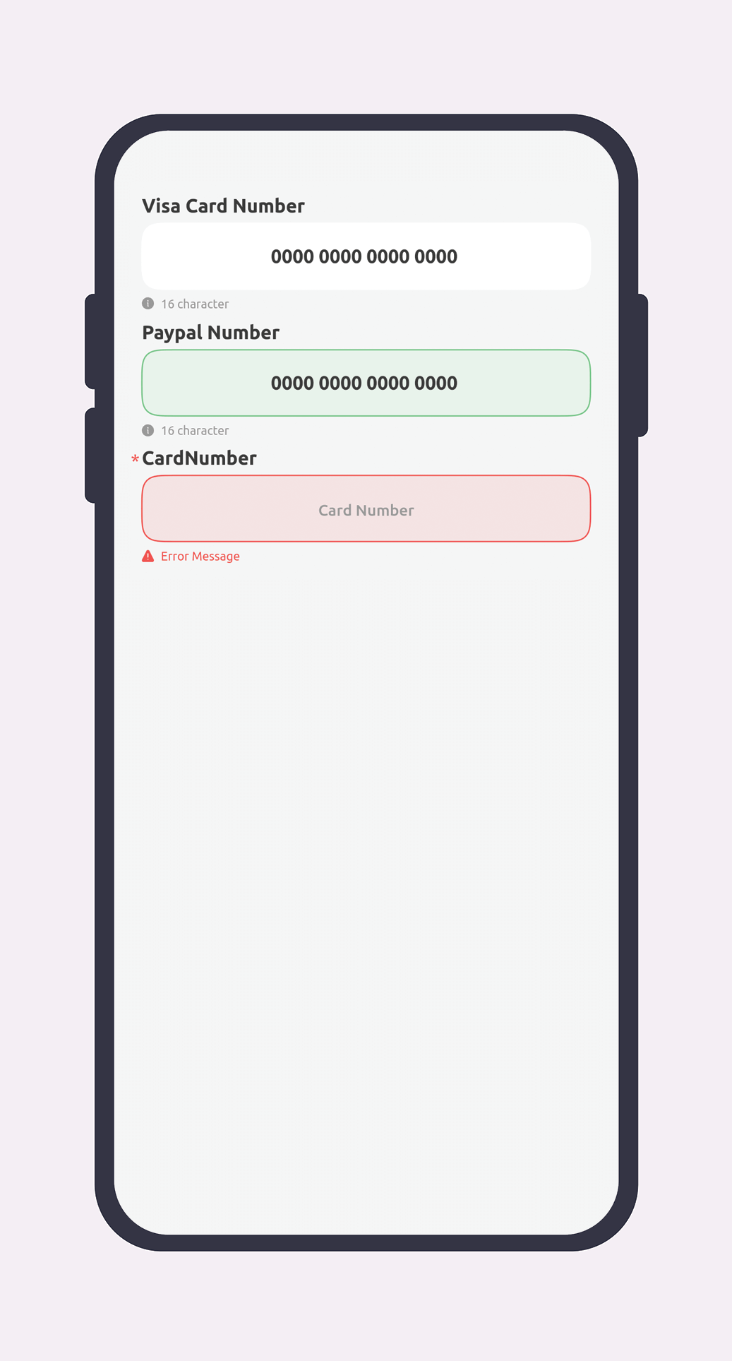
| 12 | Bank Card | ```dart GSField.bankCard( tag: 'tag', postfixWidget: widget, prefixWidget: widget, title: 'title', weight: 12, required: true, errorMessage: 'error message', hint: 'hint message', helpMessage: 'help message', ) ``` |
|
Attributes
Some features are common to all fields, which are introduced in the table below. The specific features of each field will be explained in detail below.
| Attribute | Type | Values | Required | Description |
| title | String |
- | false |
title of component |
| tag | String |
- | true |
this is the id of component for receiving data |
| errorMessage | String |
- | false |
this is the hint that shown in component |
| helpMessage | String |
- | false |
this is the help message that shown in component |
| prefixWidget | Widget |
- | false |
this is the prefixWidget and you can pass widget to show |
| postfixWidget | Widget |
- | false |
this is the postfixWidget and you can pass widget to show |
| required | bool |
- | false |
this boolean show the component status for validation |
| showTitle | bool |
- | false |
this boolean is for make title above of component visible or inVisible |
| status | GSFieldStatusEnum |
normal, success, error |
false |
this boolean is for make title above of component visible or inVisible |
| validateRegEx | RegExp |
- | false |
this regx for custom regx that can entered by user |
| weight | int |
- | false |
you can set weight for widget and max is 12 in each line |
Text
| Attribute | Type | Values | Required | Description |
| maxLenght | int |
- | false |
maximum lenght of text |
TextPlain
| Attribute | Type | Values | Required | Description |
| maxLenght | int |
- | false |
maximum lenght of text |
| minLine | int |
- | false |
minimum line of text |
| maxLine | int |
- | false |
maximum line of text |
| showCounter | bool |
- | false |
this boolean make counter of textField visible or invisible |
Number
| Attribute | Type | Values | Required | Description |
| maxLenght | int |
- | false |
maximum lenght of text |
Spinner
| Attribute | Type | Values | Required | Description |
| items | List[SpinnerDataModel] |
- | true |
List of data that fill spinner |
Mobile
| Attribute | Type | Values | Required | Description |
| maxLenght | int |
- | false |
maximum lenght of text |
| Attribute | Type | Values | Required | Description |
| maxLenght | int |
- | false |
maximum lenght of text |
Password
| Attribute | Type | Values | Required | Description |
| maxLenght | int |
- | false |
maximum lenght of text |
Price
| Attribute | Type | Values | Required | Description |
| maxLenght | int |
- | false |
maximum lenght of text |
| currencyName | String |
- | false |
the Currency text for example $ |
DatePicker
| Attribute | Type | Values | Required | Description |
| displayDateType | GSCalendarType |
jalali, gregoria | true |
you can choose type of calendar jalali or gregorian |
| initialDate | GSDate |
year,month,day | false |
initialDate of calendar |
| availableFrom | GSDate |
year,month,day | false |
available date from |
| availableTo | GSDate |
year,month,day | false |
available date to |
| isPastAvailable | boolean |
- | false |
this boolean show is past available or not |
| displayDateType | DisplayDateType |
numeric, // 1401/04/04 fullText, // شنبه 04 تیر 1401 mediumText, // شنبه 04 تیر shortText, // 04 تیر ,1401 |
false |
you can pass ENUM type for calendar date type |
DateRangedPicker
| Attribute | Type | Values | Required | Description |
| calendarType | GSCalendarType |
jalali, gregoria | true |
you can choose type of calendar jalali or gregorian |
| displayDateType | GSDateFormatType |
numeric, // 1401/04/04 fullText, // شنبه 04 تیر 1401 mediumText, // شنبه 04 تیر shortText, // 04 تیر ,1401 |
false |
you can choose type of display type |
| initialDate | GSDate |
year,month,day | false |
initial date of calendar |
| availableFrom | GSDate |
year,month,day | false |
available date from |
| availableTo | GSDate |
year,month,day | false |
available date to |
| isPastAvailable | boolean |
- | false |
this boolean show is past available or not |
| from | String |
- | false |
From text in return selected date |
| to | String |
- | false |
To text in return selected date |
TimePicker
| Attribute | Type | Values | Required | Description |
| initialTime | TimeOfDay |
- | false |
initial time of calendar |
About Rita Group
Golrang System Company is an active company in the field of information and communication technology, which aims to provide information technology solutions to help productivity and improve the capability and profitability of Golrang Industrial Group as the arm of the senior management since the beginning of the group's establishment. The passage of time has reached growth.
Considering the expansion of the use of information technology in the field of industry and the trend of companies towards globalization, this company has put the provision of advanced information and communication technology solutions on its agenda, and it tries to be an integrated task by focusing on the field of information and communication technology. Be responsible for creating systems, project management and technical and consulting services.