flutter_neat_and_clean_calendar
Simple flutter calendar based on flutter_clean_calendar package. This package offers some extra functionality. It introduced a new NeatCleanCalendarEvent object, that gets used as the data component transfered the calendar widget as a parameter. So it is possible now to color the dots in the Calendartiles with a color corresponding to the event.
The event list below the calendar view is generated by the package. Here the extra data of the NetCleanCalendarEvent objects again come into play.
The package is highly customizable.
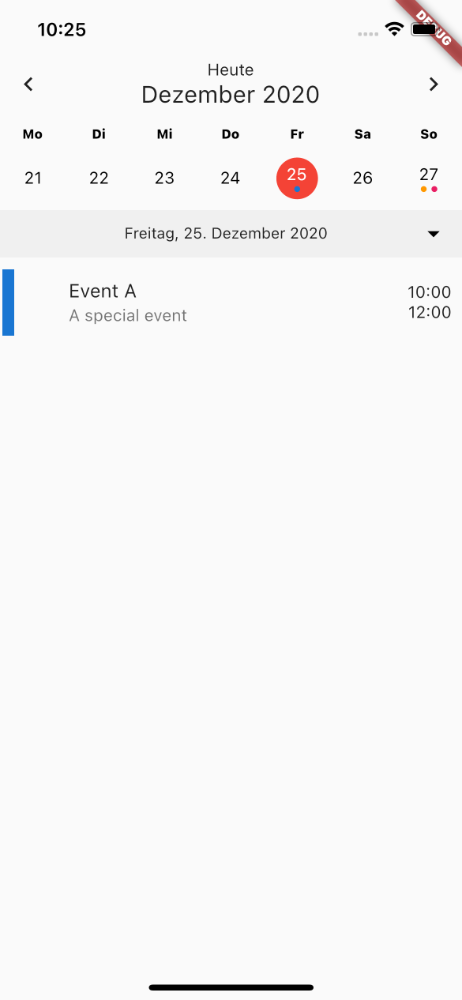
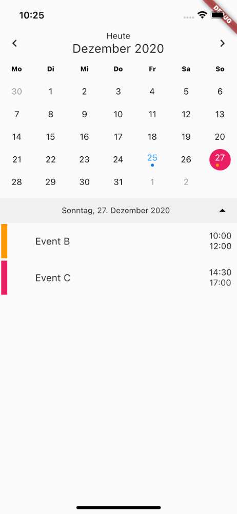
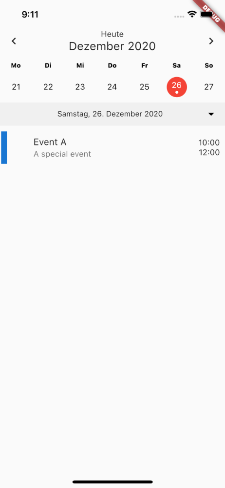
The calendar view shows a list of events for the selected date. This list view supports three different types of events:
- Single day event (starts and ends at certain time on a single day)
- All-day events (Span over a full day with no specific start and end time, property
isAllDay) - Multi-day events (Start at a specific time on one day and end at a specific time on another day, property
isMultiDay)
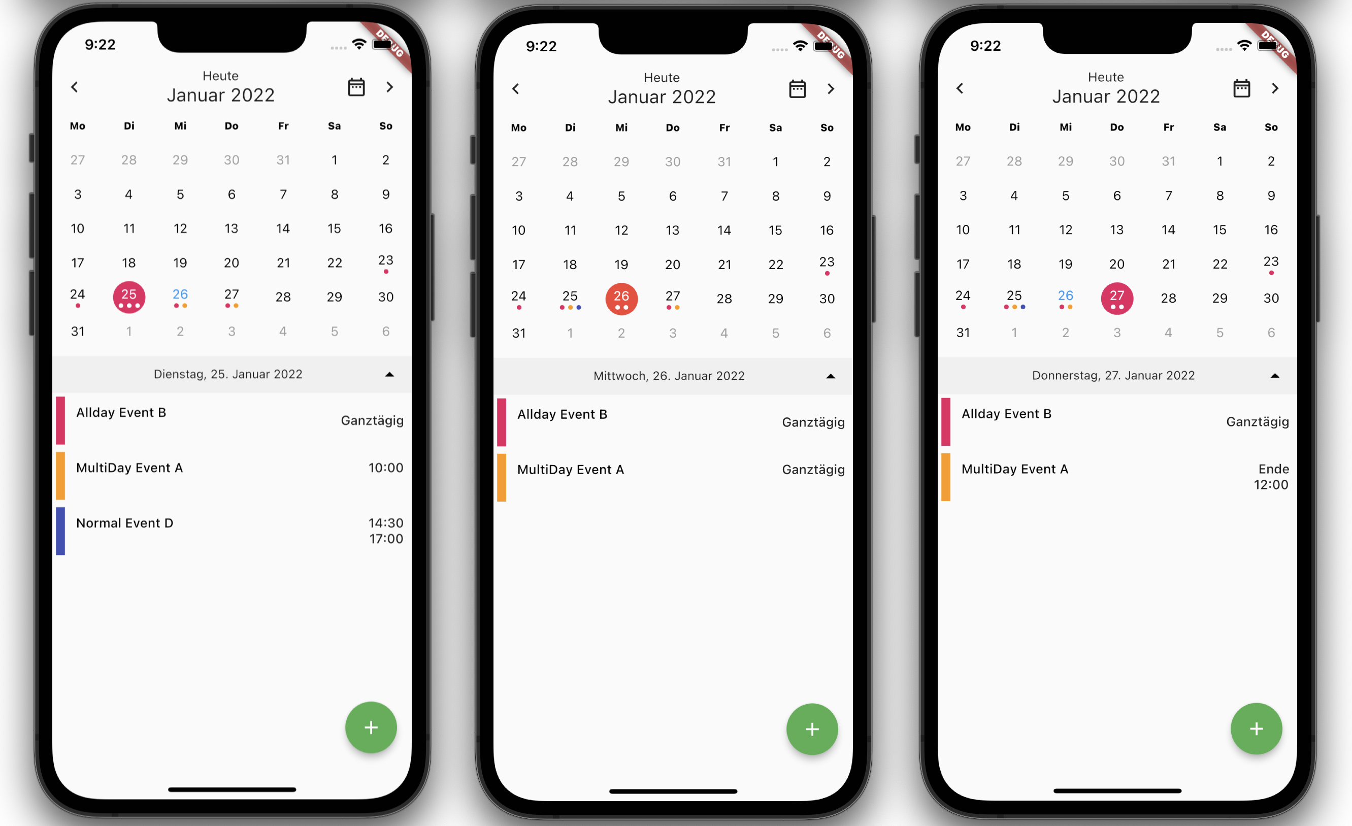
The property isAllDay has a higher priority than 'isMultiDay'. This means, that when you set isAllDay to true for an event, it will show up in the events list als all-day event without start and end times, no matter if isMultiDay was also set to true.
You can include images in calendar events. The property icon takes a String of the image name. This parameter is optional. Optionally you can set colors for the events.
To control the width of the image you can use the property wide, which is a bool.
Breaking Change
From v0.4.0 on the events map was removed from the properties. You may need to switch to the
eventsListproperty in your app now.
Usage
Embed the 'Calendar' widget in a column. Below the calendar (as the second widget in the Column) place a 'ListView.builder' widget for rendereing the list of events.
Set dependency
dependencies:
  flutter_neat_and_clean_calendar: ^0.4.1
Install
flutter pub getImport it
import 'package:flutter_neat_and_clean_calendar/flutter_neat_and_clean_calendar.dart';Use it
Widget build(BuildContext context) {
  return Scaffold(
    body: SafeArea(
      child: Calendar(
        startOnMonday: true,
        weekDays: ['Mo', 'Di', 'Mi', 'Do', 'Fr', 'Sa', 'So'],
        eventsList: _eventList,
        isExpandable: true,
        eventDoneColor: Colors.green,
        selectedColor: Colors.pink,
        selectedTodayColor: Colors.red,
        todayColor: Colors.blue,
        eventColor: null,
        locale: 'de_DE',
        todayButtonText: 'Heute',
        allDayEventText: 'Ganztägig',
        multiDayEndText: 'Ende',
        isExpanded: true,
        expandableDateFormat: 'EEEE, dd. MMMM yyyy',
        datePickerType: DatePickerType.date,
        dayOfWeekStyle: TextStyle(
            color: Colors.black, fontWeight: FontWeight.w800, fontSize: 11),
      ),
    ),
    floatingActionButton: FloatingActionButton(
      onPressed: () {},
      child: const Icon(Icons.add),
      backgroundColor: Colors.green,
    ),
  );
}
For more details see the example.
Properties
Event handlers
onDateSelected
final ValueChanged<DateTime>? onDateSelected;This parameter is of type [ValueChanged<DateTime>] and it containes the callback function executed, when the user selects a new date. This way you can update the app about the user event of selecting a date.
onMonthChanged
final ValueChanged<DateTime>? onMonthChanged;The onMonthChanged parameter is a callback function that takes a DateTime object as its argument. It is called whenever the displayed month changes.
onExpandStateChanged
final ValueChanged<bool>? onExpandStateChanged;The parameter onExpandedStateChanged can provide a callback function. This gets executed when the user changes the expanded state of the calendar. The user can select between a view showing the current week or the full month. The expansion of the calendar view could have effects on the content around the widget. So by executing this callback function your app can take care of that situation.
onRangeSelected
final ValueChanged? onRangeSelected;This parameter is a callback funtion, that gets executed, when the user picks another range. You can use this callback to give the app informations about the selected range.
onEventSelected
final ValueChanged<NeatCleanCalendarEvent>? onEventSelected;The parameter onEventSelected is a callback function. It gets executed, when the user taps an individual event in the list, so you app can react on that user input.
onEventLongPressed
final ValueChanged<NeatCleanCalendarEvent>? onEventLongPressed;Similar to onEventSelected, but for long press events.
onListViewStateChanged
´´´dart final ValueChanged? onListViewStateChanged;
The parameter `onListViewStateChanged` is a callback function. It gets executed, when the state of list view changes.

#### `onEventsUpdated`

```dart
final ValueChanged<Map<DateTime, List<NeatCleanCalendarEvent>>>?
This callback function gets executed, when the eventsMap gets updated. This happens in the initState method. This callback function can be used to pass the content of the eventsMap to the parent widget. There are some cases, where this is useful.
onPrintLog
final ValueChanged<String>? onPrintLog;This callback can be used to pass Strings with logging messages from the widget to its parent widget. By doing so can use your apps logging class to output the messages of the calendar. The only thing you need to do is to implement your allback message and call your logger with the passed String object.
onTodayButtonPressed
final ValueChanged? onTodayButtonPressed;That callback gets called, when the user taps the "today" button. The purpose of that callback is to inform the parent widget, that the users tapped this button. It can be necessary to capture that event in the paren widget, especially if you use a custom widget with eventListBuilder.
Options
isExpandable
final bool isExpanded;This option is a bool value. When true the widget shows a button to expand the calendar view (switch between week and month view). Default value is false.
dayBuilder
final DayBuilder? dayBuilder;Can contain a Widget. If this property is not null, this widget will get used to render the calenar tiles. This may come in handy, if you plan to customize the view. If you set this parameter to null, NeatAndCleanCalendar itself takes care of rendering the view. Default is null.
eventListBuilder
final EventListBuilder? eventListBuilder;This parameter can optionally contain a Widget that gets used to render the event list. Default is null.
eventCellBuilder
final EventCellBuilder? evenCellBuilder;This parameter can optionally contain a Widget that gets used to render the event cells. Default is null.
datePickerType
final DatePickerType? datePickerType;This defines, if the date picker should get displayed and selects its type
Choose between datePickerType.hidden, datePickerType.year and datePickerType.date.
hideArrows
final bool hideArrows;This parameter is a bool value. When set to true the arrows to navigate to the next or previous week/month in the top bar well get suppressed. Default is false.
hideTodayIcon
final bool hideTodayIcon;This is a bool value. When set to true the display of the Today-Icon (button to navigate to today) in the top bar well get suppressed. Default is false.
defaultDayColor
final Color? defaultDayColor;This is the color applied to days in the current month, that are not selected.
`defaultOutOfMonthDayColor'
final Color? defaultOutOfMonthDayColor;You can also set the color of days outside the current month. The widget always displays full weeks. So you will see the end of last month or the beginning of next month. This sets the color of these days.
selectedColor
final Color? selectedColor;This parameter is used to set the Colorof the selected date.
selectedTodayColor
final Color? selectedTodayColor;When the selected day falls on today's date, you can set the Color value.
todayColor
final Color? todayColor;This parameter is the Color value of the date of today, when it is not selected.
topRowIconColor
final Color? topRowIconColor;Sets the color of the icons in the top bar
`datePickerLightTheme
final ThemeData? datePickerLightTheme;Sets the ColorScheme and TextButtonThemeData for styling the date picker in light mode
`datePickerDarkTheme
final ThemeData? datePickerDarkTheme;Sets the ColorScheme and TextButtonThemeData for styling the date picker in dark mode
Using themes for the date picker
In order to apply a light theme and a dark theme to the date picker, your app must support a light theme and a dark theme. This means, your app needs to implement the following code block setting the properties of MaterialApp:
    return MaterialApp(
      title: 'Flutter Clean Calendar Demo',
      theme: ThemeData.light(),
      darkTheme: ThemeData.dark(),
      themeMode: ThemeMode.system,
      home: CalendarScreen(),
      ...
Then you can set the date picker themes when you initialize the Calendar widget like this:
        ...
        child: Calendar(
          startOnMonday: true,
          weekDays: ['Mo', 'Di', 'Mi', 'Do', 'Fr', 'Sa', 'So'],
          eventsList: _eventList,
          ...
          datePickerDarkTheme: ThemeData.dark().copyWith(
            colorScheme: ColorScheme.dark(
              primary: Colors.blue,
              onPrimary: Colors.yellow,
              surface: Colors.grey,
              onSurface: Colors.yellow,
            ),
            textButtonTheme: TextButtonThemeData(
              style: TextButton.styleFrom(
                foregroundColor: Colors.orange,
              ),
            ),
          ),
          datePickerLightTheme: ThemeData.dark().copyWith(
            colorScheme: ColorScheme.dark(
              primary: Colors.blue,
              onPrimary: Colors.white,
              surface: Colors.white,
              onSurface: Colors.teal,
            ),
            textButtonTheme: TextButtonThemeData(
              style: TextButton.styleFrom(
                foregroundColor: Colors.orange,
              ),
            ),
          ),
          ...
todayButtonText
final String todayButtonText;This is a String. With this property you can set the caption of the today icon (button to navigate to today) in the top bar.
allDayEventText
final String allDayEventText;This is a String. With this property you can set the caption of the all day event. If left empty, the calendar will use the string "All day".
multiDayEndText
final String multiDayEndText;Thhis is a String. With this property you can set the caption of the end of a multi day event. If left empty, the calendar will use the string "End".
eventColor
´´´dart final Color? eventColor;
This lets you optionally specify the color of the event (dot). If the [CleanCaendarEvents] property color is not set, the calendar will use this parameter.

#### `eventDoneColor`

```dart
final Color? eventDoneColor;
With this property you can define the color of "done" events, that is events in the past.
weekDays
final List<String> weekDays;Contains a List<String> defining the names of the week days, so that it is possible to name them according
to your current locale.
initialDate
final DateTime? initialDate;This parameter is of type DateTime. It can contain an optional start date. This is the day, that gets initially selected.
locale
final String? locale;This parameter contains a String. This setting gets used to format dates according to the current locale.
startOnMonday
final bool startOnMonday;You can select, if a week starts on Monday or on Sunday. It is a bool. If set to true the week starts on Monday.
dayOfWeekStyle
final TextStyle? dayOfWeekStyle;This is a TextStyle for styling the text of the weekday names in the top bar.
bottomBarTextStyle
final TextStyle? bottomBarTextStyle;This is a TextStyle, that sets the style of the text in the bottom bar.
bottomBarArrowColor
final Color? bottomBarArrowColor;You can set the Color of the arrow to expand/compress the calendar in the bottom bar.
bottomBarColor
final Color? bottomBarColor;Sets the Color of the bottom bar.
expandableDateFormat
final String? expandableDateFormat;Defines the formatting of the date in the bottom bar.
final TextStyle? displayMonthTextStyle;Is a TextStyle for styling the month name in the top bar.
final DatePickerConfig? datePickerConfig;This is a DatePickerConfig object. It contains the configuration of the date picker, if enabled.
eventTileHeight
final double? eventTileHeight;With this parameter you can set the height of the elements of the event list. If left null the widget will take care of calculation the height,
showEvents
final bool showEvents;This is a bool. This parameter allows you to decide, if the calender shows a list of events. Default value is set to true, but you can hide the events entirely by setting it to false.
forceEventListView
final bool forceEventListView;With this bool parameter you can switch the view to a list of events only. If set to true the calendar grid gets hidden.
showEventListViewIcon
final bool showEventListViewIcon;With this bool parameter you can control if the widget will display the list view icon. If the list view icon is hidden, the list view feature is disabled.
Setting the calendar events
final List<NeatCleanCalendarEvent>? eventsList;This `List
This parameter replaces the former parameter Map<DateTime, List<NeatCleanCalendarEvent>>? events.
The eventsparameter was supported in versions under v0.4.0 of that widget. It is removed now. So use the eventList now in your app.
Sample event data
The syntax of the event map changed due to the introduction of the 'NeatCleanCalendarEvent' class.
final List<NeatCleanCalendarEvent> _eventList = [
  NeatCleanCalendarEvent('MultiDay Event A',
      startTime: DateTime(DateTime.now().year, DateTime.now().month,
          DateTime.now().day, 10, 0),
      endTime: DateTime(DateTime.now().year, DateTime.now().month,
          DateTime.now().day + 2, 12, 0),
      color: Colors.orange,
      isMultiDay: true),
  NeatCleanCalendarEvent('Allday Event B',
      startTime: DateTime(DateTime.now().year, DateTime.now().month,
          DateTime.now().day - 2, 14, 30),
      endTime: DateTime(DateTime.now().year, DateTime.now().month,
          DateTime.now().day + 2, 17, 0),
      color: Colors.pink,
      isAllDay: true),
  NeatCleanCalendarEvent('Normal Event D',
      startTime: DateTime(DateTime.now().year, DateTime.now().month,
          DateTime.now().day, 14, 30),
      endTime: DateTime(DateTime.now().year, DateTime.now().month,
          DateTime.now().day, 17, 0),
      color: Colors.indigo),
];CAUTION: from v0.3.0 on the preferred way to set the calendar events is to provide a list (property eventsList). You can still use a map (property events) to do this, but this functionality is DEPRECATED and will get removed from v0.4.0 on.
CAUTION: from v0.4.0 there is only one way to set the calendar events is to provide a list (property eventsList). The map object(property events) functionality is DEPRECATED and will got removed.
Examples
Basic widget with customized colors
Some colors were cutomized in this example:
Calendar(
  eventDoneColor: Colors.green,
  selectedColor: Colors.pink,
  todayColor: Colors.blue,
  eventColor: Colors.grey,
)
Display a date picker to jump to a certain date
Calendar(
  datePickerType: DatePickerType.date
)
These options are available:
- 'DatePickerType.date'
- 'DatePickerType.year'
- 'DatePickerType.hidden'
If you set the option to 'DatePickerType.date' or 'DatePickerType.year' an icon to load the date picker is shown.
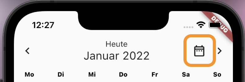
Pressing this button opens a date picker, that allows the user to jump to a certain date.
If you set the option to 'DatePickerType.hidden' no icon is displaysed. This logic replaces the option 'isJumpDateButtonEnabled' which was present in earlier releases.
Handling all-day events
The class NeatAndCleanCalendarEvent has a boolean property called ìsAllDay`. This property allows you to
define events, that last all day with now start or end time. These events get sorted at the top of the
events list.
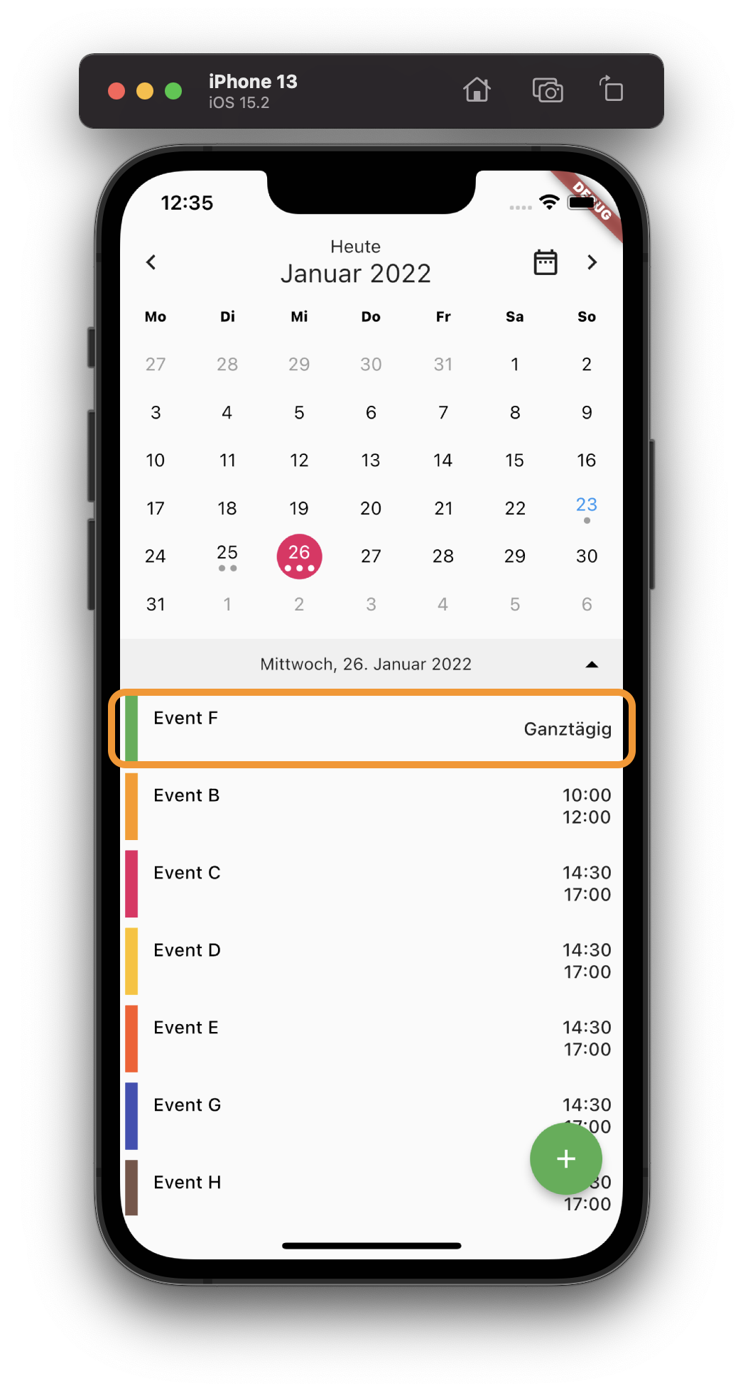
With the property allDayEventText you define the string displayed for that type of events. If you
don't set this option the calendar will display All day for these events.
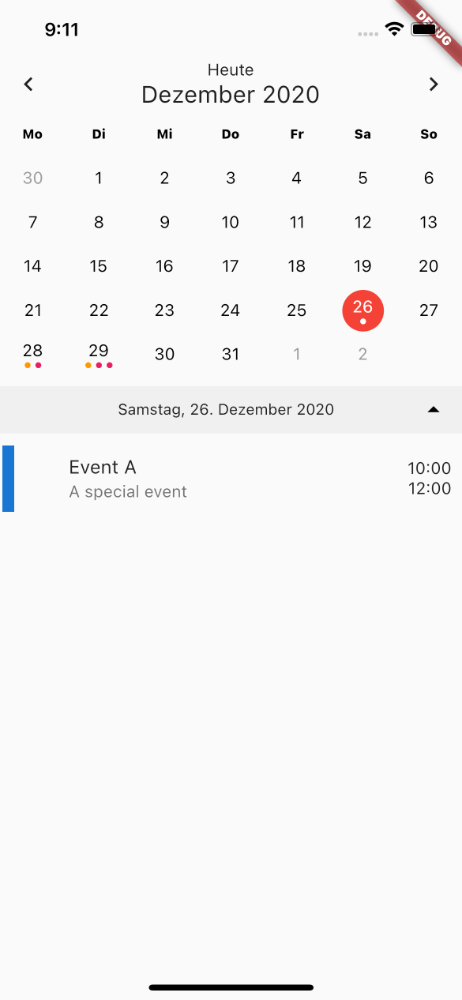
Expandable calendar view
Calendar(
  isExpandable: true;
)
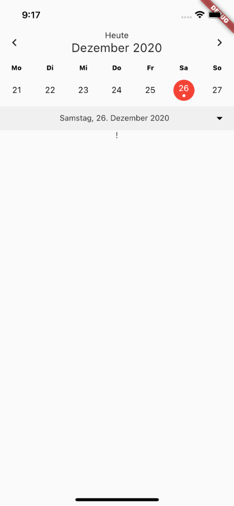
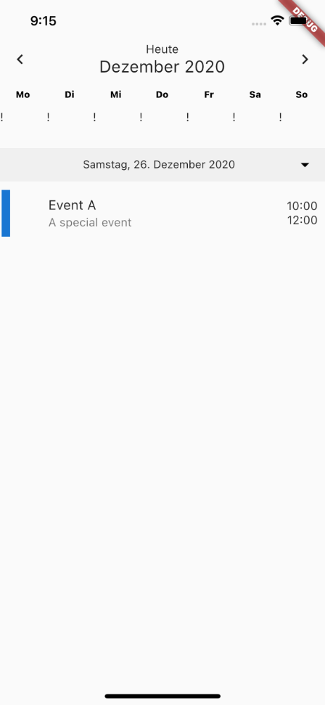
Custom day builder
Calendar(
  // A builder function that renders each calendar tile how you'd like.
  dayBuilder: (BuildContext context, DateTime day) {
      return new Text("!");
  },
)
Custom event list builder
Calendar(
  // A builder function that renders the event list
  eventListBuilder: (BuildContext context,
      List<NeatCleanCalendarEvent> _selectesdEvents) {
    return new Text("!");
  },
)