just_the_tooltip
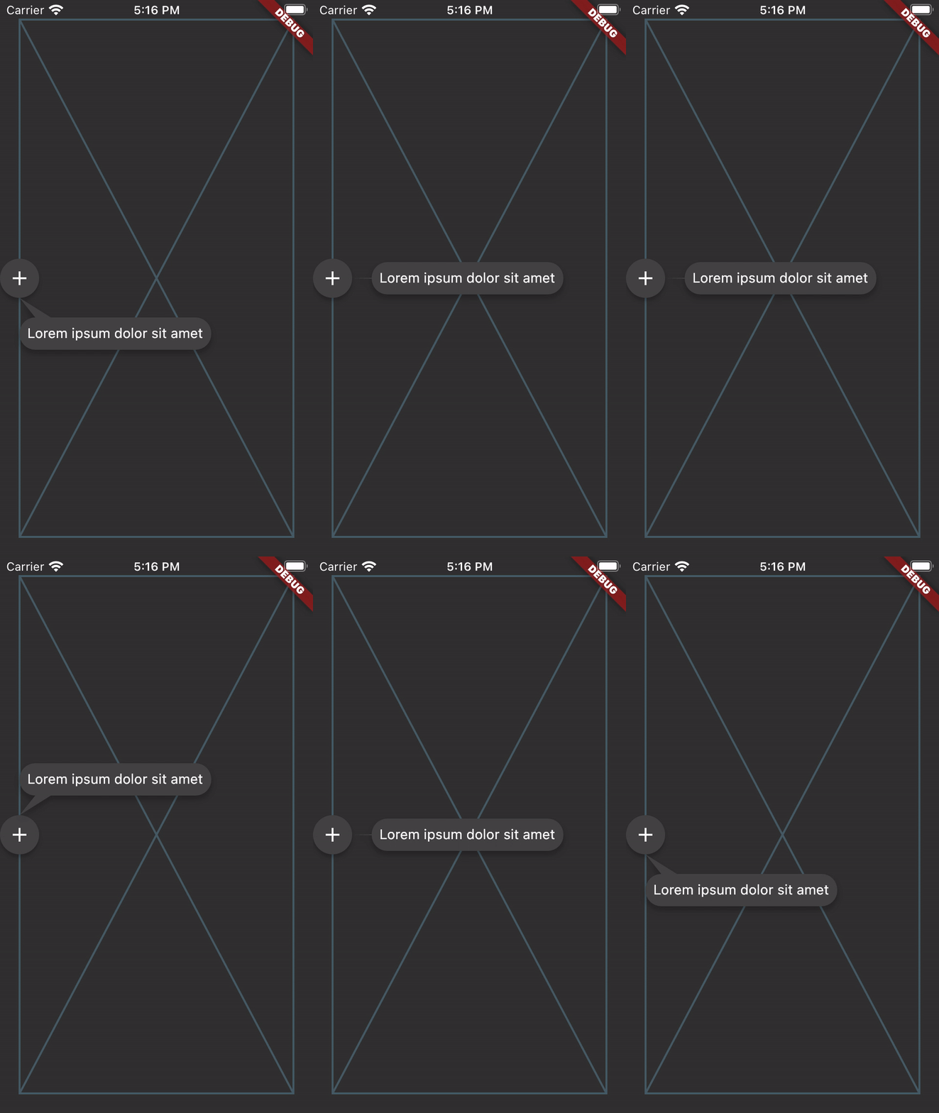
just_the_tooltip gives you more flexibility over the Flutter standard Tooltip by allowing you to set arbitrary content. It also expands on their single axis layout algorithm to fit both vertically and horizontally. The tooltip can be positioned along any axis and will fall back to the opposite side if overflowed.
Breaking
- Removed
JustTheTooltip.entrynamed constructor in favor of dedicated widgetJustTheTooltipEntry. This mirrors a change in the code that explicitly differentiates where and how tooltips are shown.
Getting Started

JustTheTooltip(
  child: Material(
    color: Colors.grey.shade800,
    shape: const CircleBorder(),
    elevation: 4.0,
    child: const Padding(
      padding: EdgeInsets.all(8.0),
      child: Icon(
        Icons.add,
        color: Colors.white,
      ),
    ),
  ),
  content: const Padding(
    padding: EdgeInsets.all(8.0),
    child: Text(
      'Bacon ipsum dolor amet kevin turducken brisket pastrami, salami ribeye spare ribs tri-tip sirloin shoulder venison shank burgdoggen chicken pork belly. Short loin filet mignon shoulder rump beef ribs meatball kevin.',
    ),
  ),
)
JustTheTooltip needs two arguments. The direct child widget and the content (of the tooltip). The child widget will be wrapped with a GestureDetector or MouseRegion that is responsible for showing and hiding the content. Further handling of the tooltip state can be managed explicitly through a controller:
If you'd like to create a controller to manage the state of the tooltip, you can do so by defining an instance of a JustTheController and pass it through to constructor.
final tooltipController = JustTheController();

child: JustTheTooltip(
  controller: tooltipController,
  // ...
)

void showTooltip() {
  controller.showTooltip();
}
The controller itself is a ValueNotifier that carries the open/close state of the tooltip. To listen to these changes, add a listener to your controller.
@override
void initState() {
  // Programatically display tooltip after two seconds
  Future.delayed(const Duration(seconds: 2), () {
    tooltipController.showTooltip(immediately: false);
  });

  tooltipController.addListener(() {
    // Prints the enum value of [TooltipStatus.isShowing] or [TooltipStatus.isHiding]
    print('controller: ${tooltipController.value}');
  });
}
If you'd like to simply react to open or close states, you can pass through onDismiss or onShow callbacks to the default constructor.
JustTheTooltip(
  onDismiss: () {
    // Maybe continue tutorial?
  },
  onShow: () {
    // Start animation?
  }
),
If you'd like to keep the user from dismissing the tooltip by clicking on the barrier, you can change barrierDismissible to true which means pressing on the scrim area will not immediately hide the tooltip.
Customization
- Modal
You can further define how a Tooltip will show by defining the isModal property. A modal will only open through clicking on the child and close by clicking on the background area (referred to as the skrim here). A non-modal (the default) is a more traditional tooltip opens and closes on hovers.
Note, phone emulators do not implement mouse controls. To test hover states, use a browser.
The fallback used when no mouse region is present but isModal is false is to only open when long pressed.

- Tail Builder
If you'd like a custom tail (the nub on the end dialog bubble) drawn on your tooltip, you can pass through your own tailBuilder. The JustTheInterface.defaultTailBuilder (default) shows how to simply draw and return a path for your custom tails:
Path defaultTailBuilder(Offset tip, Offset point2, Offset point3) {
  return Path()
    ..moveTo(tip.dx, tip.dy)
    ..lineTo(point2.dx, point2.dy)
    ..lineTo(point3.dx, point3.dy)
    ..close();
}
The library also provides a simple bezier curved tailbuilder JustTheInterface.defaultBezierTailBuilder.
- ListViews
The tooltip should also work in lists and follow the target through scrolling. For even more consideration of the available space in ListViews, a ScrollController may be passed to the just_the_tooltip to give the layout algorithm a hint as to how much space is before and after the scroll axis. This allows tooltips that would otherwise overflow to use up space offscreen in one of the scroll directions.
- Non-Overlay Tooltip
For use cases where the tooltip must be a part the widget tree rather than an overlay there is a JustTheTooltipEntry.
Scaffold(
  appBar: AppBar(title: const Text('It goes under me')),
  body: JustTheTooltipArea(
    builder: (context, tooltip, scrim) {
      return Stack(
        fit: StackFit.passthrough,
        children: [
          ListView.builder(
            itemCount: 30,
            itemBuilder: (context, index) {
              if (index == 15) {
                return JustTheTooltipEntry(
                  tailLength: 10.0,
                  preferredDirection: AxisDirection.down,
                  isModal: true,
                  margin: const EdgeInsets.all(20.0),
                  child: const Material(
                    color: Colors.blue,
                    shape: CircleBorder(),
                    elevation: 4.0,
                    child: Padding(
                      padding: EdgeInsets.all(8.0),
                      child: Icon(
                        Icons.touch_app,
                        color: Colors.white,
                      ),
                    ),
                  ),
                  content: Column(
                    mainAxisSize: MainAxisSize.min,
                    children: [
                      Container(
                        height: 120,
                        color: Colors.blue,
                        width: double.infinity,
                      ),
                      const SizedBox(height: 8),
                      const Text(
                        'Quia ducimus eius magni voluptatibus ut veniam ducimus. Ullam ab qui voluptatibus quos est in. Maiores eos ab magni tempora praesentium libero. Voluptate architecto rerum vel sapiente ducimus aut cumque quibusdam. Consequatur illo et quos vel cupiditate quis dolores at.',
                      ),
                    ],
                  ),
                );
              }

              return ListTile(title: Text('Item $index'));
            },
          ),
          // In the case of no scrim showing, this will return an SizedBox.shrink
          scrim,
          // In the case of no scrim showing, this will return an SizedBox.shrink
          tooltip,
        ],
      );
    },
  ),
);
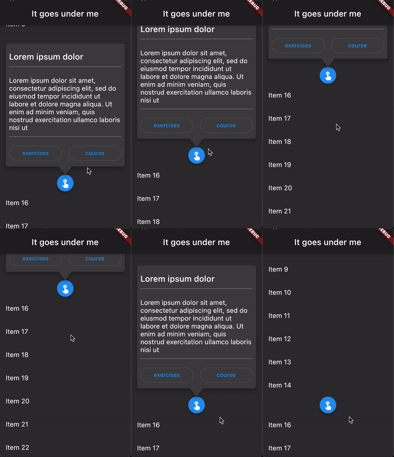
This will give you the positioned tooltip and scrim (an empty gesture detector that catches tap events and closes the tooltip) for you to enter into the tree however you like. By doing this, you can make tooltips that are visually "under" other parts of the UI such as the appbar in the above example.

API subject to change.
Contributing
Issues and PRs welcome. Unless otherwise specified, all contributions to this lib will be under MIT license.
Help wanted
If you're interested in becoming a contributor with push rights please ping me and we can talk about how to get you started ! :)