☁️ MessageBar
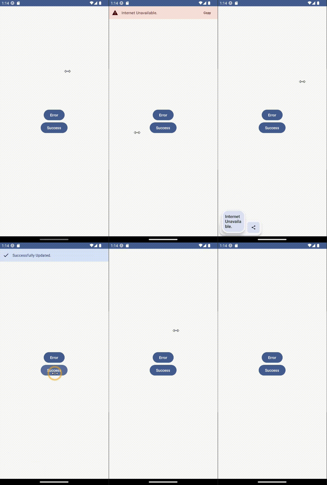
👻 Message Bar is a simple animated UI component that you can wrap around your composable content.
This component is used to display Error/Success messages to your users,
and it is built to support Material 3 design system. Android/iOS/Desktop/Web platforms are supported.


### Gradle
You can add a dependency inside the `commonMain` source set:
```gradle
commonMain.dependencies {
implementation("com.stevdza-san:messagebarkmp:1.0.6")
}
```
## Usage
There are two required parameters: `messageBarState` and `content`.
```kotlin
val state = rememberMessageBarState()
ContentWithMessageBar(messageBarState = state) {
// Your Composable Screen
}
```
You can control what kind of a Message Bar you want to display, by using the `MessageBarState`.
There are two functions that you can use to achieve that: `addError()` and `addSuccess()`.
They are self explanatory, the first one accepts an Exception type, while the other a simple String.
depending on what kind of a message bar you want to see.
### Message Bar - Success

```kotlin
val state = rememberMessageBarState()
ContentWithMessageBar(messageBarState = state) {
Column(
modifier = Modifier.fillMaxSize(),
verticalArrangement = Arrangement.Center,
horizontalAlignment = Alignment.CenterHorizontally
) {
Button(onClick = {
state.addSuccess(message = "Successfully Updated.")
}) {
Text(text = "Click me")
}
}
}
```
### Message Bar - Error

```kotlin
val state = rememberMessageBarState()
ContentWithMessageBar(messageBarState = state) {
Column(
modifier = Modifier.fillMaxSize(),
verticalArrangement = Arrangement.Center,
horizontalAlignment = Alignment.CenterHorizontally
) {
Button(onClick = {
state.addError(exception = Exception("Internet Unavailable."))
}) {
Text(text = "Click me")
}
}
}
```
## Like what you see? :yellow_heart:
⭐ Give a star to this repository.
☕ Let's get a coffee. You're paying!😜 https://ko-fi.com/stevdza_san
# License
```xml
Designed and developed by stevdza-san (Stefan Jovanović)
Licensed under the Apache License, Version 2.0 (the "License");
you may not use this file except in compliance with the License.
You may obtain a copy of the License at
http://www.apache.org/licenses/LICENSE-2.0
Unless required by applicable law or agreed to in writing, software
distributed under the License is distributed on an "AS IS" BASIS,
WITHOUT WARRANTIES OR CONDITIONS OF ANY KIND, either express or implied.
See the License for the specific language governing permissions and
limitations under the License.
```


