Adapting the browser toolbar based on web sites & an user experience experiment for Firefox

Project introduction
This project features a Dynamic Theme for Firefox, launched alongside with the Extensions Challenge effort and the Firefox Quantum Edition. In this page, you can access demonstrations, understand the project from a more holistic view, and access the Add-on code.

This is a prototype for a Firefox theme, however using a UX-oriented mindset; this project is aimed as a reflection, therefore it's beyond its initial code. The Add-on experiment is currently available for Firefox Quantum and published at Chameleon Dynamic Theme Firefox Add-on.
The idea is to consider how a browser can/should blend with the actual content that the user is visiting, and to specially consider the dichotomy between external and internal browser pages.
Screenshots and use cases
Automatically matches with master header
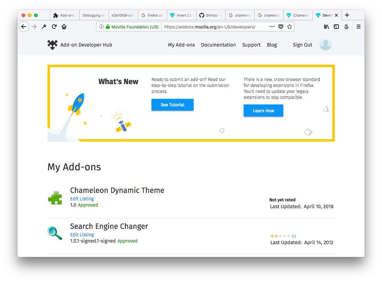
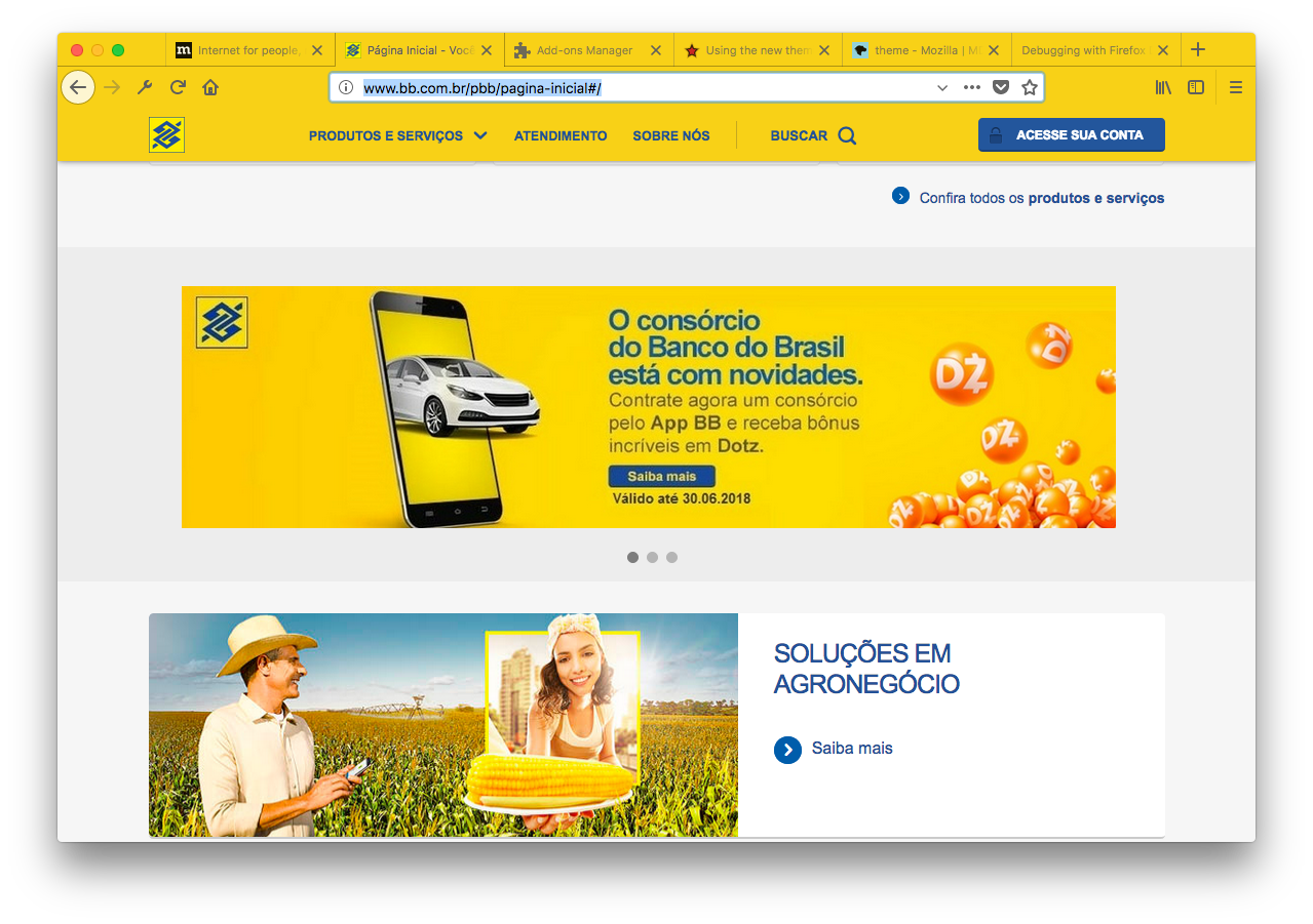
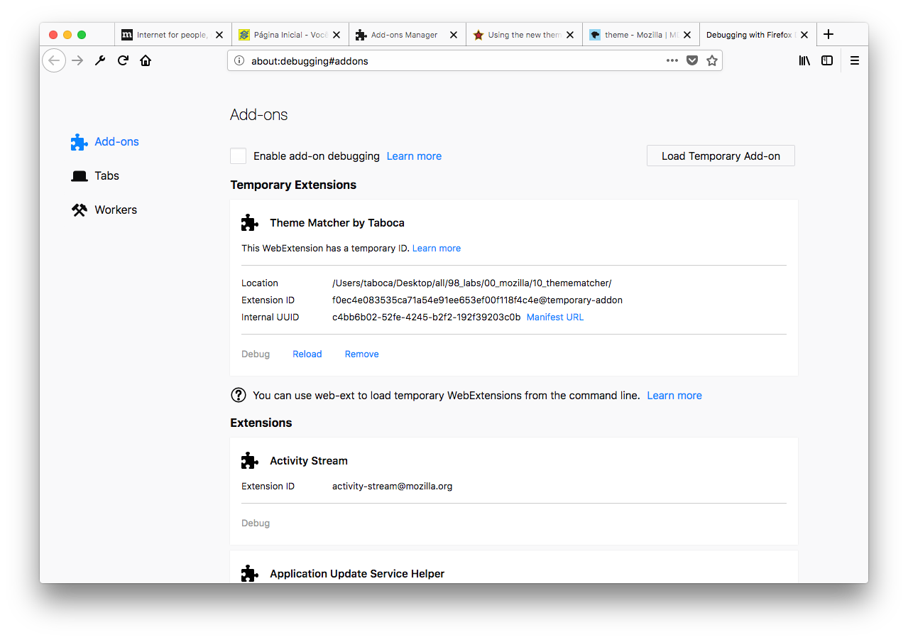
Browser blends with tab content's navbar — when the user visited Mozilla.org
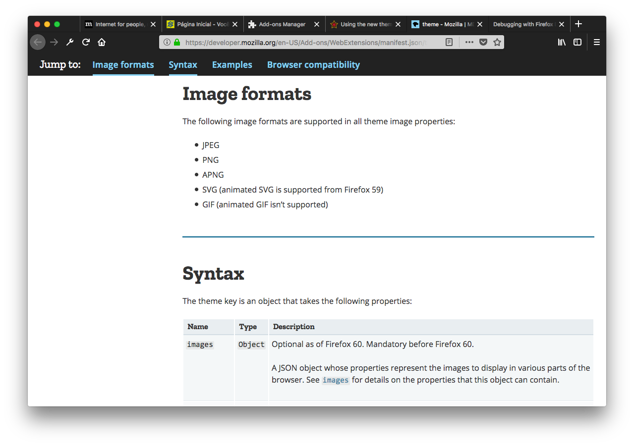
Browser content pages

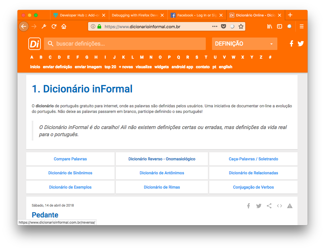
Compatible with the meta-tag "theme-color" similar to Chrome in Android
What it does and why it does?
This dynamic theme adapts the browser main theme (toolbar) to web sites or content from sites. The aim of the project is to explore a phenomena that can be perceived as immersion experience. When an user is visiting a web site she or he in fact partially surrender an interface to the site. The proposition here, or a provocation since we don't know yet this is ideal or not, is to allow a reflection — can or should a web site also affect the browser interface partially?
This can be a complex discussion exactly because the user needs a resting place, a place to be safe when navigating the web. Since the user can eventually stumble in malicious web content, there is always the question about how the browser interfaces endorses the content.
Nevertheless, this project is here so we can explore the good opportunities, first. Can we imagine a safe web and if so would it make sense to have the browser fully adapt to the site? Of course, once you allow yourself to reason about that; it's of course quite important to reason about the negative aspects as well.
Collateral intentions of the project
-
Add-on Example - this is meant as an example for Add-ons, specifically this shows potential usage for the new dynamic theme API in Firefox. For additional information please refer to Dynamic themes, New Theming API in Firefox and Theme Properties.
-
Discussion - The project is also aimed to spark a discussion about the notion/experience that impacts the user when/if the browser decides to adapts its content UI real state based in site contents. An example of an adaptation, already in place and which users are accostumed, is the URL bar: When the user visits a web site, she/he should be able to visually undestand if the URL have changed, for example. In addition, the URL bar should also indicate if a web site is secure (https) using visual elements. To instigate a deeper discussion, I have created the issue When the browser adapts to the color of the page, would the user trust more the site (think a malicious web site).
-
Research and analysis - Collecting user experience data, understand potential problems and expand the domain of the discussion.
Discussions
Calculations
Currently, the calculation for theme color setting is based in page screen capture or alternatively page analysis depending on a user preference (meta theme-color). Some other approaches should be considered in the future:
- Deeper graphics analysis;
- Text color calculation heuristics;
- Favicon analysis;
Proxy or filter for the page
While site data is critical in this project, some initial pref work was done to demonstrate that the user could also define how the orchestration happen. At this stage the user can enable/disable:
- Toolbar bottom border;
- Toolbar highlight;
- SVG gradient;
Other possible user-custom features could include:
-
Https only - As an example, should only https sites have such color?
-
When navbar — If the site has navbar, adapts to navbar and removes the bottom border of the theme.
When a theme information is present in an HTML page
There are existing solutions and emerging proposals in place and some degree of compatibility offered by other browser projects. One of the currently wotking is the "theme-color" which works for Chrome in Android according to Support for theme-color in Chrome 39 for Android. From the Google groups check Intent to Implement and ship: brand-color meta tag which dates from 2014. From the Apple side, consider [Apple-Specific Meta Tag Keys: apple-mobile-web-app-status-bar-style]. In the Mozilla front consider the bug Add meta name="theme-color" to have configurable status bar color.
The theme identity for "chrome" or browser pages
When the user is visiting the browser itself, the same idea would apply and perhaps a step further could be accomplished. At this stage we propose the bottom border of the toolbar to be removed but perhaps a background identify would overflow from the page to the browser bar, like a water mark perhaps proving that both content and the browser bars as the same.
Android Status Bar Color Setting from Apps
- Users of Android are used to the experience of the mobile status bar matching certain apps (first became apparent with Google apps) since Lollipop. In the Android framework, the behavior can be accomplished via directly using the Android View API's setStatusBarColor method. Reflections about color matching, including the means to disambiguate content from colors in the status bar, are also brought in the Google Material Design — Style Color documentation.
Inverting Page Contents Inverts Toolbars
-
Use Case @ FirefoxInvertColors Project — this project is an extension that promises to invert the colors. This is an interesting case to pay attention and to reason about what would happen when the page change content color. This may also signal some interesting ways to sniff/check current page color values. https://github.com/Max-Github/FireFoxInvertColors.
-
In theory, inverting the content should seamlessly work; however we do not trigger a change in the theme just based on any change. Therefore, one consideration here would be to put some theme filters built in the extension, or, alternatively, have a system to recheck page contents. At the earliest version, 1.0, all the times a tab is switched/updated the theme is updated anyway. But with an optimization, such feature would go away since an ideal scenario is to take the content from the cache.
Adapting the Firefox Theme to the Operating System
- Jacob Birkett, in his project Firefox Native Dark, explores the concept of adaptation however focusing in the exercise of matching against the operating system. https://github.com/spikespaz/firefox-nativedark. Jacob have mentioned that his extension gets the accent color from the Windows 10 operating system, which is defined by the user in the Windows Personalization Settings. He also informed that his extension can't get the data in Linux.
Other
Analysis of Add-ons as a distribution channel
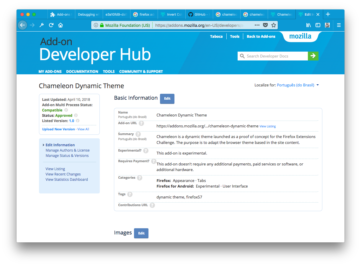
Since this is an experiment, yet functional within the guides of Mozilla Add-ons framework, I had also the chance to reflect about the actual channel of distribution, the Mozilla Add-ons web site.
When working in publishing the Add-on, again, as an experiment; I noticed a mindset: a publisher or author, aiming to connect with potential early adopters, aiming to connect with developers, aiming to connect with UX experienced professionals; willing to expand the realm of UX discussions around a work. As an example, I have decided to add screenshots as means to discuss specific cases — screenshots of the user visiting the browser internal pages versus screenshots of an user visiting external sites; screenshots of the user visiting a site where the content shows a navbar, and more.
When working with a view oriented to the UX discussion, however, I have allowed myself to stumble into the analysis of reviewing, or less naively, reflecting about the role of the Add-ons site itself.
My first naive thought was — oh, after about 10 years without visiting Add-ons, I confess surprised it's sort of the same thing.
But a less naive reflection is more like a subtle proposition — could Add-ons become a place for scaling extensions and ideas? what UI elements and social network key indicators could help to better match tests, usage, feedback, discussions around the development for next generation features?
A lot of developers, specially within the Mozilla realm, really understand that Add-on space have always served the purpose of evolving Firefox — however in a chaotic way — which Mozilla always benefited even if one or other developer-user had no idea how they have participated in the chain.
I wonder if it would be possible to better integrate Add-ons, APIs, tests and the community to improve how new UX insights could be evaluated and evolve.