popup-card
This is deprecated - Use browser_mod instead
Replace the more-info dialog of one entity with a custom lovelace card
Breaking changes!
popup-card is no longer a card. See usage instructions below.
Installation instructions
This card requires card-tools to be installed.
For installation instructions see this guide.
The recommended type of this plugin is: js
Note: By adding
?debugafter the url (&debugif you already have?track=true) popup-card will print some extra information to your browser console when you open a more-info dialog. This may or may not be helpful if you run into problems.
If you are using custom_updater:
resources:
- url: /customcards/github/thomasloven/card-tools.js?track=true
  type: js
- url: /customcards/github/thomasloven/popup-card.js?track=true
  type: js
Usage instructions
First of all, there are a few things you need to know about what this plugin is and is not.
Normally, when you click e.g. a line in an entities card, the more-info dialog for that entity is opened. Using this plugin, a card of your choosing can be displayed instead.
Things to note:
- This will replace every more-info dialog for the chosen entity on the same view. There is no way to open the popup-card when clicking one thing, and the normal more-info dialog when clicking another - In the same view. However:
- The opened card doesn't need to be related to the chosen entity in any way.
- By default - if everything is working - you will not see any difference. Until you open the card by clicking something else, nothing will pop up.
- That means that the popup-card does not magically appear by itself. You need to supply the means to open it. (I'm really rubbing this in at this point, but you wonuldn't believe the ammount of questions I get about this)
- This is not a card and should not be configured as if it is.
Still with me? Ok. Let's go.
There are two ways to define a popup-card. Either per-view, or globally.
Per-view configuration
To define a popup-card in a certain view, add a popup_cards: section to the views configuration:
views:
  - title: My view
    icon: mdi:home-assistant
    popup_cards:
      # popup-card configuration goes here
    cards:
      - type: entities
        ...etc...
Popup-cards defined in this way will replace the more-info dialogs only in the current view.
Global configuration
To define a popup-card in all views, add a popup_cards: section to the root of your lovelace configuration:
title: My awesome lovelace interface
resources:
  - url: /customcards/github/thomasloven/card-tools.js?track=true
    type: js
  - url: /customcards/github/thomasloven/popup-card.js?track=true
    type: js
popup_cards:
  # popup-card configuration goes here
views:
  - title: My view
   ...etc...
Popup-cards defined in this way will replace the more-info dialogs in all views.
It's possible to mix global and per-view popup-card configurations. Per-view takes precedence.
Popup-card configuration
Whether per-view of global, a popup-card is defined in the following form:
  <entity id>:
    title: <title>
    large: <true/false>
    style:
      <styles>
    card:
      <card>
<entity id>
The entity id of the entity whose more-info dialog is to be replaced, e.g. light.bed_light, device_tracker.my_phone, sun.sun, sensor.dummy_sensor_1.
<title>
Required
The heading title of the popup. This is required
<large>
Optional. Default: false
If true the popup will be a bit wider.
`
Optional. Default: none
Dictionary of CSS styles to apply to the more-info-dialog root.
<card>
Required
The specification of the card to pop up.
E.g:
type: entities
entities:
  - light.bed_light
  - type: custom:time-input-row
    entity: input_datetime.on_time
  - type: custom:time-input-row
    entity: input_datetime.off_time
  - input_boolean.weekdays_only
Repeating cards
If you would like the same card to replace the more-info dialog for multiple entities, you can add a redirection to your popup card configurations on the form:
<entity id 1>: <entity id 2>If a popup-card has been defined for <entity id 2>, it will now replace the more-info dialog for both <entity id 1> and <entity id 2>.
Example configuration
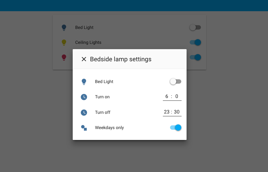
title: My awesome lovelace interface
resources:
  - url: /customcards/github/thomasloven/card-tools.js?track=true
    type: js
  - url: /customcards/github/thomasloven/popup-card.js?track=true
    type: js
views:
  - title: My view
    icon: mdi:home-assistant
    popup_cards:
      light.bed_light:
        title: Bedside lamp settings
        card:
          type: entities
          entities:
            - light.bed_light
            - type: custom:time-input-row
              entity: input_datetime.on_time
            - type: custom:time-input-row
              entity: input_datetime.off_time
            - input_boolean.weekdays_only
    cards:
      - type: entities
        entities:
          - light.bed_light
          - light.ceiling_lights
- light.kitchen_lights- Screenshot at top of page*
FAQ
Can a popup-card be opened programatically, e.g. by a Home Assistant automation?
No, but this can be done using browser-commander.
Can the size or position of the popup be changed?
The only way to change the size is the large option, which does the same thing as clicking on the title.
Can I remove the title or the X for closing the dialog?
No, but you can set an empty title title: " "
Why do I need to override a more-info dialog? Can't you just make it pop-up?
Well... yes, actually you can, by using browser-commander and something with a call-service tap_action.
Why can't I open the more-info dialog of an entity from the popup-card.
Limitations of Home Assistant.