React View is a set of tools that aspires to close the gap between users, developers and designers of component libraries. React View aims to make documentation more interactive and useful. It utilizes already popular tools such as babel and prettier. [Read the introductory blog post](https://baseweb.design/blog/introducing-react-view).
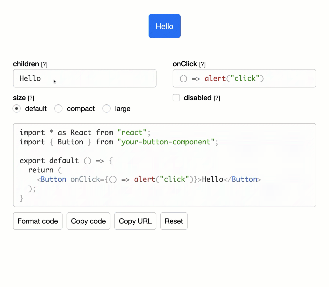
[See the example](https://react-view.pages.dev/?path=/story/view--view). [CodeSandbox](https://codesandbox.io/s/i3dbn?fontsize=14&hidenavigation=1&theme=dark).
There are a few ways how to use React View:
- **All-in-one playground**. Import `
[See the example.](https://react-view.pages.dev/?path=/story/useview--live-code-only)
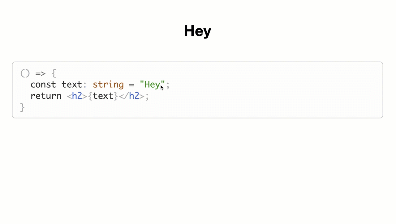
If you don't need the code generation or props documentation, you can also use React View for editing source code with a live preview.
```tsx
import {useView, Compiler, Editor, Error} from 'react-view';
import presetTypescript from '@babel/preset-typescript';
export default () => {
const params = useView({
initialCode: `() => {
const text: string = "Hey";
return
However, first you need to define these code snippets with a [special grammar](https://code.visualstudio.com/docs/editor/userdefinedsnippets#_grammar):
```json
"Button": {
"scope": "javascript,javascriptreact,typescript,typescriptreact",
"prefix": [
"Button component"
],
"description": "Base Button component.",
"body": [
"
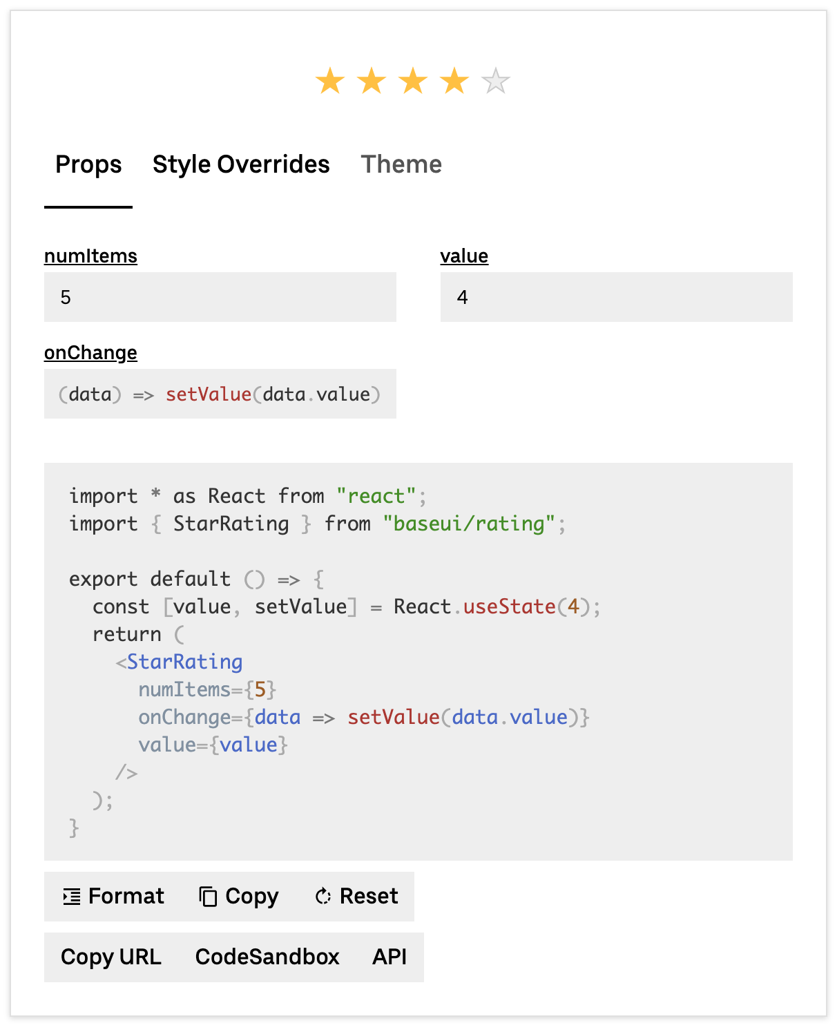
[See the example.](https://baseweb.design/components/rating/)
## API Documentation
### `useView` Arguments
```js
import {useView, PropTypes} from 'react-view';
```
useView accepts a configuration `object` where all values are optional:
#### componentName
```ts
componentName?: string;
```
The name of the primary component in the playground. It's used for the code generation and props parsing.
#### imports
```ts
imports?: {
[key: string]: {
named?: string[];
default?: string;
};
};
```
Optionally, the code generator can output import statements at the top of code editor so you can make the examples fully copy pastable. `key` represents the name of a module. Each module can have a single `default` and multiple `named` imports. For example:
```js
imports: {
'baseui/button': {
named: ['SIZE'];
default: Button;
};
};
```
would generate
```js
import Button, {SIZE} from 'baseui/button';
```
#### scope
```ts
scope?: {[key: string]: any};
```
All outside dependencies in the code editor need to be explicitly passed through the `scope`. Why? `imports` do nothing. Their only purpose is to make copy-pasting easier. React View does not include a bundler, so it can't understand ES modules. For example, if you want to use `styled` function from the `styled-components` in the code editor, you would do:
```js
import styled from 'styled-components';
useView({scope: {styled}});
```
`React` is included by default.
#### props
```ts
props?: {[key: string]: {
value: boolean | string | number | undefined;
type: PropTypes;
description: string;
options?: any;
placeholder?: string;
defaultValue?: boolean | string | number | undefined;
enumName?: string;
hidden?: boolean;
imports?: {[key: string]: {
named?: string[];
default?: string;
}};
stateful?: boolean;
propHook?: {
what: string;
into: string;
};
custom?: any;
}};
```
If you wish to use the code generation and knobs you need to define the component's API - props. Each prop can take multiple options:
- `value` - The default value (initial state).
- `type` - React View has some predefined internal types that are used to generate and parse code and should describe any React component: _String, ReactNode, Boolean, Number, Enum, Array, Object, Function, Ref, Date_ or _Custom_.
- `description` - Displayed as a knob tooltip for the user.
- `options` - When `type` is set to `PropTypes.Enum` you need to pass the enum through `options` so React View can generate all options (as input radio or select).
- `enumName` - When `type` is set to `PropTypes.Enum`, you need to pass the enum name through `enumName` so the code generator knows what to output.
- `placeholder` - A value placeholder, displayed in knobs.
- `defaultValue` - Can be useful for `PropTypes.Enum` or `PropTypes.Boolean`. When `value` equals `defaultValue`, the prop will not be code generated. It keeps examples with set default options cleaner.
- `hidden` - Some components have a lot of props but not all of them are that useful. You can optionally hide them from the default list of knobs. The user still can expand them via the "Show all props" button.
- `imports` - Same as the top-level imports argument. However, it will add import statements only if the prop is being used and code generated. For example, there is no need to display the `enum` import if the related prop is not used (defaultValue). It keeps examples cleaner.
- `stateful` - It detaches the prop value into an internal `React.useState` hook. This can make components like inputs interactive. [More info](https://react-view.pages.dev/?path=/story/useview--state-hook).
- `propHook` - This works in combination with the `stateful` flag. [More info](https://react-view.pages.dev/?path=/story/useview--state-hook)
- `custom` - When you define `customProps`, you can use this part of the configuration to pass arbitrary data.
#### onUpdate
```ts
onUpdate?: (params: {code: string}) => void;
```
Called when the source code changes.
#### initialCode
```ts
initialCode?: string;
```
You can set an initial source code. This can be useful in combination with `onUpdate` to preserve the playground's state through the URL. React View would initially hydrate the state from the `initialCode` value but all subsequent changes will be driven by its internal state.
If you use `useView` only as the live code editor, you should always set this value to something so the user doesn't see a blank page.
#### provider
```ts
provider?: {
value: T;
parse: (astRoot: any) => T;
generate: (value: T, childTree: t.JSXElement) => t.JSXElement;
imports: [key: string]: {
named?: string[];
default?: string;
}
};
```
**This is an advanced API**. It lets you build an arbitrary provider wrapper around your component. [See the example.](https://react-view.pages.dev/?path=/story/advanced--theming)
- `value` - Can be anything, represents the state of provider, when `undefined` the provider is not code generated.
- `parse` - Gives you the AST root, you should return the `value` so React View knows how to parse out the provider value out of the source code.
- `generate` - Gives you the `value` (provider state) and inner component (as a `t.JSXElement`), you should return the AST of your provider including the inner component so React View knows how to turn the provider `value` into the source code/
- `imports` - Same as the top-level `imports`, only displayed when the provider is being code generated (`value` is not `undefined`).
#### customProps
```ts
customProps?: {
[key: string]: {
parse: (code: string, knobProps: any) => any;
generate: (value: any) => any;
}
};
```
**This is an advanced API**. It lets you build your own prop/knob types and UIs. [See the example.](https://react-view.pages.dev/?path=/story/advanced--custom-prop) First, you set the `type` of your prop to `PropTypes.Custom`. Then, you can target it by its name (`key` is the prop name). For each prop, you need to define:
- `parse` - Gives you the prop code and the prop configuration (a part of the props list), you should return the **value** (internal representation) of that prop.
- `generate` - Gives you the **value**, you should return the AST of the prop so React View knows what to code generate.
Custom Props are ignored by the `Knobs` UI component, so you need to always implement your UI.
### `useView` Return Value
`useView` is a React hook, it accepts the configuration above, handles the internal state of the playground and returns many values and callback that you can plug into our default UI components or you can build your own UIs. `useView` returns on an object with these parameters:
#### compilerProps
```ts
compilerProps: {
scope: {[key: string]: any};
code: string;
setError: (error: string | null) => void;
transformations: ((ast: t.File) => t.File)[];
className?: string;
}
```
You can pass these props into the `Compiler` component.
- `scope` - Just being passed through from the input arguments.
- `code` - Source code to compile and execute.
- `setError` - To be called when the compilation fails.
- `transformations` - Additional source code transformations that are made before the compilation (for example we are removing all import statements).
#### knobProps
```ts
knobProps: {
state: {[key: string]: TProp};
set: (propValue: TPropValue, propName: string) => void;
error: TError;
};
```
You can pass these props into the `Knobs` component.
- `state` - It has the same shape as the input `props` argument, where `value` represents the state of props.
- `set` - To be called when a prop is changed after the user interacts with a knob.
- `error` - An error that happened during the compilation and is related to this specific prop.
#### editorProps
```ts
editorProps: {
code: string;
onChange: (code: string) => void;
placeholder?: string;
className?: string;
};
```
You can pass these props into the `Editor` component.
- `code` - Source code to display.
- `onChange` - To be called when the source code is changed.
- `placeholder` - A placeholder value when `code` is empty.
#### errorProps
You can pass these props into the `Error` component.
```
errorProps: {
msg: string | null;
code?: string;
className?: string;
};
```
- `msg` - Compile error messages.
- `code` - The source code.
#### actions
You can pass these props into the `ActionButtons` component.
```ts
actions: {
formatCode: () => void;
copyCode: () => void;
copyUrl: () => void;
reset: () => void;
updateProvider: (value: any) => void;
};
```
- `formatCode` - Formats the source code with Prettier.
- `copyCode` - Copies the source code into your clipboard.
- `copyUrl` - Copies the URL into your clipboard.
- `reset` - Resets the playground to an initial state.
- `updateProvider` - Can be used to update the internal provider value (part of the advanced provider API).
#### providerValue
```ts
providerValue: any;
```
The provider state. Defined only when `provider` argument is set.
### `View` Component
```js
import {View} from 'react-view';
```
The View component is a tiny wrapper around the `useView` hook and composes all UI components into one thing. This might be an ideal solution if you do not want to visually tweak anything and just get started as quickly as possible.
**`View` props are identical to the input arguments of `useView`** so see the documentation above for more details.
### Default UI Components
React View exports a set of UI components so you can quickly use them with the `useView` hook. They are also used internally by the `View` component.
```js
import {
ActionButtons,
Compiler,
Editor,
Error,
Knobs,
Placeholder,
} from 'react-view';
```
Their APIs almost exactly match the return parameters of `useView`. However, **there are a few additional props you can pass to some of them**:
#### Compiler
```ts
minHeight?: number;
placeholder?: React.FC<{height: number}>;
presets?: PluginItem[];
className?: string;
```
- `minHeight` - To prevent the scroll jump when the component is rendered for the first time (aka the code is executed), we can pre-allocate a container with the `minHeight` (px).
- `placeholder` - A React component to display before the first render, you can use the default `Placeholder` component (it's a spinner). It gets the `minHeight` through the `height` prop.
- `presets` - The Compiler component uses Babel and you can add additional babel presets to enable extra syntax features like TypeScript. `preset-react` is included by default.
- `className` - The class name passed to the root wrapper of Compiler.
#### Editor
```ts
language?: 'javascript' | 'jsx' | 'typescript' | 'tsx' | 'css';
small?: boolean;
theme?: typeof lightTheme;
['data-testid']?: string;
className?: string;
```
- `language` - Syntax highlighting option. `jsx` is used by default.
- `small` - More compact version of the editor, used as a part of the Knobs UI.
- `theme` - prism-react-renderer's [theme](https://github.com/FormidableLabs/prism-react-renderer#theming), an internal light theme is used by default (also exported).
- `className` - The class name passed to the root wrapper of Editor.
#### Error
```ts
isPopup?: boolean;
className?: string;
```
- `isPopup` - Should the component be displayed as a pop-up instead of being inlined.
- `className` - The class name passed to the root wrapper of Error.
### Other React View Exports
There are some other utilities that React View exports, mostly to help you when building your custom knobs or provider.
```js
import {
useValueDebounce,
formatCode,
parse,
getAstJsxElement,
lightTheme,
assertUnreachable,
} from 'react-view';
```
#### useValueDebounce
```ts
{text}
;
}`,
scope: {},
onUpdate: console.log,
});
return (
Hey
```
Or pretty much anything that can be executed after the return statement of JavaScript function:
```js
2 + 5;
```
## Code Snippets
VS Code has a powerful feature called code snippets. It lets you to quickly embed and modify repetitive code. In our case, React components: