Shape View for Xamarin.Forms (Android & iOS)
Create shapes content views from shared code for your mobile apps!
Setup & Usage
- Available on NuGet: https://www.nuget.org/packages/VG.XFShapeView/

- Install into your PCL project and Client projects.
- Add your first ShapeView to your layout, set its properties and see the result.
- Follow this quick guide for deeper understanding.
iOS Extra setup
Add ShapeRenderer.Init(); to the AppDelegate like so:
using XFShapeView.iOS;
[...]
public override bool FinishedLaunching(UIApplication app, NSDictionary options)
{
    global::Xamarin.Forms.Forms.Init();

    ShapeRenderer.Init();

    LoadApplication(new App());

    return base.FinishedLaunching(app, options);
}
Platform Support
| Platform | Supported | Version |
|---|---|---|
| Xamarin.iOS |  |
iOS 6+ |
| Xamarin.Android | |
API 15+ |
| Windows Phone Silverlight |  |
|
| Windows Phone RT | |
|
| Windows Store RT | |
|
| Windows 10 UWP | |
|
| Xamarin.Mac | |
ShapeView properties
You will want to customize your shapes. Here is a description of the properties you can modify:
| ShapeType | BorderColor | BorderWidth | CornerRadius | NumberOfPoints | RadiusRatio | Color | ProgressBorderWidth | ProgressBorderColor | Progress | Points | |
|---|---|---|---|---|---|---|---|---|---|---|---|
| Global Usage | Sets the shape type - Avaible values are Box, Circle, Diamond, Heart, Oval, Progress Circle, Star and Triangle | Sets the border color | Sets the border width | Sets the corner radius | Set the number of points to draw the star | Set the ratio between the inner and the outer radius of the star | Set the fill color | Sets the border width of the circle progress indicator | Sets the border color of the circle progress indicator | Sets the current progress of the circle progress indicator | Sets the list of points of the path |
| Default value | Box | Color.Black | 0 | 0 | 5 | 0.5f | Color.Default | 3 | Color.Black | 0 | null |
| Restrictions | None | Ignored if BorderWidth <= 0 or if 100% transparent | Ignored if <= 0 | Ignored if <= 0 and for circles/ovals | Only for stars | Only for stars | Ignored if 100% transparent | Ignored if <= 0 | Ignored if 100% transparent | Range from 0 to 100 for clockwise progression - From 0 to -100 for counterclockwise progress | Ignored if null or empty and only for paths |
| Box | |
|
|
|
|
|
|
|
|
|
|
| Circle | |
|
|
|
|
|
|
|
|
|
|
| ProgressCircle | |
|
|
|
|
|
|
|
|
|
|
| Diamond | |
|
|
|
|
|
|
|
|
|
|
| Heart | |
|
|
|
|
|
|
|
|
|
|
| Oval | |
|
|
|
|
|
|
|
|
|
|
| Path | |
|
|
|
|
|
|
|
|
|
|
| ProgressCircle | |
|
|
|
|
|
|
|
|
|
|
| Star | |
|
|
|
|
|
|
|
|
|
|
| Triangle | |
|
|
|
|
|
|
|
|
|
Notes
-
As any other ContentView, the ShapeView also exposes HeightRequest, WidthRequest, Padding, Margin, BackgroundColor, HorizontalOptions, VerticalOptions, Rotation, ...
-
Be aware that the oval shape relies on its dimensions. If you set equal height and width, a circle will be drawn, so double check your inputs if you get an unexpected result.
Example
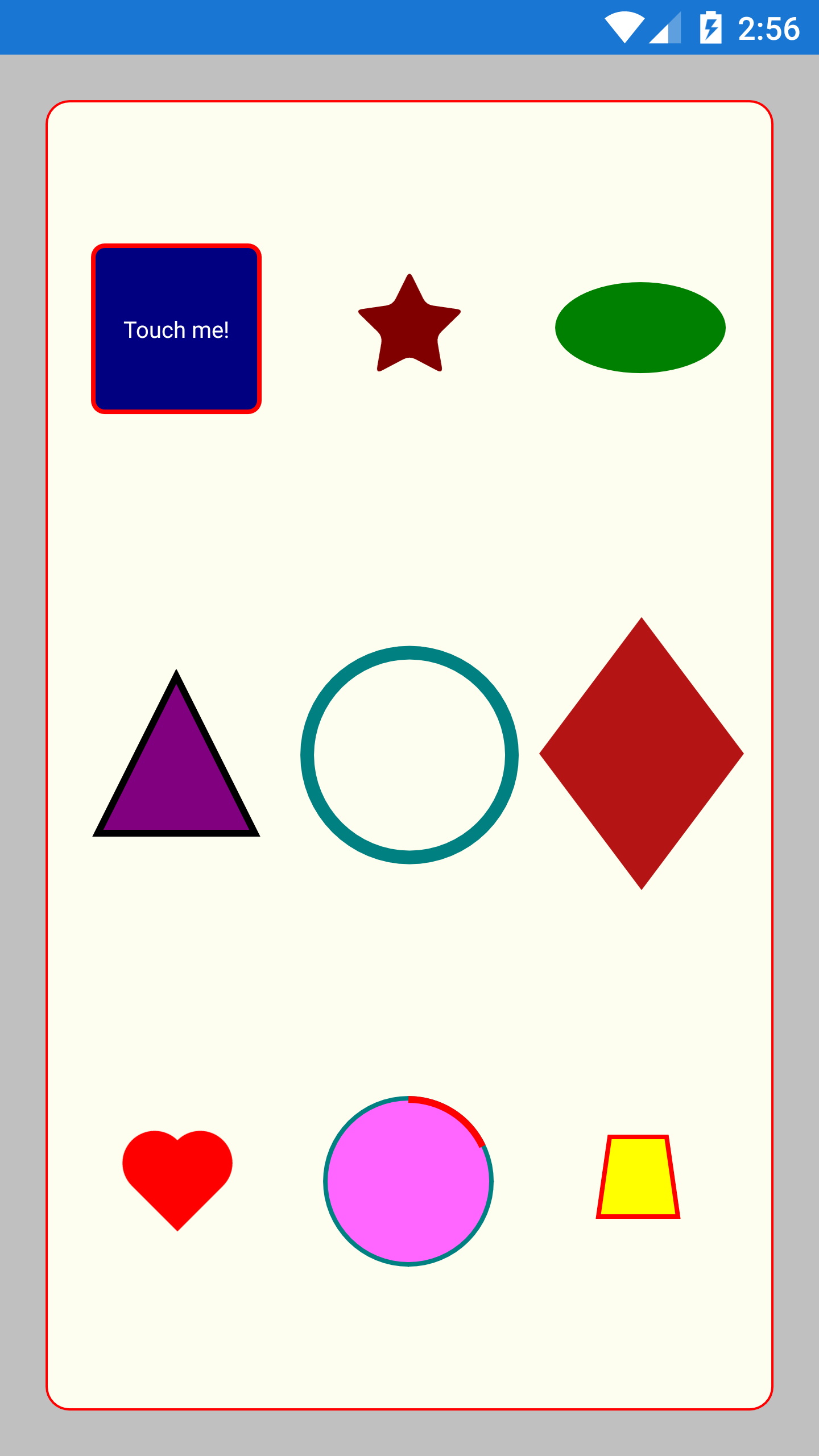
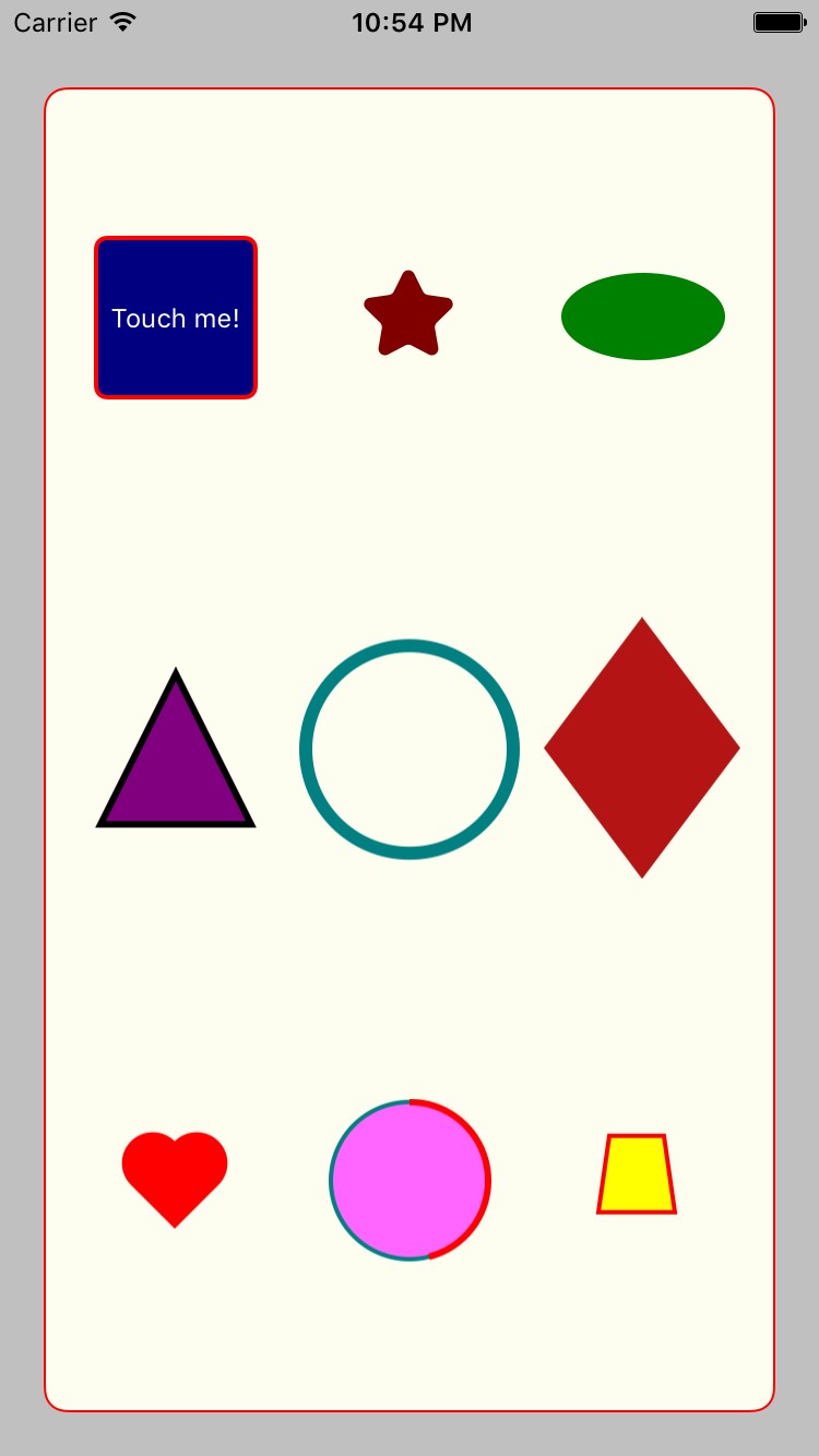
You can draw a box with a content Label, responding to touch like so:
var box = new ShapeView
{
    ShapeType = ShapeType.Box,
    HeightRequest = 75,
    WidthRequest = 75,
    Color = Color.Navy,
    HorizontalOptions = LayoutOptions.Center,
    CornerRadius = 5,
    BorderColor = Color.Red,
    BorderWidth = 1f,
    Content = new Label
    {
        Text = "Touch me!",
        FontSize = Device.GetNamedSize(NamedSize.Micro, typeof (Label)),
        TextColor = Color.White,
        HorizontalOptions = LayoutOptions.Fill,
        VerticalOptions = LayoutOptions.Fill,
        VerticalTextAlignment = TextAlignment.Center,
        HorizontalTextAlignment = TextAlignment.Center,
    },
};

var tap = new TapGestureRecognizer
{
    Command = new Command(() => {
        this.DisplayAlert("Touched", "This shape responds to touch!", "Ok");
    })
};

box.GestureRecognizers.Add(tap);
Screenshots
Contributing
Contributions are absolutely welcome.
- Fork the project!
- Create your feature branch:
git checkout -b my-new-feature - Commit your changes:
git commit -am 'Add some feature' - Push to the branch:
git push origin my-new-feature - Submit a pull request and I will be happy to test it
Thank you for your suggestions!
Credits
A lot of thanks to chrispellett and his Xamarin-Forms-Shape project for being a big inspiration. (https://github.com/chrispellett/Xamarin-Forms-Shape)
Copyright
© 2016 Vincent Gury