w3c / csswg-drafts

CSS Working Group Editor Drafts
https://drafts.csswg.org/
Other
4.49k stars 662 forks source link

[css-grid] Masonry layout #4650

Closed MatsPalmgren closed 4 years ago

MatsPalmgren commented 4 years ago

Overview

This is a proposal to extend CSS Grid to support masonry layout in one of the axes while doing normal grid layout in the other. I'll use grid-template-rows/columns: masonryto specify the masonry-axis in the examples (and I'll call the other axis the grid-axis). Here's a simple example:

<style>
.grid {
  display: inline-grid;
  grid: masonry / 50px 100px auto;
  grid-auto-columns: 200px;
  grid-gap: 10px;
  border: 1px solid;
}
item { background: silver; }
</style>

<div class="grid">
  <item style="border:10px solid">1</item>
  <item>2</item>
  <item>3</item>
  <item style="height:50px">4</item>
  <item>5</item>
  <item>6</item>
</div>

Result: image

The grid-axis behaves pretty much the same as in a normal grid container. Line names and track sizes can be specified and items can be placed and span multiple tracks using grid-column/row. CSS Box Alignment works normally etc. In the masonry-axis, items are placed into the grid-axis track(s) with the most space (typically) after the margin-box of the last item in those tracks.

Line name resolution and grid item placement

Grid items are formed and blockified the same as in a normal grid container. Line name resolution works the same as if masonry were replaced with none, i.e. names resolve in both axes. Grid item placement is done normally as well, although most of this result is discarded. Any items that were placed in the first hypothetical "track" in the masonry-axis keep their placement. Other items that have a definite position in the grid-axis keep that. Other placement results are ignored. These items will instead be placed according to the Masonry layout algorithm. (This implies that items can only be placed into the same grid area in this first hypothetical "track"). The flow axis specified by grid-auto-flow is ignored - items are always placed by filling the grid-axis. direction:rtl works as usual (reverses the grid) if the grid-axis is the inline-axis.

Containing block

The containing block for a grid item is formed by the grid area in the grid-axis and the grid container's content-box in the masonry-axis. Self-alignment works normally in the grid-axis, but is ignored in the masonry-axis. Margins do not collapse in either axis.

Track sizing

The Track Sizing Algorithm works as usual in the grid-axis, except only the subset of items with a definite placement in the grid-axis, or which span all tracks, contribute to the intrinsic sizing. This makes the first (implicit grid) "track" in the masonry-axis special since those items always contribute to the intrinsic sizing. auto-placed items which don't end up in the first track don't contribute (since which track they end up in depends on layout results). The min/max-content size of a grid container in the masonry-axis is the largest distance between the item margin-edges in each of the tracks in the grid-axis, when sized under a min/max-content constraint.

Grid container alignment and gutters

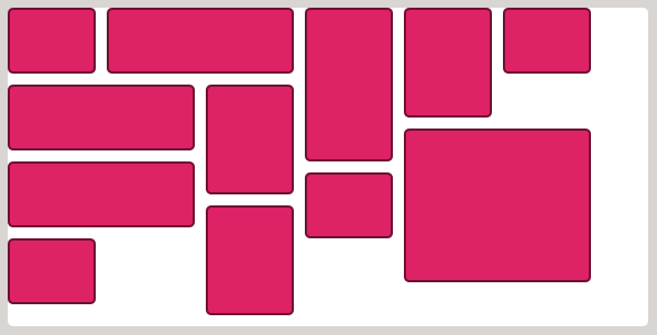
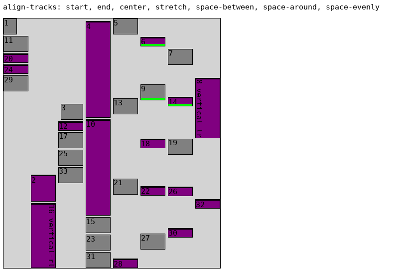
Alignment etc works normally in the grid-axis. Gutters are supported in both axes. In the masonry-axis the relevant gap is applied between each item. Content alignment (align/justify-content) in the masonry-axis is applied "to the content as a whole". More specifically, the alignment subject is the "masonry box", which has the extent from the content box edge of the grid container to the margin-box end edge of the item that is the furthest away, as indicated by the dashed border here: image (Item "1" has a 5px bottom margin here.) Note that there is only ever one alignment subject for these properties in the masonry axis, so the unique alignments boil down to start, center, end and stretch. (normal behaves as stretch as usual for grid containers). The above image shows the alignment subject with align-content:start. By default the masonry box is the same as the content box due to being stretched. This doesn't affect the items' alignment within the masonry box in any way though (which is what I meant by "to the content as a whole"). So I've added two properties to allow authors to align the items within the masonry box: align/justify-tracks which have the same values as the corresponding -content property (EDIT: I've extended it to accept a list of values, see below). Here's a screenshot showing a few alignment possibilities: image (Here's the testcase for that.) There's one difference for these new properties though: normal behaves as start. So if all these properties have their initial values, the rendering is the expected "packed" masonry layout as shown in the top left corner above.

align/justify-tracks:stretch

align/justify-tracks:stretch can be used to fill the tracks in the masonry axis by stretching items individually. Items can opt out from stretching process by setting align/justify-self to something other than normal/stretch in the relevant axis. Items that have either a definite size or an auto margin in the masonry axis are excluded from this stretching. An item only grows up to its max-size. auto margins can be used to align the item inside its new larger space instead of changing its size. I made a testcase and a video to illustrate. Only the purple items have height:auto, so they are the ones that may grow by default. A few items worth noting: item 4 has max-height:40px so it only grows up to that size and then the other items in its track picks up the remaining size. Item 16 opts out from resizing by setting align-self:end. Item 18 has margin-top/bottom:auto so it's centered in its allotted space instead of growing. Item 20 has margin-top:auto so it's aligned to the end. (Here's the corresponding testcase with a masonry inline-axis instead, with video.) It should be noted that this is an alignment step only - all items keep their pre-alignment track placement.

align/justify-tracks alignment values can be specified per track

The (highly tentative) syntax is a comma-separated list of alignment values - the start track takes the first value, etc. If there are fewer values than tracks then the last value is used for all the remaining tracks. If there are more values than tracks then the remaining values have no effect on rendering. Here's an example, which renders like this: image Note that the align-track value intentionally has one value less than the number of tracks to illustrate that the remaining track(s) use the last value (i.e. the right-most track also use space-evenly). (baseline values are also supported but excluded in this test, but see below...)

Baselines

Item baseline alignment inside the tracks in the grid-axis works as usual, as defined in Grid and Box Alignment specs, and the grid container's baseline is determined the same as for a regular grid in that axis.

Baseline alignment is supported also in the masonry axis, on the first and last item in each track (but not on items "in the middle" of the track). Only tracks with the align/justify-tracks values start, end or stretch, support baseline alignment. There are four different sets of baseline groups:

  1. the first item in each start track + the first item in each stretch track
  2. the last item in each start track
  3. the first item in each end track
  4. the last item in each end track + the last item in each stretch track

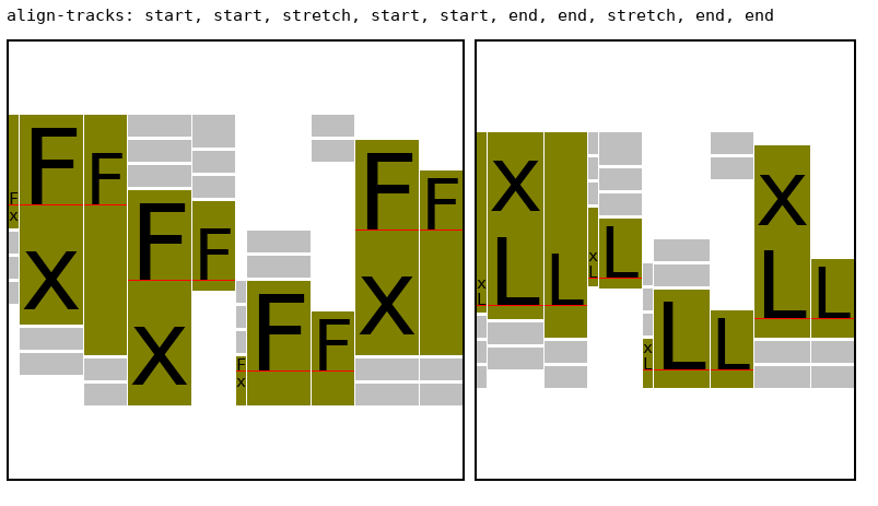
Each of those sets can have a first baseline group or a last baseline group, resulting in eight unique baseline groups. Here's an example illustrating all eight possibilities, which renders as: image I used two separate grid containers to illustrate first ("F") and last ("L") baseline groups to unclutter it. You can use all eight groups in the same container if you wish. The aligned baselines are indicated in red color. Note that the tracks that are attached to the end side of the masonry box adjust the padding (or margin in the case of align-self) on the end side, whereas tracks attached to the start side adjust the start padding/margin. (I only used align-content:[last] baseline on the items in the example above, which adjusts the padding, since it's easier to see the adjustment. You can also use align-self:[last] baseline, or a mix of the two, as usual.)

ISSUE: this needs more details about edge cases, caveat about misalignment in stretch, etc

Masonry layout algorithm

Items are placed in order-modifed document order but items with a definite placement are placed before items with an indefinite position (as for a normal grid). For each of the tracks in the grid-axis, keep a running position initialized to zero. For each item that has an indefinite placement:

  1. starting at line 1...
  2. find the largest running position of the tracks that the item spans at this position, call it min_pos
  3. increment the line and repeat step 2 until the item would no longer fit inside the grid
  4. pick the line number that resulted in the smallest min_posas the definite placement

Calculate the size of the containing block and flow the item. Then calculate its resulting margin-box size in the masonry-axis. Set the running position of the tracks the item spans to min_pos + margin-box + grid-gap.

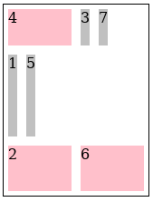
There are a few variations of this algorithm that might be useful to authors. First, the "definite items first" might be useful to skip in some cases, so that a plain order-modifed document order is used instead. Also, opting out from the packing behavior described above and instead placing each item in order (a couple of existing masonry JS packages provides this option). So, perhaps something like this: masonry-auto-flow: [ definite-first | ordered ] || [ pack | next ]. Example:

<style>
.grid {
  display: inline-grid;
  grid: 50px 100px auto / masonry;
  border: 1px solid;
  masonry-auto-flow: next;
}

.grid > * {
  margin: 5px;
  background: silver;
}
.grid > :nth-child(2n) {
  background: pink;
  width: 70px;
}
</style>

<div class="grid">
  <item>1</item>
  <item style="height: 50px">2</item>
  <item>3</item>
  <item style="order: -1">4</item>
  <item>5</item>
  <item>6</item>
  <item>7</item>
</div>

Result: image

(Without masonry-auto-flow: next, 1,3,5,6 are placed in the middle row.)

Fragmentation

Fragmentation in the masonry-axis is supported. Each grid-axis track is fragmented independently. If an item is fragmented, or has a forced break before/after it, then the running position for the tracks that it spans in the grid-axis are set to the size of the fragmentainer so that no further items will be placed in those tracks. Placement continues until all items are placed or pushed.

Subgrid

Masonry layout is supported also in subgrids (e.g. grid: subgrid / masonry). However, only a parent grid-axis can be subgridded. A subgrid axis with a parent masonry-axis will behave as masonry, unless the subgrid's other axis is also masonry in which case it behaves as none. (A grid container can only have one masonry-axis). auto-placed subgrids don't inherit any line names from their parent grid, but are aligned to the parent's tracks as usual. Here's a subgrid example:

<style>
.grid {
  display: inline-grid;
  grid: auto auto 100px / masonry;
  align-content: center;
  height: 300px;
  border: 1px solid;
}

.grid > * {
  margin: 5px;
  background: silver;
}
.grid > :nth-child(2n) {
  background: pink;
}

.grid subgrid {
  display: grid;
  grid: subgrid / subgrid;
  grid-row: 2 / span 2;
  grid-gap: 30px;
}
.grid subgrid > * { background: cyan; }
</style>

<div class="grid">
  <item>1</item>
  <item>2</item>
  <item>3</item>
  <subgrid>
    <item style="height:100px">subgrid.1</item>
    <item>sub.2</item>
    <item>s.3</item>
  </subgrid>
  <item>4</item>
  <item>5</item>
  <item style="width: 80px">6</item>
  <item>7</item>
</div>

Result: image

Note how the subgrid's first item ("subgrid.1") contributes to the intrinsic size of the 2nd row in the parent grid. This is possible since the subgrid specified a definite placement so we know which tracks it will occupy. Note also that it's subgridding the masonry-axis of the parent which falls back to masonry layout in the inline-axis for the subgrid.

Absolute Positioning

Grid-aligned absolute positioned children are supported. The containing block is the grid-area in the grid-axis and the grid container padding edges in the masonry-axis, except for line 1 in the masonry-axis which corresponds to the start of the "grid" (the content-box start edge usually). It might be useful to define a static position in the masonry-axis though, given that we only have a one line in that axis to align to. Maybe it could defined as the max (or min?) current running position of the grid-axis tracks at that point?

repeat(auto-fit)

I don't see a way to support repeat(auto-fit) since auto-placed items depend on the layout size of its siblings. Removing empty tracks after layout wouldn't be possible in most cases since it might affect any intrinsic track sizes. Even if all track sizes are definite the containing block size could change for grid-aligned abs.pos. descendants. So repeat(auto-fit) behaves as repeat(auto-fill) when the other axis is a masonry-axis.

Performance notes

In general, masonry layout should have significantly better performance than the equivalent (2-axis) grid layout, particularly when the masonry-axis is the block-axis since the intrinsic sizing of grid rows is typically quite expensive. Any intrinsic track sizing in the grid-axis should be cheaper too, because, typically, only a subset of items contribute to the intrinsic sizing in a masonry layout, contrary to a 2-axis grid where all items spanning the intrinsic track contributes. That said, justify/align-tracks:stretch specifically adds a cost proportionate to the number of items that are resized. (Note that stretch isn't the default value for these properties though.) Stretched items do a second layout (size reflow) with the new size (when it actually changed) so this can be costly if there are a huge amount of stretched items that each contains a lot of content. Especially nested stretched masonry layouts should be avoided unless they are small/trivial. This can be ameliorated by the author by opting out from the stretching on most items though, e.g. specifying justify/align-items:start and then opting in for just a few items with justify/align-self:stretch to let those items fill the masonry axis. Other justify/align-tracks values such as center, endand <content-distribution> (other than stretch) shouldn't be a problem though since they just reposition the items which is fast. (This performance analysis is from a Gecko perspective, but I suspect there's some truth to it for other engines as well.)

Graceful degradation

A Masonry design should degrade quite nicely in an UA that supports Grid layout but not Masonry layout if the grid/grid-template shorthands are avoided and the longhands are used instead. e.g.

  grid-template-rows: masonry; /* ignored by UAs that don't support it */
  grid-template-columns: 150px 100px 50px;

Here's a testcase to demonstrate. It gives you a three-column grid layout, but with "more gaps" than if the UA supported masonry. (A video of the masonry layout for comparison.)

tabatkins commented 4 years ago

I'm liking this quite a bit!

Just to be clear, the masonry axis has no explicit tracks, right? Everything's effectively placed into implicit tracks?

I'm not sure I understand from this description how auto-placed items interact with definite-placement items. In your first example, what would happen if item 4 said "grid-column: 2;"? What about item 2 or 6? Do they just get placed after all the masonry-placed items, which are presumably all in the first implicit column?

For repeat(auto-fit), is there really a case that would differ here? An empty track would be at minimum run, right, so the only way it could possibly be empty is if there just aren't enough elements in the grid to reach that track; there's no dependence on the layout size of the elements. Am I missing an interaction here?

MatsPalmgren commented 4 years ago

Just to be clear, the masonry axis has no explicit tracks, right? Everything's effectively placed into implicit tracks?

Right, the line name resolution + "hypothetical grid-placement" steps are done as if masonry were none. Note that this grid is an illusion though, there are no tracks in the masonry axis. The purpose of the grid-placement step is to resolve (some) auto-positioned items into definite tracks in the grid-axis for the intrinsic track sizing step. Only items placed into the hypothetical first implicit track keep their resolved auto-position, other auto-placed items don't. The subset of items with a definite position in the grid-axis goes into the track sizing step and contributes to the intrinsic sizing. So for example:

<style>
.grid {
  display: inline-grid;
  grid: masonry / auto;
}
x { background: silver; }
y { background: lime; width:100px; grid-row: 1; }
</style>
<div class="grid">
  <x>x</x>
  <y>y</y>
</div>

This makes the column size 100px. Removing grid-row: 1 makes is the size of "x" and the y element overflows.

Currently, I'm also handling the items that are were placed at first implicit line specially in the masonry layout step. They are sorted before other items and they all start at position zero. This has two effects, a) you can make these items in this first hypothetical track intentionally overlap. E.g., using grid-area: 1/1 above and adding more <y> items would make them all overlap. This may not seem very useful at first glance, but it's actually quite useful in creating a stacked tab-panel type of layout where you want the size to be the maximum of the children. (<x> would then follow after the largest <y>). And b) it moves the <y> element to the start, which seems like the least surprising layout.

I'm not sure I understand from this description how auto-placed items interact with definite-placement items.

Items with an auto-placement in the grid-axis gain a definite placement only if they end up in the first hypothetical track in the masonry axis. Otherwise, they are still considered auto-placed and will not contribute to track sizing. There's a sorting step before masonry layout starts. The masonry-auto-flow: [ definite-first | ordered ] controls if items with a non-auto grid-axis placement should be placed first or not (the actual line number isn't considered just if it's auto or non-auto, the set is already sorted in order-modifed document order to begin with and this is a stable sort).

In your first example, what would happen if item 4 said "grid-column: 2;"? What about item 2 or 6?

No change. No change. With grid-column: 2 on item 6:

image

In the above: items 1,2,3 are attached the first implicit line in the masonry axis, so they are placed first. Then item 6, because it has a definite placement in the grid-axis. Then 4 and 5 since the are auto-placed in the grid-axis. Items 1,2,3 and 6 have a definite grid-axis placement when masonry layout starts so we simply position them in the requested column at the minimum position possible for its span extent. That's the behavior with masonry-auto-flow: definite-first which is the default. With masonry-auto-flow: ordered you get: image

Do they just get placed after all the masonry-placed items, which are presumably all in the first implicit column?

Yes, all items with definite placement first, then auto-placed. The auto-placed items don't really have a column yet. It's resolved by the masonry layout step while honoring the masonry-auto-flow: [ pack | next ] preference for the positioning.

So, perhaps it's confusing to use the term track at all in the masonry axis since there really aren't any tracks there. It's a continuous layout. I think it's still useful to have a "first implicit line" there though. It's convenient for intrinsic sizing purposes with auto-placed items, and it allows overlapping items at this line.

It's also useful to have a line at the start/end of the items in the masonry axis for abs.pos. items to align to, although I'll punt on the exact details of that for a bit. (Currently, I'm resolving grid-row:auto/1 from the padding edge to the start of the first implicit line, and N > 1 to the last implicit line.) Example:

<style>
.grid {
  display: inline-grid;
  grid: masonry / 100px;
  padding: 40px;
  position: relative;
  border: 1px solid;
}
a {
  position:absolute;
  inset: 10px;
  border: 3px dashed red;
}
y { background: lightgrey; }
</style>
<div class="grid">
  <y>y</y><y>y</y><y>y</y>
  <a></a>
  <a style="grid-row-end: 1; border-color: blue"></a>
  <a style="grid-row-start: 2; border-color: black"></a>
</div>

Result: image

For repeat(auto-fit), is there really a case that would differ here? An empty track would be at minimum run, right

Correct.

so the only way it could possibly be empty is if there just aren't enough elements in the grid to reach that track; there's no dependence on the layout size of the elements.

Consider:

<style>
.grid {
  display: inline-grid;
  grid: masonry / repeat(auto-fit, 100px);
  width: 300px;
  border: 1px solid;
}
x { background: silver; }
</style>
<div class="grid">
  <x>1</x>
  <x>2</x>
  <x style="grid-column:span 2">3</x>
</div>

Item 1 and 2 have equal height so masonry layout places item 3 in column 1 (it doesn't fit in column 3 since it has span 2 and the grid only has 3 columns). With <x style="height: 4em">1</x> though, the desired result is that item 3 is placed in column 2. We don't know until after we have flowed and placed all items preceding item 3 whether it's the former or latter case.

MatsPalmgren commented 4 years ago

I've made a demo of a couple of fragmentation tests. A grid with masonry layout in the inline-axis, fragments like this. A grid with masonry layout in the block-axis, fragments like this. I made the items that are fragmented keep its fragments in the same grid-axis track (so they should line up in paged media), whereas items that are pushed (break before due to break-inside:avoid) are masonry-placed in the next container fragment. Does this make sense? Or should we perhaps freeze the first pushed item (for each track) to the track it came from and just place the rest?

MatsPalmgren commented 4 years ago

Robert Utasi suggested that alignment in the masonry-axis per grid-axis track could be useful too. I said above that "Alignment in the masonry-axis is applied to the content as a whole (same as for a block container in the block-axis).", but perhaps doing it per track is actually a better default. I can see both being useful though.

MatsPalmgren commented 4 years ago

A problem with doing the alignment per axis is that if there are items that span 2 or more grid-axis tracks then it's very likely that we'll make items overlap each other. It should work fine when all items are non-spanning though, which I guess is quite common in practice. Still, I think the align-per-axis feature should probably be opt-in to avoid that footgun. So we need an extension to css-align like justify/align-content: ... || per-track or something. A few examples to illustrate (grid container's content area is grey, the masonry axis is the block axis): image

image

image

Alternatively, a new property to control the track- and content-area alignment independently instead of the more limited per-tracks keyword: image

MatsPalmgren commented 4 years ago

I think having separate properties for alignment within the tracks in the masonry axis is the way to go. It gives authors very good control over the final layout. I've updated the original description above with the details.

MatsPalmgren commented 4 years ago

I've updated the proposal above with align/justify-tracks:stretch that can be used to fill tracks in the masonry axis by stretching items.

MatsPalmgren commented 4 years ago

I've updated the proposal above with some notes on performance and graceful degradation.

argyleink commented 4 years ago

I love that this is getting attacked from a proposal perspective! Thanks so much for spinning this up and putting so much great thought into it 👍

I have a question around whether or not masonry fits better into a flexbox mentality than grid. To me, grid creates rows and columns, and it does so by drawing lines and fitting cells into those lines (this isnt an exact definition but I believe they are tenants). Where flex allows for more intrinsic layouts that have no lines, but does have an axis. Masonry is a combo of both in most cases, where columns are desired (so vertical lines) but no horizontal lines, as all items can have their own intrinsic height.

Screen Shot 2020-01-21 at 10 04 25 AM

In this above Pinterest masonry layout (arguably the most famous and shining example of why/when this is effective Ui/UX) there are no visible row lines, and I believe if you added them it would move the layout more towards "packery" than masonry. Grid can already make great "dense" packery type layouts, where row/column lines are super useful. While flexbox and css columns can do types of packery (example 2) and masonry (example 1), they can't properly layout as you've shown, 1, 2, 3 children are the first in the columns.

TLDR; masonry shares more with flexbox than grid in my opinion I'm curious if this assertion can help shape this proposal? also, maybe a new display type would be better, since I feel like masonry has hybrid properties of grid and flex. save us from overloading grid or flex by putting the uniqueness into a new display type?

Those are my thoughts, hope they're helpful!

Example #1: flex masonry by setting container height

Screen Shot 2020-01-21 at 10 15 57 AM

Example #2: flex packery by setting container height

Screen Shot 2020-01-21 at 10 16 07 AM

Example #3: css columns masonry

Screen Shot 2020-01-21 at 10 17 08 AM

Notice how not 1 demo has a shared row line anywhere. I believe this to be the defining feature of masonry and I believe it conflicts with putting masonry into css grid. thoughts!? thanks for letting me vent the thought stream.

meyerweb commented 4 years ago

I’m with @argyleink: I find it weird that the resulting layout is not a grid but is still invoked using display: grid. All the layouts remind me a lot more of Flexbox than Grid.

MatsPalmgren commented 4 years ago

@argyleink argyleink

Notice how not 1 demo has a shared row line anywhere. I believe this to be the defining feature of masonry and I believe it conflicts with putting masonry into css grid.

The proposal here is to define a "one-dimensional grid", so that you have tracks in just one axis and a continuous flow (stacking blocks one after another) in the other. So indeed, there are no "shared row lines" anywhere in the masonry axis (except at the start edge perhaps). It seems to me this is precisely what masonry layout is about, one axis has grid-like properties (tracks), while the other axis has a continuous flow (in each track separately).

I considered using flexbox instead, but I came to the conclusion that Grid is the ideal fit since all the complicated stuff is in the grid-axis and we get that for free with Grid. The layout in the masonry axis is trivial in comparison. As I see it, re-using well-known concepts from Grid is a benefit to everyone: spec authors can re-use large parts of the Grid (and Box Alignment) specs (blockification of items, item placement/spans, grid lines, track sizing, content/self-alignment etc (in the grid-axis)); implementors can cheaply implement this by re-using large parts of their CSS Grid implementation; and authors can re-use their existing knowledge about grid layout and their CSS properties.

@meyerweb using display: grid and specifying masonry for each axis separately (akin to subgrid) is just a convenient way to re-use existing properties/values. I don't feel strongly about what specific syntax we use though, except that the grid-axis should use existing Grid properties/values.

MatsPalmgren commented 4 years ago

@argyleink btw, the Pinterest masonry layout you showed above is pretty trivial to specify using this proposal:

.masonry-container {
  display: grid;
  grid: masonry / repeat(auto-fill, 150px);
  gap: 10px;
}

Or some such. Another thing that is somewhat common on the web is to span an item over one or more columns. Again, you get this for free with this proposal: just add grid-column:span 2 or whatever on the specific item.

AmeliaBR commented 4 years ago

While I like many aspects of the proposal, I tend to prefer a display: masonry layout mode that re-uses many of the grid/alignment properties instead of display: grid with masonry as a column/row template.

The reason: there are lots of weird edge cases and interactions in grid layout. Sizing rules have been exhaustively defined, but will still need to be refined every time new features are added (e.g., subgrid). Adding an extra mode where sometimes the grid doesn't actually exist in one direction would likely change the best approach for some of these situations. Versus, with a separate display mode we can consider the rules & constraints that make the most sense, independent of the grid behavior.

Example: with masonry, which items get placed in which columns depends on the heights of previous items (for vertical masonry). And the height of text-container items often depends on the width. But the width of a grid column can depend on the contents of that column & now we have a new circular layout concern (maximizing a column width to fit around an item can make it so that item is no longer in that column) that didn't exist in regular grid layout.

rachelandrew commented 4 years ago

@AmeliaBR just commented with the same concern I was developing while reading this thread today. It seems like we create a lot of additional complexity by making grid do a non-grid thing.

Add to that the teaching issue, it's been tricky enough to explain one-dimensional vs. two-dimensional to authors, and encourage understanding of which layout method to use for which use case. I think that tying Masonry, which is more like flex than grid, to grid layout would be ultimately very confusing.

An argument against making this a new thing is that we don't want to have to create a new layout type for everything the world comes up with. This is a reasonable concern, however given that a lot of the stuff this relates to is not in the grid spec but instead in Box Alignment and Sizing, and these things would need to account for any differences in Masonry over grid anyway, would that be such a problem?

SebastianZ commented 4 years ago

I like @MatsPalmgren's approach to reuse the already established grid layout for that. Though I agree with @argyleink, @meyerweb, @AmeliaBR, and @rachelandrew, that masonry is rather something between flex and grid, which, while sharing logic with both of them, deserves its own display type and properties.

The approach of masonry is different than the one of grid, as its idea is to minimize the gaps between different pieces.

By making its layout be based on grid, we restrict both of them in their future extensibility. That doesn't mean that masonry shouldn't borrow concepts and algorithms of grid layout or flexbox, though. It is just not exactly one or the other.

Sebastian

jensimmons commented 4 years ago

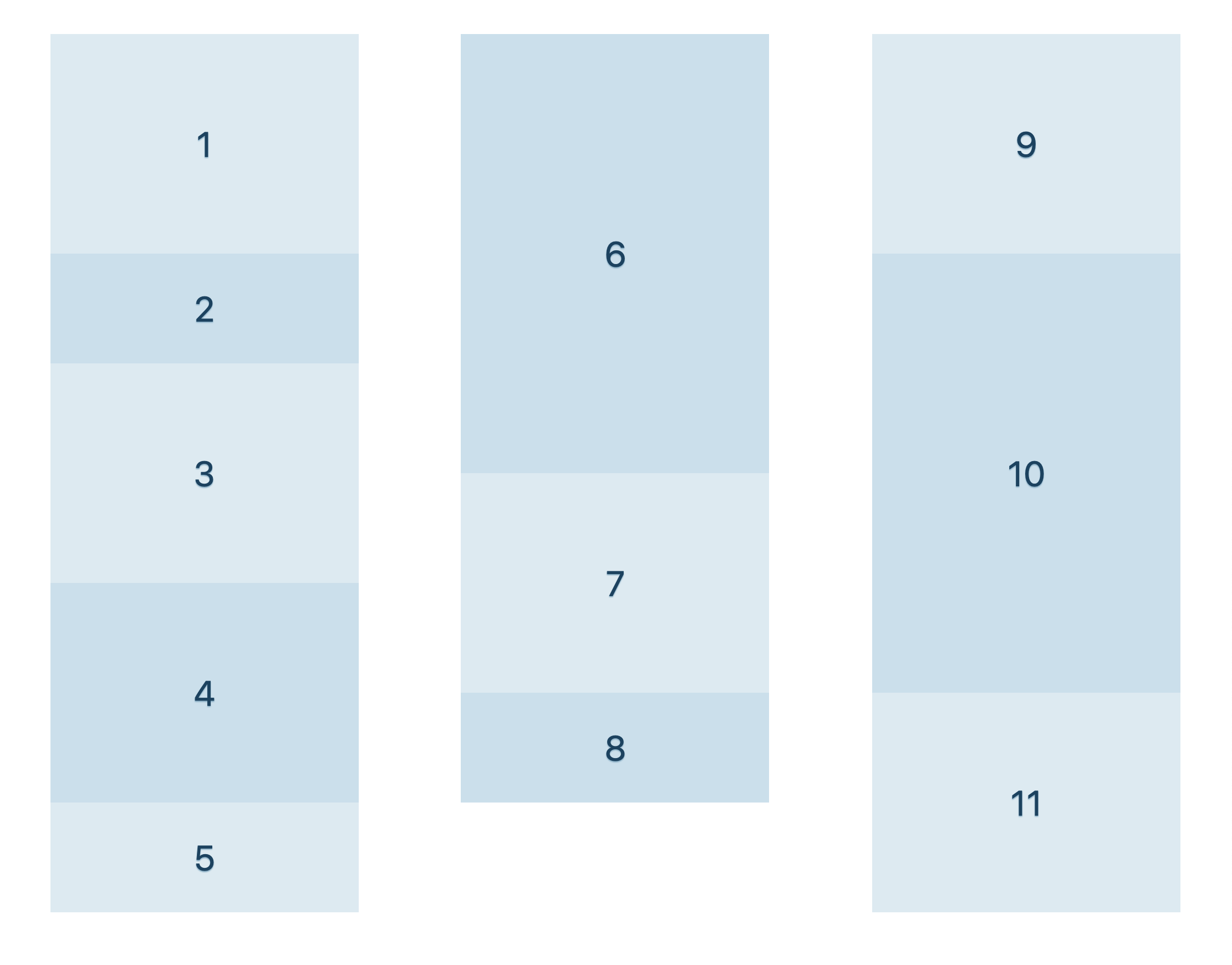
@argyleink I believe that if the desire result is what you drew in your first diagram, you can already do that today using Multicolumn.

masonry 002

The key with Masonry is the content order. The Masonry JS library can do both of these content orders:

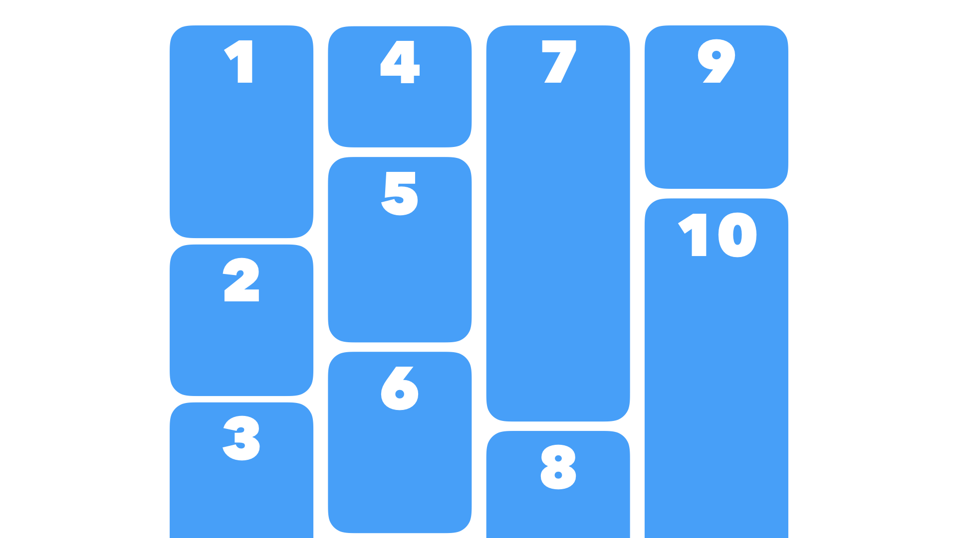
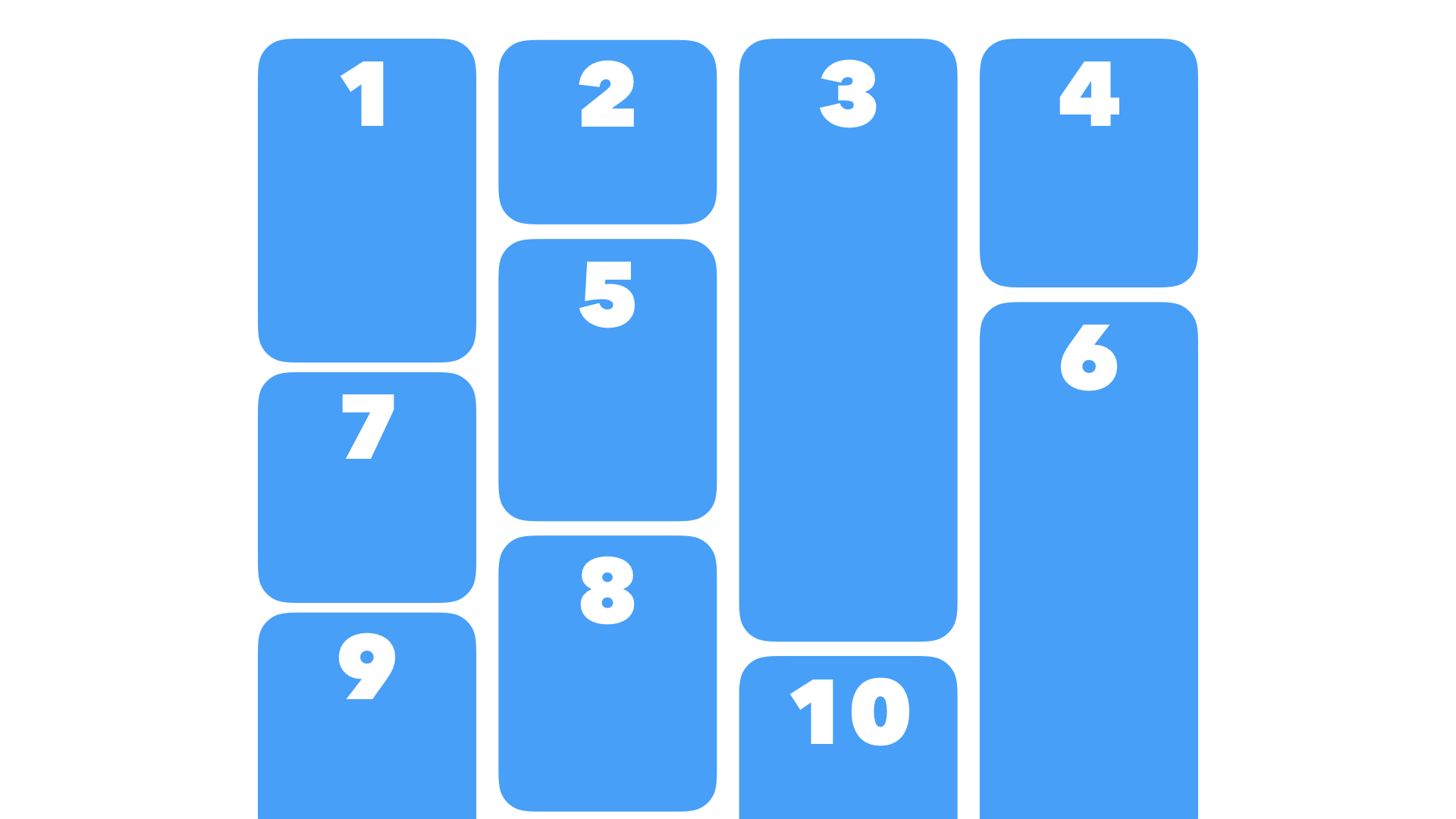
The default order puts the next item in the order as close to the top as possible. masonry 004

An alternative order (horizontalOrder: true) usually puts the next item in the next column, without regard to how close to the top the next slot is: masonry 005

I believe Masonry-style layout belongs in Grid, because the algorithm is thinking about both the rows and columns, and autoplacing content with regards to both. Flexbox can be thought of as a long content snake, that wraps around and around... same with multicolumn. Masonry requires "jumping" from one column to another — there's no content snake. No long unbroken wrapping chain.

Making this part of Grid also gives Authors all the other powers of Grid — track sizing, names, etc.

css-meeting-bot commented 4 years ago

The CSS Working Group just discussed Masonry Layout, and agreed to the following:

The full IRC log of that discussion <fantasai> Topic: Masonry Layout
<TabAtkins> github: https://github.com/w3c/csswg-drafts/issues/4650
<fantasai> jensimmons: Mats Palmgren, layout engineer at Mozilla, over Christmas break, this is what he did for Christmas present
<fantasai> jensimmons: He's thought in detail about what it would take to add something to Grid to accomplish Masonry layout
<fantasai> jensimmons: It's lots of detailed from implementer perspective
<fantasai> jensimmons: So what is Masonry layout?
<fantasai> jensimmons: It's a popular idea of how to lay out content on the Web, e.g. on Pintrest
<fantasai> jensimmons: People wanted to do it with Grid, but you can't really, still have to use JS
<fantasai> jensimmons: works fast on Pintrest because they put a lot of money and effort into it
<fantasai> jensimmons: others use this library
<fantasai> jensimmons: Here's what the layout looks like [shows outline]
<fantasai> jensimmons: Why not do it with flexbox? well that would give the wrong content order
<fantasai> jensimmons: Don't want the early things to be below the fold with late things up at top in the later columns
<fantasai> jensimmons: also makes a problem with lazy loading, would rejigger layout
<fantasai> jensimmons: Order ppl need is going across
<fantasai> jensimmons: This version of Masonry, the most common one, is that as it goes to fill in the rest of the pieces of content
<fantasai> jensimmons: puts next item into the column that is the shortest, so always closest to the top
<fantasai> jensimmons: Other option is to go from 1st column to last column always
<fantasai> jensimmons: but skip columns that are too full to keep things roughly in order
<fantasai> jensimmons: Mats believes he's figured out how to do it in Grid
<fantasai> jensimmons: That's the issue
<fantasai> jensimmons: I think it would be popular and ppl would be super happy to have
<fantasai> TabAtkins: Yes, this has been requested for like 15 years
<fantasai> TabAtkins: Overall, love the proposal, think it's great, lots of detail in it
<bkardell_> q+
<fantasai> TabAtkins: Only concern, making it part of Grid instead of its own display type
<rachelandrew> q+
<fantasai> TabAtkins: Think we should make it display: masonry, copy over concepts from Grid
<heycam> fantasai: any examples of things you're concerned about?
<emilio> q+
<heycam> fantasai: this is somewhat similar in that subgrid is also kind of like a mode
<heycam> ... which creates a different way of laying out items in the grid
<heycam> ... masonry is a different model for doing the rows
<fantasai> TabAtkins: Sugrid is fundamenally a grid still
<fantasai> TabAtkins: but Masonry is different
<fantasai> TabAtkins: Example, Mats suggests an align-tracks property that only applies to masonry
<heycam> fantasai: what's it do?
<fantasai> TabAtkins: it aligns the Masonry stuff within their track
<fantasai> TabAtkins: So there are a few different layout concepts
<fantasai> TabAtkins: that don't apply to Masonry in Grid
<fantasai> TabAtkins: and that don't apply to Grid in Masonry
<jensimmons> q+
<fantasai> TabAtkins: So I think we should re-use as many concepts as possible
<tantek> Is this orientation specific? I.e. presumably masonry refers to the overlapping brick like layout. Flickr does this for displaying photo results, e.g. https://flickr.com/photos/tags/csswg
<fantasai> TabAtkins: but separate out as a distinct display type
<fantasai> TabAtkins: that has a clear signal for what applies here vs in Grid
<fantasai> florian: For align-tracks property, if we did have different modes, could we use an existing alignment property to do this?
<heycam> fantasai: if I understand correctly, you have a box, then some masonry tracks
<heycam> ... each individual track aligning its content to the bottom
<heycam> ... rather than taking the entire masonry chunk and sliding it to the bottom
<heycam> ... isn't this exactly what justify-content does in flexbox? why not just reuse align-content?
<heycam> TabAtkins: only given an hour thought to this
<heycam> fantasai: I think it's premature to split it out, it's its own layout model, but which should think about that
<heycam> ... for now leaving it as part of grid makes sense until we have a clearer idea of what doesn't fit
<tantek> q?
<fantasai> Rossen__: Fan of this proposal
<fantasai> Rossen__: What are we trying to get out of this discussion?
<fantasai> heycam: Wanted to get temperature of the room, see if there's interest
<fantasai> heycam: and also get thoughts on integration
<fantasai> bkardell_: Of course I want this
<fantasai> bkardell_: Want to say same thing as Grid and Flexbox, we should stop and solve the a11y problem with content reordering
<fantasai> bkardell_: I have concerns about that, that's all
<fantasai> rachelandrew: I would really like to see Masonry solved
<fantasai> rachelandrew: I also agree we should look at content reordering proble
<iank_> q+
<fantasai> rachelandrew: Don't think it should be part of Grid
<astearns> ack bkardell_
<fantasai> rachelandrew: Trying to teach it, it's not a grid
<TabAtkins> I think this doesn't introduce any new content-reordering problems; it's definitely no worse than "a pile of floats", still according with the standard "left to right, top to bottom" ordering.
<astearns> ack rachelandrew
<TabAtkins> (Unless you use 'order', of course.)
<fantasai> rachelandrew: would make a lot more sense to have a separate layout model
<tantek> Is there no attempt to do baseline alignment across masonry items in different columns?
<tantek> That might be one reason to consider it grid-like
<Rossen__> ack emilio
<fantasai> emilio: I don't know if should be separate model
<fantasai> emilio: but multicol changes layout model quite a lot, this still mostly fits within grid layout paradigm
<fantasai> emilio: can share a lot of code
<fantasai> emilio: so not quite like multicol
<Rossen__> ack jensimmons
<fantasai> jensimmons: I think these are great issues to bring up
<fantasai> jensimmons: taking of introducer hat
<fantasai> jensimmons: this is jen
<fantasai> jensimmons: I was also concerned about a11y order
<astearns> tantek: I doubt it would be feasible to to baseline alignment when there are not grid lines in the block direction
<fantasai> jensimmons: but aftter explaining, I think it's less of a problem than Grid
<fantasai> jensimmons: It does seem like ppl are tabbing through DOM order, focus rings
<fantasai> jensimmons: Easier because content doesn't go below the fold
<fantasai> jensimmons: I do feel like this belongs as grid
<fantasai> jensimmons: there are 2 axes, and this only works in one axis
<fantasai> jensimmons: do this in row directly, have all power of grid in column direction
<fantasai> jensimmons: Things when it comes to subgrid and nesting a grid inside a grid, might want things to interact
<tantek> would https://flickr.com/photos/tags/csswg be an example of doing it in the "row direction"?
<fantasai> jensimmons: things interact
<Rossen__> q?
<fantasai> jensimmons: Just choose how you want to treat other axis
<fantasai> jensimmons: ...
<fantasai> iank_: I'll try and channel Adam Argyle
<fantasai> iank_: He previously worked in industry and built lots and lots of Masonry layouts
<TabAtkins> Ah, I remember why *-content can't work for distributing the items in a masonry track!
<fantasai> iank_: he had similar reaction that might fit better as a separate layout model
<Rossen__> ack iank_
<Rossen__> ack dbaron
<Zakim> dbaron, you wanted to ask about which grid properties apply sensibly given the placement algorithm
<fantasai> dbaron: Jen was talking about, and think this might relate to Tab's comment on IRC, applying grid properties in vertical axis in masonry
<fantasai> dbaron: One thing I was wondering is how many interact with placement concept of Masonry
<fantasai> dbaron: e.g. if you have align-content in the vertical axis
<fantasai> dbaron: space-around, you want even gaps
<fantasai> dbaron: you don't know how many items until you place them
<hober> q+ myles
<fantasai> dbaron: and you can't place them until you know the number of gaps in each column above the item
<fantasai> TabAtkins: Mats answered it by saying you place items before applying align-content
<astearns> tantek: I don't think the flickr thing is masonry-row. The content order would go top to bottom in that case, and it looks to me like the first three pictures in the first row are in content order
<heycam> TabAtkins: align-content is a different thing, it moves the whole grid
<heycam> ... repeat autofill doesn't work
<fantasai> TabAtkins: But back to fantasai's point about align-content, in Grid it aligns the entire grid
<fantasai> florian: If you have a grid with sized tracks in the Block axis, and the size of the tracks is smaller than the container, then you can align
<fantasai> florian: but masonry tracks don't have such a size
<tantek> astearns, I have heard what Flickr does called "masonry" layout as well so that likely deserves some clarification
<tantek> in particular, the feature of resizing images to fit like that
<fantasai> TabAtkins: Track does have a size, it's the sum of all masonry items in it
<astearns> q+ to surface my side convo with tantek
<fantasai> myles: Want to jump on bandwagon and say it's really exciting
<fantasai> myles: wrt new display type, I think Mats makes a compelling argument wrt graceful degradation
<fantasai> fremy: you can just say `display: grid; display: masonry` which works
<Rossen__> ack myles
<fantasai> TabAtkins: Especially if we re-use grid-template-columns or whatever, it's easy fallback
<fantasai> astearns: Side conversation with Tantek on IRC
<fantasai> astearns: Has example of Flickr, wants to ask if that's also Masonry layout
<tantek> specifically with the resizing of items in the masonry layout
<tantek> yes dbaron
<fantasai> Rossen__: This is a multiline flex
<astearns> ack astearns
<Zakim> astearns, you wanted to surface my side convo with tantek
<fantasai> jensimmons: Flickr decides how many photos to put in a row
<fantasai> jensimmons: then makes the outer edges to match the container
<tantek> it's not just flex. it's about resizing the images automatically to fit them in the row
<fantasai> jensimmons: then changes the height of the row to match
<fantasai> jensimmons: it's weird and complicated and totally done in JS
<fantasai> dbaron: each image is sized based on other photos in the row
<tantek> anyway the point is due to the brick-like layout, this is *also* called masonry
<fantasai> jensimmons: If you [...] then you get basically that layout, but the images are cropped by object-fit
<fantasai> jensimmons: they use JS to avoid cropping the images
<fantasai> jensimmons: and Masonry is a whole different layout
<tantek> having the row heights adjust automatically is key
<tantek> I'm saying that web developers (some at least) know this as masonry as well
<tantek> so if you call something masonry, some may/will expect this to be supported
<fantasai> Rossen__: In summary, I'm hearing a lot of support for this proposal
<fantasai> Rossen__: reminds me of early days of Grid, when we proposed something
<fantasai> Rossen__: and 2nd model was proposed to add to it, at first seemed unlikely to fit
<fantasai> Rossen__: but ended up with a harmonious merge
<fantasai> Rossen__: Let's get something in a more spec-like proposal
<fantasai> Rossen__: then decide if it should fit into Grid, or should be its own thing
<jensimmons> The demo I was just talking about: https://labs.jensimmons.com/2016/examples/image-gallery-flexbox-1.html It only works in FIrefox because of the flexbox sizing bug of images in Chrome, Edge & Safari.
<fantasai> Rossen__: Are there parts that should be extensions to Grid?
<fantasai> Rossen__: I think it will take some time to figure out
<fantasai> Rossen__: but overall goal of proposal and exposure of topic is achieved in sense that there's a lot of support and demand for this, so let's continue working on this in a separate module for now to bake out the details and decide the next path forward
<fantasai> Rossen__: might be Grid, might be something else
<fantasai> Rossen__: sound good?
<fantasai> fantasai: +1
<tantek> +1
<bkardell_> ... and to double down on solving the general reordering issue?
<fantasai> Rossen__: So I propose we take a resolution to adopt Masonry layout and move from there.
<fantasai> fantasai: Who's editing
<fantasai> TabAtkins: I'll co-edit, but not primary edit
<fantasai> Rossen__: Mats?
<fantasai> dbaron: We might have to do some convincing
<fantasai> fantasai: I can edit.
<fantasai> RESOLVED: Adopt Masonry layout proposal, editors fantasai and Tab, and Mats if he's convinceable
<fantasai> bkardell_: Masonry isn't in content order
<dbaron> and Jen?
<fantasai> florian: yes and no, it's not a 1D thing, they're in 2D space
<fantasai> florian: but within that space they're in content order
<astearns> they are always top to bottom, not necessarily left to right
<fantasai> s/convinceable/convinceable, and Jen if she's allows/
<fantasai> ?
<bkardell_> for the record, not pushing back on 'this' - worried about the general space
ramiy commented 4 years ago

Masonry layout can be implemented not only using the grid system (display: grid), but also using multiple-column layout (columns: 4) we just need to add support for the order/direction type (mentioned by @jensimmons).

Columns

The mechanism is there:

We just need to add a new property:

Column Direction

Inline

Inline behavior column-direction: inline (the default value), will position the next item in the same column:

masonry 002

Block

Block behavior column-direction: block, will position the next item in the next column:

masonry 005

Masonry

Masonry behavior column-direction: masonry, will position the next item as close to the top as possible, in any available column.

masonry 004

Orientation

I was also thinking to use the writing mode property to display vertically masonry and horizontally masonry.

mrego commented 4 years ago

It'd be nice to think how many of the grid layout stuff is needed or not for masonry layout. Basically thinking from an author perspective.

Probably there could be more questions about grid layout features that might be useful or not for masonry layout.

MatsPalmgren commented 4 years ago

From the CSSWG discussion:

<tantek> Is there no attempt to do baseline alignment across masonry items in different columns?

It might be possible to implement baseline alignment for the set of items that we can determine will be at the starting edge without doing any layout. In theory, there might be a case for baseline alignment of items at the end edge (for align-tracks:end), but this is harder since we don't know which those items are without doing layout. Baseline alignment for other items (that aren't adjacent to the start/end edge) seems pointless since there's no obvious criteria for which items would belong to the same baseline-sharing group like there is in a regular Grid (same track). Is this limited baseline alignment a feature that authors would find useful?

I haven't really thought much about baselines in general so far though... I'll add a Baselines section to the proposal above and look into it... Thanks for bringing it up!

MatsPalmgren commented 4 years ago

@AmeliaBR

And the height of text-container items often depends on the width. But the width of a grid column can depend on the contents of that column & now we have a new circular layout concern (maximizing a column width to fit around an item can make it so that item is no longer in that column) that didn't exist in regular grid layout.

I'm afraid I don't see the problem your talking about. Grid has a separate track sizing step that runs before any children are flowed. The circularity in (regular) Grid comes from having tracks in both axis which means an item's size in one axis may influence intrinsic track sizes in the other axis. That problem does not exist when you remove the tracks in one axis, as we do here in the masonry-axis. Feel free to provide a testcase though, in case I'm misunderstanding the problem...

(In case you missed it: I'm only including the subset of items with a known placement in the grid-axis for the intrinsic track sizing step. This step runs before any children are flowed (same as in regular grid) and thus before auto-placed items are placed in the masonry case (which indeed depends on layout results), but those items don't contribute to intrinsic track sizing.)

MatsPalmgren commented 4 years ago

@mrego

Do we need to set sizes for the columns? Do we need those sizes depend on the content (that might be very tricky as you never know when an item is going to end up?

See above. Yes, there are examples that would overflow because some (larger) item weren't in the subset of items that contributed to intrinsic track sizing. I doubt this will be a problem in practice though, from looking at actual examples of masonry designs on the web. It's also worth noting that authors can influence which items are considered for the intrinsic sizing step by using order to place items at the start, or use definite placement (grid-column:1 on the third item in your example), or use the placement property in the other axis to force it into the "first row", e.g. grid-row:1. Granted, it's not perfect, but it's impossible to let auto-placed items (other than those in the "first row") influence track sizes since it leads to unsolvable circularity issues. Personally, I'd rather include intrinsic track sizing that will work fine for the majority of practical designs than exclude it and require only definite track sizes just because it doesn't work perfectly in all cases.

The crux of your testcase is: how do you know which column item 3 will be placed in? This depends on the height of item 1 and 2. If item 1 has a larger height than item 2, then item 3 goes in the 2nd column and shouldn't contribute to the intrinsic size of the first column.

Do we need to be able to position an item into a particular column? Or to span columns?

Spanning tracks is most definitely a required feature if we want to support the designs already in use on the web. Maybe placing items into specific columns isn't needed but we get it for free so I see no reason to intentionally remove it. It's a powerful feature and I'm pretty sure authors will find a use for. It also gives authors better control over intrinsic sizing contributions (as noted above) so that's also an argument for keeping it. I also think it makes the design easier to understand if we can say that the grid-axis works exactly the same as in regular Grid. (Granted though, the effects of the item placement properties in the masonry axis is a bit fuzzy. Hopefully this will be easier to understand once we have polished spec text for it.)

fchristant commented 4 years ago

Compliments on the proposal itself, seems incredibly well prepared. Perhaps off-topic, but I want to share my opinion on real world usage of Masonry. Whilst I don't have data, it seems to me that it has never become a mainstream layout choice, or is perhaps past its peak. I challenge the idea that Masonry is popular.

I can think of reasons, one being that they are very messy and difficult for users to decipher. Row to row scanning as most people usually take in information is not effective using Masonry, as there are no rows. It may of course work as a method to show lots of things at once, as a discovery layout, i.e. the Pinterest use case.

Case in point, note how major photography services do dynamic layout: (heads up, galleries may sometimes contain nudity):

https://www.flickr.com/explore https://500px.com/popular https://youpic.com/explore

Same applies to Google Photos, iCloud photos and Google Image search. None use Masonry.

To be fair, counter example that does use it: https://unsplash.com/

I don't know what the particular name of this smart row-based auto sizing algorithm is (does anybody know?) but it looks common, in high demand, and not trivial to do with current layout techniques.

My main point is not to challenge the idea of Masonry in itself, instead to challenge the priority of this particular layout versus layouts that I think are in more demand, subjective as that may be.

MatsPalmgren commented 4 years ago

@fchristant Thanks for your feeedback. The flickr.com layout came up in the CSSWG discussion (see notes above). Apparently it's a multi-line flexbox and "it's weird and complicated and totally done in JS". #945 is probably a better place to discuss Masonry layout in general though, that isn't specifically about this proposal.

fchristant commented 4 years ago

Thanks, the notes seem to have a semantic discussion about whether Flickr-style layouts are also called Masonry. Looks like that is a clear no, it's quite a different layout compared to the core of your proposal.

For the interested, here's an epic article explaining how incredibly hard it can be to achieve such a layout: https://medium.com/google-design/google-photos-45b714dfbed1

I don't know if any native CSS layout module could ever achieve that, the only point I have is that if such a thing would be possible, I presume it to be more in-demand compared to vertical Masonry. I believe Masonry is an exceptional need, not a very common one.

But that's just an opinion, please don't see it as a dismissal of your idea or proposal. Best of luck!

MatsPalmgren commented 4 years ago

I've updated the proposal with three improvements:

  1. auto-placed items that span all grid-axis tracks now contribute to intrinsic track sizing (it can only be auto-placed in one way and its placement is thus not dependent on layout)
  2. I've extended align/justify-tracks to accept a list of alignment values so you can specify alignment separately for each track
  3. added support for baseline alignment in the masonry axis with eight independent baseline groups

See the OP above for additional details and examples of those features.

MatsPalmgren commented 4 years ago

An implementation of this proposal is now available in Firefox Nightly. It is disabled by default, so you need to load about:config and set the preference layout.css.grid-template-masonry-value.enabled to true to enable it (type "masonry" in the search box on that page and it will show you that pref).

Please report any errors or other feedback on that implementation to our Bugzilla. (Feedback and discussion of this spec proposal should continue in this github issue.)

I've also landed tentative tests under /css/css-grid/masonry.tentative. Feedback on those tests can be handled through normal channels for WPT (i.e. github), or in our Bugzilla, whichever you prefer.

yisibl commented 4 years ago

Is there a way to only use align-tracks: stretch for the last line of elements?

MatsPalmgren commented 4 years ago

Is there a way to only use align-tracks: stretch for the last line of elements?

No, the *-tracks properties takes the same values as *-content currently so we'd have to add a stretch-last-item value or something for that. It seems like it would be trivial to implement though so I'm open to adding it if people would find it useful.

jensimmons commented 4 years ago

I've made a demo to use the experimental implementation currently in Firefox Nightly (behind a pref). https://codepen.io/jensimmons/full/QWjqbJj

css-meeting-bot commented 4 years ago

The CSS Working Group just discussed Masonry Layout.

The full IRC log of that discussion <fantasai> Topic: Masonry Layout
<fantasai> ScribeNick: fantasai
<bkardell_> I can try to step in - do I need to do anything to switch it
<fantasai> heycam: Small update since we last talked about this in A Coruña where jensimmons gave a great introduction
<fantasai> heycam: Since that time, Mats has done some refining of the idea in the issue
<fantasai> heycam: and has landed a prototype in Gecko
<jensimmons> here's an example: https://codepen.io/jensimmons/full/QWjqbJj
<astearns> github: https://github.com/w3c/csswg-drafts/issues/4650
<fantasai> heycam: Want to get feedback
<fantasai> heycam: Also written up an explainer doc
<fantasai> heycam: Thought it might be helpful to have a more high-level description
<fantasai> heycam: so not wading through GH issue
<fantasai> heycam: Don't know whether ppl are wanting to dive into discussions about particular aspects of the proposal or not
<fantasai> heycam: Now that we have a prototype and an explainer, might be worth ppl filing individual issues against the proposal
<fantasai> astearns: definite +1 to individual issue
<astearns> ack fantasai
<dbaron> ScribeNick: dbaron
<dbaron> fantasai: great to have individual issues. Why not have a FPWD? We have agreed to work on it.
<fantasai> heycam: Seemed like ppl were not sure about whether this should be a grid feature or not
<dbaron> fantasai: when we come up with early stage work; we're often unsure about many things. Doesn't mean we don't draft it up and publish it.
<dbaron> AmeliaBR: can we agree to adopt this concept as described in this explainer as something we want written up in css-grid-2 spec or grid-3?
<fantasai> AmeliaBR: So question is can we agree to adopt what's writtenup?
<fantasai> fantasai: Thought we already agreed to adopt
<fantasai> heycam: Thought we only agreed on the idea
<fantasai> heycam: if ppl willing to resolve on, for now, keep this as something to the grid model
<fantasai> heycam: add to grid-3
<fantasai> astearns: We officially agreed to adopt and assigned editors
<fantasai> jensimmons: There seemed to be a lot of debate in the group about whether built on grid
<heycam> https://github.com/w3c/csswg-drafts/blob/master/css-grid-2/MASONRY-EXPLAINER.md
<fantasai> jensimmons: example, fallback is grid, very nice
<fantasai> jensimmons: idea that Mats had to use masonry as part of Grid spec means you get Masonry in one dimension while all power of grid in the other dimension
<heycam> jen's example: https://codepen.io/jensimmons/full/QWjqbJj
<fantasai> jensimmons: so rows can be masonry and columns are full power of grid
<fantasai> jensimmons: but other ideas, certain ppl very strongly held opinions
<fantasai> jensimmons: didn't like using Grid as the place to do masonry, wanted display: masonry
<fantasai> jensimmons: I've seen some reactions from folks on Twitter etc.
<fantasai> jensimmons: "you can already do this, why new thing", Well no you can't
<fantasai> jensimmons: they think of it as multicol or flexbox
<fantasai> jensimmons: Open question, should this be part of Grid
<fantasai> jensimmons: But enough of a disagreement that we weren't sure
<fantasai> florian: Remains an open question, will have to dive in at some late rpoint
<fantasai> florian: but even if it's an open question, can still decide if it starts in Grid 3 and split later or start later and merge later, but should put it somewhere
<fantasai> dbaron: Also one other distinction here, worth thinking about
<astearns> q?
<fantasai> dbaron: To what extent we want to put prototyping into formal spec language
<fantasai> dbaron: vs having documents about those things that are more example-driven
<fantasai> dbaron: some amount of formal spec language
<fantasai> dbaron: but serve a different audience as part of trying to solicit feedback from ppl who might use the thing
<dbaron> fantasai: I don't see why that needs to be a separate doc that's not adopted by the WG.
<dbaron> fantasai: I think publishing a side explainer that's not official work of the working group.... seems like not part of official work of WG.
<fantasai> iank_: Gives impression to Web devs that they can give feedback
<fantasai> dbaron: Just because it's an explainer doesn't mean it's not official working group work. It's in teh repo
<fantasai> fantasai: [said stuff]
<fantasai> dbaron: Idea of explainers was to address that problem
<fantasai> Rossen_: Seem to be getting off topic
<jensimmons> demo: https://codepen.io/jensimmons/pen/QWjqbJj?editors=1100
<fantasai> astearns: Let's put aside how we work and where work happens, look at demo
<fantasai> [technical difficulties]
<jensimmons> display: grid;
<jensimmons> grid-template-rows: masonry;
<jensimmons> grid-template-columns: repeat(auto-fill, 20rem);
<fantasai> jensimmons: Mats's design is elegant
<fantasai> jensimmons: Shape of this layout can be accomplished in multicol, but the ordering cannot
<fantasai> Rossen_: this is awesome
<fantasai> jensimmons: Responsive design style
<fantasai> jensimmons: narrower it's 2 col, wider is 4 or 5 columns
<fantasai> jensimmons: Content gets rearranged
<fantasai> jensimmons: but always in masonry style layout
<fantasai> jensimmons: One of the main reasons ppl keep doing this layout in JS is because of lazy-loading
<fantasai> jensimmons: They want to load new content into the bottom
<fantasai> jensimmons: using a proper masonry layout, first levels of content stay at the top, add to the bottom
<fantasai> jensimmons: with multicol, everything gets rearranged each time you add content
<fantasai> jensimmons: [shows code]
<fantasai> jensimmons: This one is auto-fill columns of even size, but could make different-sized columns... anything you can do in Grid, can do in Masonry layout
<fantasai> jensimmons: Fallback, if you open in current FF, has grid-template-rows: auto (default value), so everything lines up and just have extra space in the rows
<astearns> q?
<fantasai> Rossen_: Someone asked if only available for rows, suspect not
<fantasai> jensimmons: Could define columns as masonry
<fantasai> dholbert: works in either axis
<fantasai> jensimmons: what happens if you put in both axes
<fantasai> dholbert: you can't, fails in one
<fantasai> dholbert: probably behaves as none
<fantasai> AmeliaBR: Looking through explainer, thing that was new since last time I saw this is how this interacts with intrinsic sizing
<fantasai> AmeliaBR: and way it suggests is to just use the 1st item that goes in each column as the one that decides the size of that column
<fantasai> AmeliaBR: which I guess is similar to fixed mode for table column sizing
<fantasai> AmeliaBR: but it's a little weird, unsure if there are other solutions for it
<fantasai> heycam: You're right, hadn't thought about the analogy to fixed table layout
<fantasai> heycam: The grid items you know for sure will be in particular column, they're the only ones you can rely on to size the columns
<fantasai> heycam: can choose those that are placed in a particular column
<fantasai> heycam: or ones which by automatic placement
<fantasai> heycam: would go into a particular column
<fantasai> heycam: which is true of the items in the first row
<fantasai> heycam: Do agree it feels a bit odd, other items can't influence sizing
<fantasai> heycam: I think you can by forcing them to be in the top row with grid-placement properties maybe??
<fantasai> heycam: not sure what else you could do apart from not allowing grid items to influence sizes
<fantasai> AmeliaBR: question for those who know grid layout better than I do, when we have regular auto layout with intrinsic rows
<fantasai> AmeliaBR: How does that handle cycles
<heycam> fantasai: in grid layout, you have to do placement before you can do the sizing of the columns
<heycam> ... because the sizing can depend on what's in it
<heycam> ... grid placement doesn't depend on the size of anything
<heycam> ... you start putting things into slots, doesn't matter what the size of the item is
<heycam> ... that's not true of masonry layout, which is where this rule is coming in
<heycam> ... oyu need to know which column it's in to size it, but in order to size the column, you need to know what's in it
<heycam> ... so the proposal is using the items that we know will be in a particular column
<heycam> ... what we could do to do an initial sizing pass based on the items we know, with an explicit column or in top row
<heycam> ... then place all the items into appropriate columns, then run the grid sizing alg on all of the items
<heycam> ... so later items would also influence the size of the columns
<heycam> ... this could cause, depending on width -> height influences, could cause them to shift higher/lower in their columsn
<fantasai> AmeliaBR: Way they approached it, seems simple as anything
<dbaron> ScribeNick: fantasai
<fantasai> AmeliaBR: most of the time this layout seems to be used with fixed-width cols
<astearns> q?
<fantasai> florian: Also if we take fantasai's approach, probably want a switch it off, so that column heights can remain stable over time as you load comments
<astearns> ack fantasai
<fantasai> astearns: Comments on the proposal / demo?
<fantasai> astearns: I agree with fantasai that this should be in an official document. We did resolve on doing that
<fantasai> astearns: Let's open a separate issue for that quesiton
<fantasai> astearns: Let's assume it goes into css-grid-3
<fantasai> astearns: and have the issue have discussion for why that might not be the case
<fantasai> astearns: and come back to this next week
<fantasai> astearns: and decide if it goes into grid-3 or a separate module
<fantasai> astearns: put your arguments into the issue soon
<fantasai> astearns: Thanks for explainer, do like having a more generally-accessible version of our documents
<fantasai> astearns: I'm glad it's in our repo
<fantasai> astearns: and thanks for demo, cool to see
<fantasai> heycam: file specific issues on e.g. sizing
<fantasai> astearns: break up into subtopics will help, yes
<heycam> fantasai: I think we should be publishing our work, so we should also consider explaining the explainer either as a FPWD, or as a note at some point
<chris_> +1 for some more 4-hour meetings!
<dbaron> I think if we do ruby it should be at a later time than this, but some of the other issues should perhaps be at the early time.
pdokas commented 4 years ago

@fchristant: Hi! Flickr engineer here. At Flickr we call it our “justified layout”. We have an algorithm available here: https://github.com/flickr/justified-layout

argyleink commented 4 years ago

flexbox attempting masonry (codepen):

image

.masonry {
  width: 100%; /* bummer: still a block level element.. */
  height: 800px; /* bummer: should be intrinsic */
  display: flex;
  flex-flow: column wrap; /* bummer: columns results in wrong order */
  align-items: center;
}

As I look at that and think about it, really, by adding 1 more flex-direction, we may be able to fulfill masonry requirements and tuck the feature into the less complicated flexbox spec instead of grid.

The addition would be to flex-direction:

.masonry {
  display: flex;
  flex-flow: masonry wrap;
  align-items: center;
}

This then sets masonry up nicely for the others flex directionality's (row-reverse, etc). The spec would articulate the extra value that the new masonry direction needs to properly order the children while also establishing the container size to be intrinsic. AKA, the spec could fix flexbox's deficiencies in performing the masonry layout, making the tiny new author side CSS addition contain all the complexities required to fulfill it.

TLDR; Flex needs small nudges to be able to prototype masonry. Masonry appears to be about direction and flow, something flexbox tends to handle with less effort and has a language that's better to support it. By adding a new flex-direction of masonry, we could avoid adding extra logic to grid and instead put it on flexbox. We're also then, not asking grid to not make grids. (i still struggle seeing grid not making rows and columns like a grid..)

jensimmons commented 4 years ago

One of the debates we've had is whether we should make Masonry a part of Grid, or to make it a separate display type. By adding it to Grid, we then have all of the tools of Grid to define the layout in the other dimension. Which makes it far more powerful than the Masonry JS library.

Today, I made a demo showing off a few options: https://codepen.io/jensimmons/full/vYNeRZw

rachelandrew commented 4 years ago

The main issue I see with rolling this into grid, is as previously mentioned in this thread. If we roll this into grid layout then we have things that authors reasonably expect a grid layout to do which start to behave in perhaps an unexpected way once we roll Masonry into the mix. Folk already have issues when they mix placed items with auto-placement for example, as that behavior isn't always intuitive.

In addition I can see it adding a layer of complexity to anything we might want to add to the grid layout module in future, in terms of how this addition works with Masonry layout, we either say it doesn't (and therefore add confusion for authors) or we have to spend additional time making it work.

Because of this I much prefer this being it's own thing, or as @argyleink has suggest part of Flexbox, as it is far less likely that features will be added to the flexbox spec, which would make Masonry a burden that needed to be worked around.

I would also note that even in the most trivial of demos you start to get layouts with some degree of separation of the content order and layout, enough that it would cause weird jumps if tabbing around a list of products for example. It was brought up in the CSSWG meeting in Spain where this was discussed that perhaps we should be addressing that disconnect before adding additional layout methods which make it easy for people to cause this problem, and I would tend to agree.

andreacfromtheapp commented 4 years ago

landed on this issue after reading @rachelandrew post. I'm only a beginner and it's far from me to compare myself with the experts here. I just want to share a codepen experiment where I tried css grid masonry (in turn based on an article that is linked in the pen details) as my 2c. I hope that this can be helpful. https://codepen.io/gacallea/full/YzPQjGN

JoshuaLindquist commented 4 years ago

One of the debates we've had is whether we should make Masonry a part of Grid, or to make it a separate display type. By adding it to Grid, we then have all of the tools of Grid to define the layout in the other dimension. Which makes it far more powerful than the Masonry JS library.

Is there something preventing display: masonry from adopting the important features from display: grid (like track sizing/naming) if it is not included in the Grid spec?


I share the concern that adding complexity to Grid could be a problem in the future. Adding a new feature to Grid means making sure that everything works with Masonry as well. Syntax/features may not work in the expected way and the answer could be "it's that way because of Masonry".

I feel like making it a separate display type would give more flexibility to both even if they share a lot of syntax/features.

I think that just adding display: masonry is the easiest to understand, but I know I've read concerns previously about adding too many display types for every possible design. If it needs to be baked into an existing specification, I think Flexbox or Multicol makes more sense - especially Multicol - but it would require Multicol in the block direction to make some of the examples work and that wouldn't get you the more advanced features from Grid.

SelenIT commented 4 years ago

Considering the original @desandro's Masonry library a kind of reference implementation, I believe that native CSS solution should cover as many its use cases as possible. In my opinion, items spanning multiple columns are the essential part of the masonry layout concept, so limiting it with single-column items, as it would be inevitable with Flexbox approach, is not a way to go. While I understand the concerns about extra complexity that mixing Masonry stuff into Grid would bring, I wholeheartedly agree with @jensimmons's point about practical benefits of reusing the built-in Grid tools to control the layout of Masonry items.

After all, the subtitle of the Masonry library homepage itself states that it is the "Cascading grid layout library"... :)

falldowngoboone commented 4 years ago

Obviously this is something a great deal of people have been requested, and I very much appreciate the work that's gone into this. That said, it seems very odd to me that this is being proposed as part of the grid spec. I think of grids as a way to align along two axes, whereas this proposal is only concerned with the alignment of one axis.

Granted, I am not a browser developer, but it seems to me this could easily move to columns or Flexbox. I'm not necessarily a fan of display: masonry, either. This feels like incredibly specialized layout behavior to get its own display value.

My biggest concern is, how will supporting a masonry style layout in grid affect grid development going forward? I would rather grid remain a spec that is concerned with alignment in two-dimensions. That's my two cents.

meyerweb commented 4 years ago

In my opinion, items spanning multiple columns are the essential part of the masonry layout concept, so limiting it with single-column items, as it would be inevitable with Flexbox approach, is not a way to go.

This is an excellent point, @SelenIT, and has shifted my view on this: I’m now much less inclined to put masonry into flexbox, and more inclined (though not whole-heartedly convinced) to have it be part of Grid.

falldowngoboone commented 4 years ago

I would think @SelenIT's comment would be a better argument for adding a new type of flow to multi-column, not necessarily grid.

fantasai commented 4 years ago

Multicol is fundamentally about fragmentation: about a continuous flow broken into pieces, as across pages. Just as we didn't build flexbox layout into inline layout (which is a continuous flow broken across lines), we shouldn't build masonry layout into multicol.

thomascallahan commented 4 years ago

Masonry should be its own thing on par with Flex and Grid. It's not quite either but at the same time it's such a common layout that it would be nice to have an official spec. Maybe it borrows a lot of the syntax from Grid, but it's different enough that I wouldn't want to pollute or complicate Grid with it.

aardrian commented 4 years ago

@rachelandrew raises this point:

I would also note that even in the most trivial of demos you start to get layouts with some degree of separation of the content order and layout, enough that it would cause weird jumps if tabbing around a list of products for example.

In my accessibility work (testing with users, audits, etc) I see the reading order and tab order get horribly out of sync from user expectations. Zoom, keyboard-only, screen reader, voice, and mobility-impaired users are all affected by source order that does not match visual order (1.3.2, 2.4.3). This happens with grid, flex, floats, and absolute positioning but is becoming far more prevalent with grid and flex becoming popular.

It was brought up in the CSSWG meeting in Spain where this was discussed that perhaps we should be addressing that disconnect before adding additional layout methods which make it easy for people to cause this problem, and I would tend to agree.

This is where I land.

While I agree defining a standard for this is good, that standard should take into account the demonstrated accessibility challenges with these layout methods and incorporate rules for source versus display order.

This proposal is rather well put together and exciting. I also want it to account for the users who care little for the designer's intent and simply want to use the page.

Also, I agree with putting this under flex or as a standalone that borrows properties, but not grid.

SelenIT commented 4 years ago

I still don't see any possibility to do a layout like the following example (from the Masonry library docs) with Flexbox:

masonry

However, @jensimmons has already demonstrated how it's easily doable with the current proposal.

Also, typical masonry layouts (as well as multicol layouts) usually tend to be built "from outside" (the width of the column dictates the width of its contents), while Flex layout is more "from inside" (the base size is determined by content and then gets adapted to the available space). From my perspective, masonry layout has more in common with Grid in this aspect than with Flexbox.

yisibl commented 4 years ago

@MatsPalmgren The arrangement animation in Masonry.js is very interesting. Are you considering implementing it?

SelenIT commented 4 years ago

Wouldn't the Masonry concept better fit into the overall Grid logic if masonry becomes a new grid-auto-flow modifier rather than the separate value of grid-template-*? I.e.,

The obvious downside of that approach is the impossibility to enable the Masonry behavior on both directions at once (grid-template: masonry / masonry), but I believe that such case has low practical value anyway. In the same time it seems to have several advantages:

I suppose it would be not too difficult to enable the latter option with the following change to the algorithm: before starting Masonry layout, place all grid items assigned to explicit grid areas as usually, and then during the Masonry placement check not only the top position, but also the available space between the previous masonry item and the next grid item in each track (please correct me if I'm mistaken and have underestimated the difficulty).

Wouldn't it be easier to integrate Masonry into Grid this way?

vucurovicmarko commented 4 years ago

i cant believe that you havent solved this

css-meeting-bot commented 4 years ago

The CSS Working Group just discussed Masonry Layout, and agreed to the following:

The full IRC log of that discussion <fantasai> Topic: Masonry Layout
<fantasai> ScribeNick: fantasai
<chrishtr> Chris Harrelson, Google
<fantasai> mats_: I wrote the Masonry spec
<fantasai> https://raw.githack.com/mozilla/gecko-dev/master/layout/docs/css-grid-3/Overview.html
<fantasai> mats_: That's what we'll discuss today. I didn't prepare any presentatin of it, but happy to answer any technical questions you might have
<fantasai> heycam: Last time I presented the explainer based on Mats's gh issue
<fantasai> heycam: Mats turned that into spec text
<fantasai> heycam: Main thing we want today is, ask to put this into a draft
<fantasai> heycam: and secondly, which spec does that go into
<fantasai> heycam: is it Grid 3 or something else
<fantasai> Rossen_: Last time discussed in F2F, was at Igalia
<fantasai> Rossen_: Have there been any major changes since then?
<fantasai> Rossen_: Some of the early conversation was should it be part of grid or own display value.
<fantasai> Rossen_: Did we resolve on this? Current proposal uses grid
<fantasai> fantasai is in favor of using grid
<fantasai> heycam: That hasn't changed in the spec
<TabAtkins> q+
<jensimmons> q+
<fantasai> heycam: Initial proposal was tied into grid and not a separate layout model
<fantasai> heycam: Not sure if that's captured as an issue in the spec itself
<fantasai> heycam: Mats, could you talk about open issues listed in the spec?
<fantasai> mats_: [garbled]
<fantasai> mats_: A few issues in the spec, but mostly resolving edge cases
<fantasai> Rossen_: We should make the issue clear
<fantasai> Rossen_: Do we want to adopt this module?
<fantasai> heycam: Maybe easier to resolve on that first, then file specific issues in GH
<Rossen_> q?
<fantasai> iank_: Unsure if there was much follow-up discussion about in grid vs separate display tpe
<fantasai> s/tpe/type
<chrishtr> q+
<fremy> q+
<Rossen_> ack TabAtkins
<fantasai> TabAtkins: First, I was looking for where the proposal was and had trouble finding it. Have URL now
<fantasai> TabAtkins: looking in the thread, back in January we already agreed to adopt this proposal
<fantasai> TabAtkins: editors me, mats, fantasai, jensimmons
<fantasai> TabAtkins: We haven't done anything with it, but it seems like we already agreed to adopt it
<fantasai> TabAtkins: so should dive into structural questions like is it grid or not
<Rossen_> ack jensimmons
<fantasai> jensimmons: So not even sure what we're debating, but have comments on whether should be part of grid display type or own display type
<fantasai> jensimmons: Seems we haven't resolved that
<fantasai> jensimmons: I think it should be part of the grid display tpe
<fantasai> jensimmons: I really like how this proposal works. Read it again today.
<fantasai> jensimmons: I've been thinking about it the last few months, but re-reading again
<fantasai> jensimmons: think it would be awful lot of work to figure out making it not grid, in the other dimension etc.
<fantasai> jensimmons: and would perhaps settle on something simplistic
<iank_> q+
<fantasai> jensimmons: by making part of Grid, get an incredible body of work, resolved on gaps, alignment, repetition of tracks, etc.
<TabAtkins> If we did it as a separate thing, we would explicitly just do "exactly what Grid does" in everything that overlaps.
<fantasai> jensimmons: using minmax, etc.
<fantasai> jensimmons: Don't know why we would want to give authors a separate set of tools
<fantasai> jensimmons: Don't want to give authors two sets of things to learn
<fantasai> jensimmons: Argument from before, word "grid" means everything lines up in 2D but masonry is packing
<fantasai> jensimmons: but I think that's a pedantic argument
<florian> q+
<TabAtkins> It would just let us get a slightly more optimized syntax for declaring the masonry, basically.
<fantasai> jensimmons: I don't think "grid" can't encompass this
<fantasai> jensimmons: I think it should be part of grid, and I really like the direction this is going so far
<Rossen_> ack chrishtr
<fantasai> chrishtr: I'm wondering if, related to point already made about relation to grid, do you have data to show about how hard to implement or how much it re-uses the concept of grid?
<fantasai> mats_: It was pretty easy to fit into existing CSS grid code that we have
<fantasai> mats_: CSS grid, all the algorithms, are pretty standalone per axis
<fremy> q!
<fantasai> mats_: so our code at least, just run the code for one axis
<fantasai> mats_: ...
<fantasai> mats_: It shouldn't be hard
<fantasai> mats_: to implement for an existing CSS Grid implementatin
<fremy> fantasai: what's the keyword for moving yourself at the bacvk of the queue again?
<fantasai> mats_: get a lot of free structural [?]
<Rossen_> ack fremy
<fremy> q+
<fantasai> iank_: I think my concerns from last time still hold
<fantasai> iank_: Unless I'm wrong, a few things in the grid model that not in the masonry model
<fantasai> iank_: e.g. grid-area
<fantasai> iank_: right?
<fantasai> iank_: If I have grid-area: 1/2 it will ignore one of the axes
<TabAtkins> I strongly suspect we'd just literally build Masonry stuff into the Grid Layout Algo, even if we did Masonry as a separate spec.
<Rossen_> q?
<Rossen_> ack iank_
<fantasai> mats_: yes
<fantasai> iank_: That concerns me
<fantasai> iank_: Also, want to do things like splitting content over two grid areas
<fantasai> iank_: can re-use concepts
<fantasai> iank_: but I'd be hesitant to jump the gate
<fantasai> florian: I agree more with Jen than Ian
<fantasai> florian: Almost all the tools that work in Grid also should work here
<fantasai> florian: So theoretically we could have 'display: masonry' that either uses all the grid properties or has duplicate properties
<chris> q?
<fantasai> florian: but do we really need this?
<fantasai> florian: Having a few properties not apply some of the time is really OK
<TabAtkins> q+ about the set of properties applying to grid vs masonry
<Rossen_> q?
<fantasai> florian: Other question, If you're trying to fall back from masonry, what happens?
<Rossen_> ack florian
<TabAtkins> q+
<fantasai> florian: If separate display type, you fall back to block. Grid is probably a better naive fallback.
<fantasai> florian: But I'm leaning towards keeping it a grid variation rather than a separate thing
<fantasai> florian: and not too concerned about Ian's concern
<fremy> q- later
<TabAtkins> fantasai: I also think it makes sense to integrate it with grid, for all the reasons mentioned
<Rossen_> ack fantasai
<TabAtkins> fantasai: in terms of various things not applying, if we wantt hem to apply i think we could have a masonry layout and grid layout if we wanted to
<TabAtkins> fantasai: So if you assign it to row 1 it's in a masonry layout in row 1, then if you put it in row 2 it's in a separate masonry layout
<TabAtkins> fantasai: Woudl be happy to adopt as an ED and possibly as a fpwd
<Rossen_> ack TabAtkins
<fantasai> TabAtkins: Looking over the set of grid properties and whether or not they apply
<fantasai> TabAtkins: It is absolutely the case that Masonry should be built on Grid algorithm
<fantasai> TabAtkins: but as for property set
<fantasai> TabAtkins: Most of them will have weirdness that only one of the pair works in masonry layout
<fantasai> TabAtkins: grid-auto-rows vs grid-auto-columns
<fantasai> TabAtkins: We have different flow values for masonry that do something similar but distinct
<fantasai> TabAtkins: similar to placement properties
<fantasai> TabAtkins: and then I guess row gap vs column gap work similarly
<fantasai> TabAtkins: I think we should make a new display value with its own properties
<fantasai> TabAtkins: but have a single layout algorithm
<fantasai> TabAtkins: but I think we have a good opportunity to have a better developer-facing API instead of trying to re-use and half-ignore the grid properties.
<Rossen_> q?
<fantasai> TabAtkins: but happy to be wrong, but I want to play around with making a new set of things just in case
<Rossen_> ack fremy
<fantasai> fremy: I think I agree with Tab on this mostly
<fantasai> fremy: but also, want to accept as WD
<fantasai> fremy: I took a look, there's like one new property, masonry-auto-flow
<fantasai> fremy: but no definition of what the values do
<fantasai> fremy: Hesitant to accept when there's no definition
<fantasai> fremy: I feel like it's not working great
<fantasai> fremy: So leaning towards saying, let's make this something different and if in the end we find we re-use most of the things
<myles> q+
<fantasai> fremy: but first let's define standalone and then later on if we find convergence, I think it would be more logical
<Rossen_> ack myles
<fantasai> myles: Understand idea that some grid properties won't apply to masonry. And in the future, some masonry properties won't apply to grid either
<fantasai> myles: And understand argument that even if different specs, even if properties with different names in different specs, can share algorithm
<fantasai> myles: The strongest differentiator between the two solutions is what the fallback is
<fantasai> myles: is it better to have masonry fall back to block, or to have some properties that apply just to grid
<TabAtkins> q+
<fantasai> myles: If masonry layout falls back to block, much worse than falling back to grid with some properties ignored
<fantasai> fremy: You can also fall back using @supports
<fantasai> fremy: There's no good reason to limit yourself because of fallback
<iank_> ```display: grid; display: masonry;``` is what a lot of folks will do for this case.
<fantasai> fremy: Even if the properties work similarly, not quite the same
<fantasai> myles: The argument there is about what authors get by default
<Rossen_> ack TabAtkins
<jensimmons> q+
<fantasai> myles: of course you can do anything, but what about authors who don't think about these cases
<fantasai> TabAtkins: This is the same argument that led to multicol being built on block and not being a separate display tpe
<fantasai> TabAtkins: Multicol is different of block, and having one be variant of other is weird
<florian> q?
<fantasai> TabAtkins: The fact that it's a "block container" is awkward, and I'm afraid we'll run into the same problem again
<fantasai> TabAtkins: But because going to be slightly different
<fantasai> TabAtkins: I suspect we'll end up writing ourselves into awkward corners if one different from other
<fantasai> heycam: I think the comparison to multicol is interesting in another way because we have this precedent of having the gap properties, which apply to flex and grid etc.
<fantasai> heycam: we gave them one name to apply across multiple layout models
<fantasai> heycam: Here we have grid-specific properties, but if we considered masonry separate from grid
<fantasai> heycam: names ... obvious
<fantasai> Rossen_: Want to make the discussion more action-oriented. Repeating previous discussions
<heycam> s/names ... obvious/names of some grid properties could be changed so that the commonalities are more obvious/
<fantasai> Rossen_: want to make sure we arrive at an actual resolution of what we're doing with the current spec
<fantasai> Rossen_: keep separating the leading sort of differences on the table
<fantasai> Rossen_: implementers and what they prefer vs. fallback mechanism vs. users and authors and how they will perceive from an ergonomic point of view
<Rossen_> ack jensimmons
<fantasai> jensimmons: The way I see it, alignment was created to go with flexbox and then folks realized it would be great to do in grid
<fantasai> jensimmons: and rather than come up with new set of keywords and values, because they do work slightly differently
<heycam> github: https://github.com/w3c/csswg-drafts/issues/4650
<fantasai> jensimmons: but the argument that authors, it'll be too hard to say 'grid-template-rows: masonry' and then 'grid-auto-rows: ??' to set the default
<fantasai> jensimmons: but 'grid-auto-rows' doesn't aply
<fantasai> jensimmons: I don't think authors will be confused
<fantasai> jensimmons: to me it's very similar to alignment
<Rossen_> q?
<fantasai> jensimmons: for alignment, making a separate set of syntax would have been much much more confusing
<fantasai> jensimmons: I'm really glad they share syntax
<fantasai> jensimmons: and that's my thought son this
<fantasai> jensimmons: It doesn't seem like a completely different layout model
<fantasai> jensimmons: It's an option in something bigger
<fantasai> jensimmons: and that is something that looks a lot like grid
<fantasai> jensimmons: Don't want duplication, new set of names and properties, etc.
<fantasai> jensimmons: Not just doing the simplest things possible in masonry.js, but much more powerful because built on Grid
<TabAtkins> fantasai: my proposal is that we adopt this as an ED, and i dont' reallyc are if we temporarily name it css-masonry or css-grid-3
<TabAtkins> fantasai: and think we should fill out the missing dfns, etc
<TabAtkins> fantasai: and come back to this topic and decide if we want to take it as fpwd as either name, and let Tab try his attempt at different names, let Jen survey authors, and come back to it in a month or two
<TabAtkins> fantasai: but adopt it for now as an official ed
<TabAtkins> fantasai: It'll be a diff spec built on top of grid anyway, at least at first
<florian> +1
<fantasai> fantasai: and publish FPWD when we think we're ready to show something to the world
<fantasai> Rossen_: Internally uses grid, but also is masonry layout
<fantasai> Rossen_: suggest adopt as-is and then decide upon FPWD
<fantasai> myles: We support progress on Masonry, and agree with fantasai, let's take the step we can take immediately
<fantasai> Rossen_: and might have other things to add to css-grid-3 also
<fantasai> fantasai: We have a list of stuff that's going into Grid 3 already, already resolved, just needs edits ...
<fantasai> RESOLVED: Adopt Mats's draft as ED
<fantasai> Rossen_: Mats, before you transition over, do you want to add the rest of the editors to this spec?
<fantasai> Rossen_: Jen, are you up to it?
<fantasai> jensimmons: yes, I would love to! yay new company that let's me do things
<fantasai> heycam: Firefox has recently gained a new experiments stage in the preferences
<fantasai> s/company/boss/
<fantasai> heycam: can turn it on and play with it
<fantasai> heycam: Settings options preferences
<fantasai> heycam: I think you have to be using Nightly
<fremy> q+
<Rossen_> ack fremy
<fantasai> fremy: Now that we adopted the ED, that sounds cool, but would like to discuss content of the draft
<fantasai> fremy: I'm not sure I understand the reason why we have all the keywords in 'masonry-auto-flow'
<fantasai> fremy: But reading the algorithms section, I'm not sure what's the goal
<fantasai> fremy: I think it would be a good idea to clarify a bit
<fantasai> Rossen_: We'll have the ED in the csswg repo pretty soon, hopefully by the end of the week
<fantasai> Rossen_: once this is the case, you can go ahead and file as many issues as you want
<fantasai> Rossen_: First issue might be display type
<fantasai> Rossen_: as well as everything else that is currently unclear, but at this point spent a lot of time and other agenda items
<fantasai> Rossen_: so please open issues
<fantasai> fremy: sure
<Rossen_> q?
MatsPalmgren commented 4 years ago

@yisibl wrote:

The arrangement animation in Masonry.js is very interesting. Are you considering implementing it?

No, I have no plans on implementing it. But if I were to add a feature like that to CSS then I would make it general animation feature that you could use on arbitrary boxes. I don't see why it should be a Masonry or Grid specific feature. That said, implementing a feature like that seems non-trivial. Feel free to file a separate csswg issue suggesting it though!