 patrickhlauke
commented
5 years ago
patrickhlauke
commented
5 years ago Open Myndex opened 5 years ago
patrickhlauke
commented
5 years ago  Myndex
commented
5 years ago
Myndex
commented
5 years ago xref #360 (comment)
Thank you Patrick but as you can see I already posted in that thread. That is a separate and somewhat minor issue. The issue I discuss in THIS thread is specifically about the minimum contrast 1.4.3, and is not minor as it has far-reaching consequences such as a ton of apps that now incorrectly present colors as "accessible" when in fact they are not. And this issue has led to a great deal of misunderstanding regarding color choices and contrast.
The thread you linked to deals with a minor error in the relative luminance equation, and while the W3C picked the wrong equation that is not what is causing the much more serious problem that I outline in this separate issue.
The issue HERE is using a simple contrast (L1/L2) on linear luminance to define color & luminance contrast. But this does not provide any meaningful value for perceived contrast.
I posted this as an issue for discussion while I continue my research (search for an accurate programatic contrast assessment) and pull request separately.
Myndex
commented
5 years ago Some additional thoughts regarding 1.4.3
FWIW MY BACKGROUND: I work in the film and television industry in Hollywood as an editor/colorist/VFX & Title Supervisor. I work with color and visual perception issues every day.
I am going to continue to post in this thread while I delve further into this before generating a pull request. It is a concern for me because this W3C document is considered authoritative, and has made its way into government regulations. It is important that it be correct, and it is not at present. PLEASE COMMENT if you have thoughts or insights as to why some of these choices were made. Thank you.
On Terms:
Simple contrast "is not useful for real-world luminances, because of their much higher dynamic range and the logarithmic response characteristics of the human eye."[1]
and using simple contrast seems to have led to the higher (4.5:1) contrast specifications:
What is the cite and specific justification for the claimed need for a 4.5:1 contrast ratio? Studies by Legge, Rubin, Bangor etc. found that "Contrast by itself had no significance for either vision group." [unimpaired or impaired] [2]
However font size and polarity are very important, and contrast does interact with very small font sizes to a degree, especially in negative polarity. The Bangor study indicated that font sizes below 18 px resulted in a need for increased contrast, but these study participants were ether legally blind (20/200) or very impaired (20/100).
It is NOT about contrast as much as size and possibly polarity. While it is true that increasing contrast can help legibility for small fonts for visually impaired, increasing the font size offers a better improvement.
~As I mentioned in my first post Weber or Michaelson are possibly better here, and one of those are what is used in nearly all the research & standards. However, I am working with Bartleson-Breneman perceptual contrast at the moment~. EDIT: they are used in research for consistency and for the at-threshold JND, but are not perceptual uniform at supra-threshold which is what is needed for design guidance.
To make this point more clear: The "simple" ratio of #FFF to #808080 is 4.6:1 (3.95:1 if you add in the W3C's 5% bonus luminance). But #808080 to #040404 is a ratio of 178.88:1 (5:19:1 using the 5% extra).
So ignoring the oddly-applied/misapplied "flare" value, white to mid grey is a ratio of 100:21.6 and mid grey to black is a ratio of 21.7:0.12
BUT because the first much smaller ratio is also associated with high luminance it is much easier to read and has much better PERCEPTUAL contrast:
4.6:1 (3.95:1)

And the black one with 179:1 contrast (LOL, 5.19:1 with the cheat)

I find no justification for the 4.5:1 contrast ratio for 20/40 vision as indicated in the W3's standard. Is it set that way (along with the excessive flare luminance add) to attempt make up for the other deficiencies?
See also reference [3] below, a EU paper on this subject.
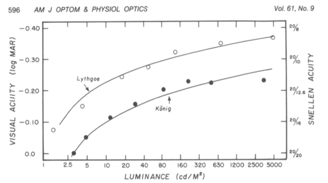
Contrast Sensitivity is a separate measurement from visual acuity. From the referenced Arditi paper: "visual acuity measurements alone are insufficient to characterize basic spatial visual function..." But I don't see where you get multiplying the ISO well established 3:1 standard by 1.5 ?? Looking at acuity vs contrast graphs is see a difference in CS as low as 5% for a 20/40 person. And as I recall the common 3:1 luminance contrast ratio included near normal vision (20/40 is near normal).
Here's a graph, (for reference logMAR 0.3 is approximately 20/40.)

In short, it appears to me the 4.5:1 contrast standard is somewhat arbitrary, and there are other more important means to improve accessibility, namely font size, appropriate polarity, and total luminance.
LUMINANCE:
NITS TO THE RESCUE! (by nits I mean cd/m^2, 1 cd/m^2 is 1 nit ... but maybe I also mean ME, nit-picking on this issue, LOL).
The sRGB spec states an 80 nit monitor, however people commonly adjust them to 120 nit to 160 nit, even more (300+ is common. Some phones do 1200). If the monitor is brighter, and the material is black text on white, the light from the monitor results in pupil contraction which improves perceived sharpness.
I'll opine that it is more important to have a monitor that is adjusted bright enough for its environment. In fact it would be a good idea to lobby the ISO for an amendment to the sRGB spec to adjust away from 80 cd/m2 to a specific luminance based on the environment. 1996 was a long time ago, and display technology has changed substantially — we shouldn't have to adjust the ROOM lighting to match the monitor, it's easier to adjust the monitor. A standard stating the max display luminance for a given ambient light would go a long way toward real accessibility/accommodation.
The main thing I am lobbying for here is a revised programatic contrast assessment that is perceptually correct. But as I research this, I see there are other concerns that should be considered.
Thank you for reading. I hope to have a solid contrast assessment model this week.
Andy
Refs: [1] https://www.schorsch.com/en/kbase/glossary/contrast.html [2] https://pdfs.semanticscholar.org/4f9f/f4bcbc0eb8d1040228e5d84cd0c0e75962c7.pdf [3] https://www.anec.eu/images/Publications/technical-studies/ANEC-final-report-1503-1700-Lenoir-et-al.pdf
Edited May 22 for typos and some clarity.
 mraccess77
commented
5 years ago
mraccess77
commented
5 years ago Hi @Myndex
Myndex
commented
5 years ago Hi @mraccess77
Thank you for commenting, it helps me to see when I am not explaining or describing completely. But perhaps more important it leads to some new discoveries. In answering your post I did some experiments that add insight. More below.
First, just to provide a little more background, I want to mention that I have personal experience with 20/200 vision. Several years ago (in my late 40s) I developed early onset cataracts which brought my vision to worse than 20/200 in one eye, the other diminished a bit less. I now have IOL implants, but those surgeries caused vitreal detachments and retinal detachments, requiring a vitrectomy in one eye, and in the other, continuing issues due to large vitreal floaters that still can interfere with reading. Also, I still need glasses (i.e. it is trivial for me to remove them to introduce poor vision).
As such WCAG is a topic I have a close personal interest in.
As I mentioned in an above post, I am an imaging professional in Hollywood with a career that spans decades and a background that includes broadcast engineering, colorist, VFX Supervisor, and perhaps most relevant, title designer.
I came across this WCAG issue while developing a CSS framework. For the color module I am trying to create a simple color subset that is both easy to read and aesthetically pleasing. This led me down the color and vision theory rabbit hole, where I stumbled on a contrast calculator and saw an odd comment by the coder who mentioned that his "calculate" button did not pass the WCAG standard. The button is completely readable with more than adequate contrast, thus started my present research journey.
I have since been doing nothing but research this issue in depth. My posts here are based on that research and my extensive experience in digital imaging.
- mraccess77 said: I agree that there are some combinations that pass that should fail and that there are some situations that fail that should pass. However, in general the algorithm works well and has made a big difference to ensure that text has better contrast.
I cannot agree here. Estimating roughly, 40% of the color pairs the WCAG math calls "PASS" are poor in quality and should fail. And somewhere in the area of 51% of colors they fail could conceivably pass.
Wrong nearly half the time is one huge fail. I believe it is the result of incorrect assumptions and cherry picking various bits of standards and cobbling them together into something that is truly inaccurate and unsuitable for the purpose.
I'm going to quote Whittle from his paper [1] (emphasis added)
With regard to the mathematical description, an important distinction is between ratios and contrast expressions that also involve differences. This concerns what is meant by ‘contrast’. Weber contrast and Michelson contrast are the commonest expressions for it, not the simple ratio L/Lb. Weber contrast = (L- Lb)/Lb, usually written ÆL/Lb. When the backgrounds are weak a ‘dark light’ constant must be included: ÆL/(Lb+L0). Michelson contrast = |ÆL|/(L+Lb). When people talk of contrast coding in the early stages of the visual pathway, they usually mean that the firing rate of sensory neurons is a function of, perhaps proportional to, Weber contrast or Michelson contrast. Such a code combines differencing (calculating L-Lb) with normalisation (attenuating by some function of the absolute stimulus level).
And then from Pelli's paper [2] (emphasis added)
The contrast of the target quantifies its relative difference in luminance from the background, and may be specified as Weber contrast Lmax−LminLbackground, Michelson contrast Lmax−LminLmax+Lmin, or RMS contrast LσLμ, where Lmax, Lmin, Lbackground, Lμ, and Lσ are luminance maximum, minimum, background, mean, and standard deviation, respectively. Weber contrast is preferred for letter stimuli, Michelson contrast is preferred for gratings, and RMS contrast is preferred for natural stimuli and efficiency calculations (Bex & Makous, 2002; Pelli & Farell, 1999). Threshold contrast is the contrast required to see the target reliably. The reciprocal of threshold is called sensitivity.
The WCAG ignores this wholesale, despite it being prominent in most research and even noted in the ISO and ANSI standards. WCAG is using simple contrast (Lw/Lk) and that is one of the errors.
Among my findings, some of the sites I have the most difficultly reading are "compliant" with the WCAG. There are countless contrast checkers and other automated or semi automated accessibility checkers that use the algorithm as written, and they all fail to detect poor perceptual contrast.
And there are a LOT of combinations that pass but are hard to read. An accessibility site has this on one of their pages indicating the problem:

The contrast checkers are all using this flawed model which ignores many important aspects of perception. The results are all over the place and inconsistent. I can see why designers are ignoring the contrast recommendations: they are ambiguous and inconsistent at best. At the moment, visual judgement does a better job than the contrast calculators.
I have a page where I am conducting live experiments in this regard, aloing with some commentary on my findings as I go along. This link is: https://www.myndex.com/WEB/W3Contrastissue
Here are some examples from today's experiments:

Today, I've been looking into luminance — it is well known and researched that increasing luminance improves readability (within a range). One thing the WCAG lacks is a specification on minimum lightness for the lightest element in a color pair.

I have more on this on the page, but as you can see, setting a minimum lightness of the lightest element to #AAA results in a consistent, readable, block of text. On the page you'll see examples where pages with 3:1 contrast and minimum #AAA on the brightest of the pair is more readable than 4.5:1 contrast on darker pairs.
- mraccess77 said: While I agree that lower acuity doesn't necessarily mean less contrast sensitivity -- once you get into the 2070 20200 levels folks tend to have eye conditions with multiple factors and there is a larger correlation between the two.
Yes, I am aware, there is definitely correlation to contrast sensitivity due to a number of vision impairments. Indeed, one can have good visual acuity and bad contrast sensitivity. The WCAG does not discuss CS though, and only lists some Snellen numbers like 20/40.
I was talking mainly of 20/40, which is what the WCAG talks about regarding AA. For the portion of the standard that relates to profoundly impaired, still the math they provide does not create useful numbers for guidance.
And that is the point I am getting at. The math is essentially wrong. Lw/Lk is not well suited for determining contrast in this context. The vast majority of research on contrast sensitivity uses WEBER or MICHELSON or both. Rarely simple contrast. But there are other math mistakes in WCAG related to sRGB and computer displays that also need to be addressed.
_(EDIT by Andy: May 2019: My recent experiments and research indicates that a "classical, unmodified Weber contrast" is really not "substantially" better than the WCAG math, though there is a modified Weber from Hwang/Peli that is much better than the WCAG math, and other more modern contrast equations such as PCL)._
- mraccess77 said: 20/40 may not be visually impaired at least by most US standards. 20/70 is generally considered visually impaired by many and I believe the criteria were written to help many of us who use vision in the range of 20/70 - 20/400. For someone with 20/200 contrast very much tends to be an important issue and these guidelines were written for folks in this range. 4.5 is very much a tipping for point for many of us and I do not agree that 4.5 is too high for someone who is visually impaired or legally blind. Many legally blind people use their vision and require this type of minimum contrast. So if the understanding text is not clear around this area then we need to update it.
I never said that 4.5:1 is too high, particularly in regards to profound impairment, 4.5:1 is TOO LOW when using the WCAG math. WCAG indicates 7:1 for the more visually impaired (AAA). And yes, the "understanding" text is all over the place and not clear.
To be clear, I am not "condemning" the 4.5:1 ratio per se, but I am questioning where it was derived from and the basis of the equations when those equations are not supported by standards nor research. I am also pointing out that luminance is a much bigger factor than contrast yet it is not mentioned, nor is local adaptation unless I missed seeing that. My statements here are from published research as well as my own research.
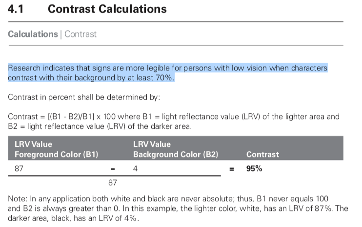
The California Council of the Blind (Lozano, 2009) states, and Federal ADA guidelines also state, that contrast for signs be 70% (note it is a percent not a ratio). The math used for the Federal standard is (B1-B2)/B1 (B1 is the lighter LRV, and B2 is the darker).[3] Now, if I use the WCAG math, 70% equals a ratio somewhere around 2.3:1 to 3.2:1. WCAG math is all over the place and does not relate to Weber's law nor anything else useful.
Nevertheless, California Council of the Blind (Lozano, 2009)[4] is on record stating that the Federal equation is flawed when B1 is less than 45. I just came across this a minute ago — I'm slightly amused as it is closely mirroring what I have been saying about the WCAG.
I describe this in more detail on the experiments page, and there are more examples.
In closing I just want to say that simply switching the equation to Weber is not the complete answer. I think we can do better, and that is the focus of my research.
Thank you again for the comments.
Andy
REFS: [1]http://aardvark.ucsd.edu/color/whittle.pdf [2]https://www.ncbi.nlm.nih.gov/pmc/articles/PMC3744596/ [3]https://segd.org/sites/default/files/SEGD_2012_ADA_White_Paper_Update.pdf [4]https://www.documents.dgs.ca.gov/dsa/access/Pt2_Final-SOR.pdfHi @mraccess77
Edited May 2019 for some minor clarity fixes.
mraccess77
commented
5 years ago Hi @Myndex I appreciate your efforts in addressing the shortcomings of the current algorithm. In your examples, I personally found some of the first 4.5 items easier to read than the ones with values greater than #AAA -- thus I know there will always be differences in interpretation by different people as we all see differently. Along those lines with the adaption you were discussing, halos may technically be used to meet the requirement but when you take into account the width of the stroke and surrounding colors haloed text can actually be harder for me to read. I agree that we want more people to use contrasting colors that meet users needs and if we can change the algorithm to meet those needs without lessening it get more adoption that would be a good thing. Personally, I see these changes as something that can't be changed with the current standard as the method is too normative to change with an errata but would be a great opportunity to address for the next version of the accessibility guidelines (silver). It would be good to socialize this with some other folks such as Jared Smith from WebAIM who also would like to change the future direction of the contrast calculations and the Low Vision Accessibility Task Force which is part of the Accessibility Guidelines Working group. Adding @WayneEDick and @allanj-uaag.
 bruce-usab
commented
5 years ago
bruce-usab
commented
5 years ago Thanks @Myndex for writing this up so thoroughly!
Myndex
commented
5 years ago 2023 edit for clarification: Weber is not the "gold standard" today, and the link to this post is an inappropriate reference made by Bengfort, as this post was part of the very early due diligence looking into the problems of WCAG 2 contrast failures. (In fact this post was made literally within the first two days of looking into and discussing this problem, four years later the body of knowledge in this area is substantially improved).
Weber is not perceptually uniform for the purpose of supra-threshold text on self-illuminated displays. Further, deeper investigation into the origins of the WCAG 2.0 contrast math shows that it is a derivation of Weber, but it is extremely important to point out that the derivation was originally intended only for 7:1, and not intended for lower contrasts such as 3:1 or 4.5:1. At 7:1, the dark color failures of WCAG 2 contrast were not as obvious.
Nevertheless the poor results of WCAG2 were used as part of the misguided 1.4.3 SC, despite the objections of major stakeholders including IBM.
Original 2019 message continues below:
Hi @mraccess77
Hi @Myndex I appreciate your efforts in addressing the shortcomings of the current algorithm. In your examples, I personally found some of the first 4.5 items easier to read than the ones with values greater than #AAA.
If that is based on the images in my post above, I should mention that the SIZE of the first set is 30% larger, and therefore easier to read (I just realized the scaling error due to how this site handles images as I looked at the post, post edited to correct).BUT ALSO, three of the first 5 have the brightest color well above #AAA. For an apples to apples comparison, please see the live experiment on the website: https://www.myndex.com/WEB/W3Contrastissue Text scaling on the site for the samples is equal in each group (the first group is general contrast assessments, and the second is body text).
thus I know there will always be differences in interpretation by different people as we all see differently. Along those lines with the adaption you were discussing, halos may technically be used to meet the requirement but when you take into account the width of the stroke and surrounding colors haloed text can actually be harder for me to read.
Indeed, for instance, research shows that most people do better with dark text on a light background (Positive Display) but with my vision, I much prefer light/colored text on a black background (Negative Display). Right now I am having difficulty with THIS site due to the bright background (L* 98 in the text area) yet for most people this is the ideal presentation.
I agree that we want more people to use contrasting colors that meet users needs and if we can change the algorithm to meet those needs without lessening it get more adoption that would be a good thing. Personally, I see these changes as something that can't be changed with the current standard as the method is too normative to change with an errata but would be a great opportunity to address for the next version of the accessibility guidelines (silver).
Yes I see it was just tagged as WCAG 2.2 which I was somewhat expecting. Correcting the algorithm also means changing the standard, as far as I can tell the current standard(s) seem to be compensating for the math issues — I don't know the complete history, but that is how it appears based on the reverse engineering/analysis.
For an errata, it might be useful to place a note to the effect of: "Current contrast algorithms may overvalue contrasts with pairs of darker colors. Designers should be cautioned not to rely on contrast numbers in these cases/"
I should note that problems and controversy on this very subject are visibly present in the research and some standards. It is partly why I am being so proactive here. I hope to cut through the clutter to bring some clarity (puns more or less intended).
It would be good to socialize this with some other folks such as Jared Smith from WebAIM who also would like to change the future direction of the contrast calculations and the Low Vision Accessibility Task Force which is part of the Accessibility Guidelines Working group. Adding @WayneEDick and @allanj-uaag.
Excellent. What are the deadlines for 2.2? As I mentioned in one of my posts while there is much research on simple monitor displays (i.e. black on white, white on black), there is not much in the way of research on complex, graphically rich content (that I've found anyway). I'm thinking some empirical studies would be illustrative.
ON ALGORITHMS:
Weber has been the "gold standard" for text contrast. But I am presently leaning toward a modified version of Perceptual Contrast Length (PCL) which "essentially" uses a modified L* type curve (perceptual lightness) in calculating contrast. I believe I have a way to adapt it so the contrast results are similar to what people are used to using (i.e. 3:1 etc).
Original post continues:
Another idea is using the difference between a brighter/darker L values (as in CIE L a b).
Those are all fairly simple models for contrast determination. A more advanced approach is a true color or image model like CIECAM02 or ICAM. ICAM is the work of Mark Fairchild at Rochester Inst. of Technology. A model like that could (I believe) analyze an overall page, as opposed to a pair of colors in isolation.
On the experiments page there is an example of local adaptation issues do to surrounding colors. But here's a quick example:
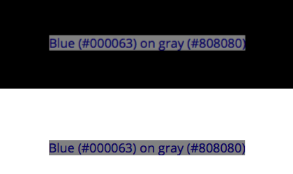
The blue text on grey is WCAG 4.5:1 contrast, and both bits of text are identical. But the one centered on black is more readable because the black allows local adaptation to the darker colors. So among other things, minimum padding for elements against a high contrasting color are important.
(I'll mention in passing that pair of blue on grey is a fail in my modified PCL algorithm).
And this is where things are more complicated than a simple contrast — web content is graphically rich. Text on a background may be a pass, but if it is far different than the overall page, adaptation will affect perceived legibility.
Thank you again,
Andy
Myndex
commented
5 years ago Thanks @Myndex for writing this up so thoroughly!
Thank you @bruce-usab — I consider this a particularly important issue, partly because W3C standards are used not just for web but for app design and other applications as well. Because it is a freely distributed standard, it has a very wide reach. Myself I spend 12 hours a day in front of monitors, while that may be more than average displays are certainly integral to the lives of so many — we are inseparable from our technology — standards like this have a very real affect on people's lives. This standard in particular has become part of government regulations, for instance.
What is the timeline/deadlines for 2.2? I'm hoping to have some candidate contrast models soon, but also thinking there is one giant rabbit hole to crawl down considering how page complexity affects perception (adaptation) etc.
Thank you!
Andy
 WayneEDick
commented
5 years ago
WayneEDick
commented
5 years ago There is a mathematical problem with this discussion line. L1 and L2 are computed using weightings that take color receptivity into account. R, G, and B have distinct weights in the relative luminance formula.
On Tue, Apr 16, 2019 at 12:32 PM Myndex notifications@github.com wrote:
Thanks @Myndex https://github.com/Myndex for writing this up so thoroughly!
Thank you @bruce-usab https://github.com/bruce-usab — I consider this a particularly important issue, partly because W3C standards are used not just for web but for app design and other applications as well. Because it is a freely distributed standard, it has a very wide reach. Myself I spend 12 hours a day in front of monitors, while that may be more than average displays are certainly integral to the lives of so many — we are inseparable from our technology — standards like this have a very real affect on people's lives. This standard in particular has become part of government regulations, for instance.
What is the timeline/deadlines for 2.2? I'm hoping to have some candidate contrast models soon, but also thinking there is one giant rabbit hole to crawl down considering how page complexity affects perception (adaptation) etc.
Thank you!
Andy
— You are receiving this because you were mentioned. Reply to this email directly, view it on GitHub https://github.com/w3c/wcag/issues/695#issuecomment-483812380, or mute the thread https://github.com/notifications/unsubscribe-auth/AH0OF8FugSGRVmc2nIyMdaxNKnTND_7dks5vhiUzgaJpZM4cui9x .
Myndex
commented
5 years ago There is a mathematical problem with this discussion line. L1 and L2 are computed using weightings that take color receptivity into account. R, G, and B have distinct weights in the relative luminance formula.
Hi @WayneEDick , thank you for commenting. I’m away from the studio, on location, so I can’t comment in depth, but:
Yes, luminance is spectrally weighted. However luminance is a linear measure of light.
Light is linear (additive) but human vision is NOT linear (essentially a power curve). So while the sRGB coefficients adjust for spectral sensitivity, luminance is NOT relative to PERCEPTION of lightness. L* is perceptual (CIELAB), and gamma encoded transfer curves are somewhat perceptual (such as luma, the Y‘ of Y‘IQ) but not luminance (Y).
But that’s not even the most relevant part. L1/L2 is called “simple contrast” and it is wrong in this context. ~The “standard” for contrast for TEXT is Weber, which is based on ∆L/L typically as
(LMax-Lmin)/Lbackground or (LMax-Lmin)/LMax
And is in fact still using linear luminance. But there are some better more modern implementations now such as Perceptual Contrast Length (PCL) which essentially converts to a modified L* (perceptual lightness)~. EDIT FOR CLARITY: WCAG2 simple contrast is essentially Weber+1, regardless, values become increasingly incorrect and lacking in perceptual uniformity as the color pair becomes darker relative to the adaptation level. Therefore they both fail for self-illuminated displays for similar reasons. This was clear a short time after making this post, but as this thread ranks highly on search engines it's useful to amend errata inline, here. End edit.
This issue came to my attention when I saw the contrast equation was wrong (as is the sRGB threshold WCAG lists), as I have outlined in my posts above. But now that this is being discussed, we can do better. I am currently investigating PCL and other methods.
For further details, I suggest Charles Poynton’s GAMMA FAQ and COLOR FAQ. Here’s a link: https://poynton.ca/GammaFAQ.html but please feel free to ask me any other questions.
-Andy
bruce-usab
commented
5 years ago @Myndex, you asked:
What is the timeline/deadlines for 2.2?
The formal/approved Project Plan has a goal of this time next year for the first public working draft.
I'm hoping to have some candidate contrast models soon, but also thinking there is one giant rabbit hole to crawl down considering how page complexity affects perception (adaptation) etc.
I am not optimistic about the chances for wholesale replacement formulas for 2.2. That is possible for 3.0.
This standard in particular has become part of government regulations, for instance.
Yes. I am one of the actors in helping that happen.
There was some user testing associated with the validation of the 2.0 formula. I could not quickly find a cite for that. My recollection is that the hard data pointed to a ratio of 4.65:1 as a defensible break point. The working group was close to rounding that up to 5:1, just to have round numbers. I successfully lobbied for 4.5:1 mostly because (1) the empirical data was not overwhelmingly compelling, and (2) 4.5:1 allowed the option for white and black (simultaneously) on a middle gray.
I am sorry to say that I will offline for the next ten days or so, but I will be circling back to this!
bruce-usab
commented
5 years ago @Myndex, this one assertion leapt at me:
The California Council of the Blind (Lozano, 2009) states, and Federal ADA guidelines also state, that contrast for signs be 70% (note it is a percent not a ratio). The math used for the Federal standard is (B1-B2)/B1 (B1 is the lighter LRV, and B2 is the darker).[3]
That formula was only ever intended for reflective light, not luminescence. It was promulgated in the 1991 ADAAG and was sufficiently problematic that is was dropped in the 2004/2010 ADAAG/ADAAS.
Your citation [3] clearly states (more than once) that 70% “is no longer a requirement”.
 alastc
commented
5 years ago
alastc
commented
5 years ago Hi @Myndex,
Just upfront - I strongly suggest we come to a resolution on this issue before you spend time creating a PR.
estimating roughly, 40% of the color pairs the WCAG math calls "PASS" are poor in quality and should fail. And somewhere in the area of 51% of colors they fail could conceivably pass.
This doesn't match my testing with people over the years. Not a large scientific study, but 100s of tests (since the early 2000s) with people with low-vision. Whenever there was a color combination that people struggled with it virtually always failed on the contrast level checks.
I've also found there are huge differences between people and the particular colors that were an issue for them. E.g. Some participants couldn't see a strong pink on white, which others couldn't ignore as it was so intense.
Broadly I think the context that you need to account for is what the guidelines are for, and how they are used. A method to measure contrast for the web content accessibility guidelines needs to:
A lot of the factors you added in the summary above cannot be accounted for in a web standard (e.g. display polarization, nits).
Also, at least some of the examples you created have the same 'background bias' effect I mentioned here, perhaps you know the name for that effect? I.e. having a different general background behind the area of interest affects the perceived readability. Reading on, I guess this is the 'local adaptation' issues?
In short, I don't think there is such as a thing as a "revised programatic contrast assessment that is perceptually correct", but I'd love to be wrong. A change would need a lot of real-world testing to ensure it provides better results.
What is the timeline/deadlines for 2.2?
Given the scale of change this would require (including the research), I suspect it would be a 3.0/Silver type of thing to do.
Myndex
commented
5 years ago @Myndex, this one assertion leapt at me:
The California Council of the Blind (Lozano, 2009) states, and Federal ADA guidelines also state, that contrast for signs be 70% (note it is a percent not a ratio). The math used for the Federal standard is (B1-B2)/B1 (B1 is the lighter LRV, and B2 is the darker).[3]
That formula was only ever intended for reflective light, not luminescence. It was promulgated in the 1991 ADAAG and was sufficiently problematic that is was dropped in the 2004/2010 ADAAG/ADAAS.
Your citation [3] clearly states (more than once) that 70% “is no longer a requirement”.
This is the section in reference [3] I was referring to (I did not read the entire document, I was mainly pointing out the continued controversy and unsettled nature of the issue):
Historical and current studies of contrast sensitivity it is typically about 1% to 1.6% over a wide range from 7 or 8 cd/m2 to over 500 cd/m2. NASA also found that under 8 cd/m2, contrast sensitivity fails increasingly.
But on the subject of reflected light vs emitted light: both can be measured in luminance. Luminance is proportional to both illuminance and reflectance.
And this is one of the HUGE ENORMOUS PROBLEMS facing us in the present conversation, I have seen two COMPLETELY DIFFERENT definitions of LRV. The correct definition of LRV is based on luminance (Y or L) which is linear light, yet some sources state it is based on lightness (L as in CIELAB, L a b) which is perceptual lightness NOT linear light.
YIKES. It appears this stems for the error in the 1991 ADAAG, which from what I have been reading was using Weber on L* and not Luminance?
Myndex
commented
5 years ago Hi @Myndex,
Just upfront - I strongly suggest we come to a resolution on this issue before you spend time creating a PR.
Hi @alastc I agree and said as much in one of my posts, it is why I am posting an issue instead of a pull request first.
estimating roughly, 40% of the color pairs the WCAG math calls "PASS" are poor in quality and should fail. And somewhere in the area of 51% of colors they fail could conceivably pass.
This doesn't match my testing with people over the years. Not a large scientific study, but 100s of tests (since the early 2000s) with people with low-vision. Whenever there was a color combination that people struggled with it virtually always failed on the contrast level checks.
That's good to know, though I am concerned about the large number of sites I encounter that pass the test yet I find very hard to read. I am less concerned with false fails and more concerned about the false passes in other words.
I've also found there are huge differences between people and the particular colors that were an issue for them. E.g. Some participants couldn't see a strong pink on white, which others couldn't ignore as it was so intense.
A "strong" pink on white should have a fairly low luminance contrast, and should fail with proper math though the WCAG math might pass it when it should fail in some cases. The problem with hue is how people with color deficient vision rely on luminance contrast. But also, a light background changes perception of text & contrast vs a dark background. I'm wondering how those who had a hard time with pink on white would have seen the white on pink.
Broadly I think the context that you need to account for is what the guidelines are for, and how they are used. A method to measure contrast for the web content accessibility guidelines needs to:
- Work across many types of visual impairment. Low vision is a general category, various forms impact color perception in different ways.
Yes the main issue is adequate luminance contrast. A useful tool for designers might be a tool that captured a website and converted it to greyscale based on luminance so the designer could see the luminance contrast without being influenced by hue.
- Work across many devices. As a web designer your work will be viewed on cheap & expensive phones, expensive Macs (or Chomebooks), cheap Chromebooks (or Windows laptops), TVs, projectors etc. Therefore it cannot account for the brightness of the display, let alone the surroundings. It has to be a measure from the way the web page is setup.
Cheap or expensive, displays are built to sRGB standards, and often with better brightness. But not the point, as the eye adapts to various conditions of light. What is important is to consider how adaptation affects readability (more on that below).
- Be simple to test. I.e. a web designer needs to be able to test their own work easily.
Most that I am discussing is simple to implement. (It's not harder to use correct math, for instance).
A lot of the factors you added in the summary above cannot be accounted for in a web standard (e.g. display polarization, nits).
It can — when I talk of polarization, I talk specifically of web DESIGN. light text on a dark background is "negative polarization" (or confusingly, positive contrast) and vice versa.
As for nits (cd/m^2) I'm not saying the web standard should specify any particular "absolute" luminance output, but the standard IS already trying to take environment into consideration
Also, at least some of the examples you created have the same 'background bias' effect I mentioned here, perhaps you know the name for that effect? I.e. having a different general background behind the area of interest affects the perceived readability. Reading on, I guess this is the 'local adaptation' issues?
Local adaptation, and adaptation in general, need to be part of the design considerations. Dark text on on a grey background may pass via the math, but if the grey background is a div with no padding on a white background, they eye adapts to the white making the dark text on grey hard to read. There is a demonstration of this on the experiments site.
In short, I don't think there is such as a thing as a "revised programatic contrast assessment that is perceptually correct", but I'd love to be wrong. A change would need a lot of real-world testing to ensure it provides better results.
There are definitely better choices than using incorrect math, which is the current state. And while vision and perception are complicated, it is also mostly academic in terms of things like contrast. There is a wealth of research on vision perception and contrast over the last several hundred years that can and should be used to guide this standard. In other words, yes there is such a thing as "programatic contrast assessment that is perceptually correct." It's just a matter of implementing it.
There may be added challenges in modern webpages due to the graphically rich content AND the variety of environments due to mobile devices. But the W3C provides the standards and guidelines not just for web design but for browser software.
(edited for spelling and some clarity issues)
alastc
commented
5 years ago False fails/passes & ‘incorrect math’: Yes there is lots of research, but any model using Mathematics is a mapping of how light is measured to how it is perceived.
There are individual differences in perception, so there cannot be a perfect model (that’s what I meant by ‘no such thing’). Otherwise the pink example wouldn’t vary by person.
A different model may improve the fit across a range of visual impairments, but it is not an absolute right/wrong. One model will not fit everyone perfectly, and we should be optimising for people with visual impairments rather than the general population.
If there is a better industry standard model to use for measuring contrast, great, let’s test it across a range of people.
There are already tools for greyscaling a screenshot, but we need to be able to assess text (and certain graphics) and show a pass/fail individually.
Web content can be defined to use color spaces other than sRGB, but we are planning to standardise testing of contrast to sRGB as a lowest common denominator.
Myndex
commented
5 years ago I am not optimistic about the chances for wholesale replacement formulas for 2.2. That is possible for 3.0.
That makes sense, there are probably some incremental changes that might be helpful as well as "leading a path" to a larger change.
This standard in particular has become part of government regulations, for instance.
Yes. I am one of the actors in helping that happen.
Ah excellent! However, that also means that the standard needs to be solid and unimpeachable. I'd like to help to get to that point.
There was some user testing associated with the validation of the 2.0 formula. I could not quickly find a cite for that. My recollection is that the hard data pointed to a ratio of 4.65:1 as a defensible break point.
Hmmm. I'd love to see this data. I believe you that the ratio from the data is higher that other standards as the equation being used overstates the contrast ratio in addition to being perceptually incorrect.
The working group was close to rounding that up to 5:1, just to have round numbers. I successfully lobbied for 4.5:1 mostly because (1) the empirical data was not overwhelmingly compelling, and (2) 4.5:1 allowed the option for white and black (simultaneously) on a middle gray.
I'm not sure it does, as written the equation is overstating contrast for darker colors. It appears the equation does not take system gamma gain into account, nor the floor of 8 cd/m2 in terms of minimum luminance for contrast (NASA). More discussion to come on these issues.
QUESTION: it would be helpful to get online access to certain ISO standards, as well as papers used in the current specification — is that possible?
Thank you!
patrickhlauke
commented
5 years ago Ah excellent! However, that also means that the standard needs to be solid and unimpeachable. I'd like to help to get to that point.
Just for context though, the formula was already in WCAG 2.0, and that's been out since 2008 https://www.w3.org/TR/WCAG20/ ... so just a word of warning that it's something deeply enshrined and not something that can be changed quickly or easily. It would take a few years at least...
Myndex
commented
5 years ago Just for context though, the formula was already in WCAG 2.0, and that's been out since 2008 https://www.w3.org/TR/WCAG20/ ... so just a word of warning that it's something deeply enshrined and not something that can be changed quickly or easily. It would take a few years at least...
HI @patrickhlauke, Yes, I do realize this and recognize the issue. I'm certainly not expecting any overnight major change! As I mentioned in one of my posts, I am looking at potential incremental changes that can lead to a more solid solution.
At the same time there are a lot of other related standards that use different models and compliance parameters. Nearly all of them are using Weber, but there are newer more useful models emerging.
I mentioned some of the reasons I'm motivated for some positive changes here — and to be clear, my intent is to assist in finding easy and workable solutions to the issues I've outlined, and perhaps others.
As CSS, Java, HTML develop into greater feature sets, I've noticed a disturbing trend toward sites that are "fancy but less useable." So much so that many browsers now have the reader view to turn off all the crap!!!
WayneEDick
commented
5 years ago Here are my questions. When you use the term spectral in the sense of functional analysis? While gamma is not a linear function it is differentiable and can be represented piecewise by line segments without? Are you saying the W3C representation does not use enough line segments in it's approximations? Or are you saying that gamma does not come into the equation? Finally what is your formula precisely including visual factors. I would like to analyze this. I am a mathematician.
Sincerely, Wayne Dick PhD.
On Fri, Apr 19, 2019 at 3:41 PM Myndex notifications@github.com wrote:
Just for context though, the formula was already in WCAG 2.0, and that's been out since 2008 https://www.w3.org/TR/WCAG20/ ... so just a word of warning that it's something deeply enshrined and not something that can be changed quickly or easily. It would take a few years at least...
HI @patrickhlauke https://github.com/patrickhlauke, Yes, I do realize this and recognize the issue. I'm certainly not expecting any overnight major change! As I mentioned in one of my posts, I am looking at potential incremental changes that can lead to a more solid solution.
At the same time there are a lot of other related standards that use different models and compliance parameters. Nearly all of them are using Weber, but there are newer more useful models emerging.
I mentioned some of the reasons I'm motivated for some positive changes here — and to be clear, my intent is to assist in finding easy and workable solutions to the issues I've outlined, and perhaps others.
As CSS, Java, HTML develop into greater feature sets, I've noticed a disturbing trend toward sites that are "fancy but less useable." So much so that many browsers now have the reader view to turn off all the crap!!!
— You are receiving this because you were mentioned. Reply to this email directly, view it on GitHub https://github.com/w3c/wcag/issues/695#issuecomment-485030931, or mute the thread https://github.com/notifications/unsubscribe-auth/AB6Q4F4R2KE2T7DNR7IJLFLPRJDDJANCNFSM4HF2F5YQ .
Myndex
commented
5 years ago There are individual differences in perception, so there cannot be a perfect model (that’s what I meant by ‘no such thing’). Otherwise the pink example wouldn’t vary by person.
Pink/white relates to hue contrasts. The more perfect accepted model is luminance contrast as it's connected to contrast sensitivity. CS threshold is 1%-1.6% over the wide range of 8 cd/m2 to over 500 cd/m2, as shown in study after study, including many visual impairments. There are of course some impairments that directly affect CS/CSF, but contrast sensitivity is separate from visual acuity.
Visual acuity is helped more by size than contrast. perceived contrast is more complex than a ratio between two colors as it is substantially affected by adaptation, local adaptation, chromatic aberation, and other issues.
CHROMATIC ABERRATION: So this relates to an optical issue with any lens system, including human eyes. Light at different wavelengths are "bent" differently through a prism, which is why a prism creates a "rainbow". Lenses are a form of prism, and blue light through a lens lands in a different spot than red light as a result. (It is theorized that this is why our eye evolved to have red cones in the center and blue cones on the periphery). But this is a reason that red (#F00) and blue (#00F) look wacky together - the shared red/blue edge focus to different places on the retina. The hot pink you mention is #FF00FF - so red and blue with no green, the red portion of the text edge focusing differently than the blue edge. So for instance, working with colors that have a high blue content needs care, as NASA discusses:
https://colorusage.arc.nasa.gov/blue_2.php
That NASA site covers a lot of related material, and it is all about user interface design considering adverse viewing circumstances.
If there is a better industry standard model to use for measuring contrast, great, let’s test it across a range of people.
The "standard' has been Weber the 1800s. There are better models now, and particularly as web pages are a "unique environment" in that they are displayed using certain standards, there are definitely better ways to assess perceptual contrast.
Secondary notes
There are already tools for greyscaling a screenshot, but we need to be able to assess text (and certain graphics) and show a pass/fail individually.
Okay, but as I have demonstrated and discussed, the ratio of two colors by themselves in isolation will not give you a complete answer.
Web content can be defined to use color spaces other than sRGB, but we are planning to standardise testing of contrast to sRGB as a lowest common denominator.
Hmmm, no you can't. The standard is still sRGB. the CSS 4 working draft does list additional working color spaces as something desired for future implementation, but that's a pretty horrible idea at today's level of technology. sRGB is ideal for 8 bit. Any larger colorspace and you start needing at least 10 bit pretty quick. I see talk of linear_sRGB or linear_Rec2020 - then you need at least 16bit_HALF(FLOAT). Double bit depth and you double data size, and pages are ALREADY overbloated and slow. And you'll NEVER see the benefits under typical ambient conditions and cheap devices.
To wit: bigger color spaces do absolutely ZERO to assist impaired vision, There is ZERO luminance contrast difference (and it's worse if you stay in 8 bit: A super-big space like ProPhoto is GARBAGE on 8 bit, and will provide WORSE contrast gradation (i.e. causes banding) due to the ginormous delta E errors. NOT TO MENTION the fact that ProPhoto uses IMAGINARY primaries, meaning that values like #00FFFF DO NOT EXIST in ProPhoto as something you can see.
Most mobile browsers and many desktop browsers still do not support any form of color management. sRGB is the standard, and is expected remain that way for the foreseeable future. The CSS tag for alternate colorspaces is not.
FOR ACCESSIBLE: 8 bit and sRGB (and Rec709) is the ideal standard at present technology.
Yes, there are some emerging color spaces like Rec2020 that are bound to make a difference someday but all these alternate color spaces have different transfer curves and different primary coordinates. Converting between spaces is computationally expensive, which is why most mobile browsers are NOT color managed and instead are sRGB "compliant".
I have high end $$$ wide gamut monitors (which are probably what caused my early cataracts), but those are rare — sRGB/Rec709 define nearly all distributed content be it Web or Broadcast worldwide, and in a non-color managed way. If you use monitors OTHER THAN sRGB/Rec709, then you MUST have color management to transform colorspaces, and that is computationally expensive. I discuss some of this in some articles I've written over the years reprinted here: https://www.generaltitles.com/helpfiles/13-q-a-blog/colorspaces-and-file-types but still, Poynton's Gamma and Color FAQ are a good and easy read first: https://poynton.ca/GammaFAQ.html
Thank you for the comments!
Andy
Myndex
commented
5 years ago Here are my questions. When you use the term spectral in the sense of functional analysis?
Hi @WayneEDick !
This is part of the CIE 1931 standard on luminance, the Y in CIEXYZ. The standard is spectrally weighted relative to the LMS cones (red green blue cones) that make up human trichromatic vision.
The coefficients 0.2126, 0.7152, and 0.0722 are part of the Rec709 standard for HDTV, and sRGB is derived from that standard. Both Rec709 and sRGB use the same color primaries and white point — the only practical difference is the transfer curve (effective gamma) is a little different between sRGB and Rec709, the reason being that Rec709 gamma is relative to a dark living room and sRGB is relative to a brighter office type setting.
Charles Poynton's Gamma FAQ is really the best crash course on this.[1]
While gamma is not a linear function it is differentiable and can be represented piecewise by line segments without?
Gamma is one form of a "transfer curve" to transform a particular color value from one colorspace to another. It is often represented "piecewise by line segments" as what we call a LUT (look up table). LUTs are very common in the film/television industry because the color represented in negative film is sufficiently complicated that it can't be accurately represented with a simple equation or matrix. 3D LUTs are used to create accurate transforms through various color spaces in the post production process.
Some color spaces like Adobe98, use a pure exponential transfer curve.
BUT ALSO: the sRGB and Rec709 transfer curves in their "correct" implementation use a combination of an exponential curve attaches the a linear region near black. The linear region has a number of purposes and motivations, including reducing camera noise near black and math issues with pure exponential curves near black.
Are you saying the W3C representation does not use enough line segments in it's approximations?
It uses "none" because luminance is linear, as in a straight line. Luminance has no gamma (or technically, the gamma is 1.0). Luminance is proportional to light, and light in the real world is linear.
The human eye is NOT linear, photopic vision has a gamma of around 2.4 to 2.5 (though vision is more complicated due to adaptation, scoptic (rod/dark night) vision, etc.)
L* is based on human perception. Luminance (not shown) would just be a straight diagonal line from 0,0 to 100,100.

Or are you saying that gamma does not come into the equation?
Right now human perceptual contrast is not represented in the WCAG "Understanding 1.4.3."
Luminance is derived by first applying the reverse transfer curve to each of the R´G´B´components, then multiplying them by the coefficients, and then summing them for the total luminance (Y but sometimes shown as L but NOT to be confused with L*).
THEN they use a simple contrast ratio Yhi/Ylo or as they print it L1/L2. They also add 0.05 flare to each term. ((L1 + 0.05)/(L2 + 0.05)).
So here is the point I was getting at: the use of L1/L2 is only useful for very absolute black & white values, because it ignores a lot of what happens with perception of in-between values.
The "standard" math for contrast of TEXT is WEBER CONTRAST which uses the Weber fraction, which is ΔL/L — Weber has been around for a very long time, and most contrast standards and research are based on Weber or Michelson, not simple contrast. Simple contrast is used for example for the contrast of a monitor from maximum black to maximum white, but not for the in between values.
EDIT: Weber contrast is often stated as (Ybg-Ystim)/Ybg, but this can result in odd results. For monitors/displays, try (Ylightest- Ydarkest) / Ylightest
I am NOT saying that Weber is the ultimate solution, but it is what jumped out at me when I was investigating why web contrast calculators were presenting "weird" numbers relative to legibility. This led me on this path of "how did we end up here" which has now morphed into "what is the most useful modern perceptual contrast calculation."
Other notes on WCAG math: The sRGB conversion to luminance is using some incorrect values. The problem is minor and likely has little effect on the contrast issue, but I will show to the correct sRGB formula below.
Also, just FYI the coefficients must be applied only after the gamma is removed, but there is an interesting wrinkle here: even the "correct" luminance math does not account for system gamma gain. There is an additional 1.1 or 1.2 exponent applied to the signal by the monitor/display. This is common even in older systems like NTSC, which used a 1/2.2 exponent at the camera, but the CRT display was actually ~ 2.5 resulting in a system gamma gain at final display. Final display gamma can in fact be adjusted by the user with the monitor controls (that adds the uncertainty aspect to all of this). But I did notice that when I added a 1.2 exponent to the resultant luminance, it improved the perceptual uniformity of the resultant reported contrast (at least it seemed to, I have not run a real controlled study yet).
Finally what is your formula precisely including visual factors.
I suggest looking at Weber contrast, Michelson contrast (aka modulation), but also two modern methods that I am investigating and experimenting with, Bartleson-Breneman Perceptual Contrast Length[2], and one I just recently found that apparently is the basis for the Australian accessibility standards, the Bowman-Sapolinski Equation [3], though I;m not certain it can be used on CIE Y (Luminance). And then there are methods using L (perceptual lightness from CIE L a b) instead of luminance, in that case, it's not usually a ratio, but a difference (L1background - L2 foreground) as L* is perceptually uniform.
So for normalized values of 0 is min and 100 is max:
Y (luminance) 0 = L 0 = sRGB 0 and Y 100 = L 100 = sRGB 100 BUT Y 18.4 = L* 50 = sRGB 46.7
This is because the perceptual halfway point between black and white is not a luminance of 50, but a luminance of 18.4 but on the perceptually uniform L* curve, the halfway point is 50. On sRGB its about 46.7 because as I mentioned earlier, sRGB has additional system gamma gain. Adding an expoinent of 1.102 to Y will put Y 18.4 at sRGB 50 for example (and I'm not saying that necessarily "should" be done, just that's how the math is for comparison).
I would like to analyze this. I am a mathematician. Sincerely, Wayne Dick PhD.
That is REALLY awesome to hear, I was hoping a mathematician would get involved. I have some planned experiments this weekend, I'll post more as I progress.
Note: the correct luminance calculation for sRGB -> D65 Y is:
From 8 bit R´G´B´, divide each channel R´G´B´/ 255 to get them 0-1, then
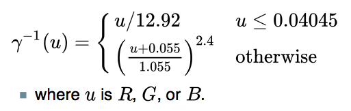 This reverses the gamma resulting in linear RGB, then
R 0.2126 + G 0.7152 + B * 0.0722 = Y (D65 luminance)
For your cut and paste convenience, here is the gamma-to-linear portion from my OO spreadsheet:
=IF( R1 <= 0.04045 ; R1/12.92 ; POWER(((R1 + 0.055)/1.055) ; 2.4) )
ALSO if you are looking at other color transforms, we are only concerned with D65. Some CIEXYZ and L a b* transforms use a D50 whitepoint, which should not be a part of anything we are doing with monitor contrast, it's D65 only.
[1]https://poynton.ca/Poynton-color.html [2]https://icdm-sid.org/downloads/idms1.html [3] https://bcdg.hoop.la/fileSendAction/fcType/0/fcOid/330620847500650652/filePointer/330902322495002398/fodoid/330902322495002396/Color_Contrast_Scientific_Report.pdf [4]http://www.brucelindbloom.com/index.html?Math.html
Myndex
commented
5 years ago So today I came across this recent research at NIH (just a couple years ago) that directly states what I have been attempting to explain in the above posts. While they don't mention the WCAG, they do use the WCAG simple contrast ratio (CR) equation as a comparison to their modified Weber equation, including the WCAG's 5% ambient component.
The paper states specifically (emphasis added):
The contrast ratio (CR) based visibility predictions fail because it does not consider the function of the observer’s visual system. Human vision achieves high dynamic range through luminance (retinal) adaptation. As the overall scene luminance increases or decreases, the viewer’s adaptation level normalizes the target to background luminance difference, and perceives the same contrast (contrast constancy). For example, a large absolute luminance difference displayed under high overall luminance condition is perceived to have the same contrast as a lower absolute luminance difference displayed under low overall luminance condition. This characteristic is embedded in the Weber contrast definition.
NIH PAPER: https://www.ncbi.nlm.nih.gov/pmc/articles/PMC5489230/
They do modify Weber a little differently than I have, and their results are interesting and provide a further demonstration of the problems with "simple contrast" (CR). There are a couple small caveats I'll discuss after the summary. The paper is a short read, but here's a synopsis:
The WCAG contrast ratio (CR) is (Llight + 0.05)/(Ldark + 0.05)
The modified Weber is: (Llight - Ldark ) / (Llight + 0.05)
CS Log plots of contrast versus ambient light:
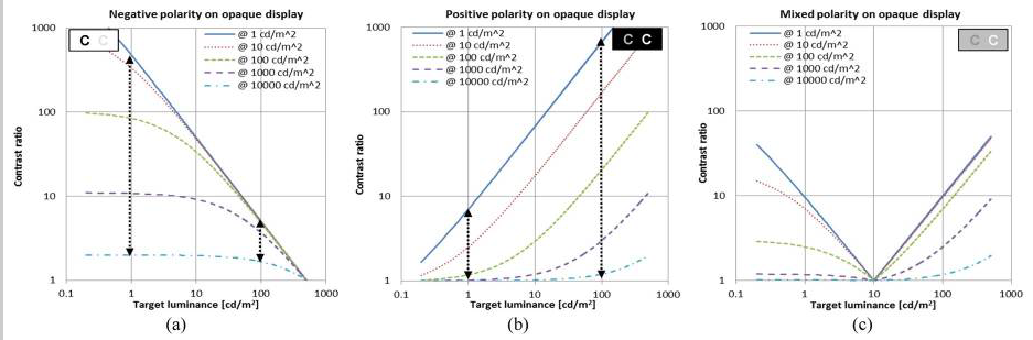
CR Plots suggest that when the display viewed indoor is moved outdoors under bright sunlight condition, the visibility reduction of the high contrast letter is much larger than the low contrast letter (the opposite of what happens in the real world).
CR Plots show patterns of contrast ratio change under the same changes in ambient luminance condition are different for the two contrast polarity cases, again opposite the real wolrd case.
Modified Weber log plots of contrast versus ambient light. Note that Weber is not a ratio, but a value ov 0 to 1 (which can be *100 and described as a percentage, like Michelson):

The Weber contrast of target decreases rapidly to zero (0), as the target luminance approaches near to the background luminance level, while it converges slowly to contrast of 1.0 as the target luminance depart from the background luminance level at all ambient light conditions.
the impact of ambient light variation is much stronger for positive contrast polarity than negative polarity contrast. (Note: this report uses contrast polarity, so positive contrast polarity is light text dark BG, this is opposite from "screen polarity" where positive means dark on light BG, which I used in another post above).
The contrast threshold can be drawn on the plots as a black horizontal line. Any target with contrast (including the impact of ambient light) below the threshold line will not be visible to the viewer.
An image composed of both contrast polarities letters (Fig. C), it is expected that even for letters of the same contrast, those darkTX-on-lightBG letters disappear first (becomes lower than contrast threshold), as ambient light increases. These results on the mixed polarity are particularly important as it suggests an effective way to compensate for the ambient light.
Some thoughts:
1) TERMS: I have seen in the research two different polarity types. Contrast polarity, where black text on a white BG is called NEGATIVE, and screen polarity where black text on a white BG is called POSITIVE. Gee can we be more confusing?
For the purposes OF THIS DISCUSSION THREAD, I want to offer these (hopefully more clear) terms based on acronyms:
WOB: for white on black, any light text on any darker background. BOW: for black on white, any dark text on any lighter background.
And maybe:
WOG and BOG, where the background is near a middle grey value.
2) The cited report describes what I have found regarding the perception difference of WOB vs BOW page designs. The implication as I have stated earlier is that there need to be a separate accounting or specification depending on design polarity.
3) The report also shows that BOW is the most stable under ALL ambient conditions, while WOB is more susceptible to brighter ambient conditions, and the middle-grey-background version (C) emphasizes this even more. This directly supports my earlier suggestions that the minimum value for the BRIGHTEST element be around #AAA (or somewhere between #999 and #AAA, TBD).
Next Post: Path Forward.
Myndex
commented
5 years ago Based on all the research and discussion THUS FAR, I see the following general path forward as far as changes and pull requests for the WCAG:
WCAG 2.2 (and possible errata for 2.1/2.0)
WCAG 3.0
THREADS: Should we create a new thread for 3.0, and then set the discussion here just to the incremental changes I've proposed for 2.2?
Thank you all again for all comments and thoughts.
Andy
Myndex
commented
5 years ago Hey @bruce-usab for when you get back, there are a couple interesting things to mention.
as an interim "minimum value" for the lightest element, pending further study.
On a thread at hoop.la: https://bcdg.hoop.la/topic/cbc-1115b-6-3-compliant
Sharon Toji says:
It is not (45 LRV) in the code, due to the fact that, as I said in my post, designers stopped it. We had passed it in ANSI, for instance, and they showed up at the next meeting in force, suits and briefcases, and defeated it with a tie vote broken by the Chair against what had been a fairly good margin in favor. They used every dirty trick in the book to do this, including out and out lies.
Then, we had voted to include it in California, unanimously, in the Access Committee, and the DSA, without telling us, did not include it in the code changes on the grounds that it had been voted down in ANSI! I was never even asked for the background! We had a scientific committee working on this for a full year, vision and color experts. The Access Board had a study on contrast that specifically stated that you had to include a minimum for the lighter of the two LRVs in order for the formula to work. Such is the power of designers who want to continue with signs that have little or no dark/light contrast.
The 45 LRV was VERY conservative. It allowed literally thousands and thousands of color combinations. However, they mindlessly shot it down, even though they all acknowledge that the formula is flawed without it.
I find this interesting, along with the Cal Blind Inst. assertion regarding 45 LRV, and how it correlates to my suggestions regarding making #A0A0A0 (Luminance 35%) or #AAAAAA (Luminance 40%) as the darkest value for the lighter of two elements. 45 LRV is sort of similar to #B3B3B3, but an important difference is that at 45 LRV, there is the implication that the eye is adapted to an illumination that's 55% brighter (I.e. if 45 LRV measured as luminance 225 cdm2, then we can assume an illumination that creates 450 cdm2 on an LRV of 90.)
On a monitor in an office, with an ambient Lux of 64, and a monitor white of 100cd/m2 (at #FFFFFF), #AAAAAA would end up as 36 to 40cd/m2, and #A0A0A0 as 31 to 35 cd/m2, depending on monitor adjustment.
Here are some examples:

Two things to notice in the above example: One is that the text is becoming difficult to read, and also notice the WCAG contrast ratios - the top is 4.5:1 and the bottom is 8:1, yet the apparent contrast difference between the two is hardly noticeable.
And the same two grey elements but now on black instead of white:

Both are now easier to read, and ALSO the contrast difference between the 4.5:1 and the 8:1 is a little more obvious. Nevertheless allowing the brightest element to go much below #A0A0A0 starts to really impact legibility, regardless of the reported contrast.
This has led me to consider something that I think could be part of WCAG 3.0, and that is looking at three colors, instead of just pairs: That is, the overall luminance of a webpage is what the eye will tend to adapt to, and then the smaller elements are thus affected. The context of the contrast a specific pair of colors is thus enhanced or degraded by the overall page luminance.
BUT GETTING BACK TO MINIMUM LUMINANCE
Nevertheless, in the interim, I am suggesting that #A0A0A0 (35% luminance) be the darkest level for the lightest element. At the moment, the WCAG math allows for #747476 (17.5% luminance) to be the lightest element if the darkest element os #000. IMO that's barely readable in typical ambient light:

Setting a minimum luminance of 35% instead of the current minimum for 4.5:1 at 17.5% reduces "available colors" 21% (65/82.5 = 79% of the colors), but many of those 21% are hard to read pairs (depending on a number of other considerations as mentioned). With WCAG 4.5:1 contrast, 35% as a minimum for the lightest element gives easy to read color pairs, here are some examples using colors other than grey:

If we split the difference, linearly, between 35 and 17.5 it.s 26.25 or #8C8C8C, I think it's getting challenging, again of course this is conditional on ambient lighting, but these darker samples do much worse as ambient light increases.

Interestingly, 30% luminance (#959594) is naturally the darkest value of the lightest element at the WCAG 7:1 ratio for AAA/Enhanced Contrast. So the comparison of the darkest 7:1 pairs against the brightest 7:1 pairs:

All these are at WCAG 7:1. As expected the first two darker pairs have lower perceived contrast than the next two brightest pairs. The last example is #A0A0A0 as the minimum luminance for the lightest color, and it still has good contrast. While this isn't an exhaustive study, it does provide some justification for setting #A0A0A0 as a minimum value for the lightest color, when relating to text elements.
 svgeesus
commented
5 years ago
svgeesus
commented
5 years ago Just discovered this thread and working through it.
I agree with the general observation that a simple, flare-corrected luminance ratio is not perceptually uniform and will thus give both false positives and false negatives. It also fails to take into account chromatic contrast (background/foreground pairs which are complementary colors will have higher perceived contrast than gray pairs of the exact same luminances).
On the other hand, WCAG is probably not the place to put a full-on color appearance model with tightly defined area, surround and viewing condition requirements.
I think this is an interesting topic and it would be great if a future version of WCAG could use a better contrast metric.
BTW reading through, one statement jumped out at me as being clearly incorrect:
Part of the reason this is happening is using simple contrast (L1/L2) on linear luminance which ignores the non-linear nature of human perception, as well as ignoring the monitor gamma.
The part about monitor gamma is false. The equation for computing luminance (from sRGB, although the same steps are used for other RGB spaces) takes these steps:
@Myndex given your background I am sure you know this, so I am very puzzled by that part of your comment. Unless you intended to indicate that monitor gamma is in some ways similar to the non-linear curve used in, for example , luminance to lightness conversion?
Y is the luminance term (currently described somewhat loosely as "rightness" etc in WCAG, but it is clearly luminance that is used).
edited to add:
It appears the equation does not take system gamma gain into account,
Aha, I suspect you were thinking of overall, end-to-end system gamma, not monitor gamma specifically. If so, that makes more sense to me.
svgeesus
commented
5 years ago excessive flare luminance
I don't think it is excessive. In comparison with all cinema and much TV, which is viewed in a very dim to near black viewing environment, the Web is used in what the original sRGB proposal called "standard office" environment and the contribution of viewing flare to an RGB black are significant (even worse on most projectors used for slide presentations and the like, where "black" is clearly a mid grey at best).
Of course this depends greatly on the actual ambient illumination, and the reflectivity of the display surface which does vary a lot (matt screens, glossy screens, etc).
So a 5% viewing flare (as a standard one-size-fits-all value, as opposed to making each tester actually measure the environment) seems perfectly reasonable and if anything, something of an under estimate.
svgeesus
commented
5 years ago The sRGB spec states an 80 nit monitor, however people commonly adjust them to 120 nit, 160 nit, even more.
Yes, this is a known issue; I also raised it for CSS Color 4.
80 cd/m^2 is clearly very incorrect, and attempts to use this value (when compositing SDR Web content on HDR mage or movie content, for example) give wildly incorrect results.
svgeesus
commented
5 years ago Estimating roughly, 40% of the color pairs the WCAG math calls "PASS" are poor in quality and should fail. And somewhere in the area of 51% of colors they fail could conceivably pass.
Wrong nearly half the time is one huge fail.
I agree completely with this assessment.
svgeesus
commented
5 years ago But I am presently leaning toward a modified version of Perceptual Contrast Length (PCL) which "essentially" uses a modified L* type curve (perceptual lightness) in calculating contrast.
Could you elaborate a bit more on why it is necessary to modify the L* equation? I'm aware of the more recent (than 1976) color difference formulae which start from pairs of Lab values and then modify the color difference (e.g the delta E 2000 formula or the CMC formula) but from memory (I'm away from my library right now) this is primarily to deal with deviations from perceptual uniformity in Lab in different areas of the chromatic space.
svgeesus
commented
5 years ago @Myndex I'm really liking the changes you propose, specifically the ones that make the overall system less sensitive to changes in ambient level. With the rise of mobile, Web content is now consumed in a huge variety of viewing environments from fairly dim (browser on a TV in a domestic, evening setting) to normal office environment to cloudy outside to sunny outside.
Any advice that could be given to content developers to maintain adequate contrast in a wide range of viewing conditions (such as the wider padding on dark backgrounds, to help local adaptation of the eye) is very valuable.
svgeesus
commented
5 years ago The TL;DR summary of my views on the proposal: strong agree, both for the fairly modest changes for 2.2 and the more important and meaningful changes for 3.0. I have minor quibbles with occasional points of detail, but the proposal is well argued, well-referenced, coherent, and deserves to be very seriously considered. Bravo!
bruce-usab
commented
5 years ago @Myndex asked about the ratios settled for with 2.0, and I have dug some of that up, but I am still looking for more. The 03-Nov-08 Proposed Recommendation had 5:1 ratio in 1.4.3, so the change to 4.5:1 was quite late in the process. All the Issue Disposition Report says is:
Note that based on implementation feedback, we have changed the ratio for SC 1.4.3 from 5:1 to 4.5:1. Also, here is a list email noting At risk SC - 1.4.3 Contrast from 1/1/2008.
Myndex
commented
5 years ago Hi @svgeesus !
I am so happy you joined this thread, I'm a big fan of your posts elsewhere — I find we are normally in agreement, and you always bring an additional perspective to complex and difficult or abstract issues.
The TL;DR summary of my views on the proposal: strong agree, both for the fairly modest changes for 2.2 and the more important and meaningful changes for 3.0. I have minor quibbles with occasional points of detail, but the proposal is well argued, well-referenced, coherent, and deserves to be very seriously considered. Bravo!
Thank you very much. this contrast issue became a central focus that I came across while working on a larger project relating to color (namely, a CSS framework, and a planned series of articles). Since I came across this contrast issue, I have dived deeper down the color perception rabbit hole than I can remember (hint: it's a really deep hole, LOL)
And it sounds like I need to review some of my early posts if I am not making complete sense. Not only that but some of my initial opinions and hypotheses have shifted, others strengthened, and new ones have emerged.
I do want to address any confusions of course. Just briefly my background is film/TV in Hollywood, VFX, Editing, Colorist, etc. (I'm normally listed as Andrew Somers in credits). We do nearly all of our work in a 32bit float linear workspace, meaning gamma 1.0 (flat diagonal line from 0 to sun, no curve) as is common today.
BACKGROUND ON TERMS THAT HAVE CAUSED CONFUSION: In the early days of digital filmmaking, Kodak developed Cineon and the 10bit per channel .cin file which became DPX. The data in the file of a scan of a film negative, and was referred to as being "log". Because the "opposite" of log in linear, this led many in the industry to calling video "linear" and DPX "log", despite the fact that video has a gamma curve. You can probably imagine the amount of confusion and frustration this caused, including an ugly shouting match between me and a certain well known colorist over issues caused by the resulting miscommunication.
I have always used the term linear to mean what it is: a straight line that represents the additive quality of light as it exists in the real world. This is in part thanks to my friend Stu Maschwitz (formerly with ILM and his company The Orphanage) who has been evangelical regarding linear, see his blog https://prolost.com/blog/2005/5/15/log-is-the-new-lin.html
The authority I always point to most of course is Charles Poynton who has been instrumental in setting hte record straight on these issues.
So my point is it's more than a little oops on my part if something I said regarding linear/gamma/perception wasn't clear, I'll review that soon/this weekend. I've also been working up a glossary and list of references to add some clarity to this thread, thank you for pointing those out.
But I was not trying to imply that monitor gamma was not dealt with or ignored — What I was trying to say was that luminance is linear and therefore is far from perceptually uniform, and simple contrast fails to accommodate perception.
On some of your other questions: But just to address what I was saying briefly to perhaps clarify: Simple Contrast (SC) does not take human perception into account. The SC math is (L1/L2) and is really only useful for the ratio between 0 or min, and max. It should be noted that between 0 and max, a variant of Weber is the same: (Lmax - Lmin)/Lmin so if Lmin is close to zero (0.04) and max is 100, then you have 99.6/0.04 which is not significantly different than L1/L2 and because it is at the extremes, the gamma curve doesn't play into it. L1/L2 is how manufacturers define the "total contrast" of their monitors, and it's a fine metric for that (though the newest monitor standards (SID IDMS, that are replacing VESA) are using Perceptual Contrast Length (PCL) I pasted a screen shot below).
SC (simple contrast L1/L2) uses luminance as input values, and so does Weber and Michaelson contrast for that matter. In fact so does PCL before it converts luminance to more or less an L* curve. But L1/L2 is not suitable for describing perception of text contrast. Weber is more the standard for text. I was really talking about the contrast equation, not so much the alphabet soup of light and perception measurements.
Nevertheless as for monitor gamma, I believe I was partly referring to system gamma gain, something I found in experiments was adding in the expected sRGB system gamma gain of 1.1 improved the perceived contrast vs the reported contrast numbers. But also, I think I was stumbling through trying to relate why simple contrast failed to accommodate perception, and pointing to gamma and other perception curves. I have a much better description I'm posting later with the glossary.
Also those statements on the problem were early on and perhaps a little premature as I had not completed a series of tests, and I hope I didn't add to confusion — going back to edit some of the earlier posts now.
So I'm pretty sure we're on the same page.
On excessive flare: one of the little bones I have to pick is that some of the WCAG is based on obsolete working drafts, even when there is a claim to be using a standard — sRGB working draft vs IEC standard is one example. The sRGB working draft is not the standard, but WCAG is using (incorrect) math from it, and also a 5% flare figure. From what I've seen in the IEC standard, the flare is defined as 1 cd/m^2, although I have also seen 0.2 nit and 4.1 nit (I don't have the most current IEC at my fingertips at the moment). And that original draft, plus some of the standards like the 1988 ANSI are based on CRT monitors, not LCD. LCD screens have a very different flare characteristic. Consider that CRTs were curved making them a glossy specular fisheye reflector on top of phosphor dots that themselves where highly reflective, coupled with low output (80 cd/m^2 LOL!) there's little comparison to modern LCD and especially mobile devices.
Modern LCDs are flat, and either matte or high gloss, and substantially darker in ambient than a typical CRT. Because they are flat, they can be angled to exclude bright light source reflections, especially the high gloss ones (the persistent problem with the high gloss is the mirror effect, bad for Hawaiian shirts!)
For mobile? iPhones are over 700 cdm^2, and Samsung has phones with over 1100 cd/m^2. To couple with this, relevant research shows that flare causes problems in the blacks, and becomes a non-factor as screen luminance increases. (All this again showing how out-of-touch the sRGB 80 cd/m^2 spec is).
I measured several monitors around the studio here, with monitors off (so measured flare/amb reflection only) some near daylight windows but no direct daylight on the monitor face — all measured less than 1 cd/m^2 per my Sekonic Cine 558. Not exhaustive by any means, but definitely a different world from CRTs.
But my other issue with the 0.05 "flare" is that it seemed more like a way to brute force the SC into something more useful, along with setting the contrast standard to 4.5 which seemed a bit of an odd number compared to existing standards (which usually specify 3:1 & 7:1).
As such, I suppose I shouldn't use the word "excessive" as you point out mobile has made ambient conditions an even more complicated issue. IN FACT: Perhaps there needs to be a different standard for mobile vs desktop.
Lstar The current standard isn't doing anything with L, but on the subject of "why modify L ", I'm not saying "should" just that some experiments I've conducted with various contrast methods — Weber, Michaelson, PCL, Bowman, along with some of my own using additional exponents or offsets to adjust for various perceptual needs. Experiments are asking questions like, is it possible to have a single equation that takes negative/positive design polarity into account, or do we need to adjust the curve near black, etc etc.
As an example the PCL equation I'm testing is from the SID IDMSv1p03b.pdf monitor standard, and it uses a bunch of weird exponents, but if you break it down it is very similar to L* in terms of curve shape but with significant changes near black. Here's the PCL math from the IDMS standard:

It looks like PCL may be derived from some of Mark Fairchild's ICAM image appearance model, but I haven't gotten too deep into iCAM, as I think "that level" is a WCAG 4.0 kind of idea.
At the moment I'm working on a web app test to test some of these ideas on a wide base of test subjects.
Again, I thank you for your comments, good to know when I stop making sense! LOL.
Andy
Myndex
commented
5 years ago @Myndex asked about the ratios settled for with 2.0, and I have dug some of that up, but I am still looking for more. The 03-Nov-08 Proposed Recommendation had 5:1 ratio in 1.4.3, so the change to 4.5:1 was quite late in the process.
Thank you Bruce — does W3C have access to ISO standards docs? There are some I'd really like to study. In the meantime, I'll mention the FAA has specific human factors guidelines where they state a 3:1 contrast ratio is a minimum, and 7:1 is preferred. They call 2:1 permissible in certain high ambient conditions. 3:1 takes into consideration aging/deteriorating eyesight, though not necessarily profound impairments.
ON CONTRAST: Research shows that without an impairment that impacts contrast sensitivity, the threshold CSF is a mere 1% to 1.6% for luminance above 8 cd/m^2, which is equivalent to a simple contrast ratio of 1.01:1 (!!!) SC 3:1 literally means the lighter element is 300% higher luminance than the darker element. With #FFF as the brightest element, 3:1 simple contrast is about Weber 67%
But of course, contrast threshold does not mean "an easy to read contrast" which of course is our focus. And then again we get into readability, and again contrast between two colors is not at the top of the list as ways to improve readability. If I were to set a pecking order of most to least important, assuming above contrast threshold and reasonable ambient light:
From most to least important (my opinion at this moment, subject to change):
Untested Theory: In terms of readability, increasing contrast only helps over a narrow range of font sizes, which I would hypothesize is the point where image softening due to blur, scatter, halo, and other visual acuity issues create blur wider than ½ the width of one of the font's glyph's stem or crossbar width. (put another way. the circle of confusion on the retina is equal or larger than the dot of an i.)
In that case, cranking up contrast is essentially using "brute force" to overcome the blur due impairment. But there is a point where no amount of contrast will help, and as a thought experiment, I'd guess that would be when the font was half the size where increasing contrast was especially helpful (CoC on dot of i). end of untested theory.
Some research that HAS been done has shown that above a certain size, contrast above 3:1 makes no difference even for 20/200+ impairments (ref in one of my earlier posts).
I mentioned in another post, SC overstates contrast with the context of midrange and darker values.. Partly due to a basic math issue: with Weber two identical colors have a contrast of ZERO, but the SC, two identical colors have a contrast of 1:1 — confusion becomes compounded here as most contrast research uses Weber or Michaelson, so does the 3:1 rule trace back to a Weber based assessment ?? Or was that standard based on simple contrast experiments? Were the parameters 1980s vintage monochrome CRTs??
My point being, I wonder how much the SC overstatement of contrast influenced the resultant 4.5:1 standard.
On another front, I am finding that working directly with L* (Lstar lightness) with a modified curve near black area is producing some very exciting results, as in it's turning into a real research project with useable methods.
Going to post some illuminating examples soon maybe tonight.
A
alastc
commented
5 years ago does W3C have access to ISO standards docs?
No, the W3C is a membership organinsation, very few of the people working on the standards actually work for W3C, and it doesn't have a library as such, it would have to come through a member.
Bruce might have access, but it would be via his employer, and I doubt that sharing the docs is something he could do.
On a completely unrelated note, I see that your site has an email address.
Myndex
commented
5 years ago Hi @alastc
On a completely unrelated note, I see that your site has an email address.
That email address is essentially a spam catcher, and that site is just a testing non-production site. My title & VFX site is generaltitles.com but PM me if you want a direct email.
alastc
commented
5 years ago Wait, github has PMs? Where's that?!
Myndex
commented
5 years ago Wait, github has PMs? Where's that?!
Doh! No it doesn't, thinking of another space. Direct is Andy at generaltitles.com
 xi
commented
5 years ago
xi
commented
5 years ago I did not understand everything in this thread, and maybe this is obvious, but comparing simple contrast L/Lb to a threshold of 4.5 should be exactly the same as comparing weber contrast (L-Lb)/Lb to a threshold of 3.5. In other words: L/Lb = (L-Lb)/Lb + 1.
And just a note from an outsider's perspective: I always find it confusing when people talk about "linear" values. In my understanding, "linear" describes a relation between two scales. So is it linear to perception or is it linear to some physical quantity like cd/m^2?
Myndex
commented
5 years ago HI @xi thanks for the comment, answers below:
I did not understand everything in this thread, and maybe this is obvious, but comparing simple contrast
L/Lbto a threshold of 4.5 should be exactly the same as comparing weber contrast(L-Lb)/Lbto a threshold of 3.5. In other words:L/Lb = (L-Lb)/Lb + 1.
Yes, this is a good catch, and something I was seeing in a lot of various papers and research are "variations" on weber, some actually less useful than others. I've intended to edit my posts to clarify this more, but since you brought it up, let's discuss.
Weber contrasts are based on the Weber law or Weber fraction. The Weber fraction is ΔI/I that is, the delta intensity (such as of a JND or just noticeable difference) divided by the background intensity. It applies to all forms of perception.
Confusion arises in terms of vision and contrast in displays due to positive and negative display modes - i.e. black text on white background or white text on black background.
But I am going to CEASE using the term "background" when discussing Weber, as it has caused confusion. The equation as you wrote it above has the difference "backwards" in a way. it is:
(BG - TEXT) / BG but to be more clear: (Ylightest - Ydarkest) / Ylightest
So if the BG is white #FFF, and the text is grey #8c8c8c, then:
(100 - 26) / 100 = .70 In other words, for Weber of 70%, simple contrast is 3.3:1 for the same color pair.
I edited the post above that caused this confusion. Nevertheless, I am working PAST Weber. It has general applications in all perceptions, but monitors/displays are a specific specialized case, and Weber breaks down in darker areas. At the moment I am most interested in more modern contrast models like PCL.
This is a modified weber from a later post (695#issuecomment-485286731), that is a bit more useful:
'(Llight - Ldark ) / (Llight + 0.05)'
And just a note from an outsider's perspective: I always find it confusing when people talk about "linear" values. In my understanding, "linear" describes a relation between two scales. So is it linear to perception or is it linear to some physical quantity like cd/m^2?
Light is linear to the physical quantity. Perception is non-linear to light.
When talking about light, displays, and video signals, linear means that the input to output level ratio does not change depending on level. I.e. its a straight line such that for instance an input of 0.5 outputs 05, input of 1 outputs 1, input 2 outputs 2 etc.
Light in the real world is linear. If you have a light source giving off 100 photons, and add another light that is giving off 100 photons, you've doubled the light to 200 photons.
BUT human PERCEPTION is NOT linear. If you see a light that is giving off 100 photons, and another light is added to make 200 photons, it does NOT look like a doubling of light. In fact we perceive that as a small increase.
For example, if we have a Y (linear) of 18, our perception is "50%" or the mid point between white and black. If we DOUBLE the Y to 36, our perception only increases to 66%, just a little brighter than 50%.
Here is a comparison of linear values of light (the straight purple line, labeled CAMERA) and perception (the exponential blue line labeled EYES).

So when we say gamma "curve" or log curve, or perception curve, we are talking about a non-linear relationship between an input and output. When we say linear, we mean a consistent ratio between in and out for all values (or values within a specified range).
Please let me know if you still have questions on this.
Myndex
commented
5 years ago SAC v0.0a ALPHA TEST
The goal is the relative perceived contrast for each chunk of text should seem the same relative to its local background. With all of the examples below, the SAC experimental math reports the same contrast value. The current WCAG simple contrast value is also listed for each block for reference purposes. Both positive and negative modes, and larger backgrounds of FFF, 777, and 000 are used:
Comments welcome. When commenting, please mention the device used for viewing and the ambient light conditions.


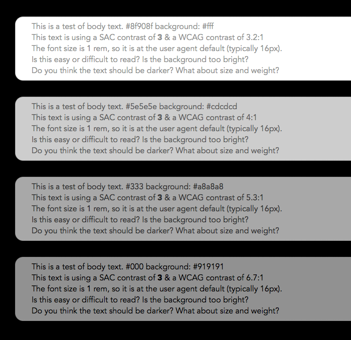

This Live Experiment page: https://www.myndex.com/WEB/W3ContrastissueTMP
Render notes: Pairs by SAC, L* estimated minimum value, f - 0.05, scale 8
mraccess77
commented
5 years ago Regarding surrounding background colors -- this can change for responsive and fluid sites -- so this would need to be taken into account at each zoom level 100, 1110, 120, 130, etc. and at each breakpoint variation of a page which would complicate the testing some. It's something to consider when considering to include. WCAG 2.1 has a conformance requirement that each variation of a page must pass. Contrast issues can already vary in these situations as well today but the size of the padding around the text and surrounding content is likely to change even more in responsive variations and fluid sites with zoom.
Myndex
commented
5 years ago Regarding surrounding background colors -- ...snip.... Contrast issues can already vary in these situations as well today but the size of the padding around the text and surrounding content is likely to change even more in responsive variations and fluid sites with zoom.
Hi @mraccess77
Yes, responsive design is certainly a factor. It is partly why I mentioned at one point that separating accessibility specs for mobile vs desktop might be useful.
Nevertheless, in responsive design, things like padding can be relative and responsive. The test page right now is not a responsive design — and perhaps I need to make a responsive version — but the padding is set in em, so if the basefont size is relative to screen, then the design elements set as em will all follow. While I have not conducted a validation study, I'd suggest that padding relative to font size is the best practice.
In the examples in my most recent post, vertical padding is probably the tightest it should ever be at 0.5em and even so I think that's too tight when against the #FFF background. This points to the main issue, and that is where the div containing text, and the contrast of text to that containing div, is substantially different than the overall page luminance. So with a dark div and darker text against a white page, the eye adapts to the brightest white, and padding needs to increase — this is something any skilled designer knows, but it has a direct effect on accessibility too.
mraccess77
commented
5 years ago Hi @Myndex distinction between mobile and desktop is really not relevant for most folks today. Most low vision users zoom in and get the responsive versions of a site -- I use 800x600 on my desktop and often see the mobile version. People use laptops in the sun and outside, etc.
On a tangential note relate to adaptation -- my eyes are drawn to white -- so a white/bright bar at the top of a presentation/document will draw my eyes away from the text to the bright area by default. While this is vision related -- I'd suspect that there are similar distraction attributes that some people with print disabilities have that draw their attention away from the text as well. So it might be worth discussion other print disabilities into the contrast calculations if there is research there to guide us.
Myndex
commented
5 years ago Hi @Myndex distinction between mobile and desktop is really not relevant for most folks today. Most low vision users zoom in and get the responsive versions of a site -- I use 800x600 on my desktop and often see the mobile version. People use laptops in the sun and outside, etc.
Hi @mraccess77 Fair enough, though I don't mean just relating to contrast. For instance, some site lock or block zooming in, which I find really unacceptable.
One of the things I've been talking about in this thread, and research supports, is that zoom level/font size is the real critical factor.
No website should be able to override my defined zoom level or root font size. In fact, as a designer, I'd submit that page design should be based around root font size, so a user with an impairment can make a single change by to their root font size that will affect all pages (and apps for that matter).
And personally, for displays, I have a terrible time here on GitHub. The background is way too white and causes significant vision problems for me. Bight white background cause an adaptation to a brighter light and causes pupil contraction, which increases sharpness (good right? NOT!) The problem with increasing sharpness for me is that the vitreal floaters in my eye become more distinct and thus they block vision MORE. Too high of a contrast with a bright light background is terrible for me for instance.
On a tangential note relate to adaptation -- my eyes are drawn to white -- so a white/bright bar at the top of a presentation/document will draw my eyes away from the text to the bright area by default. While this is vision related -- I'd suspect that there are similar distraction attributes that some people with print disabilities have that draw their attention away from the text as well. So it might be worth discussion other print disabilities into the contrast calculations if there is research there to guide us.
You mean output to paper? Today LRV guides physical media, and that's actually where most things relating to perception (like Weber) began (Weber was circa 1860). As LRV and luminance are essentially synonymous, much of that work can be applied to displays, though to be sure, display perception has several unique qualities that more modern approaches can model.
Cheers
alastc
commented
5 years ago zoom level/font size is the real critical factor... page design should be based around root font size...
Let's keep focused on the contrast in this thread, we have other guidelines for sizing, and so long as contrast is a factor we can test for and improve we will keep it in scope.
As a sidenote about the sizing methods, I've written about that a lot, here's a summary of EMs vs Pixels & zooming.
Second sidenote on your personal experience: Have you tried browser plugins that adjust the colors for you? E.g. with Change colors you can create a standard color over-ride, or with Stylus (and some CSS know how) you can create custom over-rides per site.
Myndex
commented
5 years ago zoom level/font size is the real critical factor... page design should be based around root font size...
Let's keep focused on the contrast in this thread, we have other guidelines for sizing, and so long as contrast is a factor we can test for and improve we will keep it in scope.
Yes of course, I just want to emphasize that size and contrast are interdependent, not independent.
As a sidenote about the sizing methods, I've written about that a lot, here's a summary of EMs vs Pixels & zooming.
Thank you will read.
Second sidenote on your personal experience: Have you tried browser plugins that adjust the colors for you? E.g. with you can create custom over-rides per site.
I'm using Safari, and the Safari extension that does that (Colorum) cannot change the Github pages.
This is one of those examples where the PAGE does not allow CHANGE to help with accessibility.
I have not tried Github on Chrome with the plugin you mention, will try that shortly. But Github blocks that with Safari and the safari extension. Grrr! And this is partly what I am talking about - no site should be able to lock me out of making an appearance change that I need for accessibility reasons, yet they do, ALL THE TIME.
EDIT: It works in Chrome!!! Wow thank you, my eye's thank you. I can actually read github now! Guess I'll need to use chrome for GitHub, not sure why Safari has been unable to do it.
patrickhlauke
commented
5 years ago no site should be able to lock me out of making an appearance change that I need for accessibility reasons, yet they do, ALL THE TIME.
for what it's worth, that's not a failing of the sites or their authors. it's a failing of how some of the extensions/plugins inject their custom styles and the fact that browsers themselves have removed the ability to properly define user styles, which would take precedence over page styles.
Note (Jan 2023):
This thread is mainly the very early research notes and discussions that lead to the development of certain perceptually uniform contrast methods. While of interest from a historical perspective, the most current understanding of perceptually uniform contrast can be found at the Contrast Resources page, and current discussions in the APCA forum.
The initial conclusions did not present themselves until the first several months of posts, around the time of initial fixes described in May 2019, however the present day body of knowledge is substantially improved beyond that point.
As such, this thread remains here as a matter of historical interest only, and should not be referenced directly. For a reference, a good current overview is this article
Thank you for reading,
— Andy
Andrew Somers
W3C AGWG Invited Expert
Research Lead, Visual Contrast
Color Scientist @ Myndex Research
Original Post of April 2019:
The W3C's specification for determining sRGB contrast as discussed in "Understanding WCAG 2.0 and 2.1, Minimum Contrast 1.4.3" is not perceptually uniform and as a result creates "contrast ratios" that are not meaningful. The end result is incorrect contrast choices for some web colors. Compounding the problem are the number of "contrast tools" based on this math all over the web, and all of which are returning invalid data.
The end result are websites that may comply with the W3C's math for contrast, but are otherwise difficult to read. The bad math coupled with contrast tools have provided designers with color schemes of poor accessibility. This needs to be addressed!
PROBLEM SUMMARY
Edit May 2019: after first-round research, we've found that the issue is not so much using "simple contrast" as it is the manner (or lack of) considering ambient lighting, the nature of illuminated1 displays, and/or a lack of math that better models human non-linear perception.
(L1 + 0.05)/(L2 + 0.05)(aka "simple contrast")is only really useful to determine monitor max on/off (#FFF / #000)Edit 6/19 I'll restate this as "does not accurately model an illuminated1 display in real world ambient conditions": . It fails badly in the midrange colors as it does not adjust for human nonlinear perception. As such it should not be used to programmatically determine legibility of colors, esp. in the middle and darker ranges.Weber contrast, Michelson Contrast, Bartleson-Breneman Perceptual Contrast Length (PCL), or other possible candidates are better choices for programatic legibility assessment. I am currently conducting studies on a "best" programatic contrast assessment algorithm for UI/Web design and will update this issue as I do. I am presently leaning toward a variation of PCL as it prevents the near-black contrast expansion. Using this and applying an exponent to the luminance data looks promising.
Edit June 2019: results of research/experiments below show that a "standard" Weber contrast does not provide better performance by itself — it requires a modification for a more accurate model of a computer display).
Note1: By "illuminated" I mean both emissive (led), and transmissive backlit (LCD) display types.
Web Links to some of the pages of the document: https://www.w3.org/TR/WCAG21/#dfn-contrast-ratio https://www.w3.org/TR/UNDERSTANDING-WCAG20/visual-audio-contrast-contrast https://www.w3.org/TR/2008/REC-WCAG20-20081211/#relativeluminancedef
PROBLEM EXAMPLE:
I prepared a webpage that demonstrates the problem here: http://myndex.com/WEB/W3Contrastissue
(Edit: the full set of experiments is at https://www.myndex.com/WEB/Perception )
Here is a reduced resolution screenshot of part of that test page.
In the above experiment, we set a number of panels to color-pairs with a contrast ratio of 4.5:1, this counts as a "PASS" for the W3C spec of minimum contrast for small text. Interspersed among these panels are color-pairs that the W3C criteria counts as a "FAIL" even for large text, with a contrast of 2.9:1
As you can see, many of the "PASS" color pairs are actually hard to read and of low contrast, while all of the "FAIL" pairs are substantially easier to read and of higher perceptual contrast.
The point here is that the "contrast ratios" created by the equations listed in the WCAG documents are not useful or meaningful for determining perceptual luminance contrast.
Part of the reason this is happening is using simple contrast (L1/L2) Simple Contrast fails to account for non linear human perception in values between #000 and #FFF. Also troubling is the use of outdated standards documents or drafts. I list these issues on the webpage: http://myndex.com/WEB/W3Contrastissue
The upshot of all this is that if "contrast ratios" are going to be promoted as a means to define color for accessible design, then there needs to be a clear path to assess contrast based on human perception.
Looking for a Solution (EDIT 4/25/19: Better solutions in later posts)
One idea is to process the luminance with an exponent (^1.6) then take 1/3rd the contrast result, using either weber contrast or perceptual contrast length.
The purpose of the exponent is to shift contrast for black/dark text vs white/light text, this adjusts for our perception that light text on a medium or darker background has a higher perceived contrast than dark text on a medium background. The purpose for taking 1/3rd of the result is to bring the output numbers into line with the W3C standard indicating a 4.5:1 contrast.
A more ideal solution would be to commission a study with human subjects of various visual impairments to fine tune a model for programatic contrast assessment.
-Andrew Somers Title Supervisor General Titles & Visual Effects Hollywood, Ca.