This Flutter package offers a Calendar Widget featuring integrated Day, MultiDay, Month and Schedule views. Moreover, it empowers you to tailor the visual aspects of the calendar widget.
Note
- This is a WIP package so there will be some breaking changes until version 1.0.0.
Web Example
Try it out here
Features
-
Platforms - Works with Web, Desktop and Mobile.
-
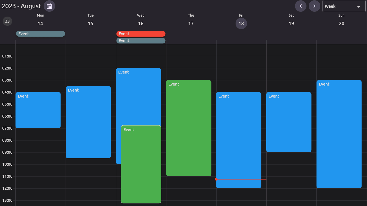
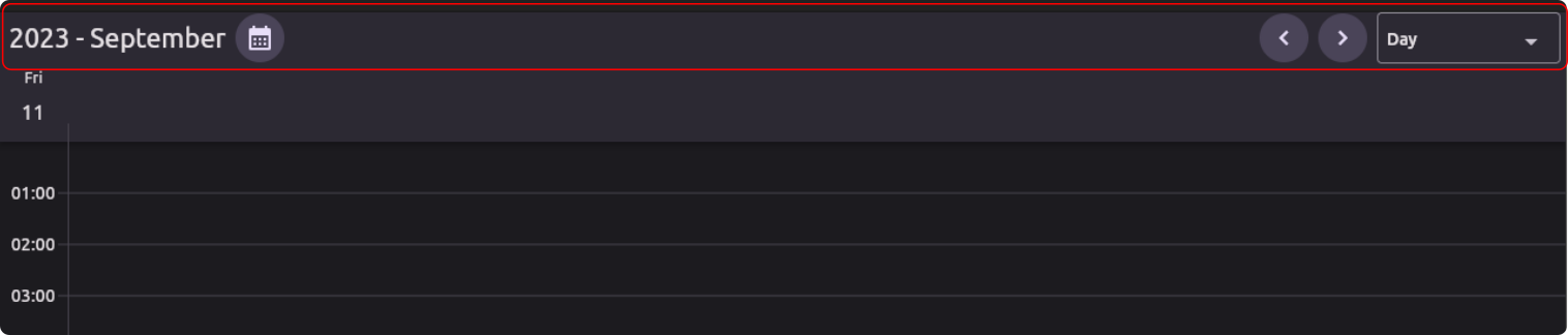
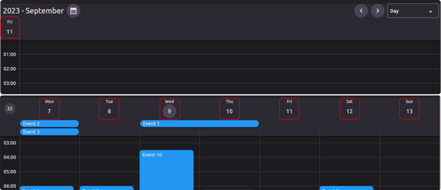
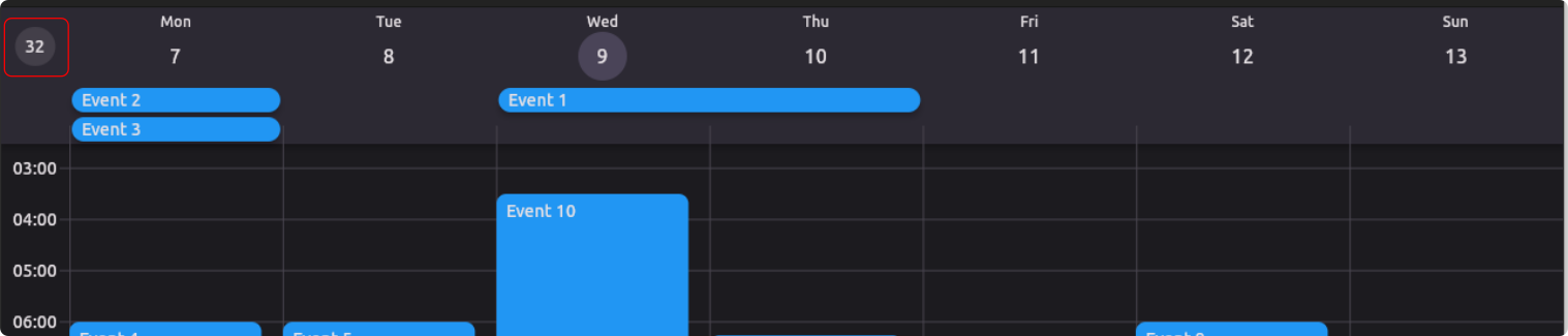
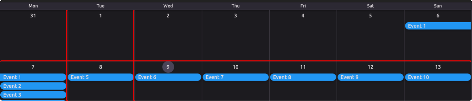
Calendar Views - There are 3 calendar views available, MultiDay, Month and Schedule. Find out more
-
Reschedule - Drag and Drop events to your liking. Try it out
-
Resize - Resize events by dragging the edges of an event (Special Case on Mobile). Try it out
-
Event Handling - When a there is interaction with a tile or component the event can be handled by you. Find out more
-
Flexible View's - Each of the Calendar View's takes a ViewConfiguration, this has some parameters you can change, OR you can create your own. Find out more
-
Custom Object - CalendarEvent's can contain any object of your choosing. Find out more
-
Appearance - You can change the style of the calendar and default components. Find out more
-
Custom Builders - You can create your own builders for different components of the calendar. Find out more
-
Custom Layout Delegates - You can create your own algorithm to layout tiles. Find out more
Installation
-
Add this to your package's pubspec.yaml file:
$ flutter pub add kalender -
Import it:
import 'package:kalender/kalender.dart';
Usage
-
Create a custom class to store your data.
class Event { final String title; final Color color; Event(this.title, this.color); } -
Create a EventsController
final eventsController = EventsController<Event>();Add events to the controller
eventsController.addEvent( CalendarEvent( dateTimeRange: DateTimeRange(), // The DateTimeRange of the event. modifiable: true, // Change this to false if you do not want the user to modify the event. eventData: Event( // The custom object that you want to link to the event. title: 'Event 1', color: Colors.blue, ), ), ); -
Create a CalendarController
final calendarController = CalendarController(); -
Create tile builders
Widget _tileBuilder(event, tileConfiguration) => Widget() Widget _multiDayTileBuilder(event, tileConfiguration) => Widget() Widget _scheduleTileBuilder(event, date) => Widget() -
Create a CalendarView
CalendarView(
  eventsController: eventsController,
  calendarController: calendarController,
  tileBuilder: _tileBuilder(),
  multiDayTileBuilder: _multiDayTileBuilder(),
  scheduleTileBuilder _scheduleTileBuilder(),
)
Mobile rescheduling, resizing
To reschedule events on mobile the user needs to trigger a longPress and then drag the event to the desired location.
The only way for events to be resized on mobile is by keeping them selected so the handlebars are built, only one handle bar can be used at a time. To do this you can do the following:
Configure the event handlers like so.
 CalendarView(
  eventHandlers: CalendarEventHandlers(
    onEventTapped: (event) async {
      // Check if the event that was tapped is is currently selected.
      eventController.selectedEvent == event
        // If it is selected, deselect it.
        ? eventController.deselectEvent()
        // If it is not selected, select it.
        : eventController.selectEvent(event);
    },
    onEventChanged: (initialDateTimeRange, event) async {
      // If you want to deselect the event after it has been resized/rescheduled. uncomment the following line.
      // eventController.deselectEvent();
    },
    onEventChangeStart: (event) {
      // You can give the user some haptic feedback here.
    },

  ),
)
Additional information
Calendar Views
There are a few constructors that you can choose from to create a CalendarView.
-
Default Constructor - this constructor will build the correct view (MultiDay, Month, Schedule) based on the ViewConfiguration you pass it.
-
MultiDayView - this constructor will build a MultiDayView.
-
MonthView - this constructor will build a MonthView and does not need the multiDayTileBuilder.
-
ScheduleView - this constructor will build a ScheduleView and does not need the multiDayTileBuilder.
View Configuration
The CalendarView takes a ViewConfiguration object, which allows you to configure the view to your liking. The view configuration serves the following purposes:
- It contains the functions that calculate the date indices that are used by the PageView's/ScrollablePositionedList.
- It contains various parameters that are used by the CalendarView:
- To layout event tiles.
- To determine user interaction with the calendar.
There are 3 'Types' of ViewConfiguration's: MultiDayViewConfiguration, MonthViewConfiguration and ScheduleViewConfiguration.
- You can create a Custom ViewConfiguration by extending one of these 'Types'.
These are the default ViewConfiguration's:
-
DayConfiguration - This configuration is used to configure the MultiDayView for a single day.
Example
```dart DayConfiguration( // This is the width of the timeline. timelineWidth: 56, // This is the spacing between the left side of the calendar and the hour lines. hourLineLeftMargin: 56, // This is the height of the multi day tile. multiDayTileHeight: 24, // This determines if events should snap to other events. eventSnapping: true, // This determines if events should snap to the time indicator. timeIndicatorSnapping: true, // This determines if the user can create events. createEvents: true, // This determines if the user can create multi day events. createMultiDayEvents: true, // This determines if the user can resize events. enableResizing: true, // This determines if the user can reschedule events. enableRescheduling: true, // This is the vertical step that events will snap to. verticalStepDuration: const Duration(minutes: 15), // This is the range that events will use to snap to other events/time indicator. verticalSnapRange: const Duration(minutes: 15), // This is the default duration of a new event. newEventDuration: const Duration(minutes: 15), // This determines the input type to create a new event. createEventTrigger: CreateEventTrigger.tap, // This is the start hour of the calendar. startHour: 0, // This is the end hour of the calendar. endHour: 24, // Show the header that displays the days. showDayHeader: true // Show the header that displays multiDay events. // If this is disabled the multiDay events will be displayed in the calendar body. showMultiDayHeader: true // Gesture type for creating events. createEventTrigger: CreateEventTrigger.tap, ); ``` -
WeekConfiguration - This configuration is used to configure the MultiDayView and displays 7 days that starts on the firstDayOfWeek.
Example
```dart WeekConfiguration( timelineWidth: 56, hourLineLeftMargin: 56, multiDayTileHeight: 24, eventSnapping: true, timeIndicatorSnapping: true, createEvents: true, createMultiDayEvents: true, enableResizing: true, enableRescheduling: true, verticalStepDuration: const Duration(minutes: 15), verticalSnapRange: const Duration(minutes: 15), newEventDuration: const Duration(minutes: 15), firstDayOfWeek: 1, startHour: 0, endHour: 24, showDayHeader: true, showMultiDayHeader: true, showWeekNumber: true, createEventTrigger: CreateEventTrigger.tap, ); ``` -
WorkWeekConfiguration - This configuration is used to configure the MultiDayView and displays 5 days that starts on monday.
Example
```dart WorkWeekConfiguration( timelineWidth: 56, hourLineLeftMargin: 56, multiDayTileHeight: 24, eventSnapping: true, timeIndicatorSnapping: true, createEvents: true, createMultiDayEvents: true, enableResizing: true, enableRescheduling: true, verticalStepDuration: const Duration(minutes: 15), verticalSnapRange: const Duration(minutes: 15), newEventDuration: const Duration(minutes: 15), startHour: 0, endHour: 24, showDayHeader: true, showMultiDayHeader: true, showWeekNumber: true, createEventTrigger: CreateEventTrigger.tap, ); ``` -
CustomMultiDayConfiguration - This configuration is used to configure the MultiDayView and displays 5 days that starts on monday.
Example
```dart CustomMultiDayConfiguration( name: 'Custom Name', numberOfDays: 3, timelineWidth: 56, hourLineLeftMargin: 56, multiDayTileHeight: 24, eventSnapping: true, timeIndicatorSnapping: true, createEvents: true, createMultiDayEvents: true, enableResizing: true, enableRescheduling: true, verticalStepDuration: const Duration(minutes: 15), verticalSnapRange: const Duration(minutes: 15), newEventDuration: const Duration(minutes: 15), startHour: 0, endHour: 24, showDayHeader: true, showMultiDayHeader: true, showWeekNumber: true, createEventTrigger: CreateEventTrigger.tap, ); ``` -
MonthConfiguration - this configuration is used to configure the MonthView.
Example
```dart MonthConfiguration( name: 'Month', firstDayOfWeek: 1, multiDayTileHeight: 24, enableResizing: true, createMultiDayEvents: true, enableRescheduling: true, enableResizing: true, showHeader: true createEventTrigger: CreateEventTrigger.tap, ); ``` -
ScheduleConfiguration - this configuration is used to configure the ScheduleView.
Example
```dart ScheduleConfiguration( name: 'Schedule', ); ```
Event Handling
The CalendarView can take a CalendarEventHandlers object. The CalendarEventHandlers handles the user's interaction with the calendar. (Do not confuse the CalendarEventHandlers with the EventsController)
There are 5 events at this time that can be handled.
Group 1:
-
onEventChangeStart: this function is called when an event is about to be changed.
-
onEventChanged: this function is called when an event displayed on the calendar is changed. (resized or moved)
-
onEventTapped: this function is called when an event displayed on the calendar is tapped.
Group 2:
-
onCreateEvent: this function is called when a new event is created by the calendar.
-
onEventCreated: this function is called once all operations on the new event is complete.
Other:
-
onDateTapped: this function is called when a date on the calendar is tapped.
Example Code
```dart CalendarEventHandlers( onEventChangeStart: (CalendarEvent event) { // This function is called when an event is about to be changed. // Use full on mobile for haptic feedback. } onEventChanged: (DateTimeRange initialDateTimeRange, CalendarEvent calendarEvent) async { // The initialDateTimeRange is the original DateTimeRange of the event so if the user wants to undo the change you can use this value. // The event is a reference to the event that was changed so you can update the event here. // This is a async function, so you can do any async work here. // Once this function is complete the calendar will rebuild. }, onEventTapped: (CalendarEvent calendarEvent) async { // The calendarEvent is a reference to the event that was tapped. // This is a async function, so you can do any async work here. // Once this function is complete the calendar will rebuild. }, onCreateEvent: (DateTimeRange dateTimeRange) { // The dateTimeRange is the range that the user has selected. // If the event was created by with a "drag" gesture then // the dateTimeRange assigned here will be modified by the drag gesture before // the onEventCreated function is called. // Return the new calendar event. return CalendarEvent( dateTimeRange: dateTimeRange, eventData: Event( title: 'Event 1', color: Colors.blue, ), ); } onEventCreated: (CalendarEvent calendarEvent) async { // The calendarEvent is the new event that was created. // This is a async function, so you can do any async work here. // add the event to the eventsController. eventsController.addEvent(calendarEvent); // Once this function is complete the calendar will rebuild. }, onDateTapped: (DateTime date) { // The date is the date header that was tapped. see example for use case. }, onPageChanged: (DateTimeRange visibleDateTimeRange) { // The visibleDateTimeRange is the visible DateTimeRange of the new page. }, ); ```
Events Controller
The CalendarView takes a EventsController object. The EventsController is used to store and manage CalendarEvent's. (Do not confuse the EventsController with EventHandling)
| Function | Parameters | Description |
|---|---|---|
| addEvent | CalendarEvent\<T> event | Adds this event to the list and rebuilds the calendar view |
| addEvents | List\<CalendarEvent\<T>> events | Adds these events to the list and rebuilds the calendar view |
| removeEvent | CalendarEvent\<T> event | Removes this event from the list and rebuilds the calendar view |
| removeWhere | bool Function(CalendarEvent\<T> element) test | Removes the event(s) where the test returns true |
| clearEvents | Clears the list of stored events | |
| updateEvent | T? newEventData, DateTimeRange? newDateTimeRange,bool modifiable,bool Function(CalendarEvent |
Updates the eventData and/or newDateTimeRange and/or modifiable (if provided), of the event where the test returns true |
| selectEvent | CalendarEvent |
Selects the given event. |
| deselectEvent | Deselects the selected event. | |
| forceUpdate | Forces the calendar to update the UI. |
Calendar Controller
The CalendarView takes a CalendarController object. The CalendarController is used to control the CalendarView.
| Function | Parameters | Description |
|---|---|---|
| animateToNextPage | Duration? duration, Curve? curve | Animates to the next page. |
| animateToPreviousPage | Duration? duration, Curve? curve | Animates to the previous page. |
| jumpToPage | int page | Jumps to the given page. |
| jumpToDate | DateTime date | Jumps to the given date. |
| animateToDate | DateTime date, {Duration? duration, Curve? curve,} | Animates to the DateTime provided. |
| adjustHeightPerMinute | double heightPerMinute | Changes the heightPerMinute of the view. (Zoom level) |
| animateToEvent | CalendarEvent |
Animates to the CalendarEvent. |
| lockScrollPhysics | Locks the vertical scroll of the current view. | |
| unlockScrollPhysics | ScrollPhysics? scrollPhysics | Unlocks the vertical scroll of the current view. |
Custom Object
The CalendarEvent can contain any object. This object can be accessed by the tileBuilders and the CalendarEventHandlers.
Custom Object Example:
CalendarEvent<Event>(
  dateTimeRange: DateTimeRange(),
  eventData: Event(
    title: 'Event 1',
    color: Colors.blue,
  ),
);
Tile Builder Example:
Widget _tileBuilder(CalendarEvent<Event> event, tileConfiguration) {
  final customObject = event.eventData;
  return Card(
    color: customObject.color,
    child: Text(customObject.title),
  );
}
Calendar Layout Delegates
There are three types of layout controllers: DayLayoutController, MultiDayLayoutController, and MonthLayoutController.
-
EventGroupLayoutDelegate Create your own EventGroupLayoutDelegate by extending the EventGroupLayoutDelegate class.
class CustomLayoutDelegate<T> extends EventGroupLayoutDelegate<T> { CustomLayoutDelegate({ required super.events, // The events that are in the group. required super.startOfGroup, // The datetime that the group starts. required super.heightPerMinute, // The height per minute of the view. required super.startHour, // The start hour of the view. required super.endHour, // The end hour of the view. }); @override void performLayout(Size size) {} } -
MultiDayEventGroupLayoutDelegate Create your own MultiDayLayoutDelegate by extending the MultiDayEventGroupLayoutDelegate class.
class CustomLayoutDelegate<T> extends MultiDayEventGroupLayoutDelegate<T> {
CustomLayoutDelegate({
  required super.events, // The events that are in the group.
  required super.visibleDateRange, // The visible date range of the view.
  required super.multiDayTileHeight, // The height of the multi day tile.
});

@override
void performLayout(Size size) {}
}
Appearance
The CalendarView consists of quite a few sub components: Each of these components can be customized in the CalendarStyle object or by passing a custom widget builder through the CalendarComponents object.
-
CalendarHeader - This is a custom widget that you can pass to the calendar to render in the header of the calendar.
(CalendarHeader)
-
DayHeader - This widget is displayed above a day colum in the calendar.
(DayHeader)
-
WeekNumber - This widget displays the week number of the year.
(WeekNumber)
-
DaySeparator - This widget is displayed between days in the calendar.

(DaySeparator)
-
HourLines - This widget is displays the hour lines in the calendar.
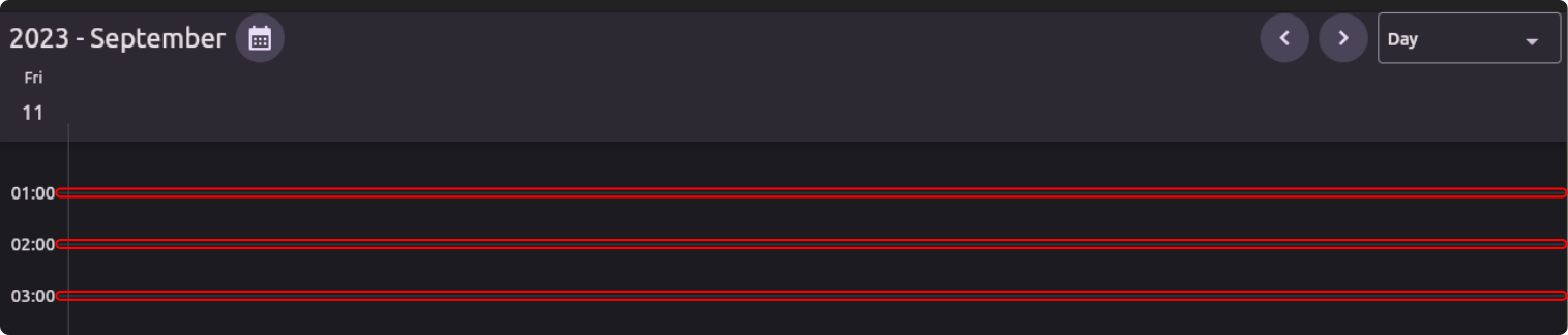
(HourLines)
-
Timeline - This widget is displayed on the left side of the calendar to show the time.
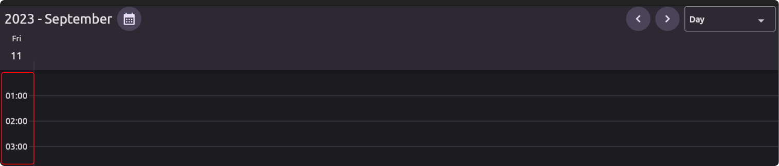
(Timeline)
-
TimeIndicator - This widget is displayed on the current day to show the current time.
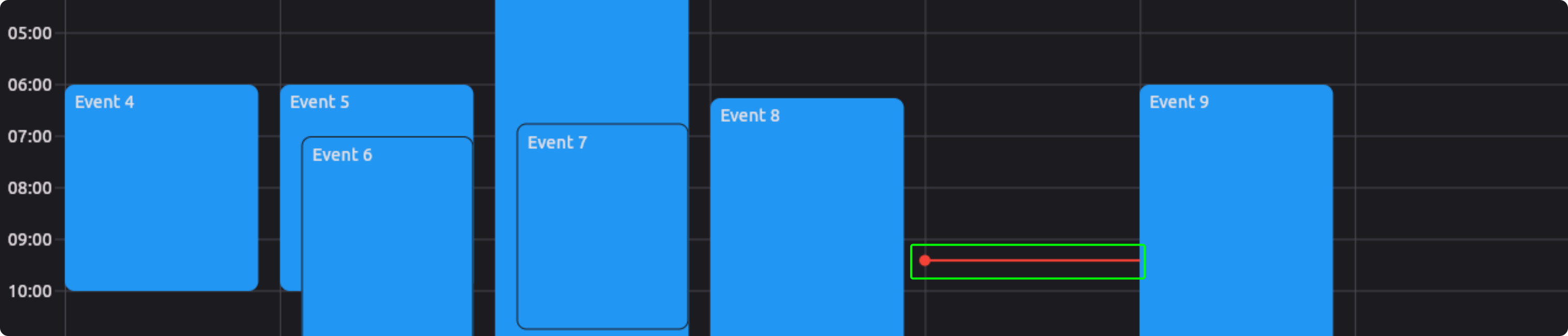
(TimeIndicator)
-
MonthHeader - This widget is displayed above the month grid in the calendar header.

(MonthHeader)
-
MonthCellHeader - This widget is displayed in a month cell in the month grid.
(MonthCellHeader)
-
MonthGrid - This widget is displayed in the month view to show the grid.
(MonthGrid)