chat_flutter
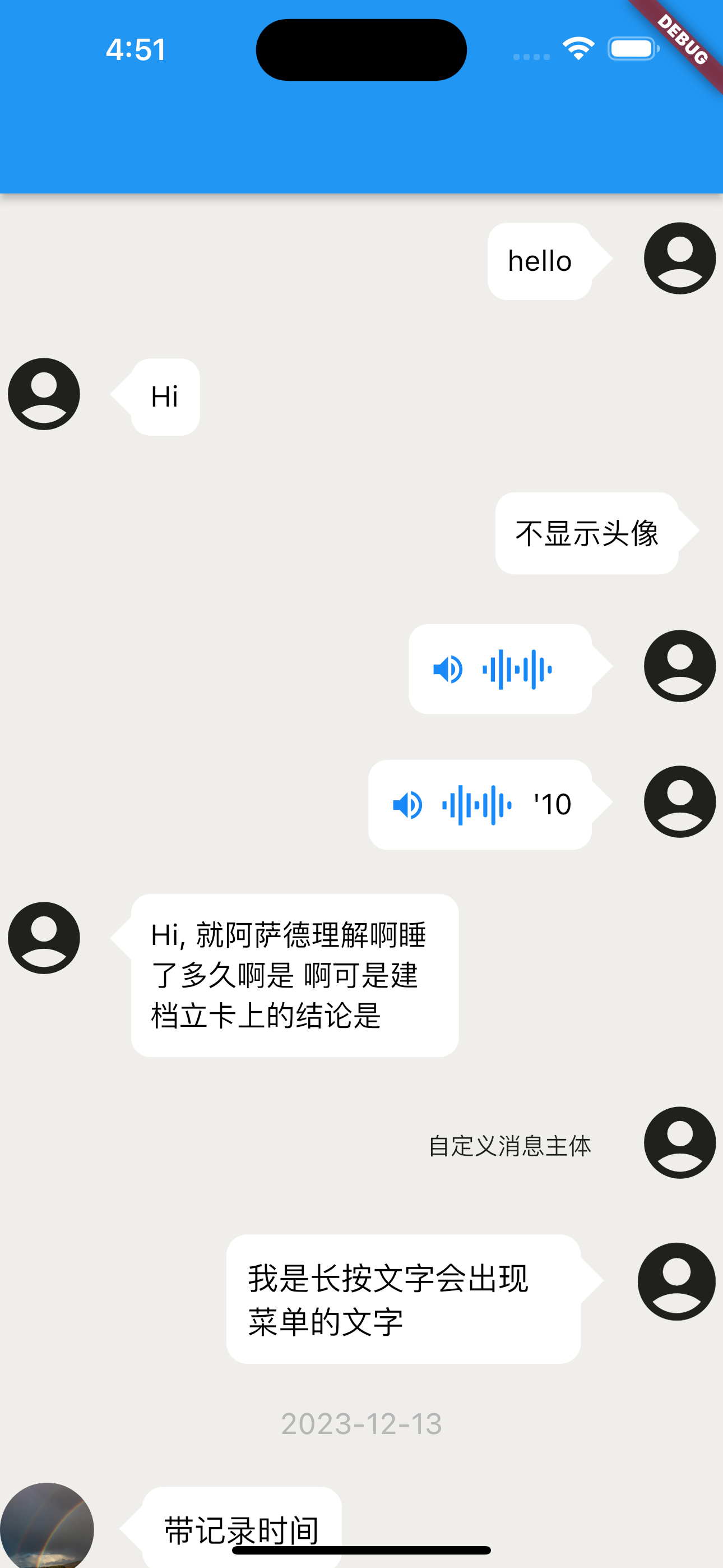
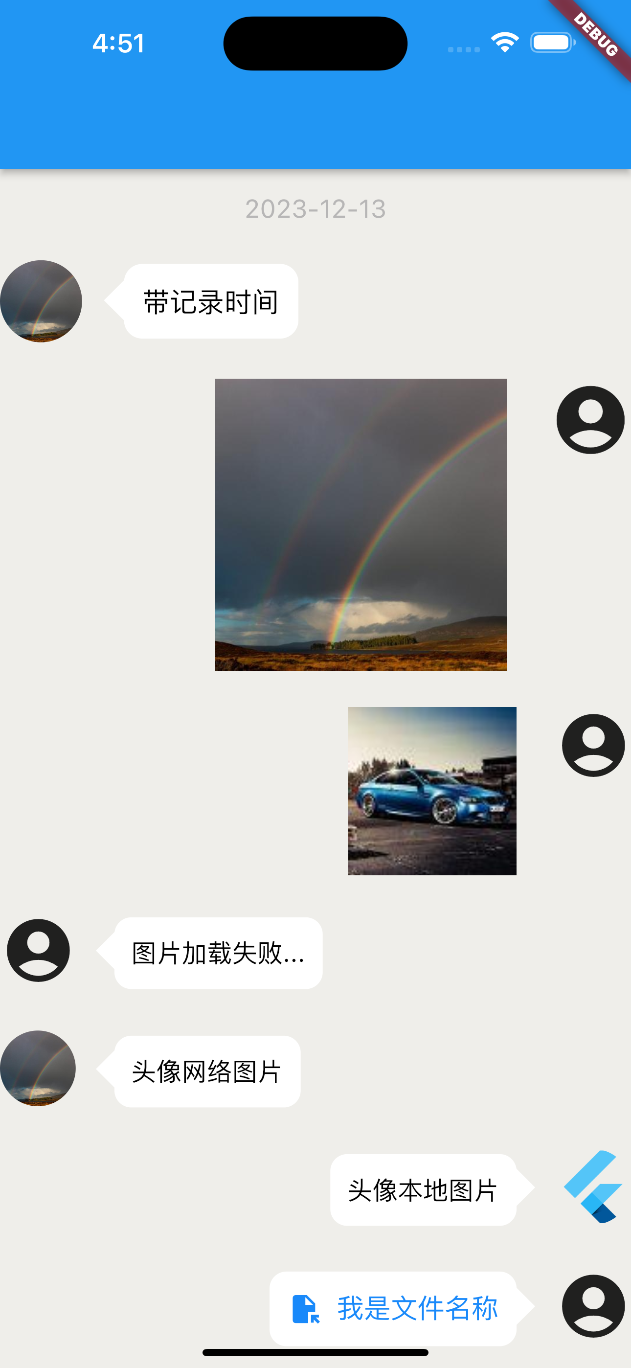
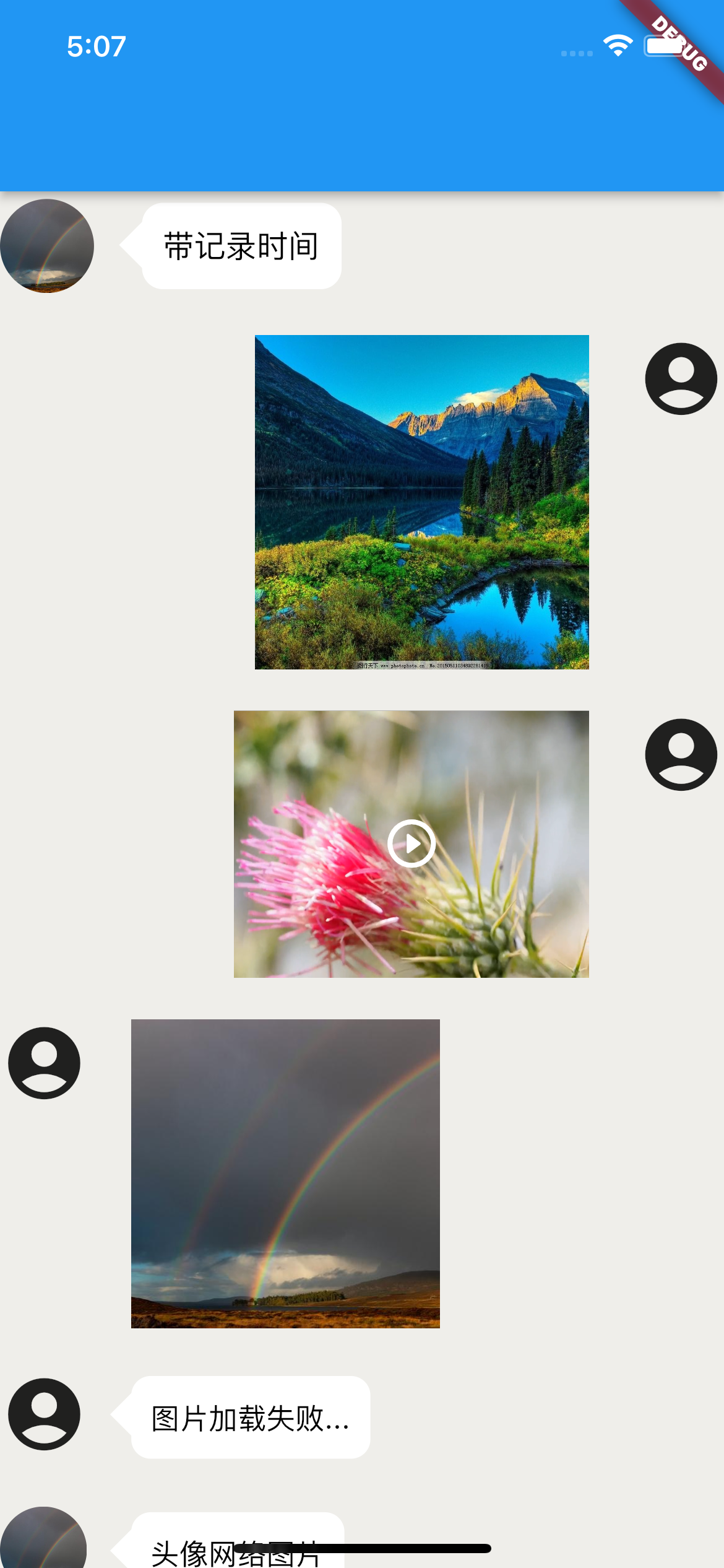
This is a component package developed purely for dart to display chat record lists, supporting the basic content display of images, files, voice, video, and text.
Language: 中文简体
We recommend that you use the
chatViewWidgetControllercontroller in theonCreatedcallback to perform operations such asadd、removeon the record list.
The plugin toolkit supports the following platforms, note ⚠️ Some functions are not fully platform supported:
- Android
- IOS
- WEB
- Windows
- Macos
- Linux
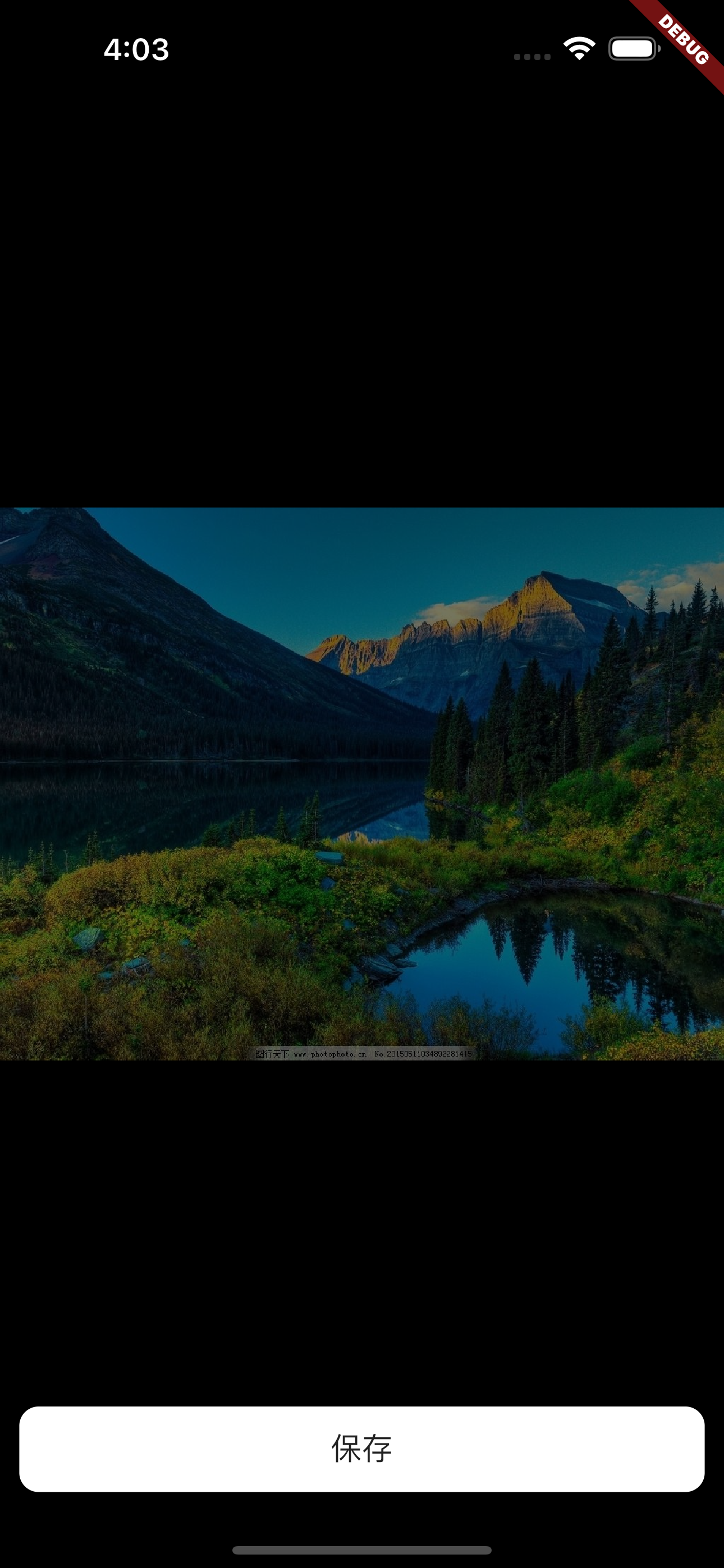
Rendering
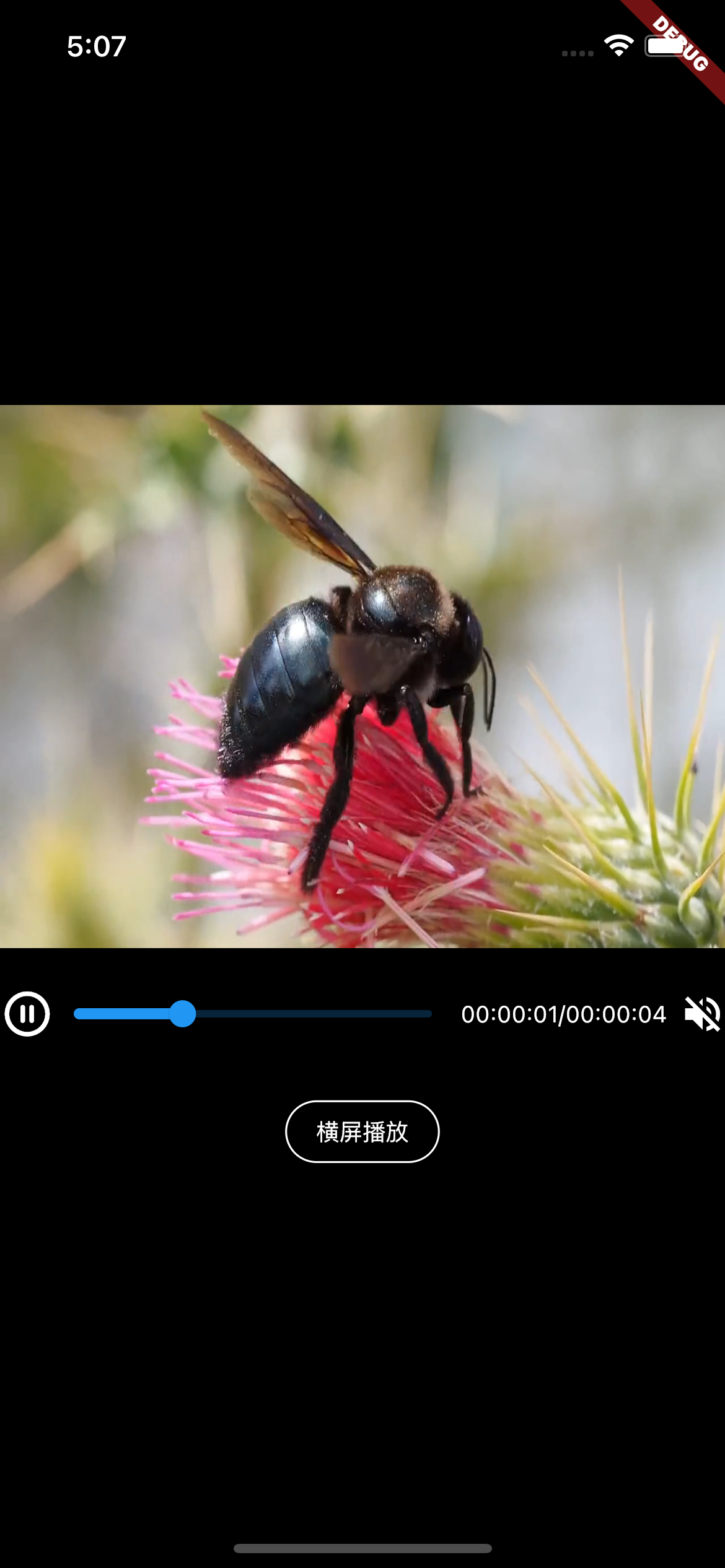
1、Characteristic
This tool component can display chat records, commonly used for displaying chat record content.
The display content supports the following basic content:
- 图片 -> image
- 文件 -> file
- 文字 -> text
- 音频 -> audio
- 视频 -> video
2、Install
pub.dev Address Navigation:
- pub.dev: https://pub.dev/packages/chat_flutter
- pub.flutter-io.cn: https://pub.flutter-io.cn/packages/chat_flutter -> (China Mirror Address)
1.
You can directly pubspec.yaml in the file dependencies add below for installation.
chat_flutter: ^1.0.0As follows:
dependencies:
  chat_flutter: ^1.0.0
2.
You can also execute the following command to install from the terminal located in the project root directory:
flutter pub add chat_flutter3、Use
Introduce on the required page:
import 'package:chat_flutter/chat_flutter.dart';Complete Use Case:
import 'package:flutter/material.dart';
import 'package:chat_flutter/chat_flutter.dart';

void main() {
  runApp(const MyApp());
}

class MyApp extends StatefulWidget {
  const MyApp({super.key});

  @override
  State<MyApp> createState() => _MyAppState();
}

class _MyAppState extends State<MyApp> {
  @override
  Widget build(BuildContext context) {
    return Scaffold(
        body: Column(
            children: [
                Expanded(
                    child: ChatViewWidget()
                )
            ],
        ),
    );
  }
}
More use cases can be found at Here hit the target /example/lib/main.dart review.
4、Precautions for use
1、This plugin only provides display and does not provide implementation of functions. If the following functions are not implemented:
- When displaying recorded content as audio, this plugin does not implement audio playback, and users need to implement the audio playback function themselves.
2、Precautions for use
-
This plugin does not impose width or height restrictions on the content of the plugin, so you need to package the plugin with
widgetset the width and height of the box. -
If you encounter rendering issues in the
releasemode during use, please make modifications as described below:
Add the following code to the release mode of buildTypes in the project/android/app/build. gradle file of your project:
buildTypes {
    release {
        signingConfig signingConfigs.debug
        // Add the following code
        shrinkResources false // Turn off code obfuscation
        minifyEnabled false // Turn off resource reduction
    }
}
5、About the Adaptation of Plugin Models
This plugin itself uses flutter_screenutil based on plugins, multiple models have been adapted, so you don't have to worry about encountering problems during use UI disorder and other issues, if the model you are using is not properly adapted, resulting in UI for issues such as disordered styles, you can contact me through the contact information below to provide assistance.
6、About plugin dependency issues
After the author discovers that the dependencies used in the plugin have been updated, they will be updated as soon as possible. For a smoother experience during use, it is recommended that you update the plugin as soon as possible, or pubspec.yaml add before version number in the file ^ symbol for using the latest version of the plugin.
Currently, some functional implementations rely on the following plugins:
- flutter_screenutil
- photo_view
- video_player
7、About Customization
This plugin provides a high degree of customization to facilitate the functionality provided by the plugin when you are not satisfied UI customize to meet your needs.
8、Case study and detailed usage reference guide
If you feel that the cases and usage assistance provided on this page cannot help you successfully start using this plugin, you can click Here and enter example/lib/main.dart file View Detailed Use Cases. Alternatively, you can contact me through the contact information below.
9、API Parameter Description
ChatViewWidget Illustrate
| Name | Type | Describe | Default value |
|---|---|---|---|
children |
List<ChatViewItem> |
record list | [] |
isNeedScrollBottom |
bool |
Whether to slide to the bottom during initial rendering | false |
onCreated |
Function(ScrollController chatViewWidgetController) |
When creation is complete, return aScrollController list controller of type |
-- |
isOpenPreviewImage |
bool |
Do you want to enable image preview | false |
ChatViewItem Illustrate
Common Parameter API
| Name | Type | Describe | Default value |
|---|---|---|---|
itemBody |
dynamic |
Content. according to itemBodyType the content conveyed varies depending on the type. When itemBodyType = ChatViewItemRecordBodyType.audio time may not be transmitted, and detailed use can refer to case studies. |
-- |
senderRight |
bool |
Is it on the right side | true |
customRecordTimeWidget |
Widget |
Custom Time Record widget |
-- |
customRecordTimeStyle |
TextStyle |
Custom Time Record Style | -- |
chatViewItemRecordBodyBoxConstraints |
BoxConstraints |
Content subject constraints | -- |
itemBodyType |
ChatViewItemRecordBodyType |
Current record content type | text |
itemBodyRecordTime |
String |
Recording time | -- |
backgroundColor |
Color |
Record the background color of the main body | Colors.white |
customItem |
Widget |
Custom Record Body | -- |
itemBodyTap |
Function |
Content subject click event | -- |
itemBodyMediaTap |
Function(ChatViewItemRecordBodyType type) |
File, image, audio, video click events | -- |
textTypeModel |
ChatViewItemTextTypeModel |
Text type configuration content | -- |
imageTypeModel |
ChatViewItemImageTypeModel |
Image Type Configuration Content | -- |
videoTypeModel |
ChatViewItemVideoTypeModel |
Video Type Configuration Content | -- |
fileTypeModel |
ChatViewItemFileTypeModel |
File Type Configuration Content | -- |
audioTypeModel |
ChatViewItemAudioTypeModel |
Audio type configuration content | -- |
avatarModel |
ChatViewItemAvatarModel |
Configuration content of avatar | -- |
commonParamModel |
CommonParamModel |
transition progressIndicator | -- |
Avatar-avatarModel -> ChatViewItemAvatarModel
| Name | Type | Describe | Default value |
|---|---|---|---|
avatarPath |
String |
The avatar address will be the default one when it is not delivered. If it is not delivered, the built-in icon avatar scheme will be used |
-- |
defaultAvatarPath |
String |
Default avatar address | -- |
isAvatarShow |
bool |
Is the avatar displayed | true |
avatarSize |
double |
Avatar size | Adapted 45 |
avatarColor |
Color |
Head color | -- |
customAvatar |
Widget |
Custom avatar | -- |
customAvatarWidget |
Widget |
Custom avatar | -- |
avatarTap |
Function |
Head image click callback | -- |
Load Transition-commonParamModel -> CommonParamModel
| Name | Type | Describe | Default value |
|---|---|---|---|
progressIndicator |
ProgressIndicator |
Custom overload Progress | -- |
isOpenTransitionLoad |
bool |
Is transition loading enabled | true |
Below are different types of parameters API
1. Text-textTypeModel -> ChatViewItemTextTypeModel
| Name | Type | Describe | Default value |
|---|---|---|---|
selectionControls |
TextSelectionControls |
Text selection controller. When isOpenTextSelect the activation is valid. |
-- |
itemBodyTextStyle |
TextStyle |
Record the text style of the main body | TextStyle (color: const Color(0xff1989fa),fontSize: 16 |
isOpenTextSelect |
bool |
Do you want to open the long press text menu | true |
contextMenuBuilder |
Widget Function(BuildContext context, EditableTextState editableTextState) |
Displayed Tools Menu | -- |
onSelectionChanged |
void Function(TextSelection selection, SelectionChangedCause? cause) |
Long press the text menu to select a callback | -- |
createSelectableTextCallback |
Function(FocusNode focusNode) |
Optional Text Content widget callback during creation |
-- |
2. Audio-audioTypeModel -> ChatViewItemAudioTypeModel
| Name | Type | Describe | Default value |
|---|---|---|---|
audioTimelength |
int |
Audio duration | 0 |
audioPlayStatus |
bool |
Playing | false |
3. Image-imageTypeModel -> ChatViewItemImageTypeModel
| Name | Type | Describe | Default value |
|---|---|---|---|
previewImageLongPressMenu |
List<String> |
Preview Image Long Press to Display Menu | -- |
onPreviewImageTapMenu |
Function(String data, int index, List<String> menuList) |
Preview Image Menu Click Callback | -- |
customPreviewImageCallback |
Function(String imagePath) |
Custom preview image callback. Note: When passing this parameter, the preview scheme provided by the library will no longer be used. | -- |
customLongPress |
Function(BuildContext context) |
Custom long press image display callback | -- |
4. File-fileTypeModel -> ChatViewItemFileTypeModel
No additional information available at the moment.
5. Video-videoTypeModel -> ChatViewItemVideoTypeModel
| Name | Type | Describe | Default value |
|---|---|---|---|
notPlayingWidget |
Widget |
Custom widget not played | -- |
playingFailWidget |
Widget |
Play Error Custom Widget | -- |
autoPlaying |
bool |
Whether to automatically play during interface display | true |
videoLoadFailCallback |
void Function(Object error) |
Video loading error callback | -- |
IOS Additional Configuration
Be directed against IOS, You need to <project root>/ios/Runner/Info.plist under the path Info.plist add the following configuration to the file.
<key>NSAppTransportSecurity</key>
<dict>
  <key>NSAllowsArbitraryLoads</key>
  <true/>
</dict>| Android | iOS | Web | windows | macos | linux | |
|---|---|---|---|---|---|---|
| Support | SDK 16+ | 11.0+ | Any* | not Support | not Support | not Support |
10、About Internationalization
Tips: The fixed text content involved in the plugin itself, such as reminders and displays, has been adapted to the language environment. Currently, only the following language environments are supported:
- CH -> Chinese (default)
- US -> English
If you need to switch and modify, please refer to the following code format for modification:
import 'package:flutter_localizations/flutter_localizations.dart';@override
Widget build(BuildContext context) {
return MaterialApp(
locale: const Locale('zh'),
localizationsDelegates: const [
GlobalMaterialLocalizations.delegate,
GlobalWidgetsLocalizations.delegate,
GlobalCupertinoLocalizations.delegate
],
supportedLocales: const [Locale('zh', 'CH')],
);
}Tips: In the above code
flutter_localizationsThe toolkit requires you to manually install it yourself.
11、Contact Author
When you encounter problems during use, you can click Here have issue ask a question or contact me through the contact information below. When you see your contact or raise a question issue I will reply and contact you as soon as possible.
