v0.2.1
<zero-list-hero>
It's hero time! A Polymer 1.1+ web component that hero-animates and layouts a sequence of elements. I do this so you don't have to.

Featuring:
- Automatic transitions.
- NEW! Automatic responsive layout - masonry using first-fit algorithm à la Pinterest.
- Bespoke cascaded entry-exit effects à la Google Play Newsstand App.
- Built-in debouncer.
- Configurable animations.
- Almost entirely declarative - works by itself!
Let's get this money
-
Import
web-components-litepolyfill.<script src="https://github.com/zerodevx/zero-list-hero/raw/master/bower_components/webcomponentsjs/webcomponents-lite.js"></script> -
Import
zero-list-heroweb component.<link rel="import" href="https://github.com/zerodevx/zero-list-hero/blob/master/bower_components/zero-list-hero/zero-list-hero.html"> -
Profit!
Basic usage:
<zero-list-hero>
<!-- Dynamically append/remove elements inside here -->
...
<div hero-id="hero1">I'm Tom</div>
<div hero-id="hero3">I'm Mary</div>
<div hero-id="hero2">I'm John</div>
...
</zero-list-hero>
With Polymer's
dom-repeat:<zero-list-hero> <template is="dom-repeat" items="[[list]]"> <my-card hero-id$="[[item.foo]]" foo$="[[item.foo]]" bar$="[[item.bar]]"></my-card> </template> </zero-list-hero>Using built-in responsive masonry layout:
<zero-list-hero layout="masonry">
<template is="dom-repeat" items="[[list]]">
<my-card hero-id$="[[item.foo]]" foo$="[[item.foo]]" bar$="[[item.bar]]"></my-card>
</template>
</zero-list-hero>
Implementation notes
-
Assign a unique
hero-idfor every display element that is wrapped inside the<zero-list-hero>...</zero-list-hero>tags. -
If you're using Polymer's data-binding (eg. inside a
dom-repeattemplate), set your target attributes annotatively via the$=syntax. -
Transitions are automatic - create, update and remove operations on any
heroelement is detected, consolidated and debounced with a default delay of 500ms (optionally change delay timing usingdebounce-delayattribute). -
Note that automatic transitions do not work under native shadow DOM behaviour.
Layout
<zero-list-hero> now handles the layout of children hero elements
responsively. To enable this feature, set the layout (and optionally the
layoutOptions) attribute declaratively in your HTML.
Included layouts
Currently, only Masonry layout is shipped. <zero-list-hero>'s definition
of this is a left-to-right display of a sequence of fixed width, variable
height elements:
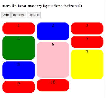
Layout is responsive; bin-packing is based on a first-fit algorithm where the next element is placed into the shortest column.
Layout attributes
| Attribute | Type | Values | Description |
|---|---|---|---|
| layout | String | masonry | A left-to-right display of a sequence of fixed width, variable height hero elements. |
| layoutOptions | Object | "breakpoint" | Number in px (default is 300) for the breakpoint multiple (ie. max-width of each column) before <zero-list-hero> attempts to repack the display elements again. |
Note that layoutOptions takes in a JSON object; it must be properly formatted
valid JSON. This means that properties (and String values if applicable) must
be wrapped with double-quotes "".
Example of Masonry layout, breakpoint of 100px
...
<zero-list-hero layout="masonry" layout-options='{"breakpoint": 100}'>
  <div hero-id="1">Red</div>
  <div hero-id="2">Blue</div>
  <div hero-id="3">Green</div>
  ...
</zero-list-hero>
Styling
If you're using Polymer, follow the Polymer-pattern and style hero elements
using the exposed custom CSS mixin --zero-list-hero-item-mixin. The mixin
will be applied on every hero element that is displayed.
Example styling using Polymer's custom CSS
...
<template>
  <style>
    :host {
      --zero-list-hero-item-mixin: {
        background-color: blue;
        font-size: 24px;
        height: 96px;
      };
    }
  </style>
  <zero-list-hero>
    <div hero-id="1">Item 1</div>
    <div hero-id="2">Item 2</div>
    <div hero-id="3">Item 3</div>
    ...
  </zero-list-hero>
</template>
If you are using <zero-list-hero> as an individual component, it runs by
default under Shady DOM, so you can simply style your hero elements directly.
Example styling using simple CSS
<style>
  .my-element {
    background-color: blue;
    font-size: 24px;
    height: 96px;
  }
</style>
<zero-list-hero>
  <div hero-id="1" class="my-element">Item 1</div>
  <div hero-id="2" class="my-element">Item 2</div>
  <div hero-id="3" class="my-element">Item 3</div>
  ...
</zero-list-hero>
Shady vs Shadow
Essentially, changes to contents inside the <zero-list-hero> tag are observed
through the MutationObservers API - when change is detected, the animate()
method is automatically called to start the transition.
Unfortunately, mutation observers are currently unable to detect changes to distributed nodes under native shadow behavior. Ongoing spec discussions can be found here and here.
Therefore, if you are using <zero-list-hero> natively, detect changes
outside the component and manually call the animate() method. Asserting
the manual attribute disables MutationObservers usage entirely.
So unless you plan to stick with shady DOM for the forever, future-proof your app by disabling automatic transitions and wire up your change observers manually. As a recommended pattern (that works under BOTH Shady and Shadow DOM):
parent-element.html
<link rel="import" href="https://github.com/zerodevx/zero-list-hero/blob/master/bower_components/zero-list-hero/zero-list-hero.html">
<link rel="import" href="https://github.com/zerodevx/zero-list-hero/blob/master/elements/my-card.html">
<dom-module id="parent-element">
  <template>
    ...
    <zero-list-hero id="myhero" manual>
      <template is="dom-repeat" items="{{list}}">
        <my-card hero-id$="{{list.id}}" card-id="{{item.id}}" card-name="{{item.name}}"></my-card>
      </template>
    </zero-list-hero>
    ...
  </template>
  <script>
    Polymer({
      is: "parent-element",
      properties: {
        list: { type: Array, value: function () { return []; } }
      },
      observers: [
        "listChanged(list.*)"
      ],
      listChanged: function (changeRecord) {
        this.$.myhero.animate();
      }
      ...
    });
  </script>
</dom-module>
UPDATE: 2015-10-07
BREAKING CHANGE - what is previously known as shadow attribute has now been
renamed to manual attribute.
Other issues
- Polymer has an ongoing issue retrieving distributed content nodes through
Polymer.dom(content).getDistributedNodes(). The bug has been filed here. As a workaround,<zero-list-hero>will first try retrieving nodes via vanilla js (which works under Shady behavior), and will silently fall back to Polymer'sdomAPIshould Shadow behavior be detected.
UPDATE: 2015-10-07
The bug has been fixed.
Retrieval of content nodes will from v0.2.0 onwards will use the normalised
domAPI.getDistributedNodes() method.
Demos
Simple demo
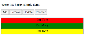
https://zerodevx.github.io/zero-list-hero/simple-demo.html
Demo using dom-repeat
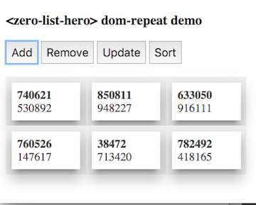
https://zerodevx.github.io/zero-list-hero/dom-repeat-demo.html
Demo under native shadow-dom behavior
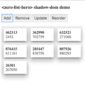
https://zerodevx.github.io/zero-list-hero/shadow-demo.html
Use in-built masonry layout

https://zerodevx.github.io/zero-list-hero/masonry-demo.html
Go crazy with Material Design - a demo Newsreader App

https://zerodevx.github.io/zero-list-hero/newsreader-demo.html
Published properties
| Property | Type | Description |
|---|---|---|
| debounceDelay | Number | Debounce delay between consolidating changes to hero elements and actually starting the transition; defaults to 500ms. |
| cascadeDelay | Number | Animation delay between multiple additions or removals of hero elements; defaults to 50ms. |
| addAnimation | String | Animation to use when hero elements are added into view; if unspecified, a special zero-entry-animation custom animation is used. |
| removeAnimation | String | Animation to use when hero elements are removed from view; if unspecified, a special zero-exit-animation custom animation is used. |
| manual | Boolean | If true, disables MutationObserver usage. Manually call the animate() method to trigger the transitions. |
| inTransit | Boolean | Read-only convenience property; switches to true whenever a transition is ongoing. |
| layout | String | Allowed values: ["masonry"]. Use <zero-list-hero> to handle element layout. At the moment, only 'masonry' layout is shipped. |
| layoutOptions | Object | Allowed values: [ { "breakpoint": Number } ]. Under 'masonry' layout mechanism, sets the "width" of each column in px before an attempt to add/remove a column is made. Defaults to 300. |
Public methods
| Method | Parameters | Description |
|---|---|---|
| animate() | none | Starts the transition process. Under shady dom behavior, this method is automatically called whenever changes are detected by the MutationObserver API. |
Exposed CSS mixins
| Name | Description |
|---|---|
| --zero-list-hero-item-mixin | Basket of CSS style rules to be applied to every .zero-list-hero-item. |
Installation
Install through bower.
bower install --save zerodevx/zero-list-hero#^0.2.1Alternatively, download the project as a ZIP file and unpack into your
components directory. <zero-list-hero> uses the following:
Polymer: https://github.com/Polymer/polymer- Polymer Elements'
<neon-animation>: https://github.com/PolymerElements/neon-animation - Polymer Elements'
<iron-resizable-behavior>for viewport change detection (and to play nicely with other Googly components): https://github.com/PolymerElements/iron-resizable-behavior - zerodevx's
<polymer-style-modules>foriron-flex-layoutstyle module (because/deep/and other shadow-piercing combinators are deprecated): https://github.com/zerodevx/polymer-style-modules - as well as their related dependencies.
Source provided as-is - no assumptions are made on your production build workflow.
License
MIT, though I'll greatly appreciate a note if you find this useful.
Version history
-
2015-08-19: v0.1.0
- Initial commit.
-
2015-10-07: v0.2.0
- BREAKING:
shadowattribute renamed tomanual. - Add automatic layout layer (included layout: Masonry).
- Remove shadow dom detection workaround for content nodes retrieval.
- Use
<neon-animation>'s in-built animatable wrapper instead. - Improve async dom write timing resolutions.
- Other performance improvements.
- BREAKING:
-
2015-10-12: v0.2.1
- Updated README.md.
- Cleaned up stray comments in
zero-list-hero.html.