Slideshow Card - No longer supporting
Slideshow Card for Home Assistant's UI LoveLace
Configuration Variables
| Name | Type | Default | Description |
|---|---|---|---|
| type | string | Required | custom:slideshow-card |
| cards | list | Required/Optional | List of cards Reqires 2 or more cards Only Optional if folder=true |
| style | list | Optional | List of Style attributes |
| arrow_color | string | Optional | Color of the Navigational Arrows, Default: Black |
| arrow_opacity | string | Optional | Opacity of the Navigational Arrows, Default: 1 |
| fill | boolean | Optional | Makes the inner Cards fill the container, Default: false |
| auto_play | boolean | Optional | Option to turn on/off auto switching of the cards, Default: false |
| auto_delay | string | Optional | Seconds between switching to next card when autoplay=true, Default: 5 |
| folder | entity | Optional | This is for dynamically pulling images from a folder See Dynamic Slideshow |
Added Child Card Variables
| Name | Type | Default | Description |
|---|---|---|---|
| style | list | Optional | List of Style Attributes per Card - This allows for styling of Child Cards |
Dynamic Slideshow
This allows you add images to a folder in your WWW folder that contains images you would like the see in the slideshow. Currently, this requires over writing the Folder Sensor so that the client can see the files. I am working on a built in method but wanted to get this feature available.
You will need to create a folder in your config directory named custom_components, within the custom_components folder you will need to create a sensor folder, and within that folder copy the folder.py file.
- Create a folder in your
configdirectory namedcustom_components - Create a folder in your
custom_componentsnamedsensor - Copy the
folder.pyinto thesensorfolder - Add the folder sensor to your configuration.yaml file
- sensor - platform: folder folder: /config/www/images - Create a folder in your
WWWfolder namedimages - Add your images to this folder
- Restart Home Assistant
- Check the sensor.images entity to see if the
fileListattribute lists your image files - Add a card to your ui-lovelace.yaml
- type: custom:slideshow-card folder: sensor.images- The other configuration variables are still available to use
- Refresh your Lovelace Frontend
Any files you add to the folder should automatically get added to the slide show
Installation
- Copy
slideshow-card.jsto<config directory>/www/slideshow-card.js - Add
slideshow-cardas a resource inui-lovelace.yaml
resources:
  - url: /local/slideshow-card.js
    type: js
Example Configuration
- type: custom:slideshow-card
  fill: true
  arrow_color: White
  arrow_opacity: .5
  auto_play: true
  auto_delay: 4
  style:
    'border-radius': '25px'
  cards:
    - type: picture
      image: /local/images/1.jpg
    - type: picture
      image: /local/images/2.jpg
    - type: picture
      image: /local/images/3.jpg
- type: custom:slideshow-card
  arrow_color: var(--primary-text-color)
  arrow_opacity: .7
  cards:
    - type: glance
      column_width: 30%
      entities:
        - entity: device_tracker.person1
          name: Person 1
        - entity: device_tracker.person2
          name: Person 2
        - entity: sensor.house_alarm_sensor
        - entity: sensor.to_work
          icon: mdi:car
          name: To Work
        - entity: sensor.to_store
          icon: mdi:car
          name: To Store
    - type: glance
      column_width: 30%
      entities:
        - entity: light.light_1
          name: Light 1
          tap_action: toggle
        - entity: light.light_2
          name: Light 2
          tap_action: toggle
        - entity: light.light_3
          name: Light 3
          tap_action: toggle
        - light.office_1
        - light.office_2
    - type: glance
      column_width: 30%
      entities:
        - light.bedroom_1
        - light.bedroom_2
        - light.bedroom_3
        - light.bedroom_lamp_2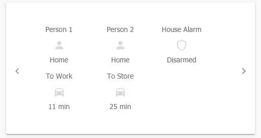
- type: custom:slideshow-card
  arrow_color: var(--primary-text-color)
  arrow_opacity: .5
  cards:
    - type: picture
      image: /local/images/1.jpg
      style:
        'border-radius': '25px'
    - type: picture
      image: /local/images/2.jpg
    - type: picture
      image: /local/images/3.jpg
      style:
        'border-radius': '10px'
Future Updates
- Option for Outer Card to stay the max-height of any card in the Slideshow
- This removes the height chainging when switching cards
- Adding Swiping Gestures for Mobile use
Credits
Thank you to @thomasloven for his Custom Cards to work from and his help when creating this card
Updates
Breaking Changes:
* Flush has been replaced with fill
* arrowcolor has been replaced with arrow_color
* arrowopacity has been replaced with arrow_opacity
* auotplay has been replaced with auto_play
* autodelay has been replaced with auto_delay
Other Changes:
* Dynamic Slideshow