react-token-field
Package was renamed from react-tokenfield to react-token-field
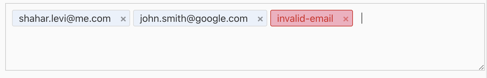
React Token Field is a React component that allows you to create token fields with copy/paste and keyboard support

Features
- Select All with Ctrl+A
- Copy & paste tokens with Ctrl+C and Ctrl+V
- Keyboard navigation, delete tokens with keyboard (arrow keys, Tab/Shift + Tab)
- Customizable token renderer
- Validation using regular expression
- Customizable token delimiters
- Customizable token style
- Auto Complete
Install
npm install --save react-token-fieldUsage
import React, { useEffect, useState } from 'react'
import { TokenField } from 'react-token-field'

interface User {
  firstName: string
  lastName: string
  email: string
  image: string
}

const App = () => {
  const [tokens, setTokens] = useState<string[]>([])
  const [users, setUsers] = useState<User[]>([])
  useEffect(() => {
    window
      .fetch('https://dummyjson.com/users')
      .then((res: Response) => res.json())
      .then((res) => setUsers(res.users))
  }, [])

  function renderOptions(str: string): React.ReactElement {
    return (
      <div
        className='options'
      >
        {users
          .filter(
            (user) =>
              user.email.toLowerCase().startsWith(str.toLowerCase()) ||
              user.firstName.toLowerCase().startsWith(str.toLowerCase()) ||
              user.lastName.toLowerCase().startsWith(str.toLowerCase())
          )
          .map((user) => (
            <div key={user.email} className='user-info' data-value={user.email}>
              <img alt={user.email} src={user.image} />
              <div>
                <div>
                  <b>{`${user.firstName} ${user.lastName}`}</b>
                </div>
                <div>{user.email}</div>
              </div>
            </div>
          ))}
      </div>
    )
  }
  const emailPattern: string =
    '[a-zA-Z0-9._%+-]+@[a-zA-Z0-9.-]+\\.[a-zA-Z]{2,}$'

  return (
    <div
      style={{
        width: '600px',
        fontFamily: 'Arial',
        padding: '10px',
        margin: '0 auto'
      }}
    >
      <TokenField
        placeholder='Type an email'
        onChange={({ tokens }) => setTokens(tokens)}
        pattern={emailPattern}
        delimiters=',; '
        showRemoveButton={false}
        options={{
          render: renderOptions,
          selectedClassName: 'selected'
        }}
        tokens={tokens}
      />
    </div>
  )
}

export default App
Properties
| Property Name | Type | Description |
|---|---|---|
| placeholder | string | a short hint that describes the expected value of an input |
| autoFocus | boolean | apply auto focus on the tokenfield |
| delimiters | string | a string that contains all related delimiters for example ',;-', the first delimiter is the main delimiter that's means that when you copy tokens the copied token will be separated with the main delimeter |
| tokens | string[] | The array of string tokens |
| pattern | string | The pattern specifies a regular expression that token should match |
| showRemoveButton | boolean | Show remove botton |
| options | object | Options for the autocomplete How to use options.. |
| onChange | function | Callback function that get the tokens and invalid tokens |
| getTokenCSS | function | Callback function that return CSS style for token, the function gets the token state of the token(selected,valid,invalid). |
| tokenFieldCSS | object | Custom CSS style for the tokenfield control. |
How to use options
Options has 2 properties
- renderer A callback function that gets the part of the string that the user inserts and returns a ReactElement that contains the options as child elements, each child element represents the option value and should add the data-value property, the data-value conatins the value that will add as a new/updated token.
- selectedClassName the css class name that will be set on the selected option
Snapshot
Demo
License
MIT © Shahar Levi